
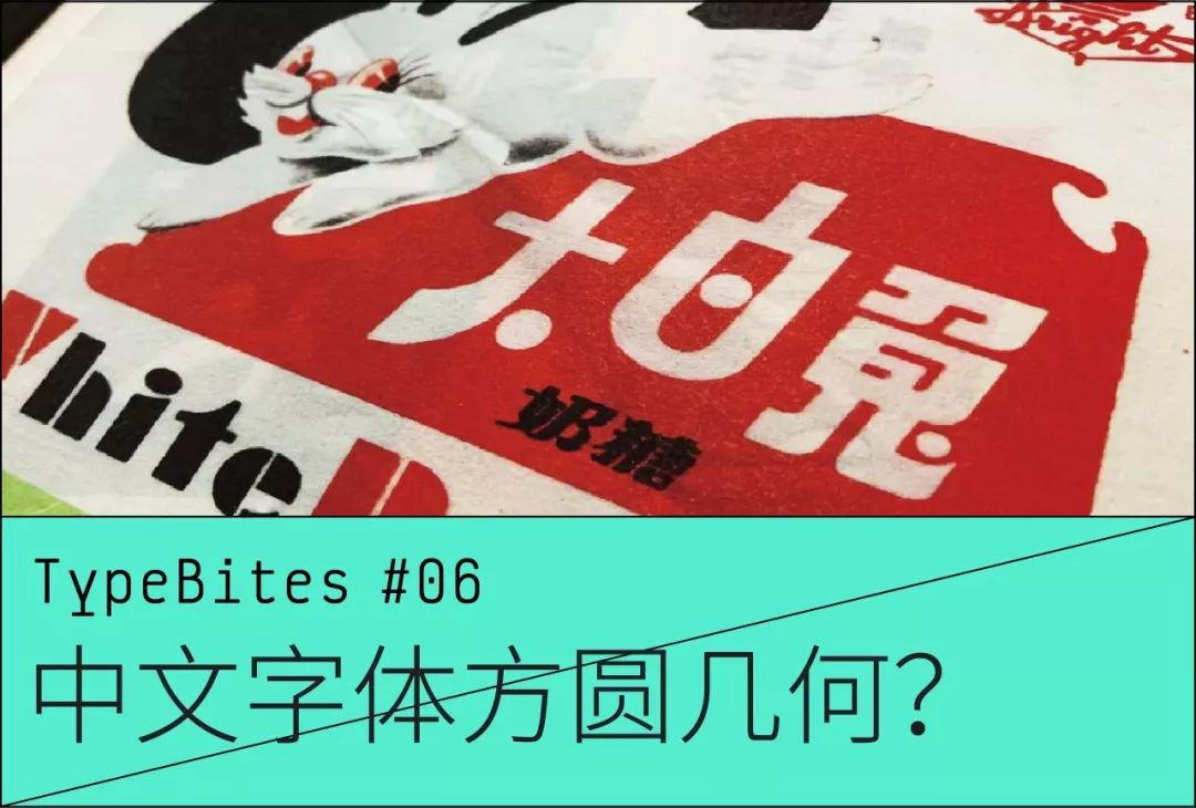
This column is updated in the second week of every month, welcome to pay attention
This geometric form exists in all aspects of life,
circle, rectangle, triangle,
Everywhere.
But have you noticed,
The "geometric fonts" that exist around us——
What is a geometric font? Maybe everyone's opinion is different. The geometric fonts we discuss in this article refer to non-text fonts composed of basic geometric shapes such as circles, rectangles and triangles .
When it comes to geometric fonts, we must mention artistic characters. There is a type of artistic characters that is composed of pure geometric shapes.
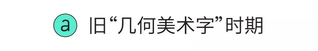
The geometric font shapes of the earliest Chinese characters have already been seen in some publications of the Shanghai Commercial Press in the early Republic of China:The first year of the Republic of China (1912) August 1st and the second year of the Republic of China ( 1913) The titles of the sixth and fourteenth issues published on February 1st are "Truth Pictorial".
Left: Issue 6 of "Truth Pictorial" on August 1, the first year of the Republic of China.
Right: Issue 14 of "Truth Pictorial" on February 1, 2002.
"Geometric Artistic Words" in the signboard
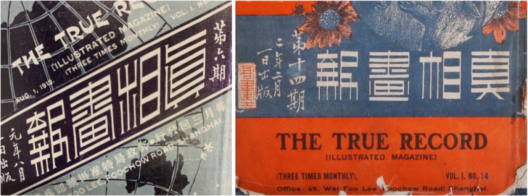
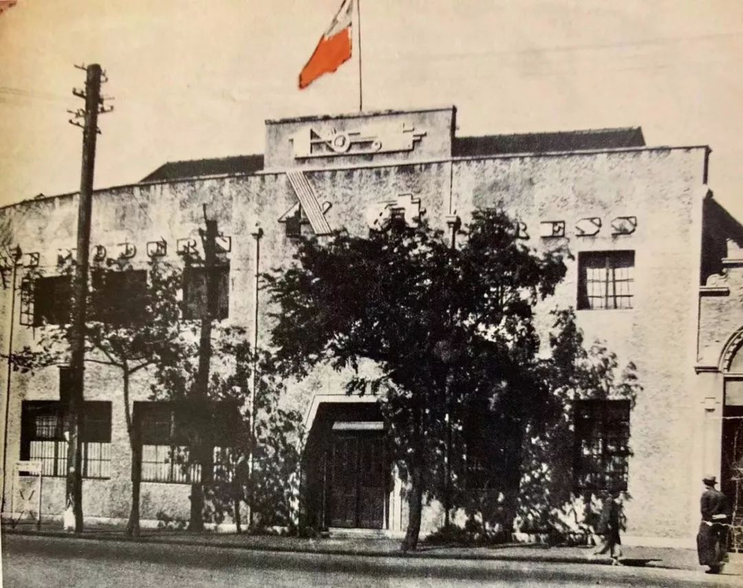
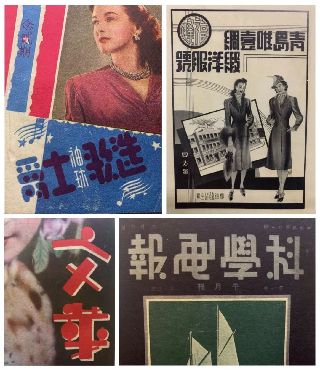
Due to the first earth-shaking changes in Chinese business at the beginning of the 20th century, many new industries emerged, and foreign-funded foreign firms abound in Shili Foreign Market. That period was also the heyday of the trend of Western geometric art characters. You can see that many foreign companies in China even directly use Western signboards, and most of them are geometric sans serif fonts.
Signboards in Western languages of foreign investment on the streets of Shanghai in the early 20th century.
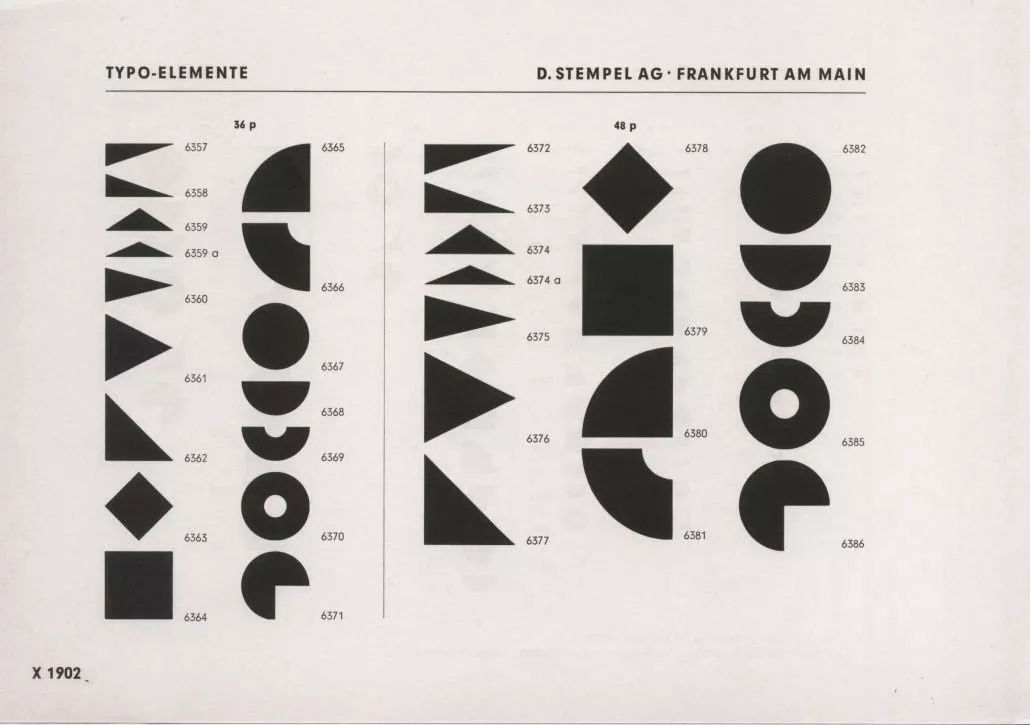
Frankfurt, 1902"Type Elements".
Back to Chinese characters,Foreign companies and emerging industries inevitably need Chinese "signboards" and "advertisements". At this time, trendy geometric art characters with a sense of design and modern decoration style come in handy use. At that time it became a common phenomenon that such typefaces were used for signs and advertisements on commercial buildings.
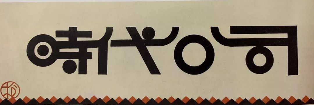
Time Inc., the most iconic geometric font sign.
Frustrated Geometric Text
In China in the 1920s and 1930s, geometric fonts reached a very high level in a short period of time. However, with the passage of time, the above-mentioned fonts were used in printed publications with the theme of "Anti-Japanese War" during the Anti-Japanese War, which seemed extremely undignified. There will also be some recognition problems when used in slogans. The Chinese government issued an order on December 31, 1939, requiring that "all slogans should be written in block letters."
Until 1949 for quite a long time, geometric fontsalthoughIt has improved, but in the endisnot back to the level of creation and frequency of use in the 1930s .

In the old days, these kinds of geometric art characters were drawn one by one by professional font designers, and the main production tool of the font industry was still lead type, which was extremely expensive. I wanted to produce this kind of geometric fonts Almost impossible. Until the appearance of phototypesetting, Japanese writing research company released the first geometric deformation font product, which is also the prototype of variety show-"Chuangjulan". The Chinese characters of this font were produced by Guo Bingquan in Hong Kong. Its style is more powerful than black body, and it is very popular, and the geometric typeface product has been kicked off since then.
Comparison between Chuangjulan and variety shows
Since the development of Chinese characters, computer fonts have become the mainstream, and few people will draw fonts according to a certain poster.So in order to meet the market, computer fonts are required to present more features, so as to be suitable for various style of commercial promotion.
Hanyi six-character black.
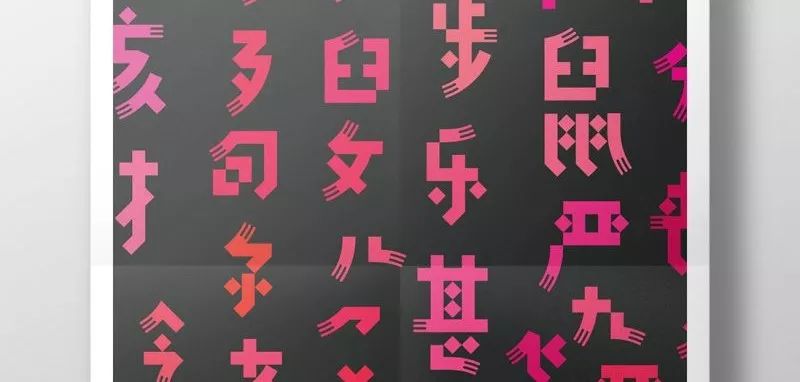
This set of very eye-catching fonts,The designer incorporated graphics such as "fork" or "scarf" into the strokes of the font, and all strokes are of equal width The randomization of the structure and structure gives this character a strong style and recognition. However, in such a random structure, although it is impossible to type a long text, it does not lose the recognition of Chinese characters.
There is no doubt that such a design method did not exist a hundred years ago. In the era of lead type, people would not have imagined that the Chinese character set could have such a peculiar shape in the near future.
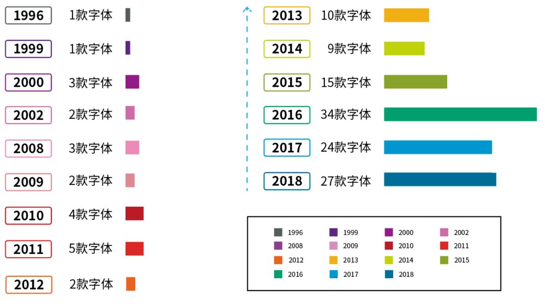
In fact, it is like an art font product whose strokes are abstracted and geometricized, and the number of releases is counted:The number of releases by major font manufacturers in 2016 has more than doubled compared to the previous year :
Why is there such a trend?
Let’s zoom in a bit to see that the font design of many modern brands is becoming more and more simple and geometric in order to cater to young people’s aesthetics and fast-paced lifestyle. At present, young people are the main consumer group, and this kind of character with great personality and expressive force is also favored by young people. It is speculated that this is one of the reasons why there are more and more "art font library products". (Of course, this does not mean that the traditional "Song Hei Fangkai" is not the mainstream.)
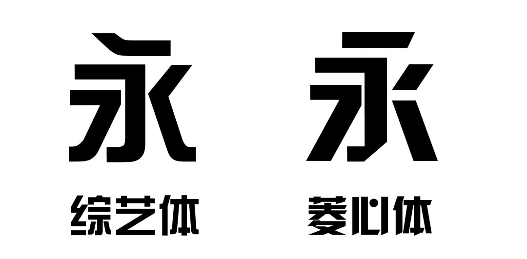
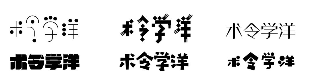
Hanyi Lingxin Body, which has always been popular, is a variation of variety show body.
Basic Transformation
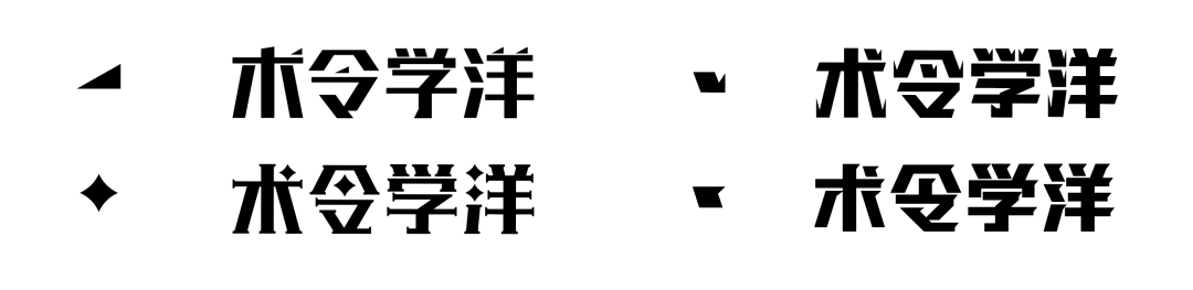
It is also a common practice of geometric deformation to replace or add decorations to "dots" and the ends of strokes, and the structure still retains the basic structure of Chinese characters. In this state without changing the font structure, adding or replacing decorations will make the font style more individual than before:
Some font products that replace and decorate "dots" and stroke ends.
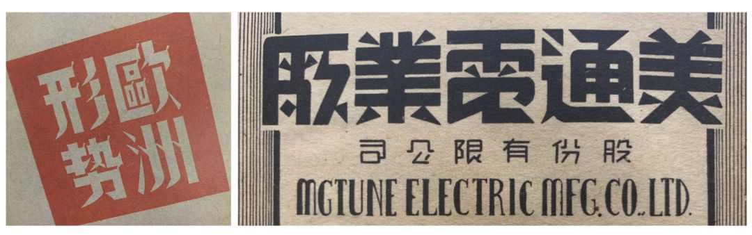
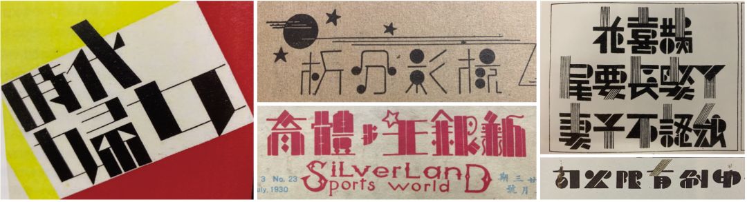
In the 1930s, there was a similar stroke replacement process, but the difference was that it was influenced by Western characters and Japanese pattern characters at that time, and had a very strong font change:
Similar treatment in Geometric Text.
Deformation of structure
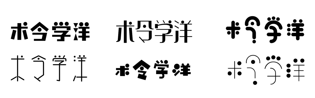
On the other hand, font products are becoming more and more abundant now. Even if the shape of the "dot" is the same (perfect circle), its structure can be processed in many different ways, and the recognition is still good:
"Dot" is a font library product with different structural shapes of a perfect circle.
Similarly, let’s take a look at the fonts of the old period.There are also many dots that are perfect circles, but the fonts of that period have more changes in font style: span>
The midpoint of the geometric artistic font is a perfect circle.
The fonts listed above are mostly font products released after 2018.Fonts in and after 2018 have more possibilities, no matter from the font strokes There are different possibilities for processing or deformation of the font structure, and evensome feelings of old-time artistic characters are included.
Some font products with interesting structures and processing methods.
In contrast, the font design of the old era is more expressive, perhaps because the font library products often have tens of thousands of characters, which requires a certain internal logic. This is actually the charm of fonts at that time-making fonts more expressive at the expense of recognition.
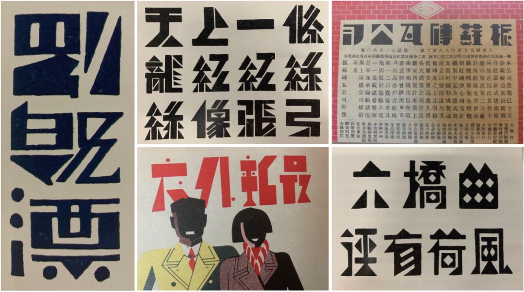
Highly expressive geometric font.
Experimental Abstract Morph
The book is back to the main story, geometric fonts, and more industrial designs in the 1930s-Extremely abstract deformation of the entire stroke outline, which looks very The experimental processing method makes the font look more like a pattern, which deviates from the recognition of the text.
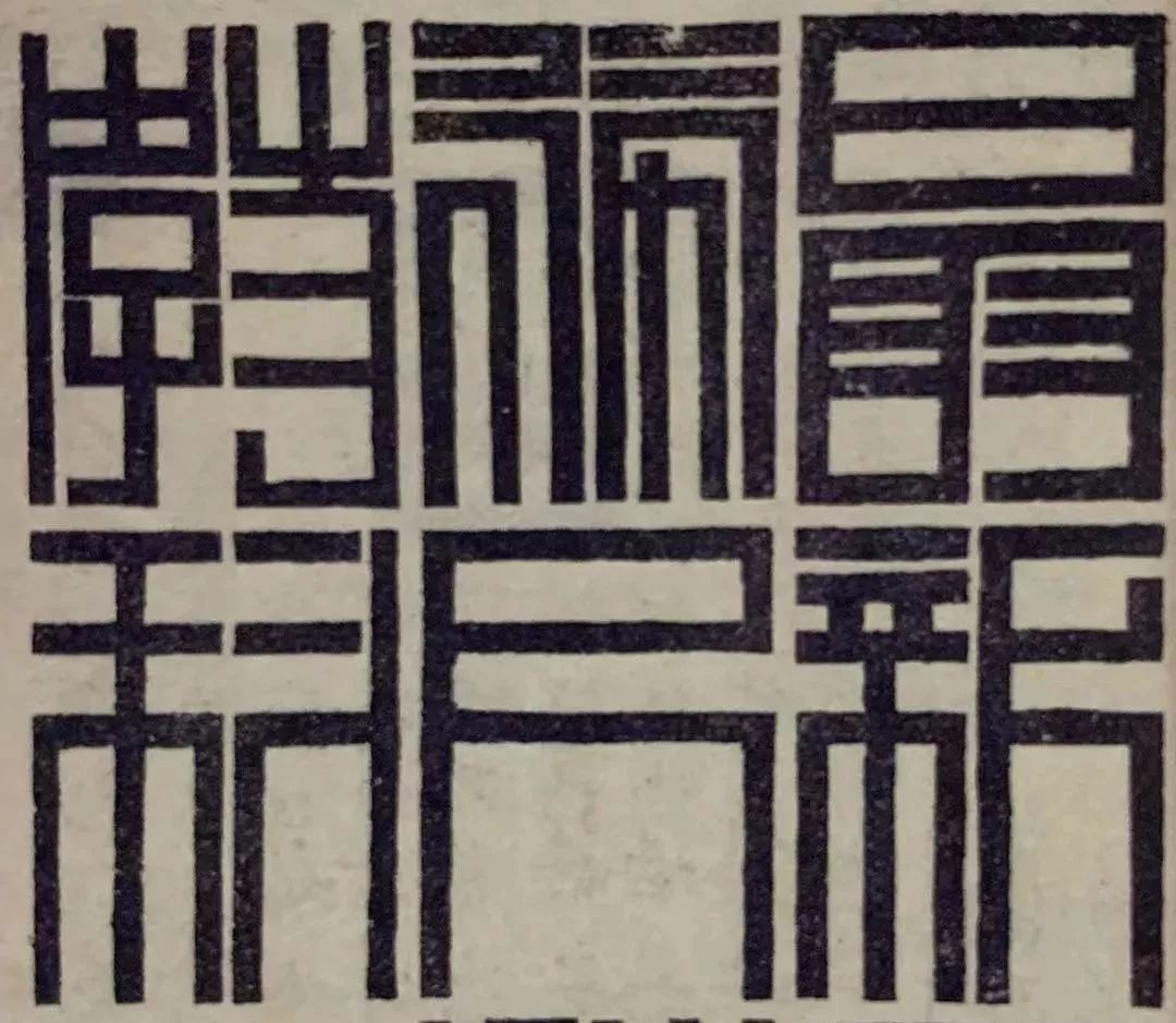
Extreme abstract deformation makes the font sacrifice the text recognition of the geometric art font.
This type of font has a bolder design, and the processing method of summarizing some strokes in the font into a whole geometric pattern is almost absent in the current font design. Such a constructivist font has strong characteristics of the times.
It is said that Chinese is a square character, but in the strict sense, they are not all square. According to the different outlines of the characters, they can’t be regarded as a square, especially in the case of "Ling", which is even more diamond-shaped.
Strictly speaking, deliberately geometricizing the outline of the entire font actually existed in the old "art characters".

Geometric text for "rectangle".
Geometric artwork for "triangle".
This type of font is found in the modern font library products, a font product of Founder "He Jiyun Solid Character", this font is intended to fill the entire character frame as a solid, and cut it to form Chinese characters. This set of fonts There is a very big disadvantage that fonts larger than 48pt are relatively easy to recognize, but cannot be smaller than 14pt, and it will turn into a black rectangular block. This design idea is undoubtedly very radical.
Founder "He Jiyun Solid Words".
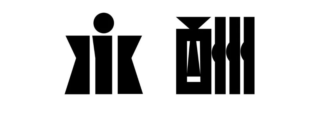
This type of font with great characteristics of the times, especially the last font with a triangle frame, has a greater meaning than the meaning of the Chinese character itself. If you try it now, it can only be regarded as a horizontal Experiment with contrasting fonts. Whether it can be used as a font library product in modern times remains to be discussed. In general, the font-based geometric fonts are quite different from the old geometric art fonts.
The above has completed the analysis of the existing relatively radical geometric font commercial font products. Compared horizontally with the "old artistic calligraphy period", can we make some possibilities? Here the author mainly focuses on the two possibilities in the last category in the above analysis and the geometric deformation of Chinese and Western matching.Because of its geometric properties, it must be a generalization of strokes Deformed, so the practicability still needs to be refined, here it is mainly experimental.
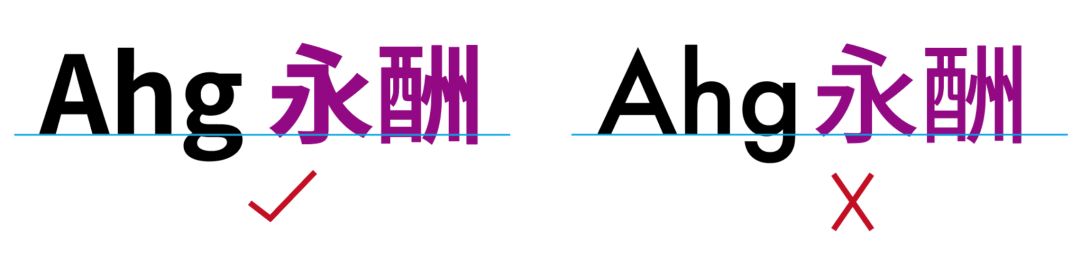
Chinese and Western geometric font matching
In recent years, there have been a lot of discussions about the matching of Chinese and Western characters, and it also appears in geometric fonts.
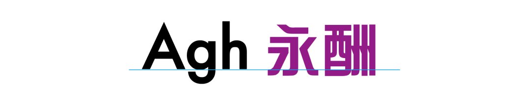
There is no problem with matching a basic sans-serif western text with a Chinese boldface. However, Western texts have more geometric deformations such as Futura fonts. Can this type of western language be matched by the relatively more geometric "variety art" in Chinese?
It is theoretically feasible, and the essence of variety show is also the basic geometric summary of Chinese characters. But from the font details and visual experience, this match is very reluctant.
Attempt to match contemporary Chinese and Western geometric fonts:Graphit’s Chinese character design, designed by Zheng Chuyang.
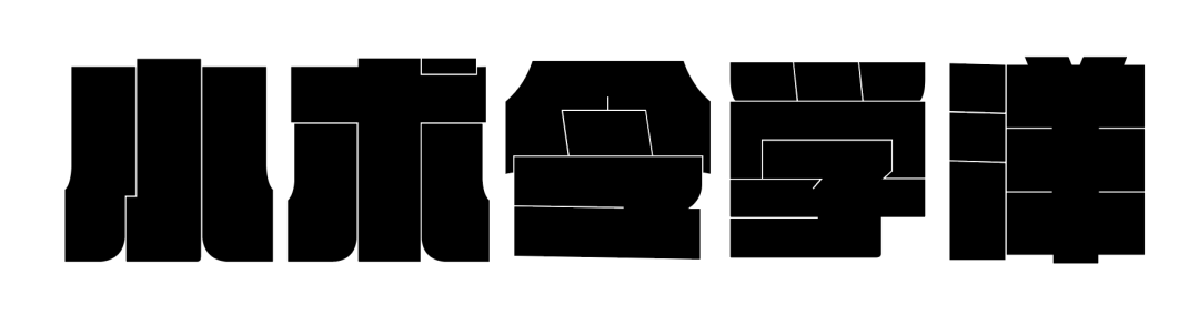
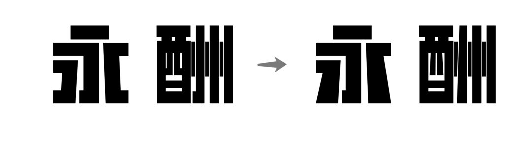
Extreme abstract deformation of strokes
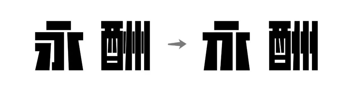
Deformation:Ordinary geometric fonts → reduce nodes on the basis of basic geometric fonts
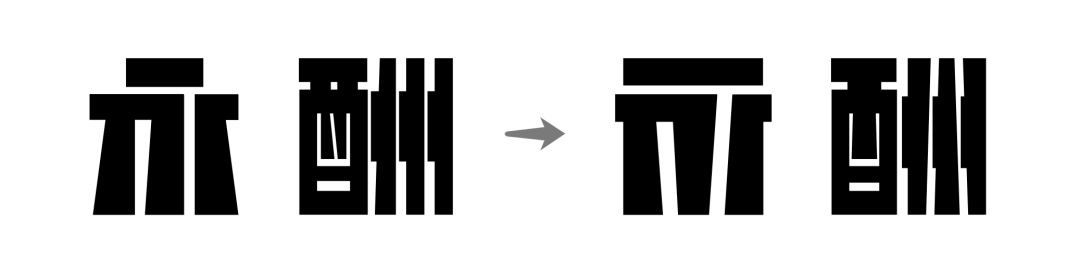
Transform:Merge strokes and parts

Deformation:Organize stroke outline
Directly summarize the stroke outline of the text
Deformation:Return the point above the word Yong to a perfect circle
Extreme geometric generalization of font outlines
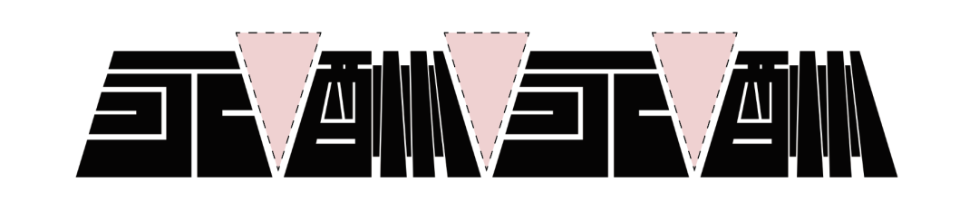
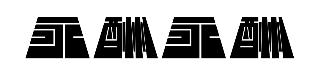
Trapezoid Outline Geometric Font Trial
Problem:Huge white space
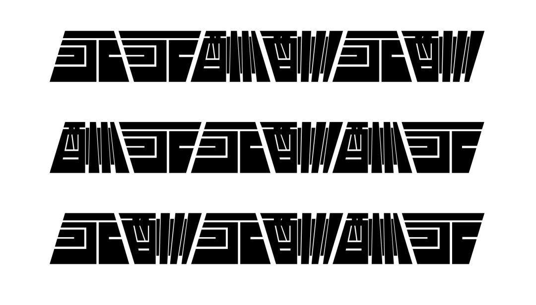
Two cases of trapezoidal geometric font
Arrangement effect of trapezoidal geometric font
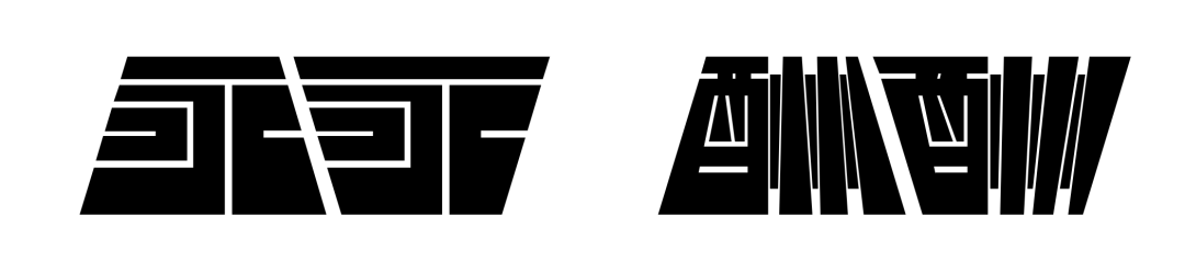
After following the official account, reply to "geometric font" in the background to get the Glyphs source file of the trapezoidal font in the text, you can see the effect intuitively, and you can also view the OpenType features.
Bibliography:
"History of Modern Chinese Characters and Graphics" by Zhou Bo
"Shanghai Characters" by Jiang Qinggong and Liu Ruiying
Special thanks to:Zheng Chuyang, Li Zhiqian, Liu Yuli for their guidance and suggestions


Articles are uploaded by users and are for non-commercial browsing only. Posted by: Lomu, please indicate the source: https://www.daogebangong.com/en/articles/detail/Chinese%20font%20square%20circle%20geometry.html
 支付宝扫一扫
评论列表(196条)
测试