
Good font design for movie posters should use graphic, text, color and other design elements to complement each other, rather than make them independent of each other. Taking 2011 as a watershed, the sudden emergence of poster design teams such as Xinyilian and Yuanshan gave a new perspective to the material design of Chinese-language films. Most poster designers choose to modify the fonts used in daily life before using them. Various Chinese fonts have different temperament and look and feel due to the different periods of production. Good designers will have a precise grasp and understanding of them. Judgment, so that it can better serve the foil of the film style.
Deep Throat Video Pin and Bell
"Font design" is through the designer's consideration and cognition of the overall temperament of the movie, and it is finally condensed and put on the poster to complement the overall picture of the poster. The tonality of the whole movie can be perceived at first glance. three. Regardless of English letters, Japanese kana, or Chinese characters, the form of the text itself is not visually advanced or not. In fact, Chinese characters have exquisite bones and various shapes. Even if you don’t need to design fonts, just a few basic fonts can be used to achieve great results. After experiencing development stages such as oracle bone inscriptions, bronze inscriptions, seal script, official script, regular script, cursive script, running script, Song style, etc., Chinese fonts have become more and more concise, with a strong sense of design and artistic expression.
With the continuous expansion of the Chinese film market, the film industry is becoming more and more mature, and every link of film production is increasingly subdivided and perfected, which naturally puts forward higher requirements for the design of movie posters. Simply put, people want a movie poster to be informative, visually appealing, and interesting. Among them, the poster font is the first visual point, and its importance is self-evident.
In order to reflect the unique characteristics of Chinese characters, especially the fonts of martial arts movies are mostly influenced by traditional ideological temperament, so the moves of swords, lights and swords in martial arts movies have become the carriers of the combination of form and meaning on the posters, and therefore they are presented with the temperament of ink and wash. It is the first choice for many Chinese-language movies with traditional temperament. Ink wash can best reflect the majesty, so it has become the favorite of major directors.
Fonts: deformed on the basis of ancient characters such as Lishu, Dazhuan, Xiaozhuan, and cursive script.
Wong Kar Wai is already a master at juggling artistic conception. The big cursive characters in "The Grandmaster" are relaxed and well-proportioned.
The poster of "Taoist Descending the Mountain" puts the characters and the title in a gourd-shaped cave.
The "Golden Age" received mixed reviews and a poor box office, but this ink version of the poster won the hearts of the people. The feeling of shifting the axis brings Xiao Hong vividly on the paper in the great era, the vertical golden font and the ink splashed on the paper in the background reflect, a free but sad sense of the times blows to the face.
At present, mature genres of Chinese movies, such as comedies, dramas, etc., the font design will be deformed to varying degrees according to the theme of the movie, and most of them are designed in this way. Since the type is obviously single, these characteristics must be expressed on the poster fonts, so that the audience can "fall in love" at a glance.
font: mostly combined with the theme style of the movie, and make variants.
"Heart Flowers on the Road" has a lively color scheme, and the relationship between the various characters and roles on the poster is fascinating. The title adds female silhouettes and road signs to the word "flower", and the tone of the story starts from this small design You can explore a little bit on the above.
On the poster of "Twenty Years Old Again", several title words look like old-fashioned light signs with spotlight bulbs, which reminds people of the signboard of the magical photo studio in the film that can bring people back to youth , retro and dreamy, which fits the tone of the movie very well.
The contradictory nature of the vocabulary of "Fireworks in the Day" makes it have a fragile and special scene beauty. Later, director Diao Yinan saw Cai Guoqiang's performance installation "Fireworks in the Days" by chance, which led to this film name. The crispness and glamor of the northern city and the black style of the story are accurately conveyed through the angular white design font.
The simple and fresh font style is most suitable for the current youthful style. Also in order to conform to the temperament of the film, although the number of poster designs is exactly the same, it has been tried and tested repeatedly. The fresh color scheme and the most friendly handwriting can most arouse the collective resonance of the audience without barriers.
Typeface: Director's handwriting.
Youth films are not a clear type of film, but the successive successes of Chinese-language films such as "The Year in a Hurry" and "You at the Same Table" in recent years have confirmed the strong demand in the market and brought a The blowout of mass-produced movies of the same type has a side effect of visual fatigue.
But it is also the simple font of the blackboard newspaper. It is used on the poster of "San Geng: Dumpling" directed by Hong Kong director Chen Guo. The word "dumpling" is crooked and almost falling apart. The expressions echo each other, and the shape of the characters is weird, like the traces of a ghost's claws scratching, giving people infinite room for reverie.
In order to combine the font with the theme of the movie content, sometimes it needs to be very simple. For example, changing the font of the movie to traditional Chinese characters is like watching a movie from another world, which often has unexpected effects. But such tricks are often suitable for titles that do not have a strong sense of form and require a little detour to think about, so that it is interesting to interpret.
Font: Traditional.
The realistic theme of "Dear" makes a fuss about the traditional Chinese character "pro", intentionally separates "pro" and "see" by a certain distance, cleverly uses the physical and expressive functions of Chinese characters, and closely Subtract the video theme.
In "Zhiming and Chunjiao", the pocket-sized and cute individual stories are conveyed in traditional fonts with a touch of pop, light and warm, and the two low "and" are also like a film The embodiment of the "quit smoking" plot elements in the film.
As the division of labor in the industry becomes more and more detailed, some movies can also cleverly choose to use appearances to make up when the depth is not enough. Some posters are the icing on the cake for the movie, and there are also some unknown designs, from the content to the packaging, which are seriously off the street:
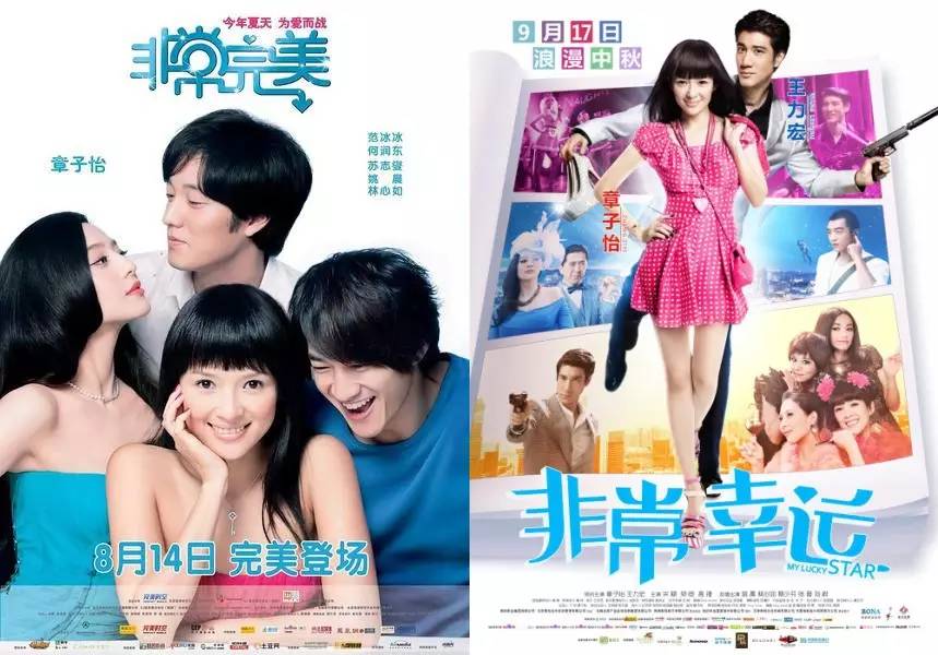
 Lack of interaction with the content: In fact, it is hard to say that compared to the quality of this series, this kind of almost thoughtless poster design is equal or worse. The urban romance films of the same type seem to be particularly fond of rough and simple "stacking words" and designs that simply show the relationship between characters (see "101 Marriage Proposals", "Love in the City", "Amount of Happiness", "I Am the Queen", etc.) , the "very" series of poster fonts seem to have nothing "very".
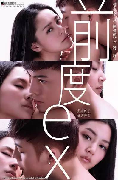
 Inconsistent with the sense of type and form: This kind of light and shadow magic hand is like a junior player, and the typography is not only the proportion of the skin area of the characters is too large, but it also does not highlight the beauty that the three-stage poster should have, and the "front degree" is so ambiguous The words of "" also use such an unambiguous and sharp font, which is a good emotional entry point for nothing.
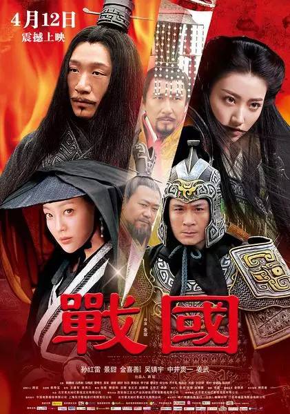
 Aesthetics are too low and there is no cure: Big productions with historical themes have not escaped the fate of becoming DVD covers of rental stores in eighth-tier cities. There is a group of strange humans with disheveled hair between the sharp-edged and the raging flames. The two red characters are so red that they are almost hidden in the background color, with an inexplicable simple and honest temperament. !
In general, the design of fonts is difficult to achieve alone, and the sensitivity to fonts must be cultivated, and the designer's penetration and understanding of various industries is indispensable. Only when you have your own understanding of the movie itself and master the characteristics and styles of various fonts can you properly grasp the temperament and characteristics of fonts when applying them, so that they can better set off the theme.
The higher and higher standards for film materials will also urge designers to shorten the process from imitation to originality. As the first face of the film, as time goes by, when the audience forgets the marketing of monsters The box office performance is as good as the bubble, but when you still remember the personality of the font on the movie poster, the powerful function of the font design will be highlighted.

Custom design contact: 2476370469@qq.com
vi design WeChat official account: visheji365
Public account of Tofu Brain Alliance: do4now


Articles are uploaded by users and are for non-commercial browsing only. Posted by: Lomu, please indicate the source: https://www.daogebangong.com/en/articles/detail/Chinese%20font%20design%20How%20to%20elevate%20the%20movie%20style.html
 支付宝扫一扫
评论列表(196条)
测试