
What font should I use?
? Don't know ⚪This button is broken
God refuses to answer
Why they don't answer
Because
They don't know the answer either
Font is the basic module to "build" all typesetting pages. When designing a page, it is usually necessary to use multiple fonts, and sometimes multiple fonts are absolutely necessary. Fonts are not works of art, but practical products. There is no absolute good or bad. Designers have been entangled with fonts all their lives.
So the topic we need to discuss about fonts today is:
Five of Fonts & Designers! big! correct! Entangled!
◆ ◆ ◆ ◆ ◆
Types of fonts and designers
There are no more than three colors, no more than three words
1~2 font styles for the same work are enough
But don't put two similar fonts on the same page
Otherwise it will make people uncomfortable
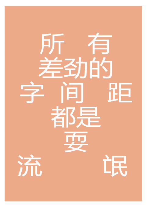 (Don’t say you learned design when you go out, shame~)
◆ ◆ ◆ ◆ ◆
The distance between fonts and designers
Each character in the Chinese font is placed in a grid, and the spacing and line spacing of very thin and thin fonts are relatively large. If the page is full of very thin fonts, it will look very boring and make people not want to read.< /span> also causes confusion.
Different positions, different fonts
Different fonts, different spacing
Specific adjustment depends on font characteristics
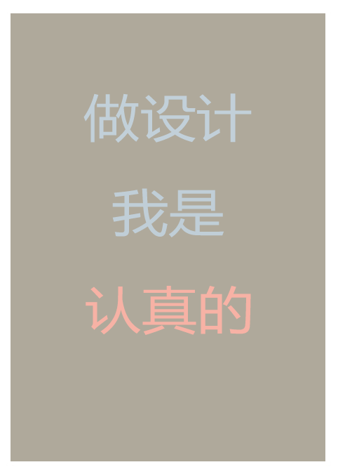 (Dare to play hooligans, you wait~)
◆ ◆ ◆ ◆ ◆
Colour of font and designer entanglement
It's still the same old saying, there are only three colors. In addition to the types of colors, warm and cool colors are also particular.
Warm colors are progressive, one point can produce contrast;
Cool colors are far away and will recede in our sight;
So cool fonts need a larger area to create limited contrast
 (Don't panic, use your works to prove your strength~)
◆ ◆ ◆ ◆ ◆
The direction of font and designer entanglement
Fonts can be in any orientation, no matter which orientation can have a negative impact on page reading.
The page only has two orientations, horizontal and vertical
A scalable font can be used horizontally
Use a tall font vertically
Emphasize the vertical direction through the structure of the font itself
PS: Never put angled text in the corner
Otherwise the result would look like this:
(That, the boss asked to show him the revised 21st draft~)
◆ ◆ ◆ ◆ ◆
Comparison between fonts and designers
The contrast of fonts can be size, weight, structure, direction, color... Also you can use completely different styles of fonts, but don't use the same weight and size.
A font
By contrast
Can also make high-definition composition and design
(No overtime, no revision, why don’t you go to heaven~)
Look
It's never the font that's wrong
It's us
Choosing fonts is easy
No matter what kind of page
Ease of readability and ease of use are the fundamental demands of users
More original design articles
More global design dry goods sharing
Stick to the top to support us now (click on the upper right corner)
Articles are uploaded by users and are for non-commercial browsing only. Posted by: Lomu, please indicate the source: https://www.daogebangong.com/en/articles/detail/Chinese%20font%20I%20hate%20youjpg.html

 支付宝扫一扫
评论列表(196条)
测试