
Text/Liu Shatu/baidu
Typeface design itself is an artistic image, which has the characteristics of beauty and expressive emotion. When designing, we should not only stop at satisfying the legibility and readability of the text, but also fully mobilize the creative expression of the connotation of the text. 
It is relatively simple to change the size of a text, but it is very effective. We can first try to process the entire text in terms of area. When we enlarge the size of the characters to an unconventional size, whether it is the shape of the characters or the negative shape of the characters, it will produce unexpected effects. We will also find that the enlarged text will divide the entire layout into several small blocks. If these several small blocks are filled with different colors or graphics, the whole work will have diversity. visual effect. 
These are the special effects that can be achieved by expanding the area of a single text. If a single character is contracted on the area, the form of points will be brought into full play. Let the whole layout produce an extremely ethereal feeling, which makes people daydream. Alternatively, the reduced text can also be repeated and rotated in the layout to create a sense of rhythm. Of course, what we must not ignore is to compare the size of the same text in the same page at the same time, give them different colors, and achieve the perfect unity of contrast and harmony. 
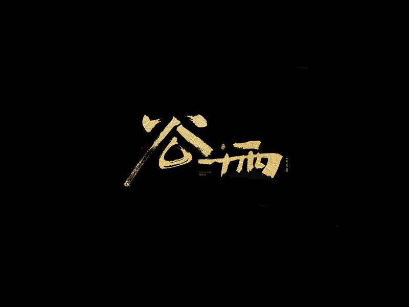
Work hard on the shape of a single text. In addition to scaling it, the most effective way is to deform it in terms of shape. The deformed text gives people a feeling of dancing, which makes the picture have a certain sense of space. The specific methods of deforming the overall shape of characters include: flattening the characters vertically or horizontally. The characters processed by this method will have a strong sense of urgency, and if they appear in design works, they will have a tendency to gravity. Stretch a single corner of the overall shape of the text to make the whole text produce a slanted space effect. This method of text processing is also used frequently in the design works of many masters, so as to achieve special visual effects. 
Rotating text, this is a processing method that can be quickly completed by using a computer. It is to change the direction of the text at different angles, break the original sense of balance, and make the entire text feel dynamic, as well as directionality. indicative. Mirroring the text is to reverse the entire text. It is a way of processing that challenges the normal reading order. This kind of fresh visual sense that breaks the routine is very consistent with a certain rebellious tendency. preferences of young people. Distorted text is the most deformed way, which will give the whole text a sense of flow. Grasping the beauty and recognition of the deformed text is the key to the above methods. When text is deformed, its recognition will be severely challenged, which is what all our designers need to pay attention to at all times. Recommended reading: Chinese character modeling method! Chinese font design skills
Increase or decrease the area of the positive or negative shape of the text, which can give the text a new look. Of course, the method of increasing or decreasing can not be limited to cutting, but can also add tearing, covering, gradient and so on. There is another way to change the area of the positive and negative shapes, which is to change the thickness of the strokes of the characters, and the particularly thick parts will dominate the vision. When doing this exercise, also pay attention to the effectiveness of the image base. 
Under normal circumstances, we habitually regard the text in the layout as a picture, and the rest as the bottom. So it can be said that whoever pays attention to both will have a better design. . Therefore, when we design, we should consider the effectiveness of the image base within the scope of the design, so that every corner of the image is filled with things that can be thought about. 
By breaking up the original strokes of the characters and then recombining them, a brand new font can be obtained. The purpose is to break through the structure of the original text. Concretely we can use the following method: part of the stroke structure of a single character is broken up and dislocated, and the font of the original font is kept to a large extent, and the recognizability of the character is strong; all stroke structures of a single character are broken up and dislocated, and then re- Combination, you can also enlarge or reduce certain strokes, pay attention to ensure the legibility of the text as much as possible. There is also a very interesting method, that is, we can replace all the strokes of a single character with the same stroke form, and we will find a font with a strong modern sense. 
In the fonts we have chosen, adding a rough texture is to satisfy people's pursuit of primitive and simple psychology, and to give people a sense of affinity. This method of expression is relatively popular at present, and it is an effective method of changing fonts. As long as we carefully observe many design works around us, we can find them. You may think, how can you get a rough texture effect that suits you? In fact, in our daily life, such an effect can also be found. Or do some of these effects yourself. Or "write" with various imaginable tools and methods. 
We know that there are various fonts in the font library of the computer, and each of them presents a unique shape. The combination of multiple fonts is to use these different forms and recombine them to create a strong contrast in a single text. There are two specific ways of combining: combine two fonts with relatively different stroke shapes, and the proportions of these two fonts can be basically balanced, or you can adjust the ratio between them yourself. If we choose the combination of calligraphy and black body with traditional charm, then in this word, there will be a strong collision between tradition and modernity. 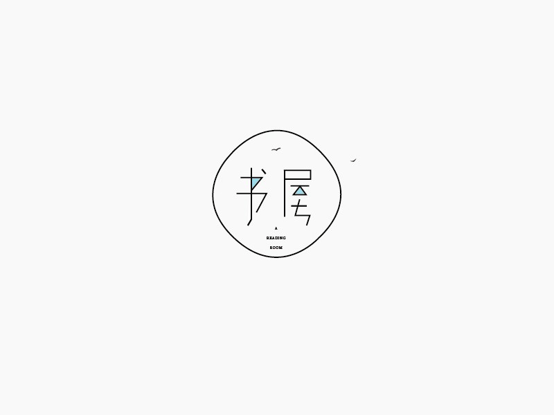
Another method is to change a single text with several different fonts, and then superimpose all the text with the same content and different fonts. The superimposition method can be the superposition of the text itself; it can also use different colors or transparency so that each different font can appear on the screen; it can also simply not let the text itself have any filling, but each different The fonts of different fonts are represented by borders, and the lines are used; or the text of different fonts is used as the constituent elements of the pattern texture to form textures with various effects. The recognition of the text processed by this method is very different from that of the background. relation. 
The combination of text and pictures can not only make the expression of fonts more diversified, but also make it easier for text to combine meaning and shape. The graphics used in the combination of words and pictures can be photos, hand-painted graphics, geometric shapes, or irregular abstract shapes. 
There are several ways to combine words and pictures: Filling lines or graphics directly on the text can increase the richness of the text surface, but pay attention to the position, color, and density of the picture will affect our recognition of the text; Put the text into the graphics; replace the edges of the original text with regular or irregular dashed lines, realistic or abstract graphic geometric color blocks, etc.; replace all or part of the strokes of the text with pictures; the text itself does not Make any changes, but add some other graphics on top of the text. This method is especially common in advertising design. Recommended reading:Big reveal! Chinese font creation skills
In the future, in our design projects, we will need to use traditional expression methods to design a large proportion, so whether we have the ability to grasp traditional elements is very important. This change method specifically refers to the use of excellent traditional elements at home and abroad in one's own font changes, but the simple stacking of traditional elements should be avoided. Our country has a long and splendid folk art, such as: paper-cut, ancient prints, auspicious patterns, historical patterns, seals, imaginative characters, etc., can all be used in font design. 
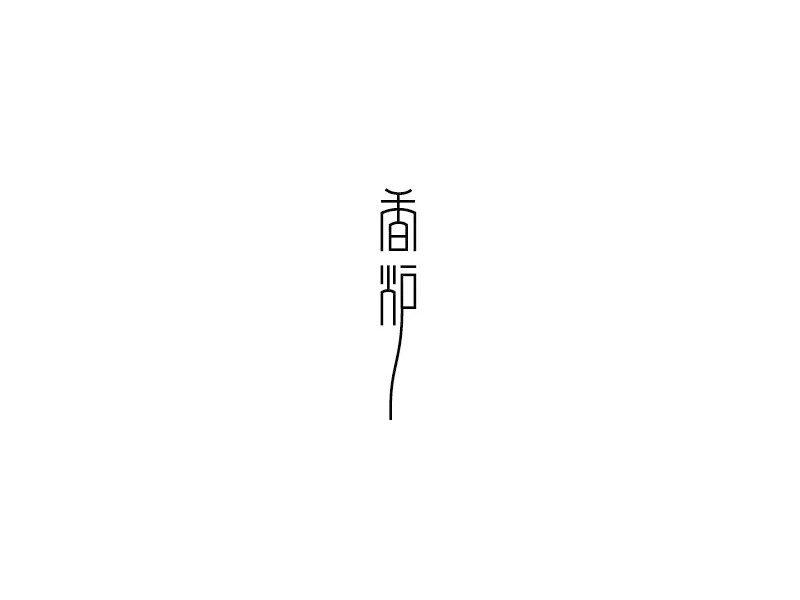
For the representation of text, in addition to using two-dimensional methods, we can completely use it in two-dimensional space to express three-dimensional effects and endow text with interesting three-dimensional effects. The specific methods are: the three-dimensional perspective of the text itself, which can give the text different materials: wood, stone, paper, glass, metal, etc.; the embossed effect of the text makes people feel like they want to touch; Use the negative shape of the shadow to contrast the positive shape of the text itself, keep only the shadow part of the text, observe the recognizability of the shadow of the text, sometimes it is more attractive to recognize the text from the shadow, etc. These methods can remind us of the existence of another space. 
Articles are uploaded by users and are for non-commercial browsing only. Posted by: Lomu, please indicate the source: https://www.daogebangong.com/en/articles/detail/Chinese%20character%20design%20techniques%20Chinese%20font%20creation%20skills.html
 支付宝扫一扫
评论列表(196条)
测试