Text/Yan Mingjun No rules, no rules, no reason, no basis, no design. Before designing Chinese characters, it is necessary to have an understanding of the basic principles and specifications.


①The stroke specification of Chinese characters. All Chinese characters are composed of regular strokes, which can be summarized into eight strokes, and these eight strokes are simultaneously reflected in the Chinese character Yong. The eight strokes are dot, horizontal, vertical, left, right, lift, fold, and hook, so Yongzi has become the research object of learning fonts and calligraphy.
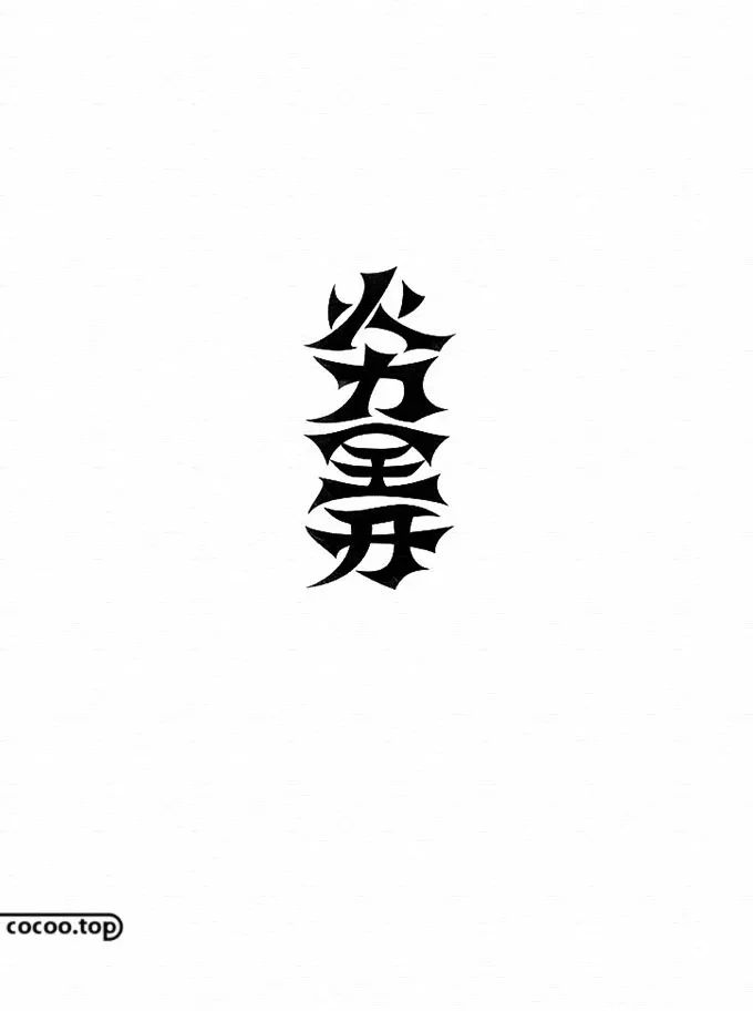
Strokes are the key to the difference between fonts, and different fonts exhibit different stroke characteristics. For example: the thickness of the strokes in bold is balanced and consistent, and the strokes are tough, giving people a rational and rigorous visual impression; the structure of round characters is round, simple and generous with a soft feeling, which is very friendly.
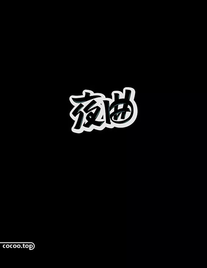
② Chinese character structure specification. There are two main factors that affect font size: shape and padding. The shape refers to the size of the glyph area; the inner white reflects the complexity and thickness of the strokes of Chinese characters, which has a great influence on the size of the font.

There are five principles to adjust the thickness of strokes: less stroke thickness. Multiple strokes are thin; sparse, thick, dense and thin; the intersection of strokes should be thin; the main stroke is thick, and the secondary stroke is thin; the outer stroke is thick, and the inner stroke is thin.
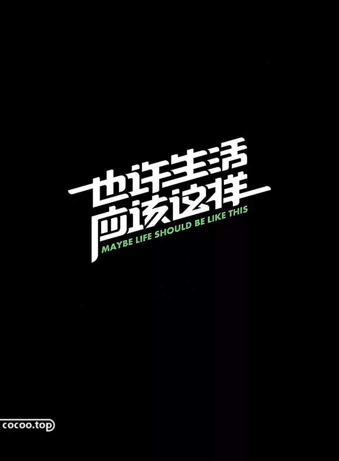
Center of gravity adjustment. Every word has a center, which is the center of vision. In addition to individual strokes affecting the center of gravity and balance of the word, the height of the center will also produce uneven heights. In order to make the entire font neat, uniform, uniform and stable, the center should be placed in a balanced left and right, vertical up and down.
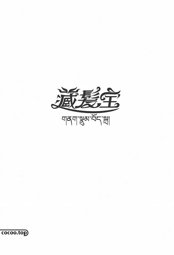
It is necessary to set the center of the Chinese character on the visual center, make the upper part of the character more compact and the lower part more spacious, which meets the needs of aesthetic psychology.

③The group word specification of Chinese characters. Character spacing is much more important than its shape, which is related to the rhythm of the font. The word spacing of general reading text is 1/12 of the width of a single word, and the spacing can also be increased or reduced according to the situation. The coherence and readability of increasing the spacing of the text are relatively weakened; reducing the spacing of the text will make the text more compact and more integrated.

The impression of text will also change with the change of color. Different colors will give people different visual feelings, so as to achieve different visual appeals. According to our life experience, memory and accumulation of knowledge, each color will have a concrete or abstract form of expression in our understanding. For example:
Red -- Enthusiasm, liveliness, excitement, warmth, happiness, auspiciousness
Orange -- bright, gorgeous, excited, sweet, happy
Yellow -- clarity, cheerfulness, nobility, hope, development, attention.
Green -- freshness, calm, ease, peace, softness, youth, safety
Blue -- Profound, Eternal, Serene, Sensible, Honest, Cold
Purple -- elegance, nobility, glamour, pride, recklessness
White -- pure, innocent, simple, sacred, bright, weak, nothingness
Gray -- modesty, silence, moderation, loneliness, melancholy, negativity
Black -- sublime, serious, vigorous, solid, rough, silent, dark

Each basic font has a different personality, and each personality will give people a different visual experience. When we are designing, choosing a basic font with a structure similar to the target object will save money in the subsequent design process. A lot of time and energy.
①Arial: objective, elegant, atmospheric, and versatile. Times New Roman is a publishing font of the same age as typography and best suited for any medium, including television subtitles. When you don't know which font to choose, choose Arial, the most common and plain font is actually the most beautiful and timeless font.
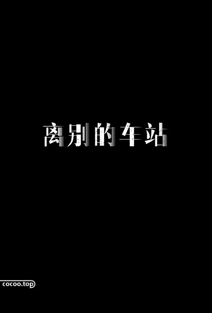
②Black body: thick and eye-catching. The biggest difference between "HeiTi" and "SongTi" is that the thickness of the strokes in SongTi is different, while the thickness of the strokes in HeiTi is balanced and consistent. Because the black body occupies a larger area in the word frame, it has a high degree of recognition and is multi-purpose For title production, it has an emphatic effect.

③Italic script: delicate, peaceful, and bookish. Kai typeface is similar to Song typeface, and the strokes and turnings have the form of paused strokes, which has a strong taste of books. On the other hand, the strokes of Kai typeface are smooth, the turning points are plain and gentle, and it also has a sense of modern simplicity.
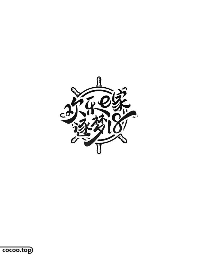
④ Imitation of Song Dynasty: authoritative and old-fashioned. Fang Song is a special typeface for early Chinese typewriters. The use of Fang Song typeface in printed materials gives people a certain sense of authority, and is generally used for suggestive exposition of ideas.
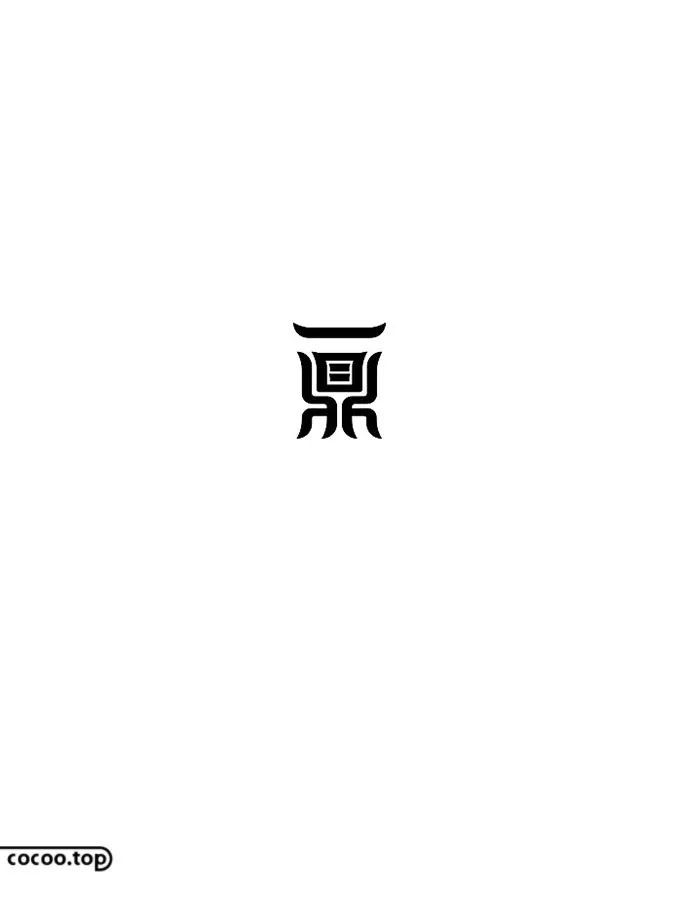
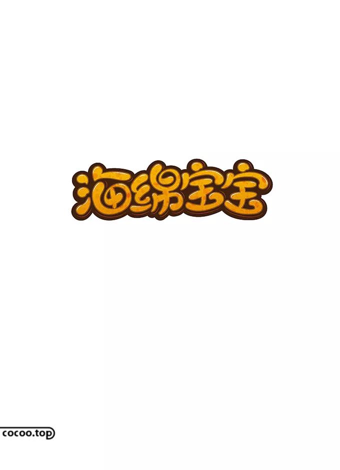
⑤Round body: petty bourgeoisie, snobbish, commercial. Usually people have gentle and cute associations with things with rounded corners, which is why when facing children and women, they usually choose rounded fonts as the basis of design, and it feels less formal, so it is not suitable for use. In more serious and formal occasions.

① Suitability. Conveying information is a major function of font design, and it is also the most basic function. The most important point of font design is to obey the requirements of expressing the theme, to match its content, let alone conflict with it, which will destroy the appealing effect of the font. For example: When creating a font related to men, it should reflect some characteristics of strong and masculine.
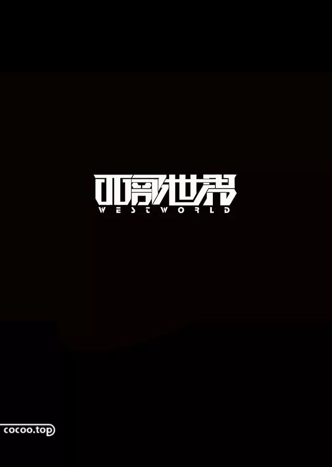
② Recognizability. The main function of text is to convey information to consumers. To achieve this goal, the overall appeal of the text must be considered. The shape and structure of the font must also be clear. It is not allowed to exaggerate the shape structure, increase or decrease strokes at will, making it difficult for people to recognize .
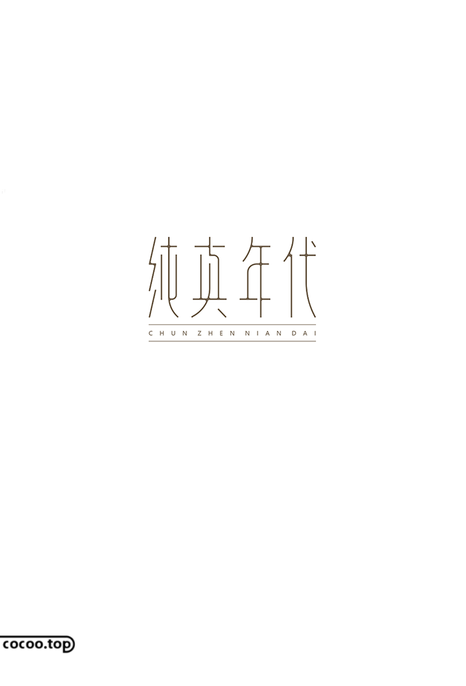
③ integrity. In font design, whether it is a glyph logo, a phrase or a multi-character slogan, it should be designed as a whole, and the style of expression should be unified—otherwise style conflicts and font structures will be scattered. Font design failed.
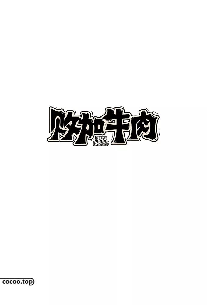
The thickness of font strokes must have certain specifications and proportions. When designing text, the thickness and form of the same strokes within the same character and between different characters should be unified, so that the overall sense of order and balance cannot be lost due to too many changes in the font, which makes people feel uncomfortable visually.
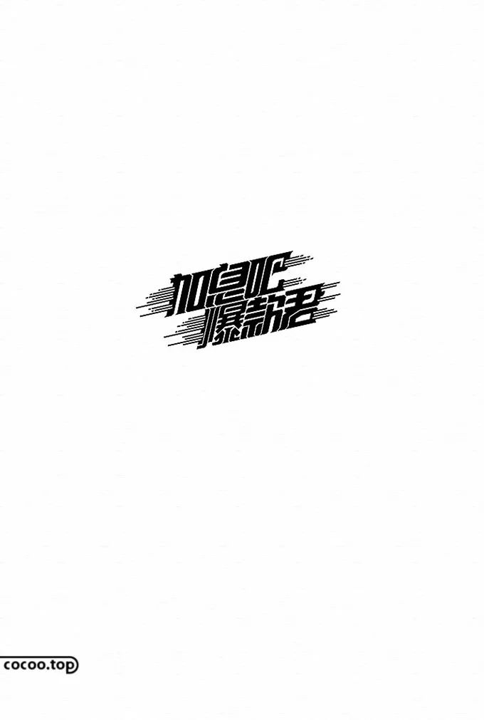
④ aesthetic feeling. In text design, beauty is not only reflected in parts, but in the grasp of pen shape, structure and the whole design. Characters are composed of lines such as horizontal, vertical, dots and arcs. In the arrangement of structures and the collocation of lines, coordinate the relationship between strokes and strokes, and between characters, emphasizing rhythm and rhythm, highlighting expressiveness and appeal. force.
In short, an excellent font design can make people never forget it. It not only plays the role of conveying information, but also achieves the purpose of visual aesthetics.
Recommended: Font Design Skills Pixel Method ( Video Tutorial)
① Official headline number: Smart Design, a must for top creative designers
② This article is edited and organized by Design Intelligence www.cocoo.top, the copyright belongs to the original author, please indicate the source for reprinting!
Articles are uploaded by users and are for non-commercial browsing only. Posted by: Lomu, please indicate the source: https://www.daogebangong.com/en/articles/detail/Chinese%20character%20design%20principles%20and%20specifications%20Make%20fonts%20more%20charming.html

 支付宝扫一扫
评论列表(196条)
测试