Original: Wang Mengqi I am Design Wet
The theme of this tutorial is "red envelope". Our target needs can be divided into two types.
The first type can be accepted by the audience in the traditional aesthetics. In terms of design, the degree of completion is relatively high (the degree of completion refers to the comprehensive level, and the tonality is accurate, the creativity is achieved, the elements are exquisite, and the layout is qualified). Then its meaning is very clear, satisfying the market means success. By design, the risk is low. I found some such traditional style works, let's analyze them first.
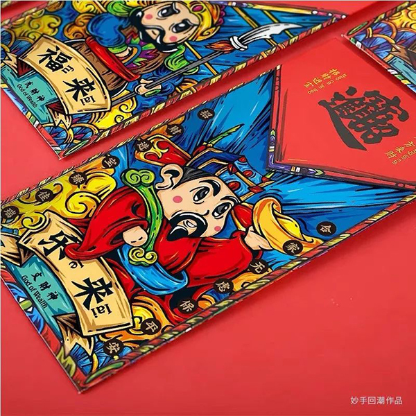
Let's take a look at this group of works. The main body of the picture is the God of Wealth. My family worships the God of Wealth every Chinese New Year. This is also a traditional graphic element that ordinary people have a clear understanding of. The font part is a calligraphy combined character, which is also a traditional element. One, the combined character here is "recruiting wealth and treasure", which just forms a matching relationship with the graphics.
Then this is a work with accurate tonality and unified elements. There is nothing new in creativity, but it has a high degree of completion and a high degree of conformity with the market.
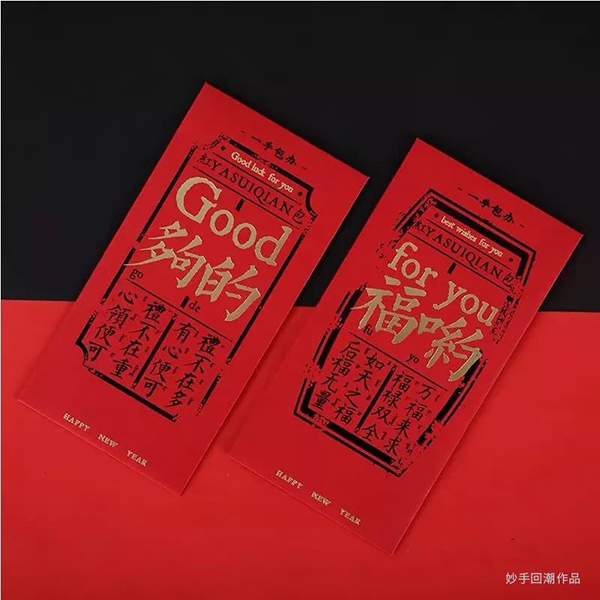
Let's look at this one again, it is still the standard red, yellow and black collocation, and the color is more conservative. But the copywriting part is more interesting. The homonym of Chinese and English is used as the idea of threading the needle. With the information copywriting in italics, the whole picture is won by the text layout. Of course, this is also a work with a high degree of market fit.
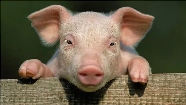
So what should we do if we want to design such a red envelope now? Come and share my thoughts with me. See what elements can be expressed in the red envelope. First of all, this year is the year of the pig, so the pig can be the main element of the picture.
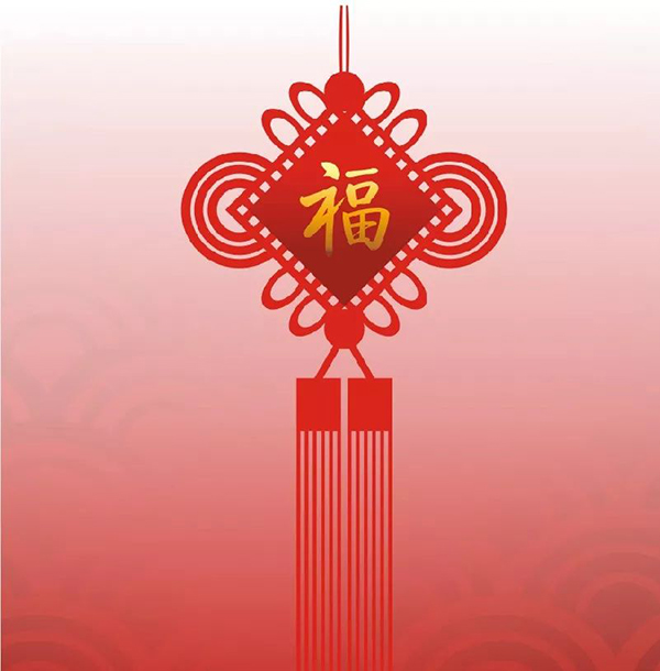
Of course, it may not be such a completely realistic photo, and there are other ways to achieve it. It can also be some traditional New Year elements, such as God of Wealth, lanterns, auspicious clouds, ingots, coins, calligraphy, Chinese knots and so on. These are some regular and safe element choices.
Another point to mention is the creative part. Many students mistakenly think that creativity is to be unexpected. This is unheard of, but it is not true. Even if the most traditional and conventional elements are used to design, different designers have different expressions. Sometimes creativity is simply a difference in the means of expression.
For example, it is also a Chinese knot, and some people choose such elements as the main screen.
Some people choose this way to express.
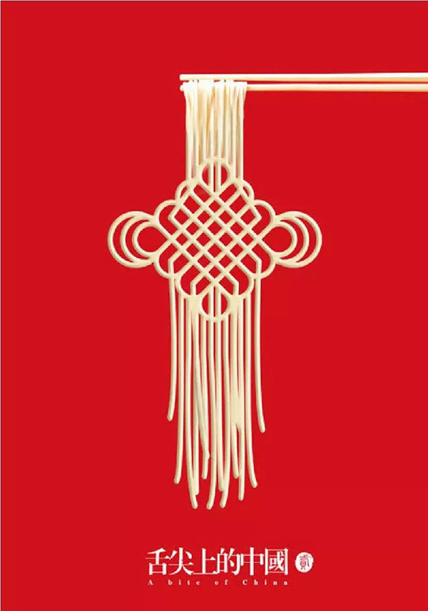
You can also use the characteristics of the Chinese knot itself, combined with text, to do a text processing similar to graphics.

The picture below is the effect after combined processing. Two seemingly ordinary elements, after fusion, will get an unconventional effect.
Let's think about it again, if the proposition of designing pigs is based on font design, how should we do it? Pigs should be very fat, so we can set the font to be fatter and fatter. Then let's look at the red envelope processing in the second direction. This kind of traditional meaning is not so strong. On the contrary, it is mainly expressed in an interesting and more abstract way.
We demonstrated the glyph part above, and now we use a case to demonstrate how to complete this traditional conventional screen. The basic requirement of such a thing is that the elements should be more popular, and the screen should be It should be direct and unambiguous, and the degree of matching with the market is relatively higher.
My general idea is to use the pig as the main element, a simple small illustration screen. Let me tell you here, many students don’t know how to illustrate, so the first reaction is to find materials, and then the accumulation of pure graphics and information will be the next step. This will kill the designer’s desire for creation, so my suggestion is , The elements that appear in the screen can be drawn by themselves.
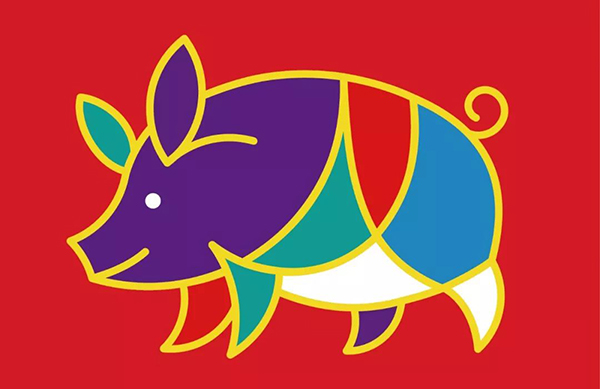
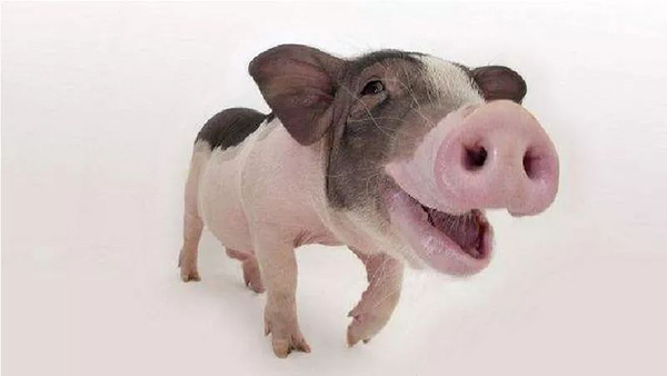
As an outstanding representative of the disabled, I would like to share my personal response to this problem. First of all, don't think about too rich illustrations, this is too difficult for novices, so let's just draw the pig element first. Let’s look for a reference first. My initial idea is to draw a pig with a strong sense of geometry. As long as the graphic shape and color matching are done well for this kind of illustration, it can be considered done.
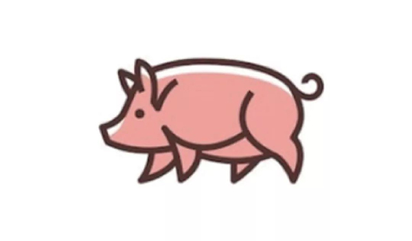
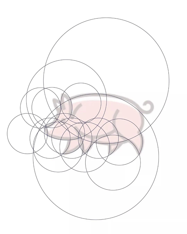
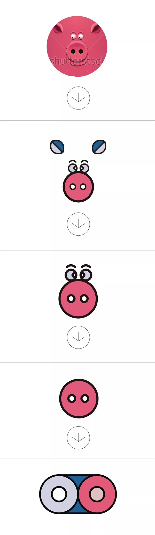
Then this is the graphic reference I was looking for. It is a logo itself, so the shape is relatively simple, and the sense of line is also acceptable. Next, we will use this shape to complete a simple small illustration. Since it is a geometric shape, try to use a circle to cut it.
The first step is like this, you may look a little dazzled.
The second step, yes, you may have felt my mood, probably like this.
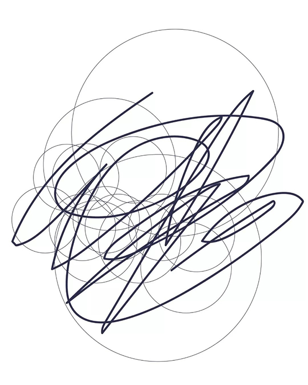
It's okay, let's pack up and start again. This time I learned how to be smart. I drew parts one by one. After drawing, I used the shape generation tool in AI to generate the desired parts.
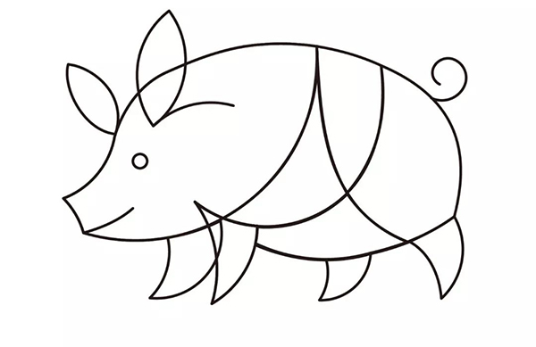
Next, let's match the color and set the thickness of the stroke. It looks like this.
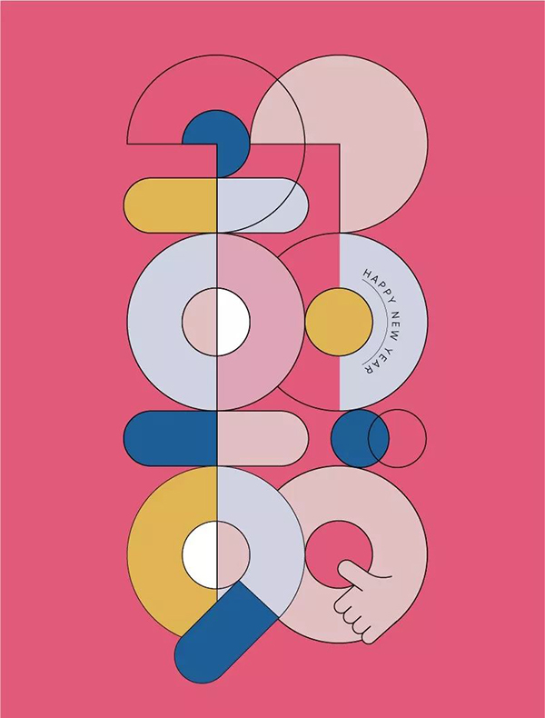
I started trying to use this simple graphic typesetting, and my first reaction was arranged like this...
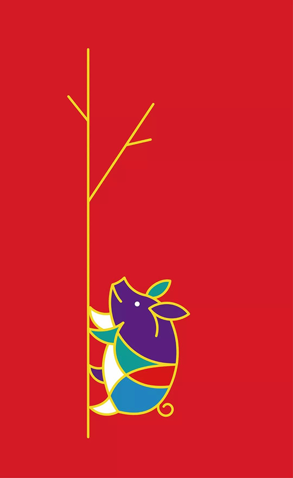
After all, the sow climbing the tree is a natural association of the image, so I can't blame me, well, I know this meaning is not good, let's change the posture again.
Then the rest is typesetting. How to use this simple graphic shape to produce a more complete picture requires repeated attempts.
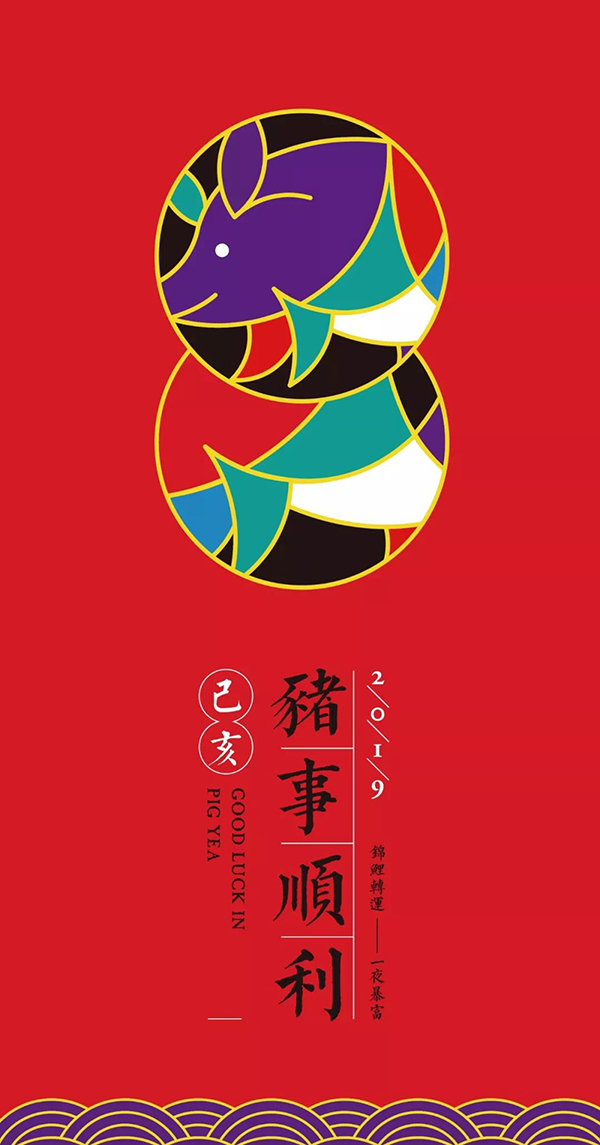
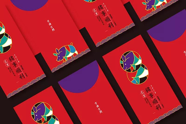
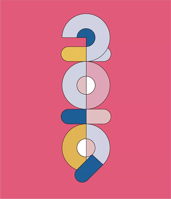
The front of the red envelope here disassembled the pig into parts for display, so when this geometric shape is displayed in parts with a strong sense of order and color combination, it is close to a pure color display. Show the pig in its entirety.
This is a front display with a moiré pattern on the bottom.
This is a negative display, stepping on auspicious clouds, a good moral.
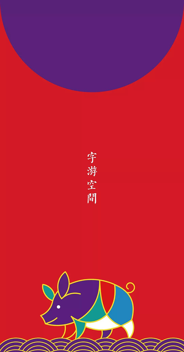
Let's take a look at a simple effect display.
Then let's look at the red envelope processing in the second direction. The traditional meaning of this one is not so strong. On the contrary, it is mainly expressed in an interesting and more abstract way.
Then, it will be bolder in terms of element processing, typography, and even color processing.
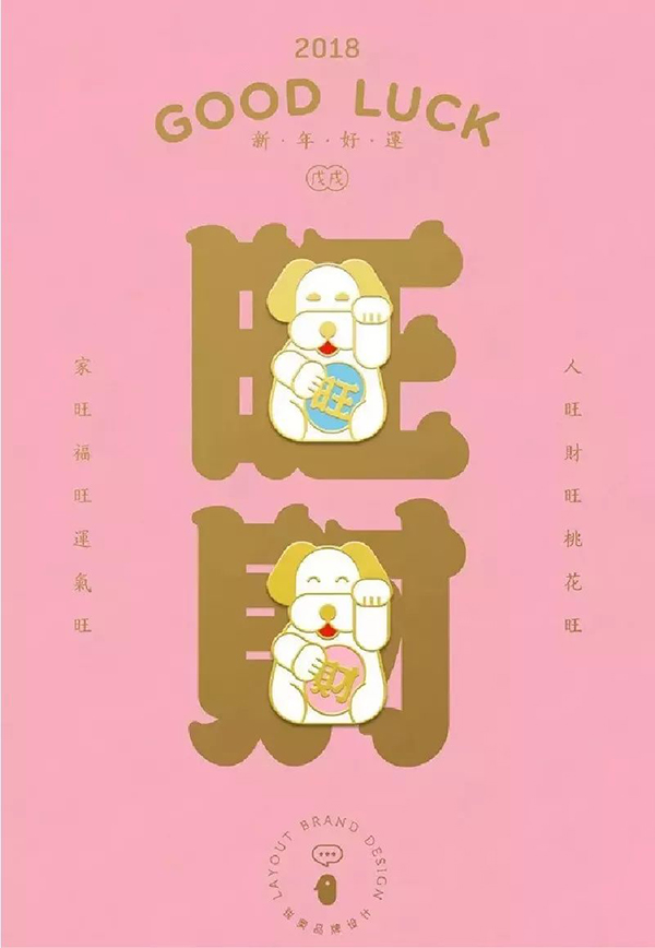
Let’s look at this one again. First of all, the color uses a girlish pink as the background color, and the copywriting is also very good. It makes a clever combination of dogs and wealth. The dog's name. The overall style is pink and cute, so the English also uses a round body, the overall wrap-around typesetting, and the order of the picture is complete.
The following demonstrates a case in this direction.

First of all, let's determine the elements to be used in the screen. Since it is the Year of the Pig, we choose to use the pig element to deal with it. Well, a handicapped party like me can't draw, how can I break it? It doesn't matter, I will teach you a way to deal with simple graphics. Let's first think about what is the biggest feature of a pig, that is to say, when you see a pig, you will first think of its physical characteristics.
My first thought is big ears and nose. Then I have to find some references for my handicap. Let's take a look, after getting a reference, how to start imitating the elements you want.
After a lot of effort, I finally extracted an abstract nose. It’s too sad not to be able to draw... Next, let’s combine this nose with other elements. If If it is used as the main body of the picture, this stroke is too thin and weak, and the shape changes from a circle to 2019.
Evolve the graphic part again, area it, and then add a rotating like. But until now, the pig's nose is already ugly, it doesn't matter, we can put the pig's nose in other places, so as to form an echo relationship with the main screen.
(Mom’s studio partner said that I was driving in a serious manner, and said that what I made was a contraceptive pig, covering my face face~~)
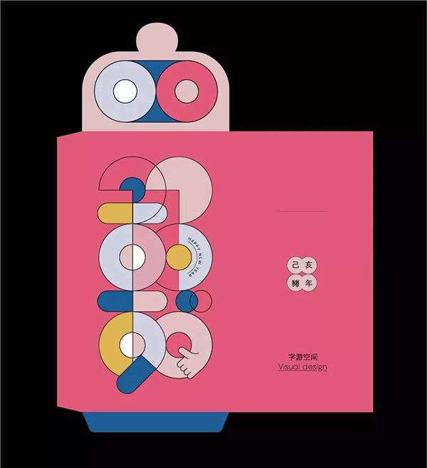
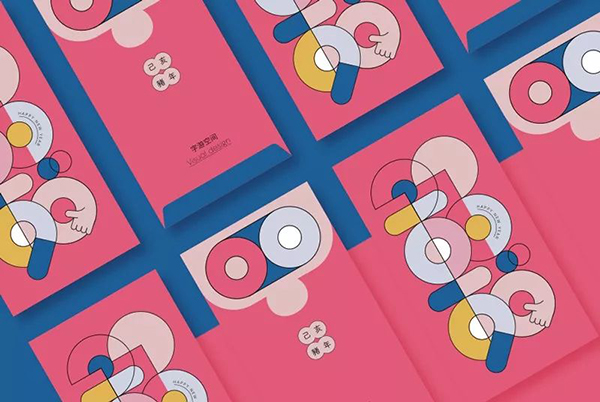
Process the text information on the back, and then deal with the layout of other parts. Let's take a look at the expansion diagram and effect diagram.
This tutorial is here~
Articles are uploaded by users and are for non-commercial browsing only. Posted by: Lomu, please indicate the source: https://www.daogebangong.com/en/articles/detail/Chinese%20New%20Year%20is%20coming%20soon%20let%20me%20teach%20you%20how%20to%20design%20a%20red%20envelope.html
 支付宝扫一扫
评论列表(196条)
测试