In the past, people communicated by letters, but with the advancement of the times, the development of network technology, and the popularization of mobile phones and computers, many people often have the problem of "forgetting words when picking up a pen". "Case.
But for students, they have to write every day, even handwriting The quality of the test will affect the test scores. Therefore, many parents pay more and more attention to the students' handwriting practice. Once any font of Xueba is released on the Internet, it will cause a wave of hard training, there is "cheese font" in front, and "whale drop" in the back. Although both are Xueba fonts, the gap is still obvious.
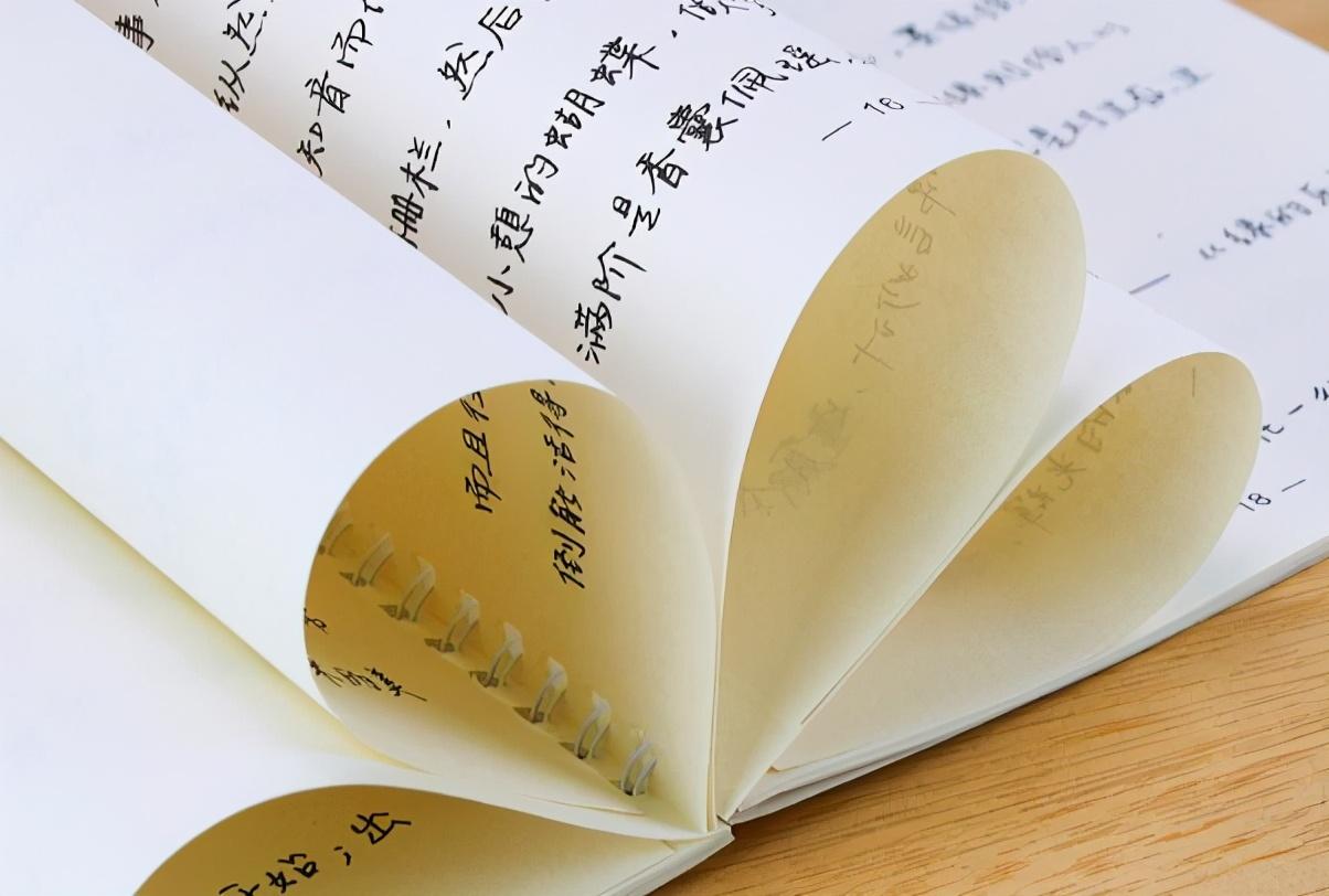
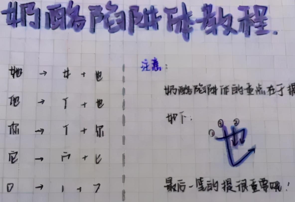
"Cheese font" is popular among junior high school students and has a unique style
Cheese font is an Internet celebrity font, which is very popular in junior high school campuses and is deeply loved by junior high school students. The overall cheese font looks round and lovely, with great personality.

Many junior high school students bought copybooks to practice carefully, But teachers are disgusted with this font. The reason is that the single characters of the cheese font look very individual and cute, but once they are connected together, it is difficult to recognize, especially during the exam. Such a font will bring difficulty to the teacher's marking and give the teacher a headache.
"Whale Fall" is widely praised by teachers, and the handwriting is beautiful
In contrast to cheese fonts,Whale Fall is not only loved by students, but also by teachers. , and even said that they couldn't bear to deduct points when they saw this kind of handwriting, so many middle school students began to practice whale falling.
The most important thing is that it is relatively easy to practice, and the neatness of the test paper will also improve< /strong>, you may also get more roll points.
It can be seen that although the two fonts are very popular in junior high school campuses, but the Students suddenly realized after seeing it, and began to practice more suitable for the exam Whale falls.
In fact, while teachers pay attention to students' learning, they also care about their handwriting. Some teachers also force students to practice calligraphy. Because the student's handwriting is good or bad, it will indeed have a certain impact on the test scores< /strong>.

Several fonts that the marking teacher hates, students should try to avoid
< strong>Type 1: Word spacing is too large, like long-distance love
When some students take the exam, they are afraid that their words are too dense and the marking teacher can’t see clearly , to widen the distance between words, such as long-distance love,makes the original There are not enough answer slots, and it becomes too crowded, and the answers are not written completely. Especially for the electronic marking of the middle and college entrance examinations, there is a specified range for answering questions, and no points are awarded if they exceed the range .

The second type: ant font, illegible< /strong>
Some students write very small,I feel that all the words are drawn with a few strokes, especially when the words are large, densely packed like ants flying on the scroll. It is difficult for the marking teacher to read the paper directly, let alone display it on the computer. If you can't see clearly at all, and the teacher can't recognize it, it will naturally affect your test scores.
The third type: blue font, no aesthetic feeling
This kind of student can only say "knowingly committing a crime", Students are clearly required to write with a black pen during the high school entrance examination, it is best to develop a habit in normal times. Because the black pen will make the characters look clearer and neater,The handwriting itself is not good-looking, and then Writing with a blue pen will look even less aesthetically pleasing. It is worth mentioning that you must use a black pen during the exam, otherwise the computer will not be able to scan it , can only record zero points.
The above fonts,It will not only increase the difficulty for teachers when marking papers, but also affect students' grades. Therefore, students still have to work hard to standardize and write comfortable words.
Which font will make the marking teacher look comfortable and not easy to lose marks?
If the students are just for the exam, let the marking teacher can clearly identify , It’s actually very simple,As long as you do three steps, you will basically not lose the noodles.
First of all, students should avoid continuous writing,Try to write in regular script, that is, to write "one stroke at a time" as taught by the teacher since childhood, so that the marking teacher looks will be clearer.
Secondly,The font size should be moderate, and proper word spacing should be maintained. This point is for students to write slowly first. Write faster. Students don't have to worry about slow writing speed affecting answering questions. In fact, answering speed depends more on your mastery of knowledge points.

Finally, especially in exams, About how much space will be occupied, and then adjust the size and distance of the characters appropriately to avoid the situation that it cannot be written.
It can be seen that although various fonts are often popular now,< /span>Middle school students can also practice for hobbies, but pay attention to distinguish which is more suitable for the exam,Otherwise, the words you practice will affect your grades. In fact, as long as you practice more calligraphy at ordinary times, pay attention to standard writing during the exam, and ensure that the paper is clean, you can You can avoid losing points in the exam due to the paper.
Today's topic: Do you prefer "cheese body" or "whale drop body" ?Do you know any other Internet celebrity fonts?
(The picture comes from the Internet, if there is any infringement, please contact to delete)
Welcome to follow, like, leave a message in the comment area below to express your opinion !
Articles are uploaded by users and are for non-commercial browsing only. Posted by: Lomu, please indicate the source: https://www.daogebangong.com/en/articles/detail/Cheese%20Font%20and%20Whale%20Falling%20Font%20are%20both%20Xueba%20fonts%20but%20the%20gap%20is%20obvious.html
 支付宝扫一扫
评论列表(196条)
测试