
Text/Shang Wei
Everyone has their own personality, and so do fonts. Different fonts will show different font personality characteristics, and the font personality is more obvious in handwritten font design. 
The so-called font character refers to the understanding of the meaning of the word and the structure, strokes and details of the font during the font design process, so that the fonts show different differences, and then create different forms of fonts Style, produce different sensory feelings. 
Font refers to the shape of the font.Most single characters can live in a square, and how to use this square is the most basic way to reflect the character of the font. It is flat, wide, Whether it is square or thin and tall, these different changes form different personalities of the fonts. 
①From the point of view of the height, width, and thinness of the glyph structure, the low, flat and wide glyphs will give people a solid feeling; the slender, thin and tall glyphs will give people a cold feeling;
② From the point of view of the density change of the glyph structure, the sparse and loose glyphs will give people a casual feeling; the tight and compact glyphs will give people a rigorous feeling. 
The different straight and straight strokes of the font can give the font different characters. 
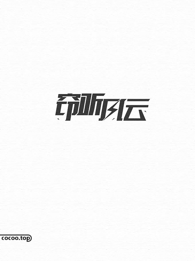
①From the point of view of the straight and straight changes of font strokes, the curvilinear font processing method can give the font a delicate and flexible character, and can better interpret the relaxed, lively and agile character The character of the font shown by the straight-line font processing method is the opposite. It represents seriousness, solemnity and strength, and is suitable for formal occasions. 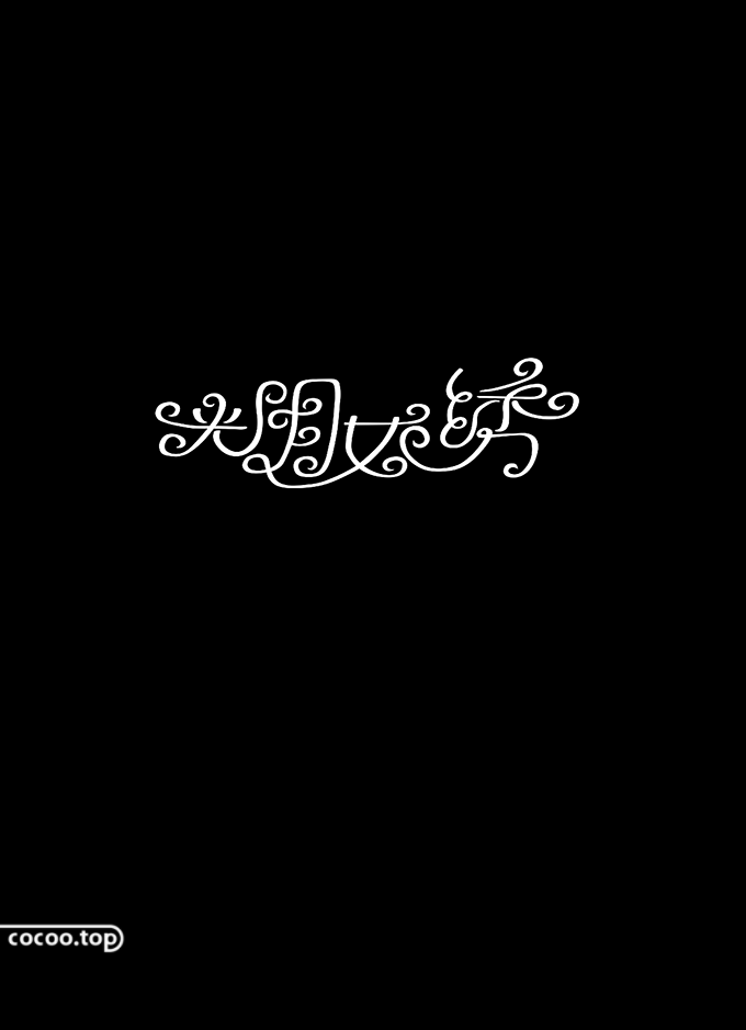
② From the perspective of the thickness of the strokes of the font, fonts with thicker strokes will appear thick and powerful, and are generally used in glyphs for emphasis, the thicker the strokes of the font Thick and thick, the more visual impact it has;The font with thinner strokes appears soothing and soft, the structure is clear and clear, and the overall visual effect is also lighter and lighter, light and Smart. 
Pay attention to the design and processing of font details,By changing the stroke details to reflect the character of the font. 
In general, serif fonts have slightly more complicated stroke details than non-serif fonts. The more changes in the stroke structure of serif fonts, the more classical the font will be; The simpler the stroke structure of the sans-serif font is compared with the serif font, and the less the stroke structure changes, the stronger the modern feeling will be. 
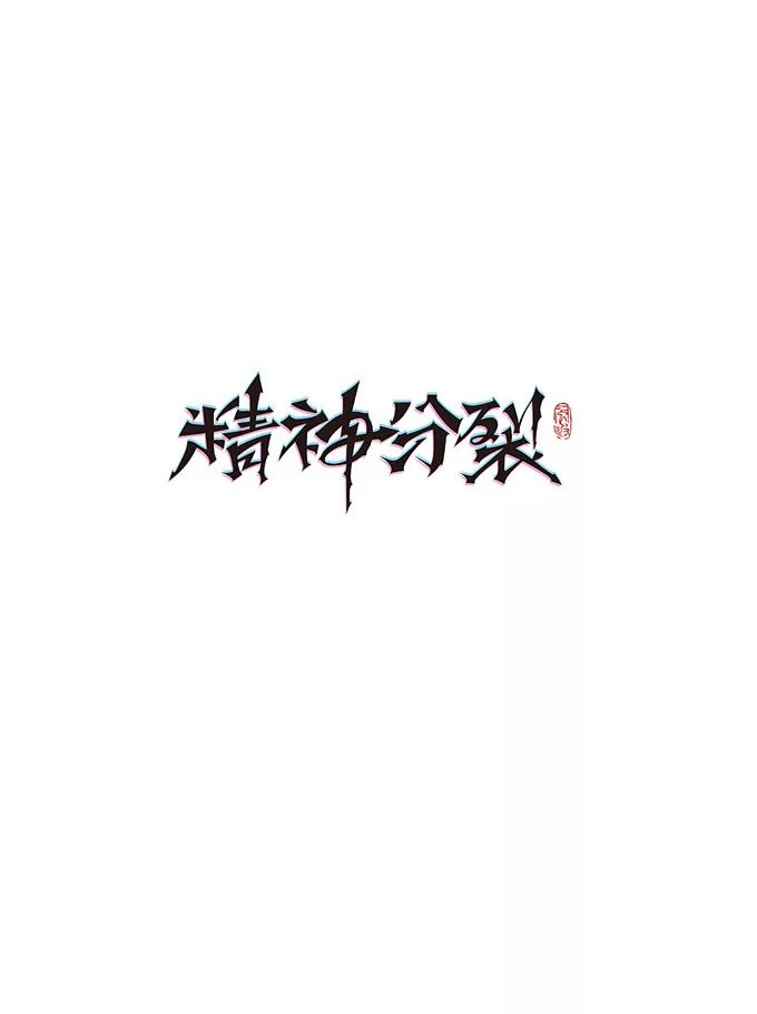
The bold and domineering handwriting font itself should have thick strokes, a stable structure, and the meaning of the words should cater to the aura. In order to enhance the character and momentum of the font, ink spray can be properly matched according to needs Splash effect and strong brushstroke fly-white effect, etc. 
When designing handwritten fonts of this kind of character,The handling of stroke turning should be thick and firm, and the overall font should be completed in one go. On the layout of the glyphs, you can adjust the position and size of the key words according to the meaning of the characters, without affecting the layout of the glyphs, Make the overall font more visual impact. Recommended reading: The words form a grid! Font graphic design skills! 

The strokes of rigid and heavy handwritten characters should be clear, thick and flat, and the structure should be square and rigid. , the shape of the font is thick and square, and the bold strokes will reduce the negative space of the font, which will give people a thick and steady feeling, and then strengthen the visual center of gravity of the font. 
Delicate literary and artistic handwritten fonts should have soft and fresh strokes, avoid too many hard edges and corners and large areasThick strokes, the font structure should be fresh and soothing, eloquent . Delicate and artistic handwriting styles are diverse. Its brushwork emphasizes gentleness and freedom, and there is no need to deliberately express it for the performance of the font, but only to express it with a peaceful mind. 

The relaxed and casual handwriting font is biased towards the daily handwriting state. The strokes and lines are mainly expressed in smart curves, which appear relaxed and lively, with a casual and uninhibited aesthetic feeling. The glyph structure can be freer without losing the center of gravity, and the more jumps, the more relaxed it will be. 
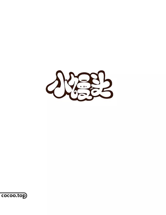
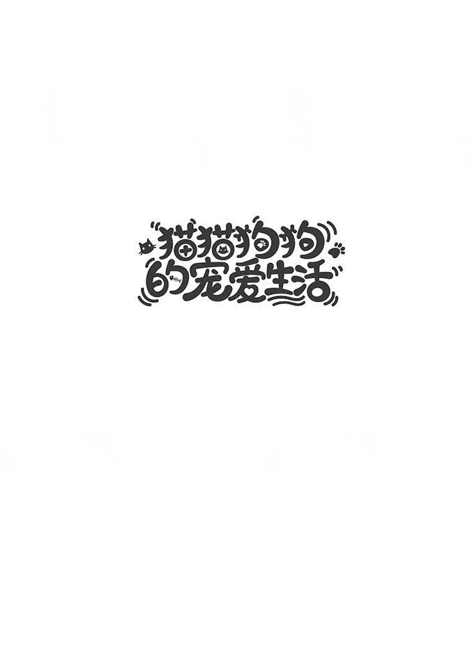
The processing of cute cartoon handwritten fonts can show cute font characters through the roundness of the strokes itself, and can also make the fonts have cute characters through the integration of structures. 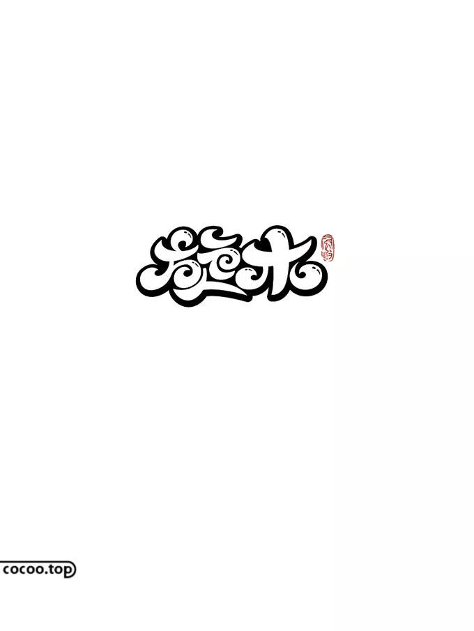
The roundness of font strokes requires a single stroke to show a soft and cute state, through the processing of some highlights and the depth of details to highlight the lovely character. The structural performance of the font is mainly to adjust the center of gravity of the glyph, and to adjust the stroke processing method according to the glyph itself. 
Black and white handwritten font design is a font processing method that converts some strokes into graphics.It needs to have in-depth consideration of the text itself, and at the same time need to think about how to better For integration and expression, the block surface part should be balanced with the visual sense of the strokes. On the basis of not affecting the recognition of the font, the irregular shape of the block surface shape can be processed to make the font more flexible and rhythmic. 
The handwritten font with texture is a font processing method that uses some texture effects that conform to the meaning of the font to improve the texture of the font. It should be noted that the detail processing should be as abstract as possible, and the texture should be in an auxiliary position in the glyph design. On the premise that it does not affect the font recognition, the texture should be matched with the glyph . 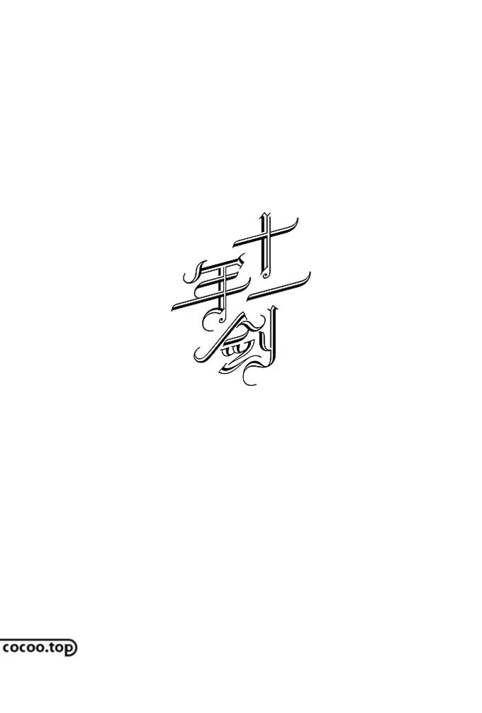
The charm of fonts is that they have emotions, and they can express different characters through different effects. In short,handwritten fonts that can show the character of the font are good designs . Recommended reading: Personalized font design! Chinese/English/Number


Articles are uploaded by users and are for non-commercial browsing only. Posted by: Lomu, please indicate the source: https://www.daogebangong.com/en/articles/detail/Character%20of%20handwritten%20typeface%20design%20How%20to%20behave.html
 支付宝扫一扫
评论列表(196条)
测试