In this article, I'll take you through the different techniques we employed during the 5 stages of the design thinking process - from empathizing with users to testing our prototypes - and what we found.
Our first project at the Ironhack Amsterdam UX/UI Design Bootcamp was for a local business - an e-commerce platform.

Left to right: Danique Nagel, Marine Lejeune and myself
Our challenge was to design a website for a local business with a focus on providing a great shopping experience to the end user.
Our group chose a thrift store called Episode, which sells second-hand clothes, shoes, and accessories. Like many brick-and-mortar thrift stores, Episode doesn't offer an online shopping platform.
In this article, I'll take you through the different techniques we employed during the 5 stages of the Design Thinking process - from empathizing with users to testing our prototypes - and what we found.
This project is a collaboration with three of my classmates at Ironhack (Alexis Middleton, Danique Nagel and Marine)!
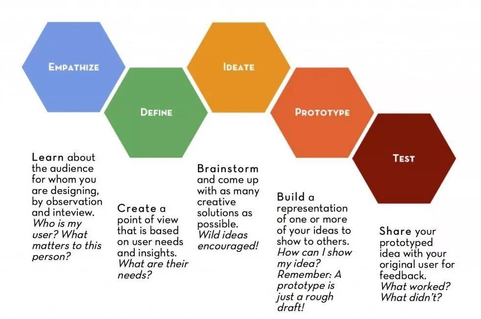
The five stages of the design thinking process
Small local shops are suffering from a decline in annual sales due to the prevalence of online shopping giants such as Amazon, Ebay, AliExpress and, in the Netherlands, Bol.com. This affects not only the small business itself, but the local economy and the many families that depend on it.
However, there is a tendency for middle-class consumers to choose to buy fewer items for which they are willing to pay more.
Phase 1: Emphasis
The first step in the design thinking process is understanding and emphasizing with users. This is also known as the research phase. Since eCommerce sites are well researched in the industry, we were directed to spend most of our research time on benchmarking and market research, and developing professional best practices and rules of thumb that can be used to create eCommerce experiences.
The methods used at this stage are:
- Brand Analysis (Brand Comparison, Feature Comparison, Proposition Matrix)
- Survey (Lean Survey Canvas, Google Forms)
- Interview
(1) Brand Analysis
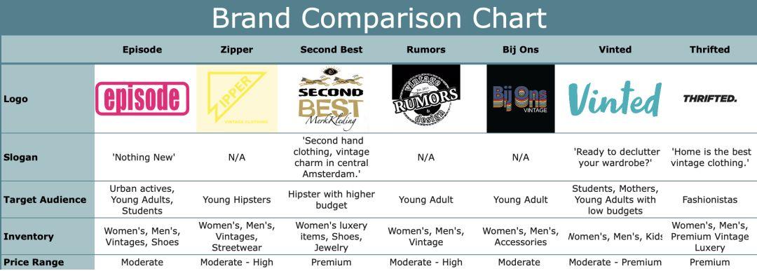
The brand comparison table compares Episode to its four direct competitors (other thrift stores in Amsterdam), as well as two indirect online competitors, including slogan, target audience, stock and price range. This helps us understand where the interpolation is between these two positions.
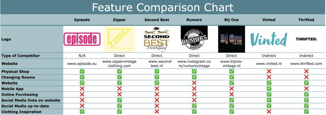
The "feature comparison table" compares plots based on the "features" we've discovered through observation and research that seem noteworthy. The goal was to get a better sense of how Episode compares to the competition, and what thrift stores seem to be (or aren't) common.
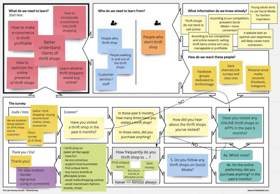
Developed by Chris Thelwell, the Lean Survey Canvas is a useful way to quickly and collaboratively create short surveys that capture all the information you need. It focuses on defining the target user and the insights needed to validate the hypothesis (What do we need to learn? What information do we already know? Who do we need to learn from? How do we connect with these people?)
Our Lean Survey Canvas helps us understand who we should be targeting with surveys, how to properly arrange logical flow chart questions, and how to cut them down to the bare essentials. (Remember: no one wants to fill out lengthy text surveys).
(2) Survey
Next step: create a survey in Google Forms. With the problem and layout already defined, the process is relatively straightforward.
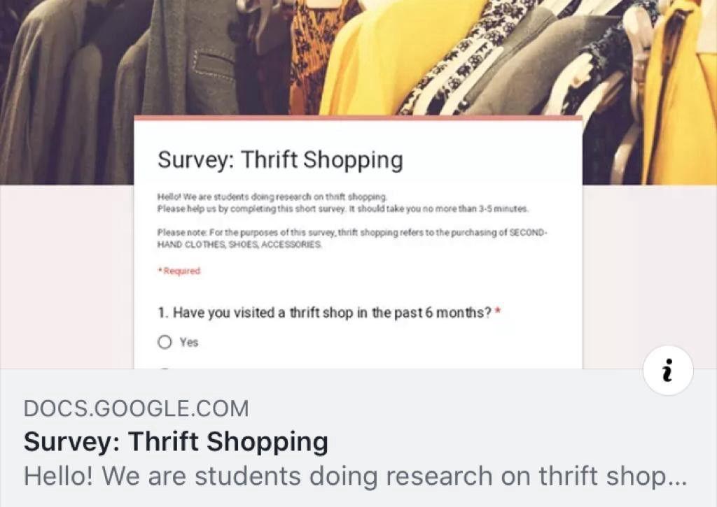
After creating the Lean Survey Canvas, my team and I conducted a short survey on Google Forms. We distributed the questionnaires through personal channels (Facebook) and group pages dedicated to thrift shopping and vintage clothing.
A total of 133 people responded to our survey, and some key findings are:
- The top three reasons people shop thrift are: to save money (72%), to be environmentally conscious (59%) and to find unique items (52%).
- 73% of respondents (133) have visited a thrift store in the past six months. 75% of them made a purchase.
- 38% of respondents (133) have visited an online thrift store in the past 6 months. 65% of them made a purchase.
Some of the lessons we learned from this exercise are:
- Remember to ask the pain point - we look at why people celebrate the holidays, and how important certain aspects are to them (uniqueness, money saving, quality), but forget a question to validate the possible ( discover new) pain points.
- Before publishing (and sharing) your survey, please test all possible scenarios for your survey - due to time constraints, we forgot to test a specific workflow. It turns out that if a certain combination of questions is answered, the final section won't show up.
- Keep in mind that Google Forms doesn't support complex display logic - you can add basic display logic ("If the answer to Q3 is A, show part 2"), but Google Forms can't handle More complex logic (i.e. "If the response to Q3 is B AND the response to Q5 is C, show step 4)).
(3) Interview
We conducted a total of 9 interviews: some interviewed customers who left the Episode, and some interviewed regular customers on the street. Interviews make us go deeper and ask "why?". While there's not much you can do about it, responses tend to be richer and help you understand your users' inner thoughts, feelings, and motivations.
Stage 2: Definition
With the research concluded, our group entered the second phase of the design thinking process: defining the problem. At this stage, we want to group and synthesize all findings.
Here we employ the following techniques:
- Brainstorming sessions (affinity diagrams, mind maps)
- "How might we" statements
- User personas, user journeys
- problem statement, hypothesis statement
(1) Brainstorming session
Affinity graph:
The Affinity Diagram helps us group our own perceptions, findings and opinions into logical categories and subcategories.
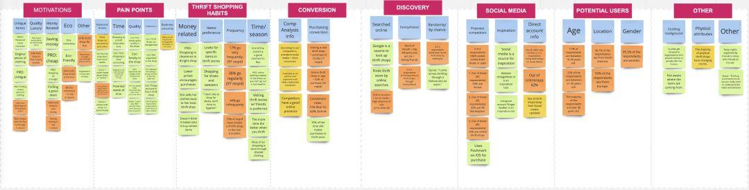

The Affinity Diagram helps us group our own perceptions, findings and opinions into logical categories and subcategories.
Next, we take a closer look at the pain points we discovered. These are categorized as: Exposure/Access, Timing, Quality, Organizational and Business Issues.
We decided to create separate mind maps for each pain point. After reflecting on the most recurring pain points during interviews, we decided to move on to Time and Organization.
Mind Map:

This mind map helps us organize the relevant aspects.
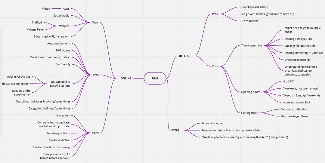
This mind map helps us organize our time in related aspects.
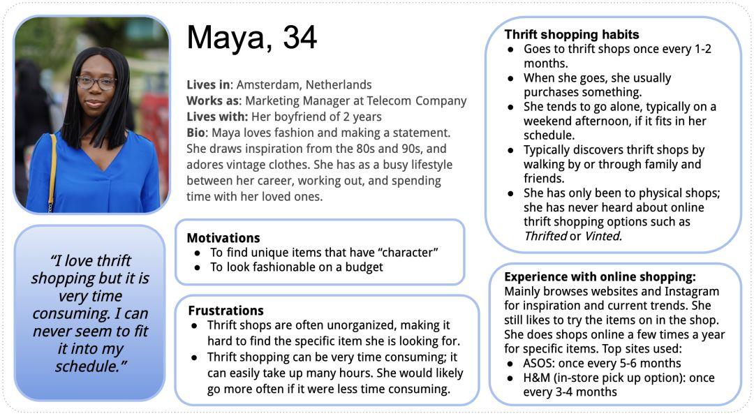
(2) User Person
Maya is our main user character. She is in her 30s and works full time. She loves to shop thrift stores for unique vintage clothing. But, unfortunately, she found that thrift shopping took a lot of time, often because of the clutter of the thrift store. It was getting harder and harder to find the time in her schedule that worked for her.
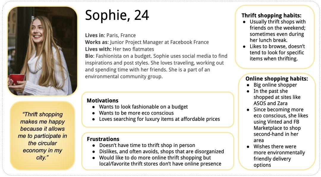
Little ophie is our secondary user role. She was just starting her career in her 20s. She's a self-proclaimed "fashionista on a budget." She is also passionate about the environment and is committed to contributing to the circular economy.
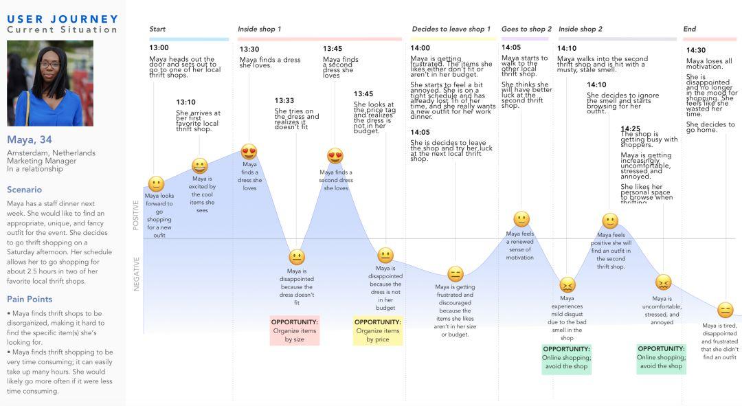
(3) User Journey
User journeys help us better empathize with users. We chose the following scenario for the primary user role:
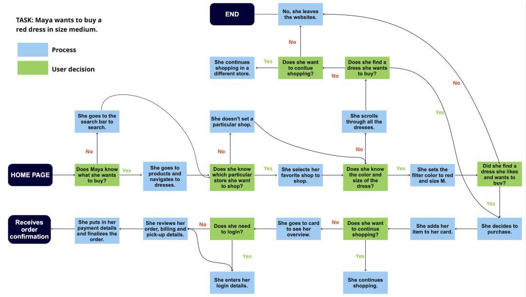
"Maya has a staff dinner next week. She wants to find appropriate but unique clothing for the event. She decides to frugal shopping on Saturday afternoon. She has about two and a half hours."
From all these insights, we were able to codify the following problem statement:
"Frugal shoppers, frustrated with cluttered stores with limited time, demanded a more efficient and enjoyable way to shop."
From this, our hypothetical statement becomes:
“We believe that creating an online shopping experience that focuses on organizing items for frugal shoppers with limited time will allow them to shop more efficiently and with less frustration. When customer loyalty is within 6 months When we improve by 10 percent, we know we're right."
Stage 3: Ideation
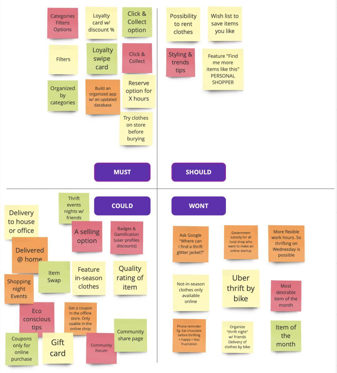
Armed with our research, our team is ready to enter the "ideal" stage of the design thinking process.
We first went through all the findings and user insights and created the M o SC o W graph - representation:
- M=Must
- S=Should be
- C=Can
- W=No
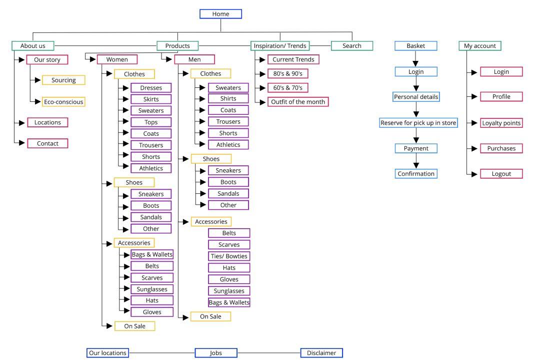
(1) Site map
Next, we move on to creating the information architecture (IA) or blueprint of the website. Here, we decide how to categorize and organize the content in a logical format. Otherwise, users will get lost while navigating our website, and it also helps us in the next step: creating a prototype.
(2) User flow
Phase 4 and 5: Prototyping and testing
Now, we're ready to create a paper prototype.
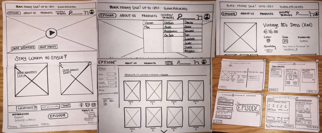
some paper prototype screens
After testing the interactive prototype with four of our classmates, we discovered the following:
- Choose the city and location of the store is not clear enough;
- The fact that the item can only be picked up in the store is not displayed correctly.
We optimized the prototype and created a mid-fidelity prototype in Sketch.
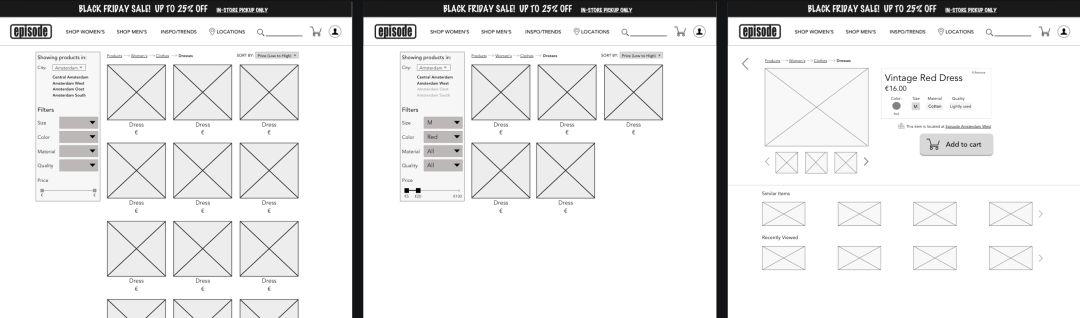
Product Result Page/ Filter Result Page/ Product Page
UI flow:
Next, each member of our group individually created a high-fidelity prototype. We spent four days working on this part. The following will walk you through the various elements of the visual design/UI process.
Mood Board:
I start by creating a mood board. I wanted to challenge myself to stay true to the brand's brand, including the black and bold red found in Episode's store. The image I'm looking for represents what the Episode will look like. The Van's and Converse brands and fur coats deserve to be highly represented, and I've noticed a lot of both in stores.
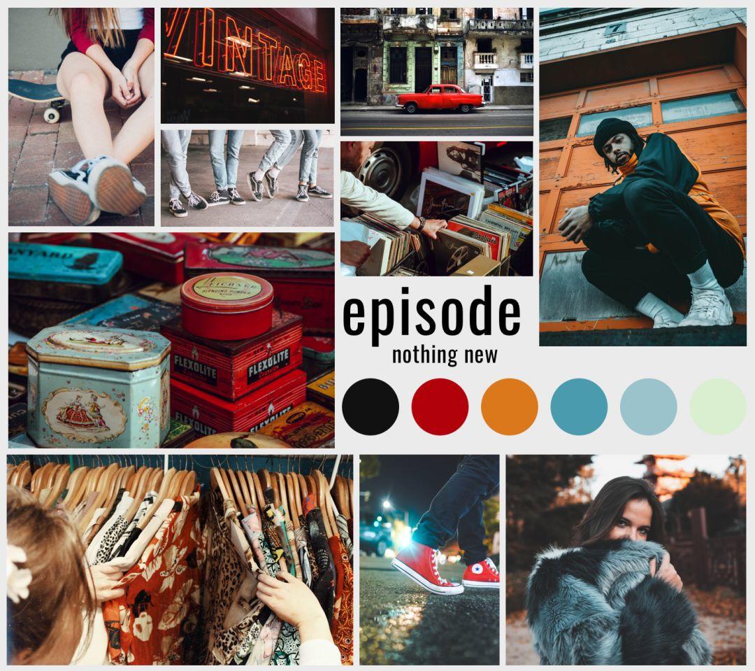
mood board
Color:
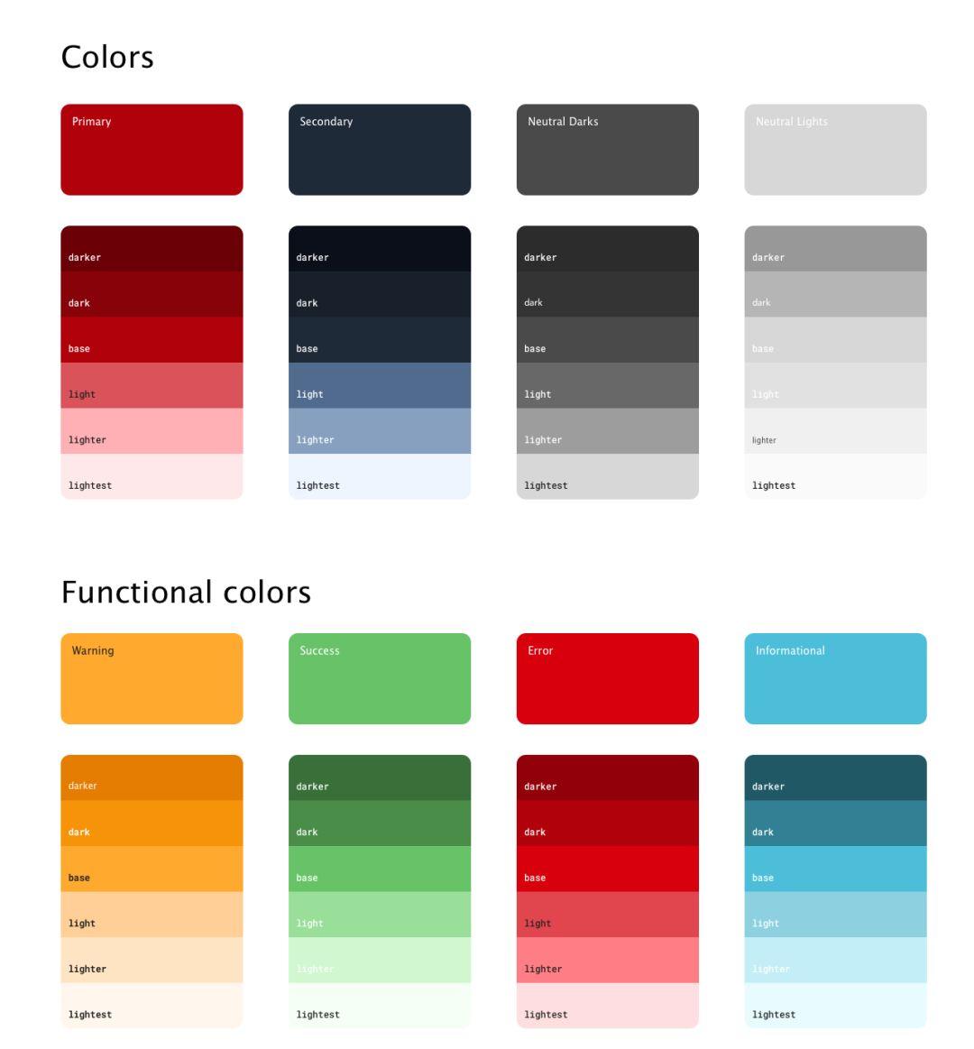
I ended up going with a (slightly) darker red, plus dark navy as a secondary (accent) color.
Layout:
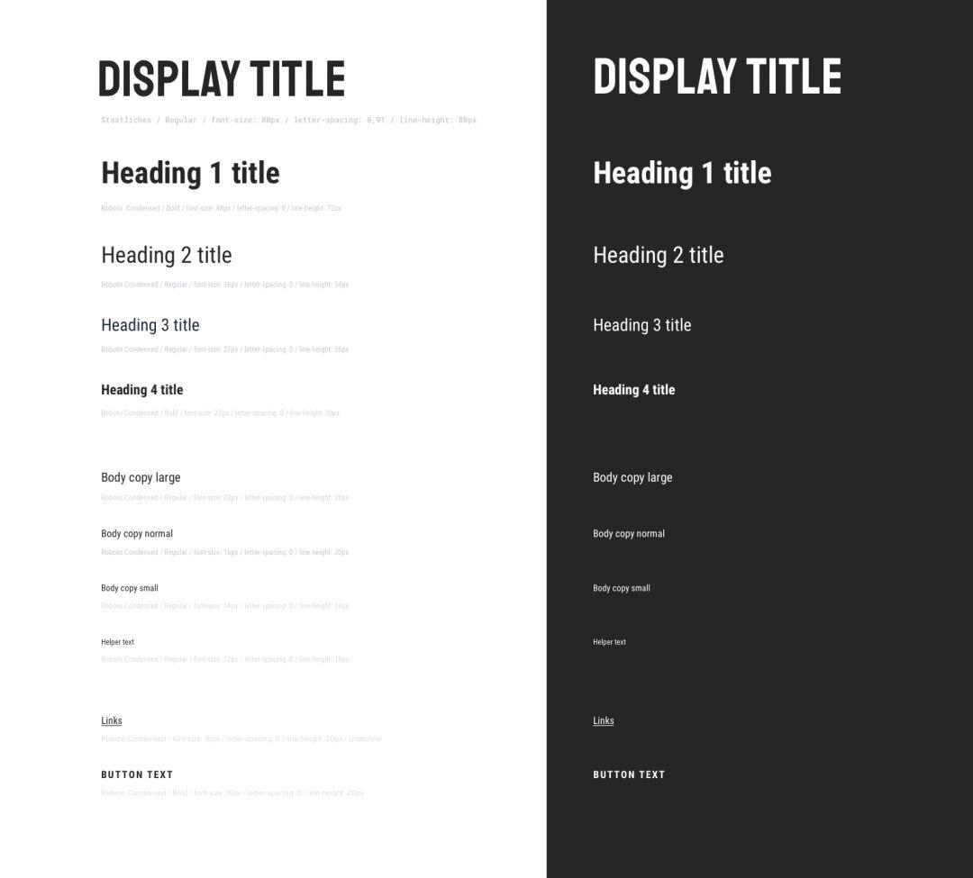
I chose the 80px Staatliches font for the display title, which is very similar to Episode's actual logo font - but a bit edgier at the same time.
For the title and body, I chose Roboto Condensed. This is a neutral and readable font that still complements the display heading font. I also feel that the "compressed" version of the Roboto font is great for e-commerce sites, since more text can fit in each line of text.
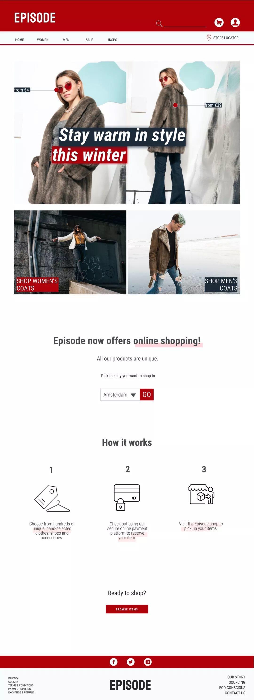
High-fidelity prototype:
Home page:
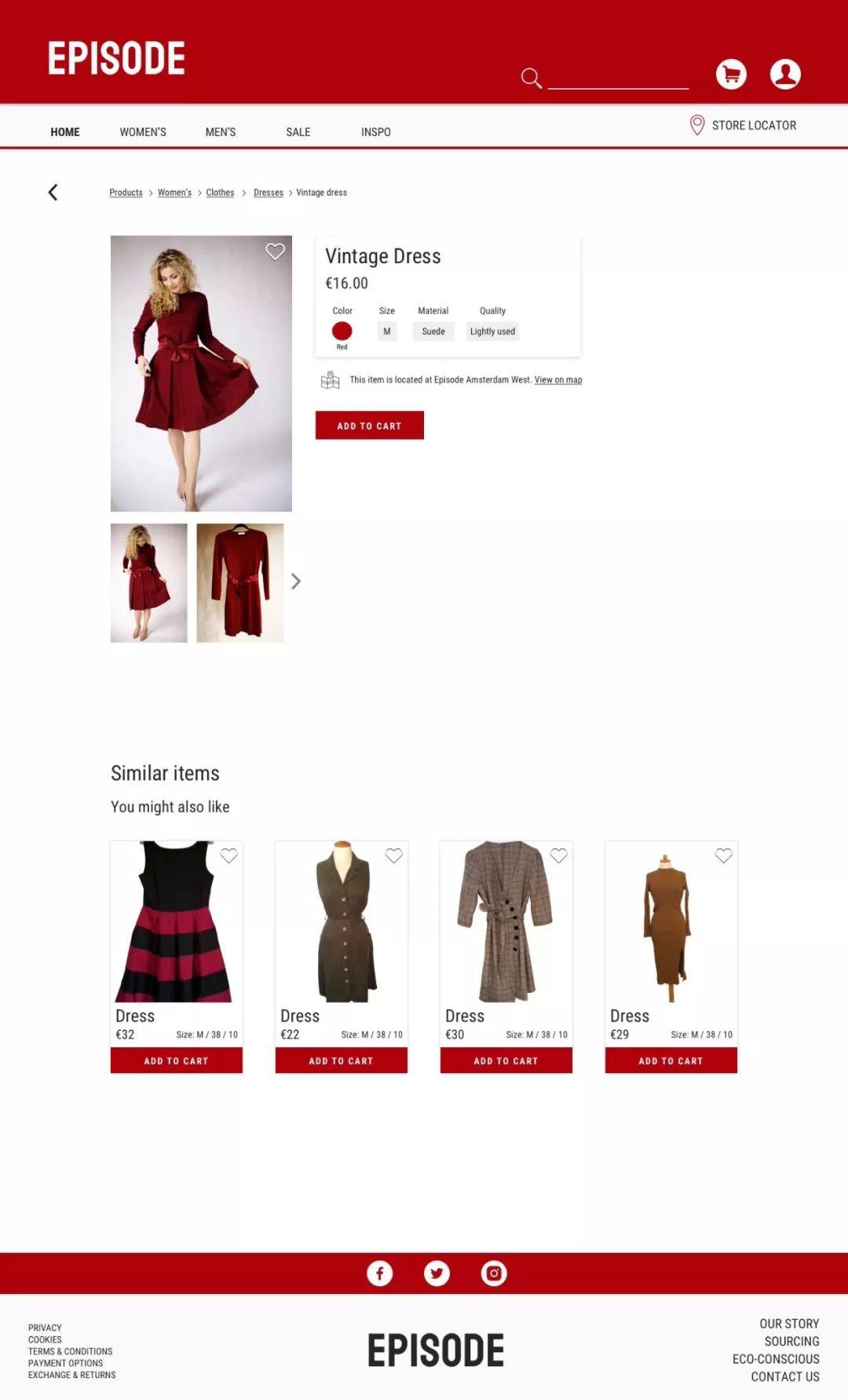
Product page, taking women's clothing as an example:
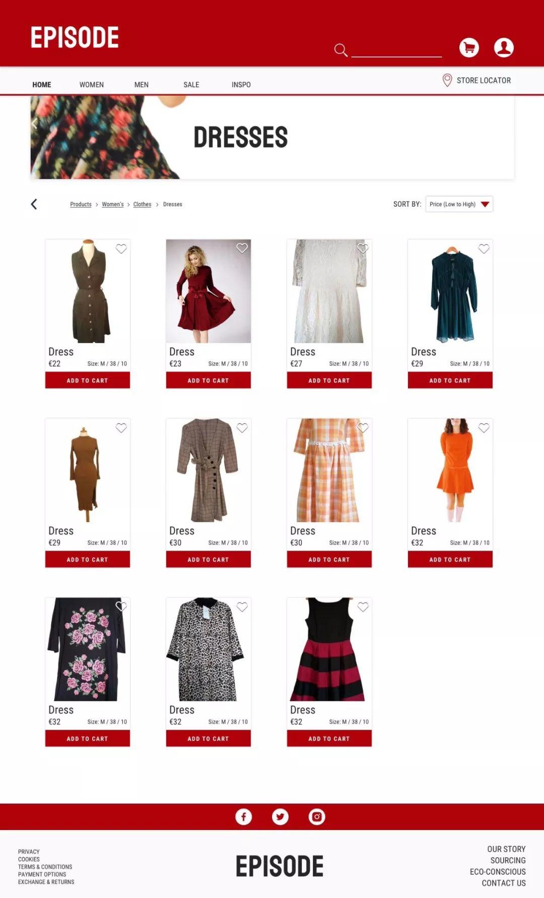
product page
The details are kept simple and to the point: size, colour, material, quality and (of course) where the item is stored.
Also remember that since all items are unique, there will never be a star/rating system like you find on other eCommerce sites.
Author: Nele Groosman
Original address: https://medium.com/@nelegroosman/ux-ui-case-study-e-commerce-for-second-hand-clothes-1078355f0de3
Translator: Nanshe; Translator public account: Nanshe (ID: shemenglianmeng)
This article was translated and published by @南设 on Everyone is a Product Manager. Reprinting is prohibited without permission
The title picture is from Unsplash, based on the CC0 protocol
Articles are uploaded by users and are for non-commercial browsing only. Posted by: Lomu, please indicate the source: https://www.daogebangong.com/en/articles/detail/Case%20Study%20The%205%20Stages%20of%20Ecommerce%20Platform%20Design.html
 支付宝扫一扫
评论列表(196条)
测试