
CSS control centering is a very common layout skill in front-end development. This article lists several ways to control the centering of CSS elements.
When it comes to centered display of HTML elements, it involves horizontal centering and vertical centering, as well as horizontal and vertical centering. Since HTML document flow is horizontal, layout control in the horizontal direction is much simpler than in the vertical direction, and the same is true for centering. However, there are still many ways to write (horizontal) vertical centering, at least more than you can count on one hand. This article lists several and makes a simple comparison.
1. Horizontal centering
Controlling horizontal centering with CSS is simple:
- Set width for block-level elements and set margin auto
- Set text-align center for the parent element of inline elements
- The HTML code is as follows:
<div class="container"> <div class="content"> Center it horizontally</div></div>
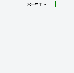
1. Block-level elements are centered horizontally
.container { height: 300px; width: 300px; border: 1px solid red;}.content { width: 10rem; border: 1px solid green; margin: 0 auto;}Effect:
2. Center inline elements horizontally
.container { height: 300px; width: 300px; border: 1px solid red; text-align: center;}.content { display: inline-block; border: 1px solid green;}Effect:

The code is very simple and there are no compatibility issues, so there is usually no need to use other complicated methods to achieve the horizontal centering effect.
2. Horizontal and vertical centering
Using CSS to control vertical centering (or horizontal and vertical centering) is not as convenient as controlling vertical centering. Here are the main ones.
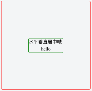
1. flex layout
After the flex layout appears, vertical centering is very convenient. You can directly set the parent element:
display flexalign-items center
If you want to center it horizontally at the same time, set it at the same time:
justify-content center
It should be noted that it is only supported by IE10+. The webkit prefix browser needs to add webkit when setting the flex attribute.
.container { width: 300px; height: 300px; border: 1px solid red; display: -webkit-flex; display: flex; // Key attributes align-items: center; // Vertical centering justify-content: center // Center horizontally}.content { border: 1px solid green;}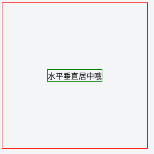
2. margin+ position:absolute layout
For position: absolute layout elements, by setting the top/bottom and left/right attributes, the element can have adaptive characteristics in the vertical and horizontal directions respectively. Just like the default behavior of div in horizontal direction!
For the horizontal centering of block-level elements above, we set the width and then use margin to achieve horizontal centering. For absolute positioning elements with top/bottom, left/right set, we can set the width and height and cooperate with margin to achieve horizontal and vertical centering:
.container { width: 300px; height: 300px; position: relative; border: 1px solid red;}.content { position: absolute; left: 0; right: 0; top: 0; bottom: 0; width: 200px; height: 100px; margin: auto; border: 1px solid green;}Effect:
The compatibility is very good, supported by IE8 and above.
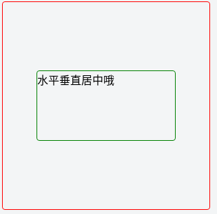
3. transform + absolute
The left and top attributes of the absolute positioning element are positioned relative to the left and upper borders of the child element; transform is a very powerful attribute in CSS3 and can receive multiple attribute values, including rotation, scaling, translation and other functions. . Here we use the combination of the two, first position the upper left fixed point of the child element to the center point of the parent element, and then use transform to move the center point of the child element to the center point of the parent element:
.container { width: 300px; height: 300px; position: relative; border: 1px solid red;}.content { position: absolute; left: 50%; top: 50%; transform: translate(-50%, -50%); border: 1px solid green;}Effect:

This method has a small flaw, that is, the parameters of the translate function, the final calculated value cannot be a decimal, otherwise the rendering effect of some browsers will be blurred, so when using this method, it is best to set the width and height to an even number.
4. absolute+margin negative value
It is very similar to the previous method. The previous method uses transform to translate the element to the upper left. This method uses a negative margin to pull the element to the upper left corner.
Code:
.container { width: 300px; height: 300px; position: relative; border: 1px solid red;}.content { position: absolute; left: 50%; top: 50%; width: 200px; height: 100px; margin-top: -50px; margin-left: -100px; border: 1px solid green;}Effect:
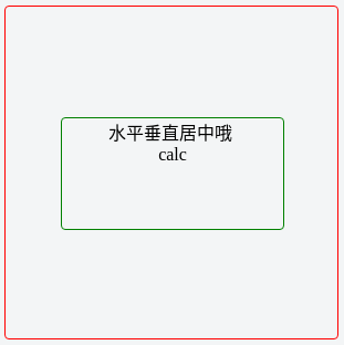
5. absolute + calc
As you can see from the above two methods, absolute sets left and top and then repositions the element back through translation or margin. If we can directly calculate the correct left and top values, wouldn't it be done at once? The calc function has this function, of course we need to know the width and height of the child elements:
.container { width: 300px; height: 300px; border: 1px solid red; text-align: center; position: relative;}.content { position: absolute; border: 1px solid green; width: 200px; height: 100px; left: calc(50% - 100px); top: calc(50% - 50px);}Effect:

6. line-height + vertical-align
vertical-align is an attribute that works on inline elements. The characteristic of inline elements is that they will be displayed on the same line as other inline elements or text, but by default they are "baseline aligned" with the parent element. The baseline here refers to a vertical position in each line of the parent element, which is the level where the lower edge of the English x is. By setting vertical-align to middle, the middle of the inline element can be aligned with the middle of the parent element (baseline + letter x half the height). So you can take advantage of this and set the row height of the parent element to its own height, and then align the child element with the center line of the parent element to achieve vertical centering.
Code:
.container { width: 300px; height: 300px; border: 1px solid red; line-height: 300px; text-align: center;}.content { display: inline-block; line-height: 1.5; border: 1px solid green; vertical-align: middle;}Effect:
Each of the above methods has different applicable conditions, and therefore has different advantages and disadvantages. The following table compares the various methods:
Method condition compatibility flex layout None IE10+margin + absolute knows the width and height of the child element IE8+transform + absolute None, the width and height of the child element should be an even number IE10+absolute + margin negative value knows the width and height of the child element absolute + calc knows the width of the child element High IE9+line-height + vertical-align knows the width and height of the parent element
There are often many different implementation methods for the same performance effect in CSS. You must deliberately try multiple writing methods to avoid being familiar with one or two methods and then stop moving forward. Only in this way can you be comfortable in various situations.
Articles are uploaded by users and are for non-commercial browsing only. Posted by: Lomu, please indicate the source: https://www.daogebangong.com/en/articles/detail/CSS-chui-zhi-ju-zhong-ni-hui-duo-shao-zhong-xie-fa.html
 支付宝扫一扫
评论列表(196条)
测试