Source: https://www.mdeditor.tw /pl/pSGX

1. Display an ellipsis when the text exceeds
The overflow of a single line of text displays an ellipsis (must have a width)
 p{
 width:200rpx;
 overflow: hidden;
 text-overflow:ellipsis;
 white-space: nowrap;< br> }
Multi-line text overflows to display ellipsis
p {
 display: -webkit-box;
 -webkit-box-orient: vertical;
 -webkit-line-clamp: 3;
 overflow : hidden;
 }
2, medium English automatic line break
word-break:break-all; only works for English, with letters Word-wrap:break-word; works only for English, uses words as the basis for line breaks white-space:pre-wrap; only works for Chinese, force a line break white-space:nowrap; effect
p{
 word-wrap: break-word;
 white-space: normal;
 word-break : break-all;
}
//No line break< /span>
.wrap {
 white-space:nowrap;
}
//automatically wrap
.wrap {
 word-wrap: < span >break-word;
 word-break: normal;
}
//forced line break
.wrap {
 word-break:break-all;
}
3. Text shadow
text-shadow adds shadows to web fonts, by setting related attribute values for the text-shadow attribute. The description of attributes and values is as follows: text-shadow: [X-offset, Y-offset, Blur, Color];
X-offset: Refers to the position where the shadow is located at the horizontal offset of the font.
Y-offset: Refers to the position where the shadow is located in the vertical offset of the font.
Blur: Refers to the blur value of the shadow.
color: refers to the color of the shadow;
h1{
text-shadow: < span >5px 5px 5px #FF0000;
}
4. Set the font style of placeholder
< pre data-tool='mdnice editor' >input::-webkit-input-placeholder { /* Chrome/Opera/Safari */
color: red;
}
input::-moz-placeholder< /span> { /* Firefox 19+ */
color: red;
}
input :-ms-input-placeholder { /* IE 10+ */
color: red;
}
input:-moz-placeholder { /* Firefox 18- */
color: red;
}
5. The method of vertically centering div with unfixed height and width
Method 1: Pseudo-elements and inline-block / vertical-align (compatible with IE8)
.box-wrap:before {
 content: '';
 display: inline-block;
 height : 100%;
 vertical-align: middle;
 margin-right: -0.25em; //finely adjust the space
}
.box {
 display: inline-block;
 > vertical-align: middle;
}
Method 2: flex (not compatible with ie8 and below)
.box-wrap {
 height: 300px ;
 justify-content:center;
 align-items:center;
 display:flex ;
 background-color:#666;
 }
Method 3: transform (not compatible with ie8 and below)
 .box-wrap {
 width:100 %;
 height:300px;
 background:rgba(0,0,0,0.7);
 position:relative;< br>}
.box{
 position:absolute;
 left:50%;
 top:50%;
 transform:translateX(-50 %) translateY(-50%);
 -webkit-transform:translateX (-50%) translateY(-50%);
}
Method 4: Set margin:auto (This method is strictly non-fixed width and height, but 50% of the parent's width and height.)
.box-wrap {
 position: relative;
 width:100%;
 height:300px;
 background-color :#f00;
}
.box-content{
 position: absolute;
 top:0;
 left:0;
 bottom:0;
 right:0;
 width:50%< /span>;
 height:50%;
 margin:auto;
 background-color< /span>:#ff0;
}
6. Solve IOS page sliding freeze/span>
 body,html{
 -webkit-overflow-scrolling: touch;
}
7. Set scroll bar style
.test::-webkit-scrollbar{
 /*The overall style of the scroll bar*/
 width : 10px; /*The height and width correspond to horizontal and vertical scrolling respectively Bar size*/
 height: 1px;
}
.test: :-webkit-scrollbar-thumb {
 /*Small square inside the scrollbar*/
 border-radius : 10px< /span>;
 background-color: skyblue;
 background-image: -webkit-linear-gradient(
 45deg,
 rgba(255, 255, 255, 0.2 ) 25%,
 transparent 25%,
 transparent 50%,
 rgba (255, 255, 255, 0.2) 50%,
 rgba(255, 255, 255, 0.2) 75% ,
 transparent 75%,
 transparent
 );
}
.test::- webkit-scrollbar-track {
 /*track inside the scrollbar*/
 box-shadow : inset 0 0 5px rgba(0, 0, 0 span>, 0.2);
 background : #ededed;
 border-radius: < span >10px;
}
8、 Realize hiding the scroll bar while scrolling
< span >.demo::-webkit-scrollbar {
 display: none; /* Chrome Safari */< br>}

.demo {
 scrollbar-width: none; /* firefox */
 -ms-overflow-style: none; /* IE 10+ */
 overflow-x: hidden;
 < span >overflow-y: auto;
}
< strong >9. css draw triangle
div {
 width: 0;
 height: 0;< br> border-width: 0 40px 40px;
 border-style: solid;
 border-color: transparent transparent red;
}
effect as follows: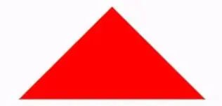
Achieving a triangle with a border:
<div id='blue'><div>

#blue {
 position: relative;
 width: 0;
 height: 0;
 border-width: 0 40px 40px;
 border-style: solid;
 border-color: transparent transparent blue;
 }
#blue:after {
 content: '';
 position: absolute;
 top: 1px;
 left: -38px;
 border-width: 0 38px 38px;
 border-style: solid;
 border-color: transparent transparent yellow;
}
The effect is as follows: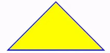
Note: If you want to draw a right-angled triangle, set the left border to 0; if you want to draw a left-angled triangle, set the right border to 0 (other cases are the same).
10, Table table frame merge
table,tr,td{< br> border: 1px solid #666;
}
table{
 < span >border-collapse: collapse;
}
< strong >11. css select the nth label element/span>
first-child first- child means select the first label in the list.
last-child last-child indicates the last label in the selection list
nth-child(3) indicates the third label in the selection list
nth-child(2n) indicates the label in the selection list Even labels
nth-child(2n-1) This means odd labels in the select list
nth-child(n+3) This means the labels in the select list start from the 3rd to the end.
nth-child(-n+3) This means that the labels in the selection list are from 0 to 3, that is, labels less than 3.
nth-last-child(3) This means the 3rd last tag in the select list.
How to use:
li:first-child{}
12. The mobile terminal soft keyboard becomes the search method
By default, the key on the soft keyboard is text such as go or confirm. To change it into a search text, you need to add on the input type declaration:
<form action='#' >
 <input type='search' placeholder< /span>='Please enter...' name='search' />
 </form>
needs a form tag to cover and set action Attribute, so that the lower right corner of the input method will automatically become a search after writing. At the same time, after using the search type, the search box will have a default delete button.
13, onerror processing image exception
When using onerror exception handling, if there is a problem with the onerror picture, the picture display will fall into an infinite loop, so after assigning the abnormal picture, set the address to empty
<img onerror='this. src='url;this.onerror=null'' />
< /span>14. The size of the background image
< /span>.bg-img{
 background:url(../img/find_pw_on_2.png) no- repeat center center !important;
 background-size: 27px auto !important;
 < span >/*background-size: 100% 100%;*/
 /*background-size: 50px 100px*/
}
15, spacing between text
Word text-indent header distance, letter-spacing word and word spacing
p{
 text-indent: 10px; //Word header distance< /span>
 letter-spacing: 10px; //spacing
}
16. Elements occupy the entire screen
heigth If you use 100%, it will be determined according to the height of the parent, so use 100vh unit.
.dom{
 width:100%< /span>;
 height:100vh;
}
17. CSS implements text alignment
.wrap {
text-align: justify;
text-justify: distribute-all-lines; //ie6 -8
text-align-last: justify; //Last line alignment of a block or line
-moz -text-align-last: justify;
-webkit-text-align-last: justify;
}18. Realize text vertical layout< /h3>
// When displaying in a single column< /pre>
.wrap {
width: 25px;
line-height: 18px;
height: auto;
font-size: 12 px;
padding: 8px 5px;
word-wrap: break-word;/*You need to add this sentence in English, automatically wrap*/
}
// When displaying multiple columns
.wrap {
height : 210px;
line-height: 30px;
text-align: justify;
writing-mode: vertical-lr; //From left to right
writing-mode: tb-lr; //IE from left to right
//writing-mode: vertical- rl; -- right to left
//writing-mode: tb-rl; -- right to left
}19. Disable element mouse events
< h3 data-tool='mdnice editor'>20. Forbid users to choose.wrap {
// If you press tab to select the element, such as button, then press The carriage return can still execute the corresponding event, such as click.
pointer-events: none;
cursor: default;
}.wrap {
-webkit-touch-callout: none;< br> -webkit-user-select: none;
-khtml-user-select: none;
-moz-user-select< /span>: none;
-ms-user-select: none;
user-select: none;
}21. Use hardware acceleration
Use css to enable hardware acceleration in the browser, so that the GPU (Graphics Processing Unit) can function, thereby improving performance. Hardware acceleration is especially useful on mobile as it can effectively reduce resource usage.
At present, mainstream browsers will open when they detect that certain CSS rules are applied to a certain DOM element in the page. The most prominent feature is the 3D transformation of the element. If you don't use 3D deformation, we can open it in the following way:.wrap {
transform: translateZ(0);
}22. Page animation flickering problem
In Chrome and Safari, when we use CSS transforms or animations may cause the page to flicker. The following code can fix this situation:
.cube {
-webkit-backface-visibility: hidden ;
backface-visibility: hidden;
-webkit-perspective: 1000;
perspective: 1000;
/* Other transform properties here */
}Another method that works well in webkit browsers is
.cube {
-webkit-transform: translate3d(0, 0, 0);
transform: translate3d (0, 0, 0);
/* Other transform properties here */
}23, letter case conversion
p {text-transform: uppercase} / / Turn all letters into uppercase< /pre>
p {text-transform: lowercase} // Turn all letters into lowercase
p {text-transform: capitalize} // capitalize the first letter
p {font-variant: small-caps} // turn the font into small caps24. Make a container transparent
.wrap {
filter:< span >alpha(opacity=50);
-moz-opacity:0.5;
-khtml-opacity: 0.5;
opacity: 0.5;
}25. Eliminate transition splash screen
.wrap {
-webkit-transform-style: preserve-3d;
-webkit-backface-visibility: hidden;
-webkit-perspective: < span >1000;
}26、 Recognize the '' in the string and break the line
Generally return the line break in rich text instead of < ;br> tags, and . In the case of not using regular conversion, the following styles can be used to achieve line breaks.
body {
white-space: pre-line;< br>}27. Remove the border of the clicked link of the a tag
a {
outline: none; //or outline: 0
text-decoration:none; //Cancel the default underline
}28. CSS displays the URL after the link
<a href='//www.webqdkf.com'>Youke Frontend Network</a> ;
<style>
a:after {content: ' (' attr(href) ')';}
</style>29. The select content is centered and the drop-down content is right-aligned
select{
text-align: center;
text-align-last: center ;
}
select option {
direction: rtl;
}30. Modify the color of the cursor in the input box without changing the color of the font
input{
color: #fff;
caret-color: red;
}31. Child element fixed width parent element width is stretched< /h3>
// The child element under the parent element is an inline element
.wrap {< br> white-space: nowrap;
}
// If the child element under the parent element is a block-level element
.wrap {
white-space: nowrap; // Child elements are not wrapped
display: inline-block;
}32. Let the pictures and text in the div be centered up and down at the same time
The flex layout is not used here. by vertical-align
.wrap {
height: 100,
line-height: 100
}
img {
vertical-align: middle
}
// vertical-align css property vertical-align is used to specify inline elements (inline) or table units The vertical alignment of the table-cell element. Only valid for inline elements and table cell elements, it cannot be used to vertically align block-level elements
// vertical-align: baseline/top/middle/bottom/sub/text-top;33. Realize adaptive rectangle with equal ratio of width and height
< /span>.scale {='scale'>
width: 100%;
padding-bottom: 56.25%;
height: 0;
position: relative;
}
.item {
position: absolute;
width: 100%;
height: 100%;
background-color: 499e56;
}
<div < span >class
<div class ='item'>
Here is the container for all child elements
</div>
</div>< /span>34. The rotate attribute of transfrom is invalid under the span tag
span {
display: inline-block
}35, CSS loading animation
< p data-tool='mdnice editor' > Mainly through the implementation of css rotation animation:.dom{
-webkit-animation:circle 1s infinite linear;
}
@keyframes circle{
0%{ transform: rotate (0deg); }
100%{ transform: rotate(360deg); }
}achieve the following effects:
<div class='loader' ></div>
<style> span>
.loader {
border: 16px solid #f3f3f3;< br> border-radius: 50%;
border-top: 16px solid # 3498db;
width: 80px;
height: 80px;
-webkit-animation: spin 2s linear infinite;
animation: spin 2s linear infinite;< br>}
@-webkit-keyframes spin {
0% { -webkit-transform: rotate( 0deg); }
100% { -webkit-transform: rotate(360deg); }< br>}
@keyframes spin {
0% { transform: rotate(0deg span>); }
100% { transform: rotate(360deg); }
}
</style>36. Realization of text gradient effect
<div class='text_signature ' >fly63 front-end network, a free learning front-end Knowledge Site</div>
<style>
.text_signature {
-webkit-background-clip: text;
-webkit-text-fill-color: transparent ;
background-image: linear-gradient(to right, #ec2239, #40a4e2,#ea96f5);
width: 320px;
}
</style>< br>37, beautiful border shadow< span >
<div class< /span>='text_shadow'></div>
<style>
.text_shadow{
width:500px;< br> height:100px;
box-shadow: 0px 0px 13px 1px rgba(51, 51, 51, 0.1);
}
</style>38. Beautiful background gradient
<div class='text_gradient'></div>
<style >
.text_gradient{
width:500px;
height :100px;
background: linear-gradient(25deg, rgb(79, 107, 208), rgb(98, 141 span>, 185), rgb(102, 175, 161), rgb(92, 210, 133)) rgb(182 , 228, 253);
}
</style> ;39. Realize the effect of three-dimensional characters
<div class='text_solid'>There is a class front-end network-web front-end technology learning platform</div>
<style>
.text_solid{
font-size: 32px;
text-align: center;
font-weight: bold;
line-height:100px;
text-transform:uppercase;
position : relative;
background-color: #333;
color:#fff;< br> text-shadow:
0px 1px 0px #c0c0c0,
0px 2px 0px #b0b0b0,
0px 3px 0px #a0a0a0,
0px 4px 0px > #909090,
0px 5px 10px rgba( 0,0, 0, 0.6);
}
</style< /span>>40, full screen background image Implementation
.swper{
background -image: url(./img/bg.jpg);
width:100%;
height:100%;//If the parent height is not 100%, please use 100vh
zoom: 1;< br> background-color: #fff;
background-repeat: no-repeat;
background-size: cover;
-webkit-background-size: cover;
-o-background-size : cover;
background-position: center 0;.stroke {
-webkit-text-stroke: < span >1px greenyellow;
text-stroke: 1px greenyellow;
}Method 2:
.stroke {
text-shadow:#000 1px 0 0,#000 0 1px 0,#000 -1px 0 0 ,#000 0 -1px 0;
-webkit-text-shadow:#000 1px 0 0,#000 0 1px 0,#000 -1px 0 0,#000 0 -1px 0;
-moz- text-shadow:#000 1px 0 0,#000 0 1px 0,#000 -1px 0 0,#000 0 -1px 0;
*filter: Glow(color=#000, strength=1);
}42. Realization of element transparency
.dom{
opacity:0.4;
filter:alpha(opacity=40);< span >/* IE8 and earlier */
}Use rgba() to set color transparency .
.demo{
background:rgba(255,0,0,1);
}Explanation: RGBA is the abbreviation of three words representing Red (red), Green (green), Blue (blue) and Alpha (opacity).
43. Solve the problem of 1px border thickening
.dom{
height: 1px ;
background: #dbdbdb;
transform:scaleY(0.5);
}Ps: The reason why 1px becomes thicker, for example, when the screen is doubled A pixel of 1px actually corresponds to 2 physical pixels.
44. Operation of different CSS units
css itself can also perform simple calculations, mainly because the function calc is used. Implement addition and subtraction operations with different units:
.div{
width: calc(100% - 50px);
}45. CSS achieves text blur effect
.vague_text{
color: transparent;
text-shadow: < span >#111 0 0 5px;
}46. Use a filter to make the icon gray
A color picture can achieve the effect of changing the color when the mouse is moved in, and graying out when the mouse is moved out.
<a href=''< /span> class='icon'><img src= '01.jpg' /></a>
< style>
.icon{
-webkit-filter: grayscale (100%);
-moz-filter: grayscale(100%);
-ms-filter: grayscale(100%);
-o-filter: grayscale(100%);
filter: grayscale(100%);< br> filter: gray;
}
.icon:hover{
filter : none;
-webkit-filter: grayscale(0%);
}
< span ></style>< span >47. Image adaptive object-fit
When the image ratio is not fixed , if you want to make the image self-adaptive, you usually use background-size:cover/contain, but this only applies to background images. The object-fit attribute can be used in css3 to solve the problem that the image is stretched or zoomed. Preconditions used: The image's parent container must have width and height.
img{
width: 100%;
height: 100%;
object-fit: cover;
}fill: Default value. The content is stretched to fill the entire content box, and the original ratio is not guaranteed to be maintained. contain: Keep the original size ratio. The longer side of the length and height is the same size as the container, and the shorter side is proportionally scaled, and there may be a blank space. cover: Keep the original size ratio. The short side of the width and height is the same as the size of the container, and the long side is scaled proportionally. There may be some areas that are not visible. (Common) none: Keep the original size ratio. While maintaining the original size of the replaced content. scale-down: Keep the original size ratio. If the container size is larger than the image content size, keep the original size of the image without zooming in and distorting; the container size is smaller than the image content size, and the usage is the same as contain.
48. There is a gap problem with inline label elements
Method 1: Set parent font-size to 0
.father{
font-size:0 ;
}Method 2: Set the value of word-spacing on the parent element to a suitable negative value
.father{
word-spacing:- 2px
}Other solutions: 1. Write inline elements as 1 line (affecting reading); 2. Use Float style (affects layout).
49, to solve the vertical-align attribute does not take effect< /h3>
When using vertical-align:middle to achieve vertical centering, it is often found that it does not take effect. Here you need to pay attention to the conditions that need to be met for it to take effect:
**Environment: **The parent element sets line-height. Need to be consistent with height. Or set the display property to table-cell to convert block elements into cells.
**Action object:** inline-block and inline elements in child elements.<div class='box'>
<img src='.est.jpg'/>
<span>Inner Text</span>< /span>
</div>
<style>
.box{
width:300px;
line-height: < span >300px;
font-size: 16px;
}
.box img{
width: 30px;
height:30px;
vertical-align:middle
}
.box span{
vertical-align:middle
}
</style>PS: vertical-align cannot be inherited and must be set separately for child elements. At the same time, it should be noted that the height of line-height is based on font-size (that is, the height of the font). If the text needs to change lines, an exception will occur. This article is over~
1. JavaScript review series (22 articles Full) 2. ECMAScript Revisited Series (10 articles) 3. JavaScript Design pattern review series (9 articles) 4. regular/framework/algorithm review series (16 articles) 5. Introduction to Webpack4 (top)|| Introduction to Webpack4 (below) 6. Introduction to MobX (top) || Introduction to MobX (below) 7. 120+ original series summary Reply to "Join the group" to communicate and learn with the big guys~
Click "Read the original article" to view 120+ original articles

Articles are uploaded by users and are for non-commercial browsing only. Posted by: Lomu, please indicate the source: https://www.daogebangong.com/en/articles/detail/CSS%201062%20List%20of%2049%20commonly%20used%20CSS%20styles.html
 支付宝扫一扫
评论列表(196条)
测试