Editor: Scallion Author: Liu Baikun
Foreword: If you have a good word to change, the new column "Kun Ge Chang Zi" will meet you. Last year, there were several articles on word change. After the handwriting practice activities stopped, I hope this new column can be maintained once a week. More, everyone is welcome to vote for me.
Changing the characters is like a semi-propositional composition. I will try my best to narrate when the materials are given. Helping everyone to change the characters is not to overthrow all of them, so it doesn’t make much sense. I will try my best to maintain the original font direction, solve the main contradiction, and what I am good at, help you clarify your thinking and expand some small knowledge points. If you feel that there is something inappropriate in the word change, please leave a message to discuss.

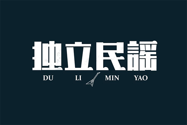
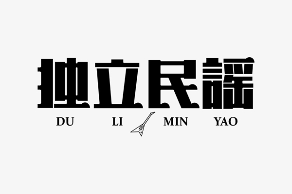
Contributions from my former students, a remarkable and relatively restrained work. Before modifying this group of words, I deliberately searched for some articles about independent folk songs. After reading around, I didn’t see why. This thing It's a bit like "what is the spirit of rock and roll", there is no standard answer, just listen and change it.

#Negative space cramped and airtight
The extremely extended strokes and thick vertical strokes make this group of characters have tension and stability. As a title art word, this is a processing method, but it is still a bit reluctant to deal with some local spaces.
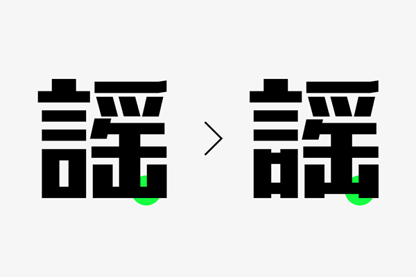
Taking the character '謡' as an example, it has the most strokes compared to the previous three characters, and needs to deal with more positive and negative space relationships. not enough.
Based on the above, I re-planned the basic structural framework of this group of characters (see the picture below), the processing of the two characters in the middle is slightly different from the original manuscript, have you noticed?
#Restore basic features
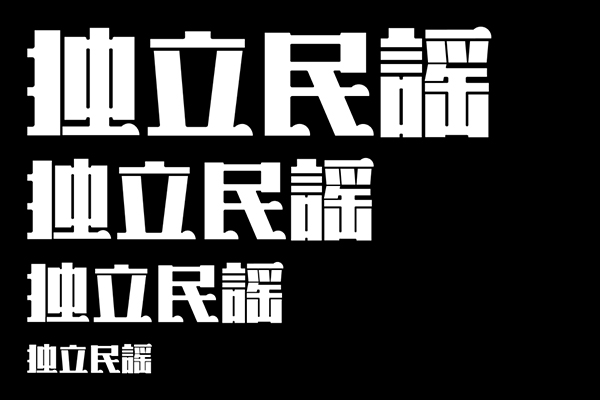
Immediately afterwards, one of the more obvious features in the original manuscript was restored, and the intersection of horizontal strokes and vertical strokes was made into a shape similar to Song typeface, which added a bit of elegance to the whole.
#Stroke processing is unified and single
The strokes and some details of the original characters are fairly uniform, which is good, but could be better. For example, the handling of horizontal strokes and closing strokes, the typical shape characteristics of Song typeface, since it is an 'independent folk song', it is always necessary to find something 'ethnic'. The closing of the strokes here is used in the two places of the word "min", which is a bit uncoordinated, which is extremely uncoordinated.
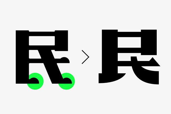
Generally speaking, different writing methods will definitely have differences in stroke processing. The strokes of hook and stroke are obviously different from horizontal strokes, so can we go further on these points? Get the word processing on the right side of the picture above.
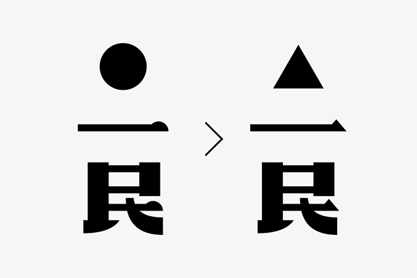
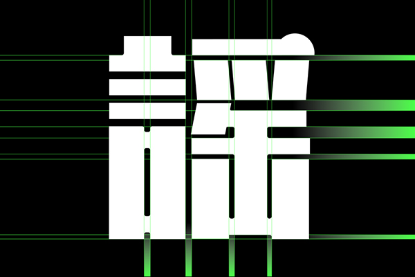
Careful students will find that the shape of the horizontal pen has also changed, from a semicircle to a triangle, why change it like this? The original horizontal strokes are correct, but they are not what I want. I hope this group of characters can convey a more direct and free-spirited attitude, so I make this modification. The Chinese part is completed here, as shown in the figure below.
#Choose the matching font carefully
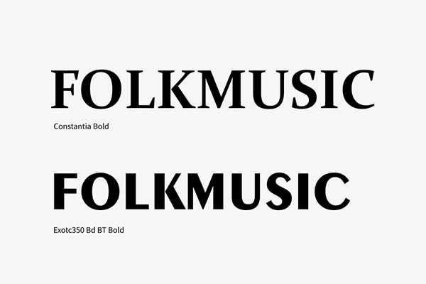
The choice of font for the subtitle of the original manuscript and the Chinese characters can be said to be people from two worlds. It is a bit of a disaster to force them together, and there is that extra electric guitar.
In fact, this group of characters has a sense of tradition, but it is only a small part, so it seems too conservative to choose Constantia as a serif. So I chose a cleaner font for the new modification, and the stroke thickness change can also find some commonalities with our group of characters, see the comparison in the figure below.
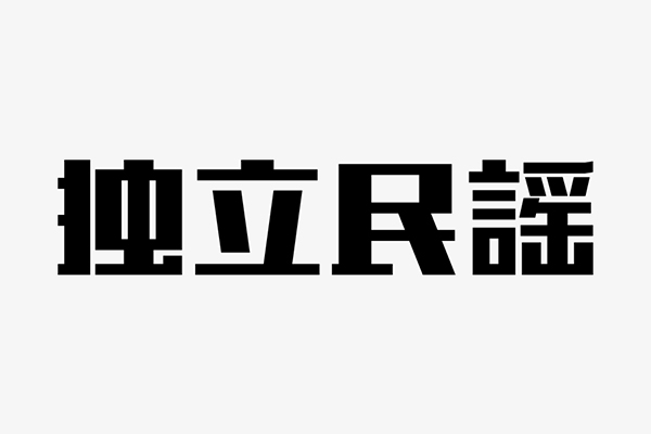
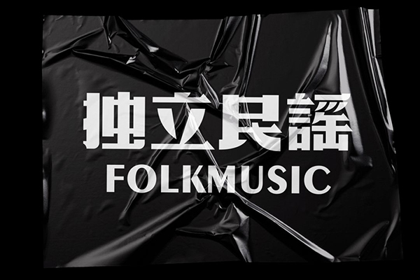
#Final draft

There is a layer of texture superimposed in the original manuscript. The texture is like a tattoo. I must have thought about it before tattooing. Is it manageable? Is it suitable? Don't be blind!
The independent folk songs in everyone's mind are very different. I just added some my own understanding on the original basis, so there will be countless different interpretations of this group of characters. Would you like to give it a try? See you again in the next issue, brother kun~
Articles are uploaded by users and are for non-commercial browsing only. Posted by: Lomu, please indicate the source: https://www.daogebangong.com/en/articles/detail/Brother%20Kun%20changed%20the%20word%20%20black%20and%20white%20font%20design.html
 支付宝扫一扫
评论列表(196条)
测试