Foreword: Changing characters is like a semi-proposition composition. I will try my best to narrate the material when I get it. Helping everyone to change the characters is not to overthrow all of them, so it doesn’t make much sense. I will try my best to maintain the original font direction, solve the main contradiction, help everyone clarify their thinking, and expand some small knowledge points. If you feel that there is something inappropriate in the word change, please leave a message to discuss.
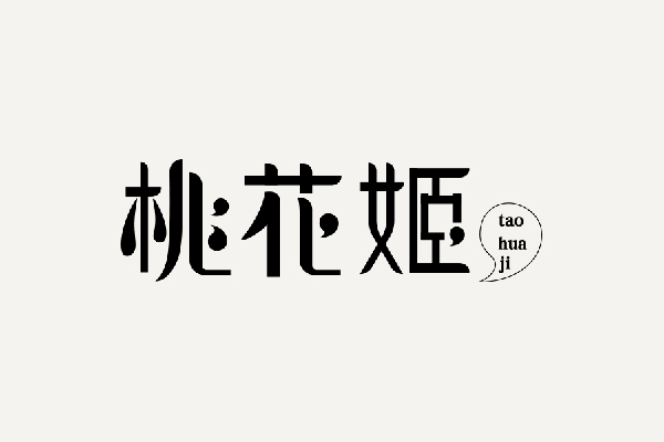
If you put aside the design and only understand the three characters or the word "Peach Blossom Girl", what kind of "image" will it be in your mind? Does the design of the original manuscript roughly meet your imagination?
#Unified 'point'
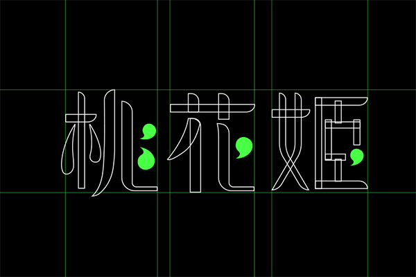
Let's take a look at the most special features of this group of fonts. When you first look at this group of characters, you will definitely notice several "commas" in each character, and they are unified into each character to achieve "rain and dew". , which makes the whole group of words look jumpy and a bit more mischievous; it's just that the 'comma' in the third word is too forced.
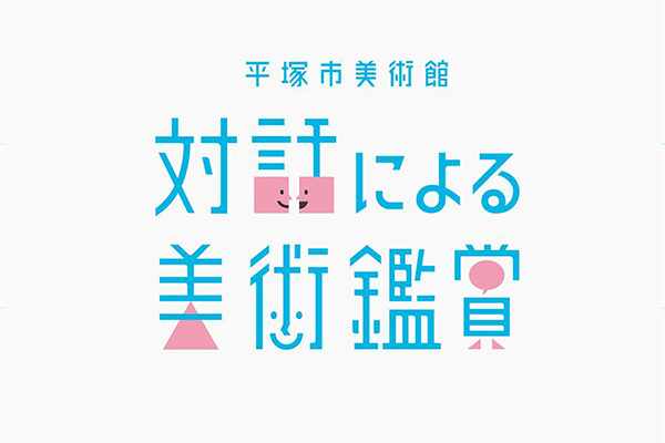
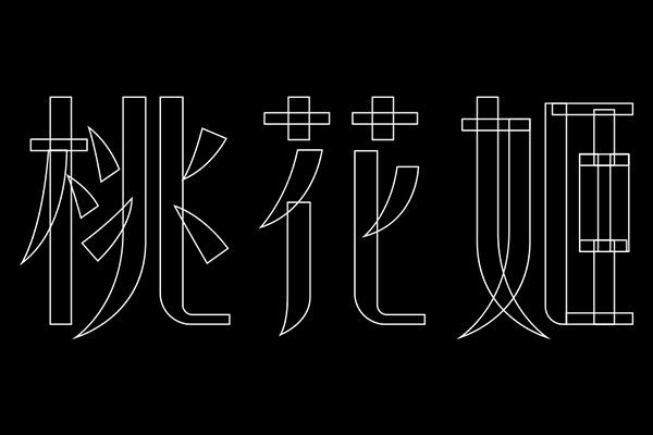
This method is a typical graphic processing, which is widely used in font design. The graphics can be simple geometric figures or very concrete graphics. For example, there are many graphic processing in the following group of characters.
#Unity details
In the basic strokes, the closing strokes of the horizontal strokes and the starting strokes of the vertical strokes are treated with rounded corners. Coupled with the change of the curve of the stroke, the whole group of characters has more affinity and feminine characteristics.
But in fact, the ending treatment of the word "female" on the left side of the word "Ji" in the original manuscript can completely unify the form of the front apostrophe, it can only be said that the unification here is not thorough enough.
#Variable stroke thickness
In this group of characters, the thickness change of the strokes has become the 'culprit' that destroys the integrity. The thickness change of the vertical strokes is really incomprehensible, and the author's mind cannot be guessed, especially the width of the vertical strokes of the third character drops suddenly. , even "thinner" than the horizontal pen, such a change is obviously a bit excessive.
#Changed structure writing
Paying attention to the change of the word '桃', the second point is not only next to the word '木' but also the two points on the left of the character 'Zhao'. Here a common stroke is used, but it is a bit far-fetched and causes some problems of recognition; Except for some differences in size, the pen is basically symmetrical, and it doesn't look beautiful.
#Return to the origin
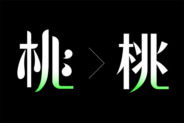
The original modification was to keep the original 'comma' graphic, but after playing with it for a long time, I felt that the effect was not good, so I changed the direction and returned to the original appearance of the font. Keep the thin and tall structure of the font, replace the original drop-shaped scribble, and change the rounded corners of the starting pen to flat corners for the time being.
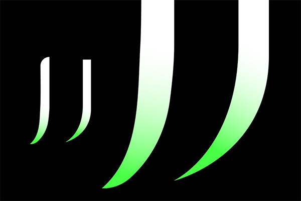
The marked green strokes are basically retained, and the radian is slightly modified. For strokes with arcs, you must pay attention to the size of the arc and the smoothness of the lines. If you zoom in on the details, you can compare the changes in the curvature of the two strokes.
#Balanced space
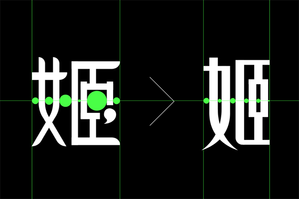
Instead of taking the word "Ji" as an example, in addition to paying attention to the changes in strokes, especially the changes in the left side of "Nv", we should focus on the adjustment of space. The green dots marked in the above picture are the intervals between the vertical strokes of the font , the strokes of the original manuscript characters are too radical, obviously did not allocate the negative space changes well, the proportion of 'Chen' is much wider than that of 'Female'.
At this point, it is difficult to see the shadow of the original font. In retrospect, the above work is basically simplified, removing all interference factors, and returning to the initial state of the font.
#Unified new details
The initial and final strokes of the original manuscript have rounded corners. During the revision process, all of them were changed to flat heads. In the end, it seems that there is a lack of energy, so I want to restore some details of the horizontal and vertical strokes. The change.
#Final comparison
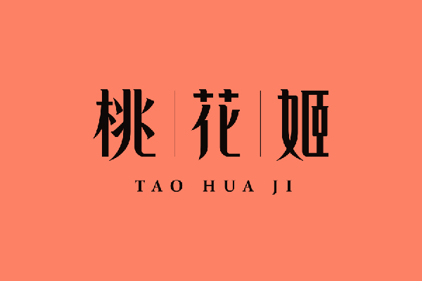
Finally, looking at the comparison of the final draft, it is obvious that the characters are completely in two states, and the color and layout have also been adjusted. Unity and change are relative. You can't blindly seek unity without spirituality, and you can't just seek change without the whole. Through this case, are there any points that have not been thought of before?
There is a limited amount of time for word correction in each issue, and there are still many shortcomings. Many friends also left messages to express their opinions, which is very good! I hope to give you a platform for discussion, and I also hope that you can vote for me. Brother Kun will change the words and see you next time~
Articles are uploaded by users and are for non-commercial browsing only. Posted by: Lomu, please indicate the source: https://www.daogebangong.com/en/articles/detail/Brother%20Kun%20changed%20the%20word%20%20Unification%20Variety%20What%20is%20going%20on.html






 支付宝扫一扫
评论列表(196条)
测试