Author: Liu Baikun
Foreword: Changing characters is like a semi-proposition composition. I will try my best to narrate the material when I get it. Helping everyone to change the characters is not to overthrow all of them, so it doesn’t make much sense. I will try my best to maintain the original font direction, solve the main contradiction, help everyone clarify their thinking, and expand some small knowledge points. If you feel that there is something inappropriate in the word change, please leave a message to discuss.

In this issue, I choose a group of special characters. I say it is special because it may represent a group of friends who are new to fonts. Even though there are many books, videos, and tutorials on font design, there are still a large number of students who have no way to start when they first come into contact with font design, and problems arise frequently.
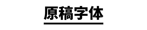
Just like the original font in the picture above, it can be seen that there are many "rules" in it. For example, the most obvious oblique cutting treatment of the vertical pen is unified, and the overall structure is also changed in thinness and height, but there still seems to be a comparison. What an obvious problem, the most intuitive feeling if you put it in the vernacular is: it is not good-looking!
Let's take a look at the most terrible pitfalls for beginners through this group of characters!
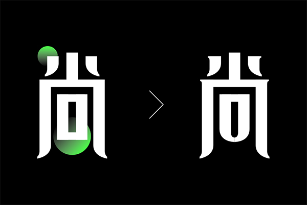
# Changes that break unity
When you read some font tutorial articles, you will find that each family has a different statement, and each person has a different point of view, and there are even many contradictions, which will confuse many novices. In the world of design, it is difficult to distinguish between right and wrong. Contradictions are not scary. The key point is that everyone must learn to balance.
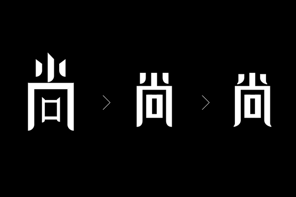
Unity and change seem to be contradictory, but they are not in conflict. They are more like the relationship between the whole and the part. In the picture above, pay attention to the change of stroke thickness. The strokes of "口" inside Shangzi are obviously thinner than most of the strokes. The author may be based on such a theory: the strokes of the font are thick on the outside and thin on the inside.
There is a limit to everything, too fine processing will directly lead to an imbalance in the thickness of the strokes, and a large area of blank space in the surrounding space will directly lead to the visual "weakness" of this part, so this change is problematic.

# For unified unity
Unification does not mean that there is no change. In the original manuscript, the author treats all strokes uniformly, and all strokes with curvature changes are also unified into horizontal, flat and vertical. However, the final apostrophe and vertical hook of the word "yard" is inevitably a bit rigid in this way.

# The devil is in the details
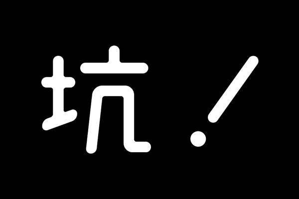
Some weird and incomprehensible 'changes' ruin a work. The picture above is to enlarge the details of the word "Yuan". The inclination of the vertical line and the change of the form of the dots are too casual. It is not like a change, but more like a design mistake.
Listen to the story of a nail: "Without a nail, a horseshoe is lost; with a horseshoe lost, a horse is overturned; with a horse overturned, a battle is lost; a battle is lost Battle, lost a country."
# Typesetting is not casual
More things does not mean richer picture. When doing the final typesetting, the contrast and fusion between elements need to be precisely coordinated, and unnecessary elements that do not work are not forced to stay! What is the meaning of adding a thin rectangular frame around the subject word in the manuscript? I can only put out one expression to express my mood at the moment.

The elements on the right side of the main character still have a sense of rhythm alone, but if they are integrated together, two obvious problems will be found. One is that the alignment of the top and bottom and the thin frame causes the pinyin in the lower right corner to be a bit underpinned; The font selected for the words Shang' is too thin, which is out of balance with the weight of the main character.

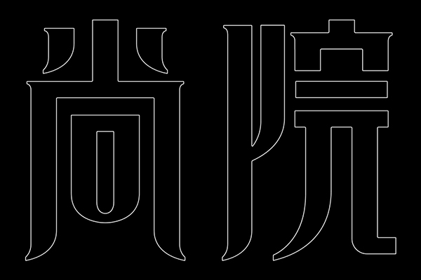
# Retain stroke style and basic structural relationship
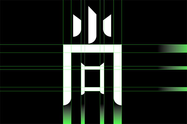
The treatment of the vertical strokes of the original characters is suitable for this group of characters. At the beginning, I wanted to keep them completely. As shown in the centering effect in the picture above, I felt too calm, so I made some adjustments, as shown in the far right of the picture above.
In terms of structure, it still retains the original relatively slender state, but there was too much internal space before, and here it will be properly shrunk when adjusted, and the overall look will be more compact.
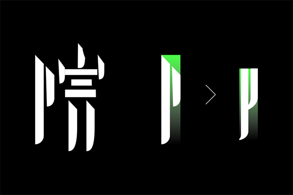
# There is a risk of breaking the pen, and the change needs to be cautious
Breaking the pen is a very common way to deal with it, but be careful not to break up the whole character. For example, in the processing of "阝", the original character is basically two vertical lines, which is too simplified, so I increase the arc at the bottom to connect it with the left vertical line, so that the integrity will be better.
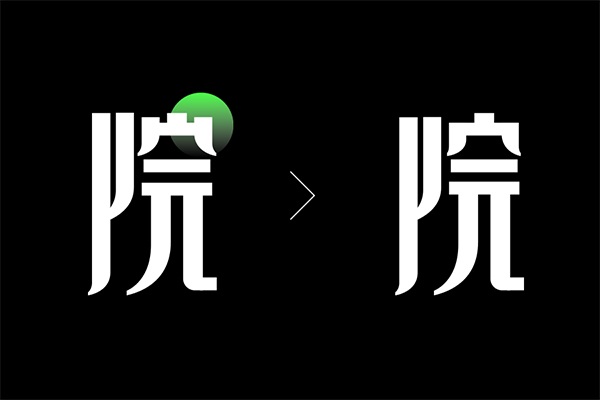
Continuing to look at the treatment of the word 'yard', an obvious change lies in the left and right hooks. I have mentioned these two points before, so I won't talk about them in detail.
The left side is the original modification, but I felt that the '宀' would be a bit trivial, and then adjusted it to the right side horizontally and vertically.
#Strengthen personality
At this point in the modification, the tone is basically set, but I feel that the personality is not prominent enough, and some small modifications and changes have been added. See the left and right comparison in the above picture.
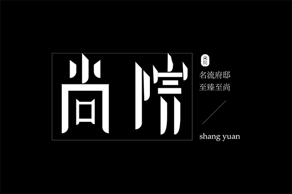
The picture above is the enlarged outline of the Chinese characters. Next, let’s solve the problem of typesetting.
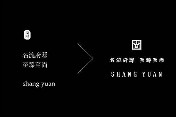
# Selection of other elements
Typesetting is a long-standing and difficult problem for many novices. Let me talk about the reasons for choosing from top to bottom. First of all, this stamp. The stamp of the original manuscript is an ellipse plus the two Song style characters of "Shangyuan". The evaluation of the two words: simple! Especially in the case of zooming out, the two words in it almost need a magnifying glass.
I directly borrow the writing method of the word "Shang" in the seal, and use the pen tool to draw the line segment.
The Chinese slogan mentioned the problem before, it is too light and too weak, so I just look for something with a little traditional charm and a sense of weight.
Looking at the choice of pinyin again, I still clearly feel that the choice is casual. The easiest way is to find English according to the characteristics of the main Chinese characters, thin and tall, decorated with serifs, more solemn, thin horizontally and thick vertically... In short, not ! want! too! follow! easy!
# Final draft comparison
The following is a comparison of the final draft. The color is directly black, the seal is vermilion, and the center alignment will highlight the key points and make it more imposing, so the typography is not "playing tricks", and too many changes are not suitable for this theme.
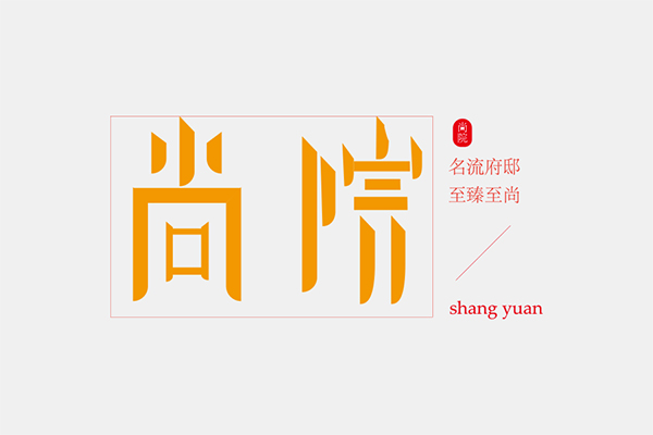
Original
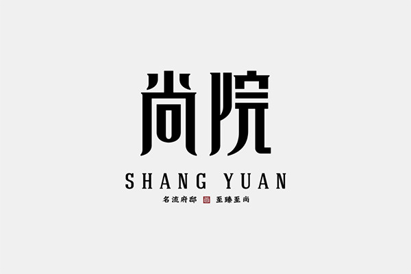
Revised manuscript
This guide will not list a lot of odds and ends for you. It will be broken down by a word made by a novice. I hope that all students can get what they need, and it will be beneficial to open the book. This is the end of this issue, if there is more, see you in the next issue~
Oh, remember to vote for me, send the font source file to zitixt@163.com, maybe change your wording in the next issue!
Articles are uploaded by users and are for non-commercial browsing only. Posted by: Lomu, please indicate the source: https://www.daogebangong.com/en/articles/detail/Brother%20Kun%20Changed%20the%20Words%20%20Mistakes%20I%20made%20in%20font%20design%20in%20those%20years.html
 支付宝扫一扫
评论列表(196条)
测试