Editor: Green Onion Original: Font School

Foreword: Changing characters is like a semi-proposition composition. I will try my best to narrate the material when I get it. Helping everyone to change the characters is not to overthrow all of them, so it doesn’t make much sense. I will try my best to maintain the original font direction, solve the main contradiction, help everyone clarify their thinking, and expand some small knowledge points. If you feel that there is something inappropriate in the word change, please leave a message to discuss.

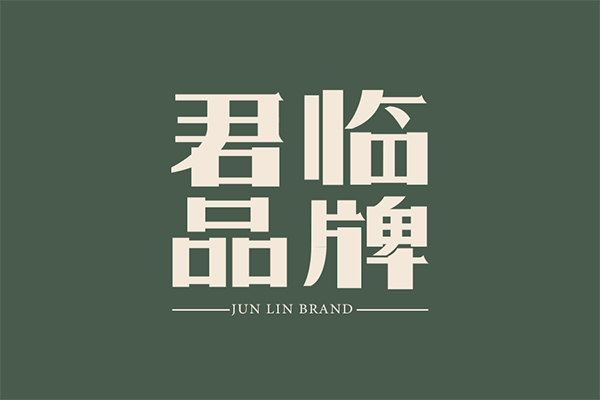
If I have seen this group of works, what I can’t forget may be the color matching, which is elegant and exquisite. Of course, many places in the font can also fit this point, such as the change of the horizontal stroke and the details of the "mouth". They are all quite exciting, but there are more issues worthy of attention besides strokes in a font!

#Good stroke state
The strokes in the font may be the most perceivable part for us. It can exist in many different forms, simple or complex, playful or serious. For example, the strokes of the original character taken out alone in the picture above have black body and stability. The charm of Song typeface, and the state of the strokes is also good, but the strokes in a font are not all.
#Space is the most important foundation
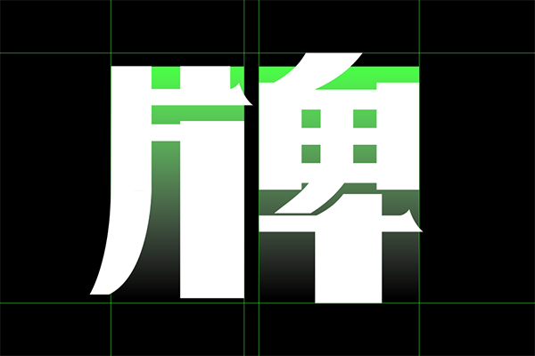
When we "spell" these pretty good strokes into Chinese characters, this is a point that people often make mistakes and "underestimate" in font design. For example, the word 'pai' in this group of characters, although we can recognize it, is not elegant enough, and even looks uncomfortable.
For the left and right parts of 'Pian' and 'Pian', it is obvious that the strokes of the former are mainly concentrated in the upper part. Although the part of 'Pian' is also tight at the top and loose at the bottom, compared with the lower part of "Piece", the processing is too deliberate, resulting in visual The center of gravity is high on the left and low on the right, which is extremely disharmonious.
#Literal size imbalance
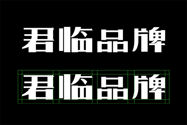
The problem of the unbalanced font size of the overall horizontal layout of the text is even more prominent. The character "Lin" is the largest one, and the character "Pin" feels a lot shorter, like four people of different sizes standing in a row. , a lack of unity.

#Unbalanced, average, balanced
The simplest understanding of imbalance is that when the distribution of strokes is unreasonable, the negative space will be unbalanced, and the result is like the left character in the picture above, and the space in the middle is overcrowded; average is a concept in mathematics, and most of the time it is difficult for you to use the average distribution method to adjust the font space, the font structure is ever-changing and the strokes are interspersed with each other, so the average is not applicable.
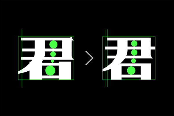
I specially made a comparison chart to understand the concept of balance. Pay attention to the size of the green circles on the left and right. The size of the circle on the left is very different. Although the circle on the right is not equal in size, it is relatively balanced. It can be understood in this way when reflected in the strokes: strokes The spacing is moderate and the negative space is reasonable, so the font structure is relatively stable.

#local adjustment
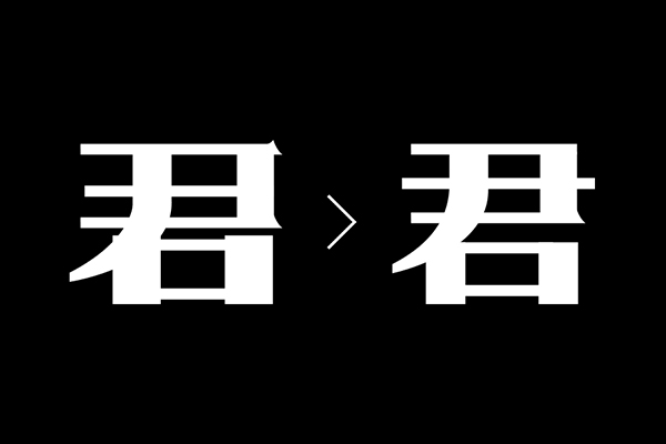
Adjust the other characters according to the above idea. The above picture is the line of the basic outline. You can compare it up and down to see the specific details that have been changed. In addition, pay attention to the treatment of 'mouth'. The upper part is flush and the original horizontal and vertical misalignment is removed. The reason It will appear more clean and neat in this group of characters.

#Diverse ways of writing
The handling of the word "card" in the original manuscript is very bad, especially the middle part on the right is too densely interspersed. In addition to the structure of multi-reference fonts including some modern designs, old fonts are also one of the good references. Pay attention to the wording of the word "Pai" in the picture above, it is wonderful!
# Final draft comparison
The typesetting of this group of words adopts a centered alignment method, but it seems that it is not completely centered, and the two leading lines are also short and long, which is not rigorous enough; it is no problem to choose a sans-serif font or a modern serif font for the English part , but the original English is a little lighter.

////////////////////////

This is the end of the word change for this issue. The original plan should be updated last week. There are some other things that have been delayed until this week. Forgive me~ Everyone is welcome to vote for me, and I hope that this form of word change will allow everyone to have more See you in the next issue.
Articles are uploaded by users and are for non-commercial browsing only. Posted by: Lomu, please indicate the source: https://www.daogebangong.com/en/articles/detail/Brother%20Kun%20Changed%20Characters%20%20In%20addition%20to%20strokes%20we%20should%20pay%20more%20attention%20to%20font%20space.html
 支付宝扫一扫
评论列表(196条)
测试