
Picture/text balixiang111
The methods of font design vary greatly, and there is not only one method, so I also hope that you can give more pointers. In the process of writing this article, I also referred to other materials, which can be regarded as a summary. Then turn to the topic.
"There is a great world in the heart, and there will be a great world in the pen" This sentence means that no matter what type of design you do, you should have the idea first. This is especially true for Chinese font design. Before designing fonts, you should also have a full understanding of the shape and structure of Chinese characters. Reading through thousands of volumes, writing with spirit, this is the truth.
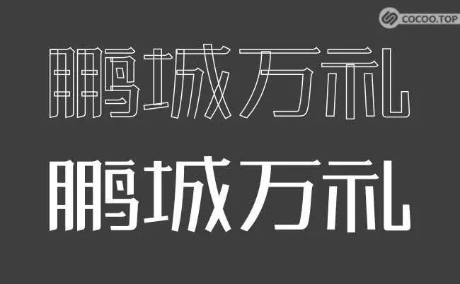
Start by copying
You can start with Song typeface for copying fonts. The strokes of Song typeface are horizontal and vertical. It is relatively easy to copy, and does not require much calligraphy foundation compared with regular script and running script.
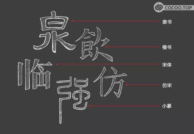
Start from Song style, and further copy other fonts, such as official script, regular script, Xiaozhuan, Song Dynasty and so on. The more fonts you copy, the more commonalities you can draw from the differences in fonts, and understand the influence of stroke characteristics on the character of fonts.
Apart from these common types of fonts, seal cutting is also a very important category. Seal cutting is an art that pays great attention to layout and black and white. It has the characteristics of calligraphy and incorporates knife skills, from which we can learn a lot of font design Methods.
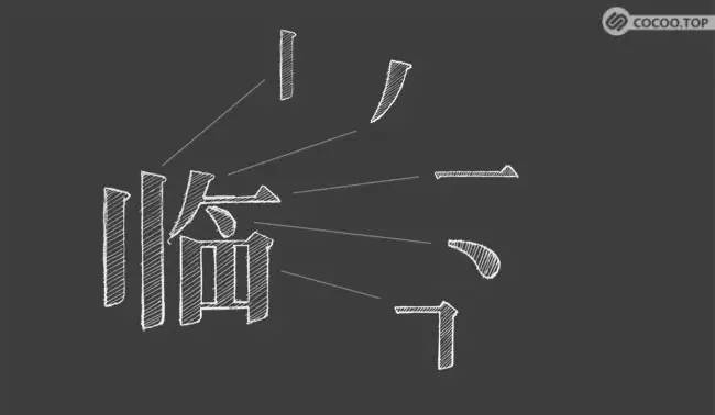
Learn the characteristics of strokes
Stroke is the most basic unit of Chinese characters, and stroke characteristics are also the most intuitive expression of font character. In the process of copying, deconstruct Chinese characters and start from the details to understand the most subtle and delicate strokes. For example, in Song style, there are many subtle and rich changes in starting strokes, pauses, turnings, strokes, and strokes. The lines may be tough, soft, or Hard and soft. Recommended reading: Analysis of Chinese and English fonts, what you need to know when designing fonts!
Learn Literal Size
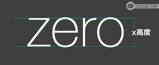
Literal size refers to the visual area of the text. Another criterion for the quality of font design also depends on whether multiple characters are coordinated and balanced together. Because the structure of English letters is relatively simple, we can take the helvetica font as an example to explain the literal size.
The four letters of zero in the above picture are all lowercase. Here I typed two auxiliary lines and found that a small part of the letters e and o exceeds the x height. In addition, the sum of r is also slightly higher. This is because the shapes of e and o are circular, while the visual shape of z is rectangular. In the case of the same height, the rectangular has a larger visual area than the circular. To make the rectangle and the circle (that is, z and e) form a visual symmetry, the height of the circle (that is, e) should be increased accordingly. The same is true for the curve in the letter r. In addition, there are other processing of visual shapes, so I won’t give examples one by one.
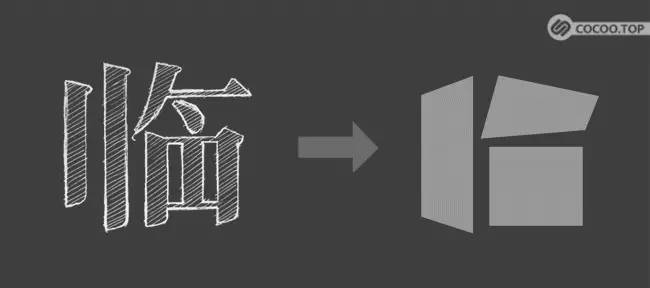
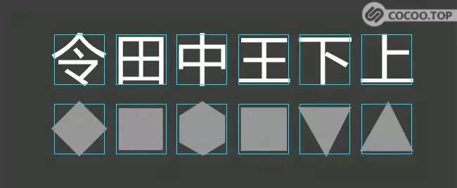
Compared with English letters, Chinese characters have much more strokes and a more complex structure, and there are many details to be paid attention to when dealing with the size of words. Next, let's take Fangzheng Lantinghei as an example to analyze the way Chinese characters deal with the literal size.
Although Chinese characters are known as square characters, many Chinese characters are not typical rectangles. In the picture above, the Ling character is a rhombus, the Chinese character is a hexagon, and the lower and upper characters are triangles. Part of the four characters in the middle, bottom, and upper part of the order exceeds the bounding box in the figure. When the width and height are the same, the visual area of the rhombus is much smaller than that of the square, so Tian characters are relatively restrained, Ling characters are relatively outward, and the other characters are treated in the same way. And the center of gravity of lower characters is relatively upward, and the center of gravity of upper characters is lower. Therefore, the center of gravity of lower characters moves down, and the center of gravity of upper characters moves up.
Emotion and Purpose
The purpose of font design is to express emotion and personality. Different lines and strokes, different thicknesses of black and white create vivid fonts with flesh and blood. Expressing meaning is the most basic function of text, and expressing emotion and personality while expressing meaning is the meaning of font design.
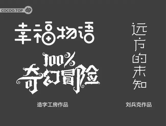
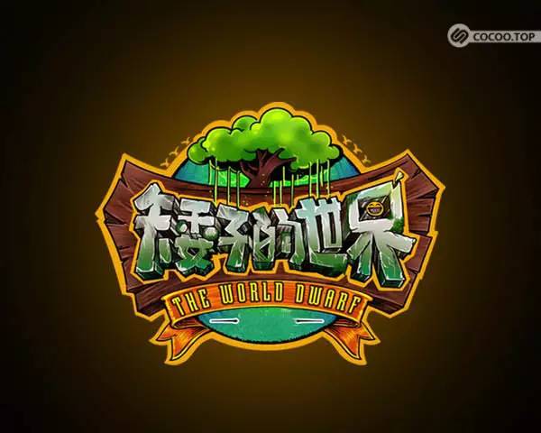
For example, the use of the center shape, plus sign and circle in the picture below makes the whole font present a warm and playful flavor. While expressing meaning, the font itself also has a personality. In 100% Fantasy Adventure, the use of Gothic font style, exaggerated fonts and spiral strokes express a fantasy flavor.
Typefaces, like people, have unique personalities, and good typography conveys emotion long before discerning semantics.
Attention to detail breaks the rules
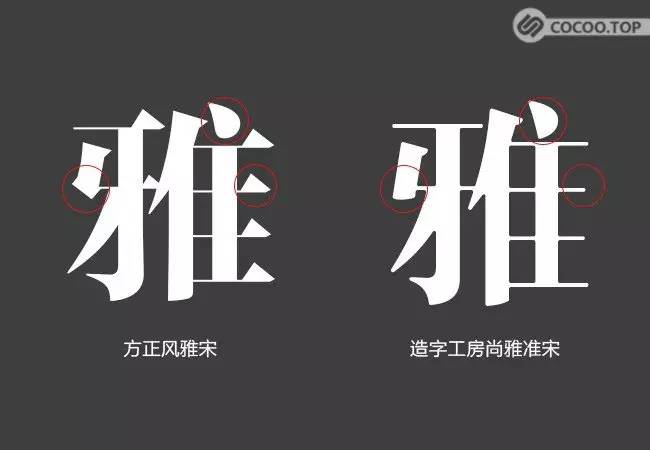
Founder Feng Ya Song is a very beautiful font, square and elegant, with typical features of Song typeface. Such as drop-shaped dots, triangles at the end of horizontal strokes, etc. Shangya Junsong, a calligraphy studio, improved these features and removed some decorations, making the fonts more fashionable and modern.

Many rules play the role of guidance and instructions in the early stage of learning, but when the design reaches a bottleneck period, it is necessary to break the rules. When rule theory and your own eyes diverge, trust your eyes. All rules can be broken in order to express emotion and character, and to look comfortable.
Font design cannot be learned just by looking at it. It focuses on a lot of accumulation and practice, focusing on aesthetic training and basic skill practice, and does not involve specific software operation methods. I hope it can help you, if you find it useful, please bookmark it!


Articles are uploaded by users and are for non-commercial browsing only. Posted by: Lomu, please indicate the source: https://www.daogebangong.com/en/articles/detail/Big%20reveal%20Chinese%20font%20creation%20skills.html
 支付宝扫一扫
评论列表(196条)
测试