To complete a set of beautiful and qualified PPT, in addition to logic and layout, there is also color matching. The color matching seems simple, but there are some insurmountable secrets that must be followed. The following sharing is from the PPT color matching of business workplace or formal occasion. If you want to complete a cool, shiny and artistic style PPT, then you don’t need to follow this cheat, just feel free.
One slide background color
In order to make the content of the page more focused when making PPT, a color contrast between the background and elements will be added to make the content more intuitive.
For the background color, choose a light color or a low-saturation background to better highlight the content of the PPT presentation.


Bright and cool backgrounds can't highlight the content and distract the audience's attention. Only a light-colored or low-saturation background can better highlight the content of the PPT presentation.
In fact, many excellent slides have a light gray background or use white directly.


Some people will say that the background of the conference slides is black or dark. In fact, black or dark colors are also colors with very low saturation and brightness.
 Due to certain occasions, the background of the press conference must be black or dark. The reason is that the dark background can highlight the speaker. If it is a white or bright color background, there will be back shadows or reflections, making the audience unable to see the speaker clearly.

For most business workplace slideshows, choosing a black background is too risky and depressing. Light backgrounds are still recommended.
Two best and worst color schemes
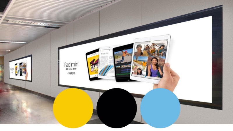
The best color schemes to use in the workplace are black, white or light gray, black and yellow, and white and blue if you need a sense of technology.


If the company designs VI, it is recommended to use standard VI color matching.
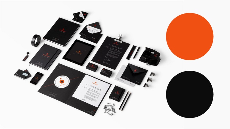
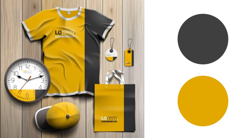
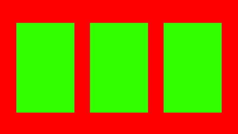
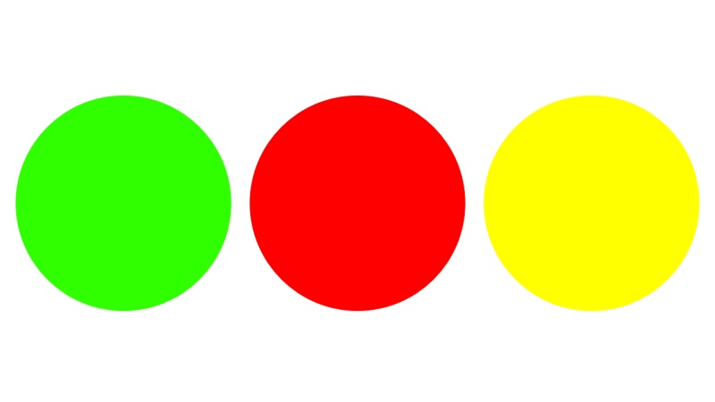
I said it is the best to use, let me say that it is the worst to use the color matching that blinds the eyes. Red-green, red-purple, blue-black, blue-yellow...

Three, choose only one color as the main color
It is recommended not to use more than three colors in one slide. The more colors are used, the more distracted the audience or the person reading the PPT will be.

In the business workplace slideshow, we need to use colors to highlight the achievements, problems, improvements, and plans on the page, so that the boss, colleagues, and customers who are watching the slideshow can understand at a glance.
If you use color for contrast and emphasis, it is only recommended to choose one color as the main color. This keeps the design consistent throughout the slideshow, making it more readable and design-friendly.
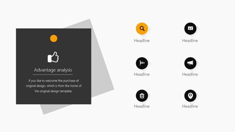

The contrast between the main color and other auxiliary colors is important for emphasis. The best auxiliary color is dark gray, light gray or black. Remember not to use other bright colors with high saturation, such as blue, green, etc.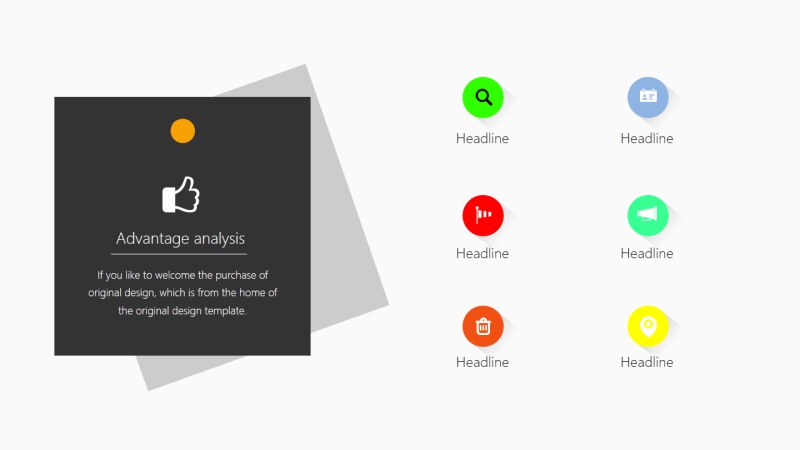
Fourth, make the color matching look more comfortable
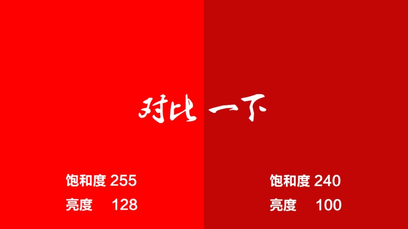
High saturation is mentioned above, the higher the saturation, the brighter the color.
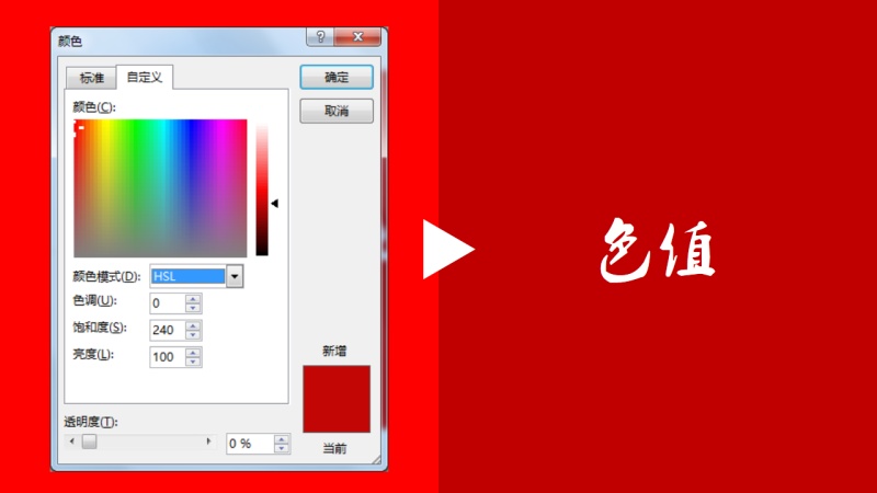
For other colors in the PPT pure color fill, you can call up the color toolbar, and you can see the hue by selecting the HSL mode.
Simply put, hue is the basic color. Slide the slider on the right to see the color change of this basic color, and the change is also around the basic color.
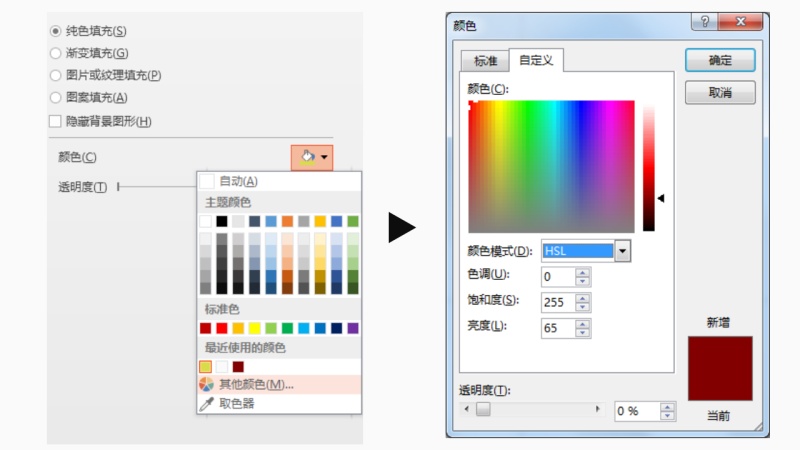 Therefore, a set of monochrome schemes can be configured by changing the hue.
It doesn't matter if you don't understand it before, just understand this. Turn down the brightness and saturation of the color so it doesn't blind your eyes.

In addition, I also prepared a color matching inspiration package, a complete and refined color card package, to make PPT color matching simple, you only need to use a straw to suck it. 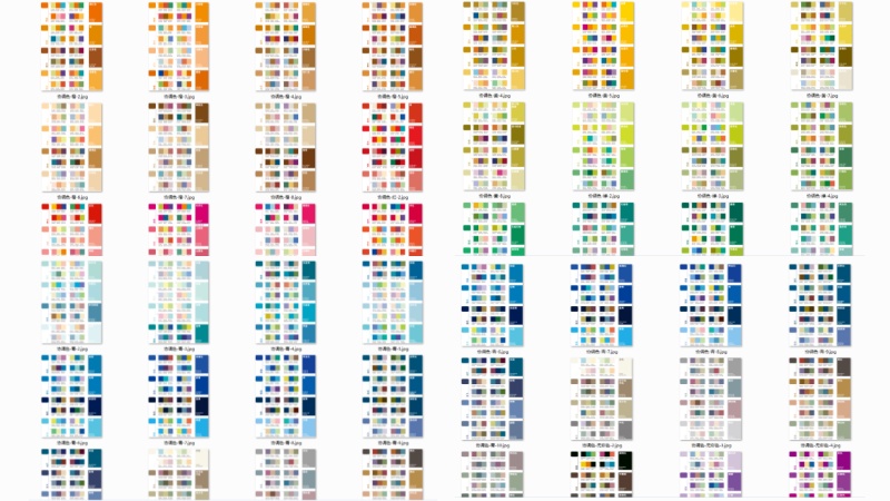
If you are familiar with PPT, you have reached the advanced stage. Walking on the street can also see PPT color matching or layout everywhere.
How convert to PPT?
When encountering a good store color scheme, advertisement, or magazine, you can take pictures with your mobile phone first. Then use QQ screenshot to absorb the color RGB value, and apply RGB to the pure color fill in the PPT.
If you use office2013, you can directly drag the photo to the PPT, and use the eyedropper tool to pick up the color and fill it.
Seven final conclusions
The color matching of business slides should follow the logical content, and the color scheme should don’t be fancy and disturb the vision.
Instead, use a lighter background color for better results. It is best not to use harsh color schemes. In order to make the color scheme look more comfortable, it is recommended to use a color value with lower saturation and brightness.
There should be no more than three colors in the slideshow, and it is best to use only one color to emphasize contrast. For more tips, search for demo home and pay attention to the official account.

Articles are uploaded by users and are for non-commercial browsing only. Posted by: Lomu, please indicate the source: https://www.daogebangong.com/en/articles/detail/Become%20a%20master%20of%20color%20matching%20in%20seconds%20PPT%20color%20matching%20cheats.html
 支付宝扫一扫
评论列表(196条)
测试