
The screen was swiped by a picture yesterday, and the two words "challenge" in the middle of the poster are nothing special.
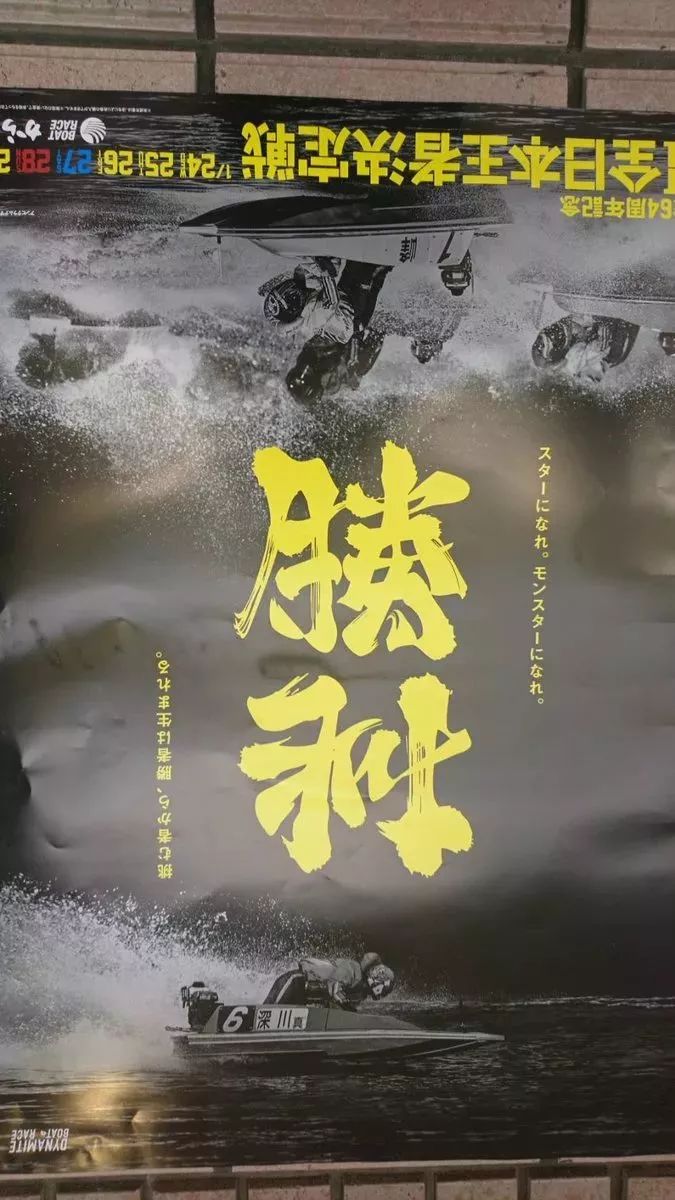
But in reverse, you will find that "challenge" instantly becomes "victory"!
In fact, this is the work of font designer Kazuki Nomura. Apart from this one, he also has some other great works. Now let’s take everyone to experience it~
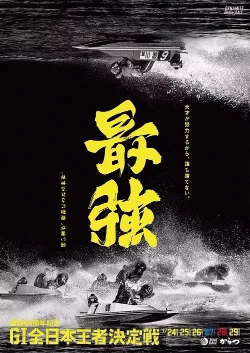
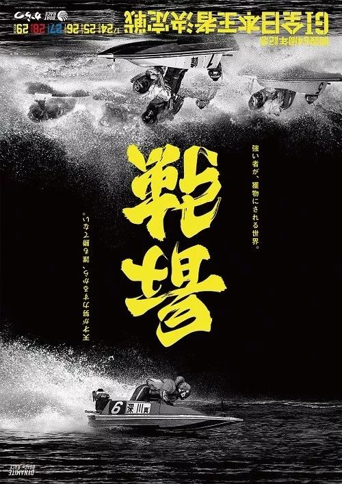
"Strongest" VS "Battlefield"
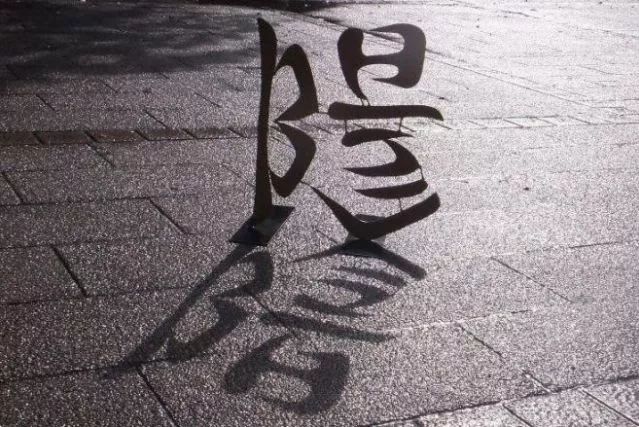
Yin vs. Yang
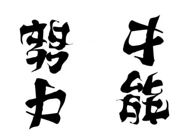
"hard work" vs "talent"
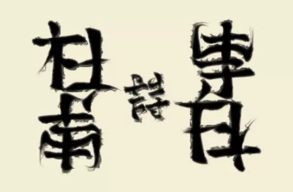
"Du Fu" VS "Li Bai"
"Nobunaga" VS "Mitsuhide"
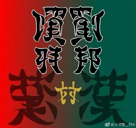
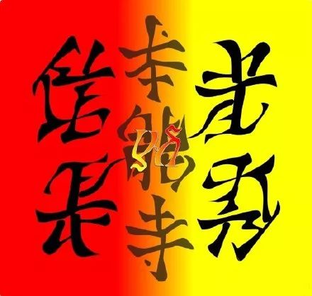
"Xiang Yu" VS "Liu Bang", "Chu" VS "Han"
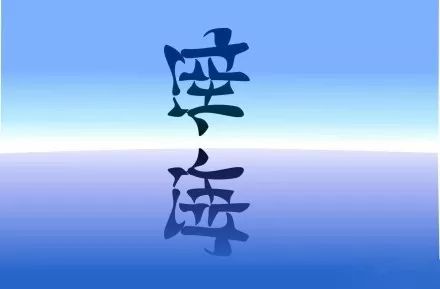
"Empty" VS "Sea"
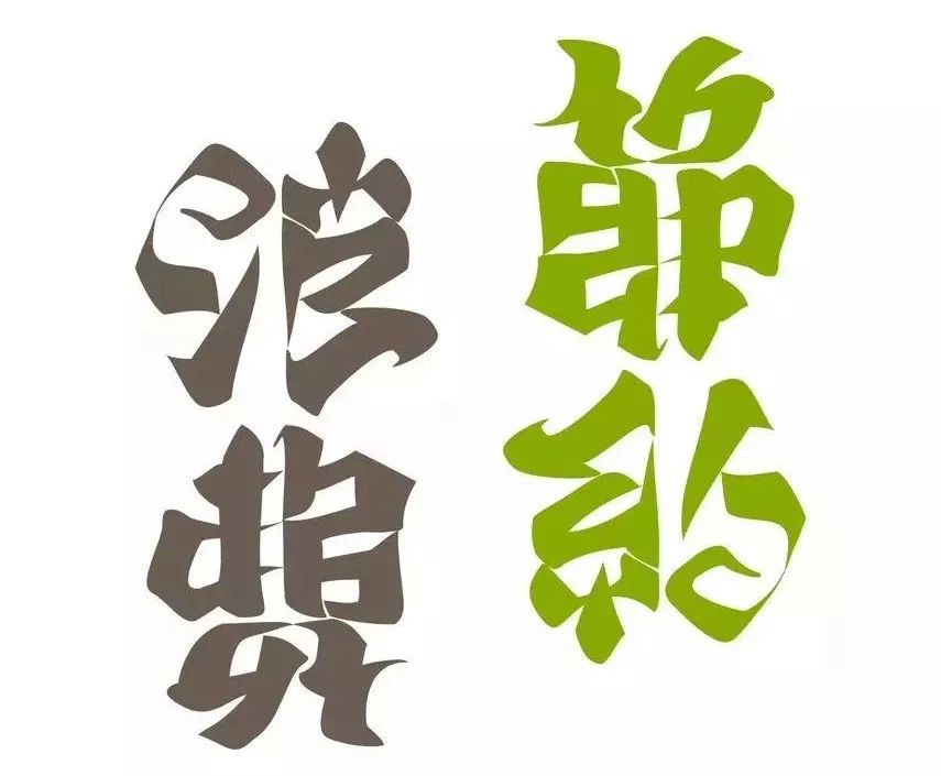
“Waste” vs. “Save”

This idea is so ingenious, I have to accept it!
Articles are uploaded by users and are for non-commercial browsing only. Posted by: Lomu, please indicate the source: https://www.daogebangong.com/en/articles/detail/Be%20stunned%20by%20these%20superb%20font%20designs%20Isnt%20it%20true%20that%20Chinese%20characters%20have%20become%20fine%20.html
 支付宝扫一扫
评论列表(196条)
测试