
Recently, some friends hope that Hanwentang can introduce the knowledge of Chinese fonts from the most basic, which is of course no problem! The basic Chinese fonts are Ming Ti, Hei Ti, Kai Ti and (imitation) Song Ti. Today I want to talk to you about black body and light body.
1. Their shape can be extended to different weights (weights)
2. In the era of metal movable type in the past, the four major fonts can be used for different typesetting purposes. For example, the text, title, and signboard (but I don’t seem to have seen a thick imitation of Song Dynasty... Khan)
3. They have a long history
4. They are difficult to design and make (especially italic and imitation Song!)
So, whether it is a character maker or a typeface company, Ming, Hei, Kai, and Song are generally used as representative works!
【黑体】< /section>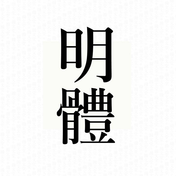
The horizontal strokes are thick, and the vertical strokes are also thick. The horizontal strokes are thinner than the vertical strokes, just to achieve a balance of visual thickness. "Hei Ti" is thick, rich in blackness and solid in expression, so it is called "Hei Ti".
Talking about the history of "Hei Ti", whether it is a master craftsman (see Liao Jielian's "One Character Life"), a design scholar (see Chinese Professor Li Shaobo's "Hei Ti Characters Research"), or a Japanese typography scholar (such as Komiya Mr. Hiroshi Yamashita), they all believe that "Black body" was first invented in Japan, and it can be seen in the subtitles of official newspapers in the 19th year of Meiji. In Japan, "黑体" is called "ゴシック" (read Goshikku, which means "Gothic" in American English, and today it is also divided into angle ゴシック black body and pill ゴシック round black body). Line body (San-Serif), and created according to the principle of Chinese character creation. (Author's note: It is very difficult to make black fonts, because its structure is contrary to the shape of Chinese characters. There are many principles that must be studied again and again before they can be discovered. I have to admire the minds of Japanese font craftsmen.)
“黑体” was only used for titles when it was first invented, and today it has become the most versatile and versatile basic font. It can be used well for titles, content, and notes. It is also the main font on electronic products today.
Usage: The shape of "黑体" can be traditional (such as Heiti-繁, ヒラギノ角ゴ) or modern (such as Siyuan Heiti, AXISBasic), and can be used from inner text to titles. Because the strokes are clear and hearty, it is also suitable for low-resolution screens, so the black body is mostly the main system font of the computer system.
Letter bold (VMType, JustFont)
Style keywords: between traditional and modern, imitation Kai structure
Advantages: Good composition, heavy characters, suitable for both horizontal and vertical layouts, very well-proportioned space, especially suitable for reading
Disadvantage: increasing word count
·Li Hei Ti (Huakang)
Style keywords: solid, clear, easy to understand, readable, full of energy
Advantages: first-class workmanship, bone structure is especially suitable for Chinese reading, excellent horizontal layout, strong flow, character spacing is a model of Chinese boldface
Disadvantages: lack of font weight, the existing three font weights are difficult to use today
Siyuan Blackbody/NotoSans (Adobe/Google)
Style keywords: modern, neutral, versatile
Advantages: Neutral, complete character count, heavy character weight, easy to use, advanced technology, free, suitable for all purposes, can replace Kotsuka Goshiック
Disadvantages: many serious bugs are still being fixed
Monnar Orthographic (Monnar)
Style keywords: traditional bones, strong cultural sense, tough strokes, Hong Kong sense
Advantages: complete fonts, sufficient version support, suitable for both horizontal and vertical layouts, widely used in Hong Kong magazines and newspapers
Disadvantages: embarrassing font weight, work needs to be improved, expensive, low font weight, hard to find in Taiwan, unsuitable screen, other font weights are not recommended
You ゴシック style (word tour workshop, with MacOSXMaverick comes with two font weights)
Style keywords: generosity, culture, humility, humanism, culture
Advantages: top-notch skills, complete number of Chinese characters, wide range of uses, applicable to all purposes
Disadvantages: lack of words and heavy (need to purchase separately), Hong Kong and Taiwan are difficult to find
ヒラギノ角ゴ (Dainippon SCREEN, comes with MacOSXMaverick with two weights)
Style keywords: generous, versatile, refined, geometric
Advantages: top-notch writing skills, few Japanese Kanji characters suitable for long Chinese reading, many Chinese characters, don’t recommend W8 word weight
Disadvantages: lack of words and heavy (need to purchase separately), Hong Kong and Taiwan are difficult to find
Super Blackbody (Huakang)
Style keywords: heavy, bold, traditional, full chinoiserie, title
Advantages: Produced by masters, Huakang Canghai Heritage Pearl, suitable for advertisements and titles
Disadvantages: traditional style, partial renovation is a bit rustic
Lanting Black (Founder, attached with MacOSXMaverick, three characters each in Traditional and Simplified Chinese)
Style keywords: no pretensions, super wide application, strong energy, and the palace is completely outside
Advantages: Teacher Qi Li's works, Fangzheng's representative works, complete support for traditional and simplified, unified style, strong versatility, and top-notch skills
Disadvantages: The style completely deviates from the aesthetics of traditional Chinese characters, the taste of the market, lack of elegance, too dense spacing and long reading is uncomfortable
【Ming body】
The "horizontal, thin, straight and thick" style comes from the "craftsman script" of the Ming Dynasty, so it got its name. In order to enhance production efficiency, engraving craftsmen in the Ming Dynasty unified the thickness of horizontal and vertical strokes to facilitate engraving. "Ming Ti" can be said to be a Chinese character style specially created for printing and reading through the joint efforts of many engravers and readers for hundreds of years. It wasn't until the middle of the Qing Dynasty that Western missionaries who were not good at the aesthetics of Chinese characters first fully horizontalized the horizontal strokes of "Ming Style" for the convenience of production, and "Carpenter Style" evolved into today's boxy, somewhat dull form. appearance.
Purpose: "Bright body" has a square shape and a stable center of gravity, which can effectively maintain stable reading. The layout expression created by the contrast of thickness is also more interesting and attractive than the black body. The thin typeface is suitable for content layout, while the bold typeface can be used not only for tone enhancement, but also for titles to create an elegant and cultural sense.
Li Song style (Huakang)
Style keywords: modern, strokes and calligraphy taste, honest
Advantages: Good workmanship, suitable for both horizontal and vertical layouts, and the space is suitable for titles and street signs
Disadvantages: Difficult to use font weight, less choice of font weight, not suitable for inner text heavy screen
Super Bright Body (Hua Kang)
Style keywords: modern, heavy, eye-catching, title
Advantages: master producer, Huakang Canghai legacy, suitable for advertising and title use
Disadvantages: /
Monar Arial (Monar)
Keywords of style: traditional, strong sense of culture, tough strokes, eye-catching
Advantages: large font weight, suitable for both horizontal and vertical layouts, suitable for books and newspapers, recommended for medium weight
Disadvantages: Expensive, few font weight options, hard to find in Taiwan, not suitable for screens with heavy text
You Mingchao style (word Yougongfang, with MacOSXMaverick comes with two font weights)
Style keywords: generous, soft, humble, humanistic, cultural
Advantages: top-notch workmanship, complete number of Chinese characters, wide range of uses, suitable for books and printing
Disadvantages: lack of words and weight (need to be purchased separately), Hong Kong and Taiwan are difficult to find, and the screen is not applicable
●Zhengtune Ming Dynasty Style (Xinxitang)
Style keywords: generosity, humanity, culture, flexibility, humanity
Advantages: top-notch writing skills, large number of Chinese characters, breaking the conventional horizontalization of Ming style, suitable for printing
Disadvantage: Hong Kong and Taiwan are hard to find
Although the "bright body" has a similar appearance to the western "serifed-style" (serifed-style), it is completely different in terms of history and styling. This is what everyone should know!
Author/JuliusHui Xu Hanwen

Born in 1984, Hong Kong native font designer and character designer, graduated from the Department of Visual Communication of the Design Department of Hong Kong Polytechnic University, and spent five years of campus life specializing in Western and Chinese character design. Immediately after graduation, he teamed up with Chris Tsui and Adonian Chan to form "Trilingual Design" (Trilingua). Soon after, he became a font apprentice with the well-known type designer Ke Chijian. In three years, he worked with Mr. Ke to create a project that was widely recognized in China, Hong Kong and Taiwan. The "Xin Hei Ti" font family.
After becoming independent, his studio juliushui.com successively designed the traditional and simplified Chinese logo for the New York Times, and the Chinese version logo for Bloomberg Businessweek, and was also a Chinese font consultant for Wallpaper* Magazine, Figtree and other large multinational design companies. In September of the same year, he joined the famous British font design company DaltonMaag, responsible for the design of Chinese, Japanese and Korean fonts, and participated in the development of the latest brand fonts of HP and Intel. Now he is the resident representative of DaltonMaag in Taipei and Hong Kong.
heyshow.com
Recommended by: Zhou Zhou Zhou Zhou Zhou Zhou...
【UTS contribution: 2650232288@qq.com】
Articles are uploaded by users and are for non-commercial browsing only. Posted by: Lomu, please indicate the source: https://www.daogebangong.com/en/articles/detail/Basic%20knowledge%20of%20Chinese%20fonts%20you%20must%20know%20Hei%20Ti%20Ming%20Ti.html
 支付宝扫一扫
评论列表(196条)
测试