I often see students in the group discussing a question, that is, how to highlight the key points of the picture?
I believe many people touch When it comes to this problem,The solution is to add a red box to the key area:
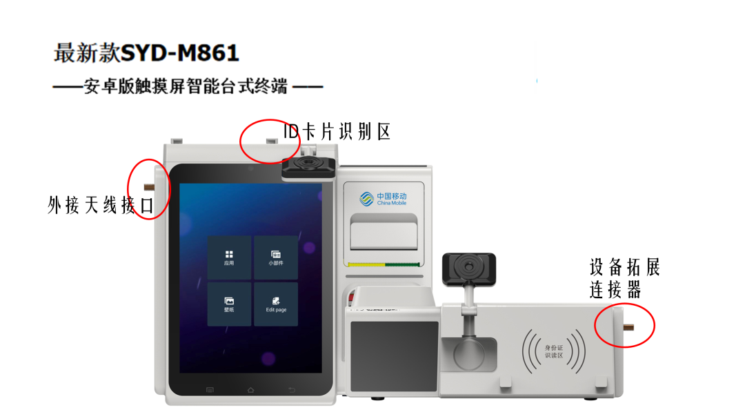
Of course, if What I got is the typesetting of multiple pictures, and the red frame is still added as always:

Then , when it is necessary to present the key points of the picture, is there no other way than adding a red frame?
Today's article , Let me chat with you about this issue.
The case source files involved in the article and 173 pages of selected background images are packaged at the end of the article, be sure to read to the end~
01 Change image layout
in multiple images When typesetting, if we want to highlight one of them, then, no injections, no medicines, no need to add a red frame,Just put the key image in the visual focus:

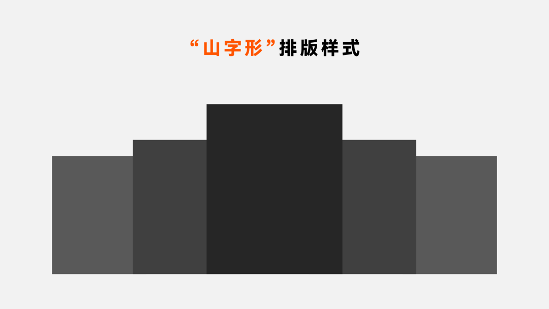
How to put it Woolen cloth? Share two classic layouts, they both put the key pictures in a more eye-catching position, that's all.
first first , by shrink the pictures on both sides to achieve the effect of emphasizing the key points:< /strong>
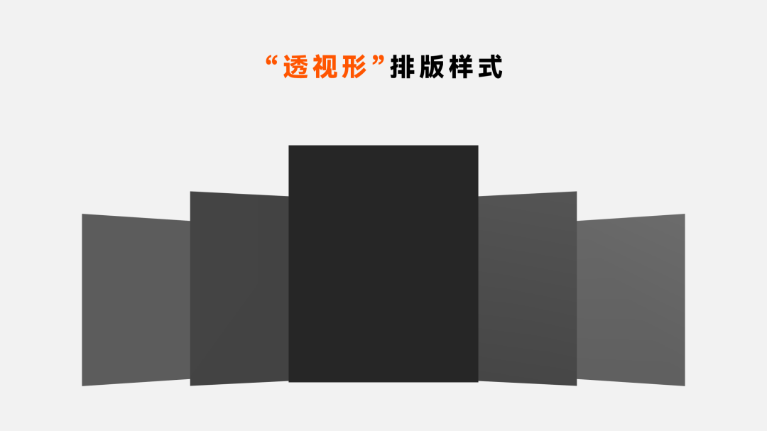
The second one , is to reduce the visual area by changing the three-dimensional rotation effect of the left and right sides of the picture, so as to highlight the key points :
Give a specific example example. For example, like this page:
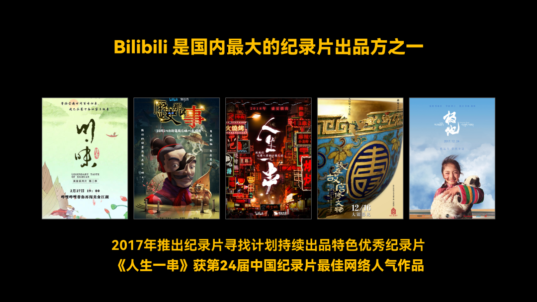
From the copy, What I want to highlight here is the documentary "A String of Life", so,We can Shrink the pictures on the left and right sides to highlight the key points:

Of course, if you use Another method is also possible, which can also highlight the key points:

The case source files and PPT typesetting templates involved in the article are packaged at the end of the article, be sure to read to the end~
02 Different Color Border/Underlay
If it is encountered Typesetting of multiple pictures,By adjusting the border or background color of some pictures, span> can also achieve the effect of emphasizing the key points.
What do you mean? To give a simple example, like this page, what I want to highlight is Baidu Tieba:

So, we'll You can use borders of different colors to highlight the key points:< /span>

In this way, It can also easily achieve the purpose of visual emphasis:

Of course, if App interface pictures,We can not only add borders, but also put a shell on the pictures< /span>, also has the same effect:

In addition to changing the picture Border effect, we can also change the background of the picture.
What do you mean? Also give an example. For example, like this page, which emphasizes new features:
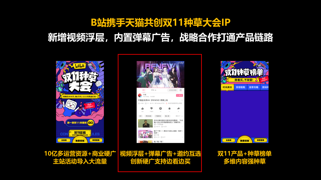
So, we'll You can draw 3 color blocks at the bottom of the picture and highlight one of them:

In this way, Can it serve a similar purpose?

03 Card Partial Method
This is more suitable When highlighting certain areas of a single image, we can partially enlarge it to achieve outstanding Effect.
Use this method There are two methods I usually use.
One It is to zoom in directly above the corresponding position of the picture
What do you mean? To give a specific example:
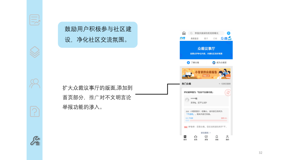
From the content , is to highlight the outstanding features, so,We can make this part of the screen, Crop it out, and through three-dimensional rotation, zoom in and place it on top of the original image:

Finally, simply add A background image can achieve a good effect:

For example, we When you want to highlight the partial information of a document, can you do the same?

Two By adding some marking lines to guide the enlarged area
This method, ComparisonSuitable for emphasizing the focus of a smaller area, what do you mean? Also give an example.
For example, like this page , used to introduce some features of the product:

So,We can take a screenshot of the corresponding area and zoom in,In addition, add a trapezoid to connect the enlarged images:

Introduction of other functions , you can also use the same method, so that the key points can be well highlighted:

How about it? Can this kind of layout not only highlight the key points, but also make the layout of the entire page more advanced?
The cases involved in the article The source files and 173 pages of selected background images are packaged for you:

You can:

Articles are uploaded by users and are for non-commercial browsing only. Posted by: Lomu, please indicate the source: https://www.daogebangong.com/en/articles/detail/Baidus%20official%20PPT%20is%20ugly%20especially%20the%20picture%20page%20I%20only%20use%20one%20trick%20to%20fix%20it.html

 支付宝扫一扫
评论列表(196条)
测试