Written in front:
As a PPTer who loves design, I want to use PPT to express everything I see. Popular movies like "Avengers 2" must not be missed, so this work was born naturally. My design level is very limited, and there are still many shortcomings in the PPT I made, but I am willing to share some insights from my creation with you. This can not only accumulate my own experience, but also may be helpful to "Xiaobai". He Le Why not?

Cover:
There is not much design on the cover, but the title text is added on the basis of the poster image. From this we can see how important a good material image is, and only simple modification can achieve a satisfactory effect. If time permits when making PPT, it is necessary to be patient and find a good picture. The text on the cover is all added and made in PPT, including the effect of mottled metal characters, which is also realized in PPT. In fact, the text and image processing functions of PowerPoint2013 version are still very powerful. Combining several functions, you can Get good results. (PS: If friends are interested in this effect, there may be a text production tutorial later.)
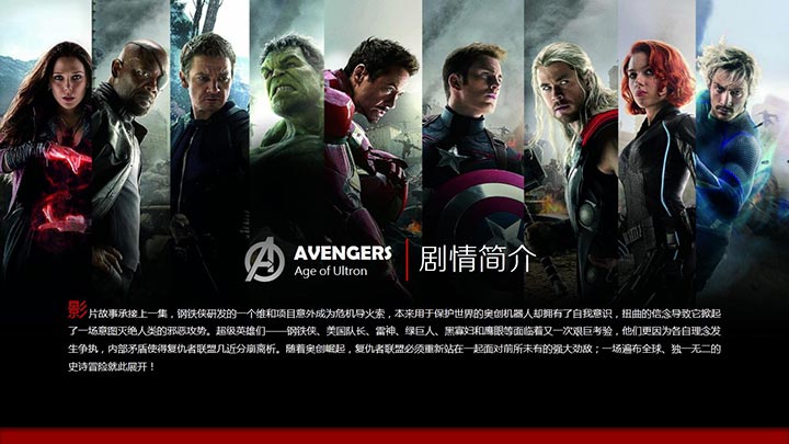
Synopsis:
When this set of PPT was still in the conception stage, the first expression method that came to mind was the effect of juxtaposing characters in a puzzle. It is a very stylish way to represent many characters. I did not expect such an official promotional picture. Take it and use it, save a lot of time. The overall structure of the text on this PPT page is relatively simple. Since there are not many changes in the layout, some details need to be slightly modified, so that the overall page can be changed and the visual effect is richer, such as paragraphs The enlarged initial text, the long red bar at the bottom, and the vertical line in the title text are all added for this purpose. In many cases, as long as the details are slightly modified, you can receive a completely different overall effect.
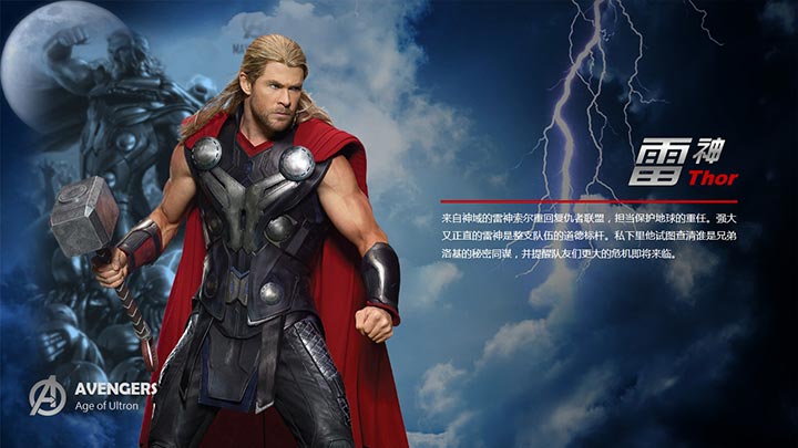
Thor:
This is the first completed page of this set of PPT. Through the design of this page, the structure of the entire set of PPT is basically established. Each character introduction page is composed of several parts such as pictures, character names, brief introductions, and logos. Although this set of PPT was positioned at the beginning to express characters in different styles on each page, it still needs to be consistent in terms of content structure, otherwise several pages of PPT with no connection will be really messy and impossible look! When conceiving the Thor page, I naturally thought of the background of the starry sky with thunder and lightning (there is always a big movement when the gods go down to earth!), this kind of material is still easy to find, simply crop the image as needed, and use a gradient rectangle to mask it. Make a background with a dark effect, place the cutout figure on the left, place the blurred picture behind, add text on the right, and then add the logo. After minor adjustments in the position, you're done. Other pages also basically follow this design idea, but the corresponding design is carried out according to the different characters.
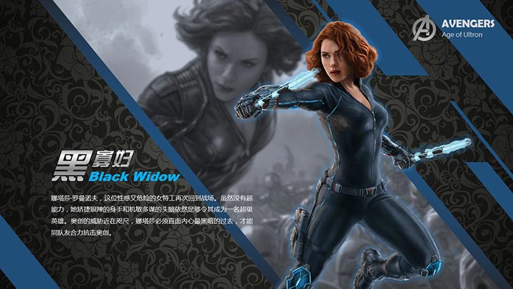
Black Widow:
This figure is full of dynamic movement, which establishes the direction for the design of this page, which is to express the dynamic. Of course, the oblique composition is the first choice. Use lines to strengthen the dynamic effect. At the same time, pay attention to the changes in the arrangement of the lines, length, thickness, and sparseness The harmonious combination of density and other aspects constitutes a complete page layout, which properly reflects the dynamic theme. In addition, the reason why the page chooses the background of dark flowers is because of the Russian background of Black Widow, and wants to show a little exotic style, but the selection of the picture is not suitable, and there is no material with a strong Russian flavor. In fact, this background still has a lot to offer. room for improvement.
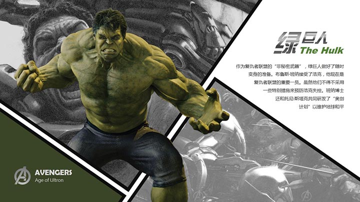
Hulk:
The most manga-style character shape gives people the first impression of being strong and tall, so these characteristics of him are intentionally highlighted during the design. If you want to show tallness in a limited space, you need to use contrasting techniques. Use the frame to limit the characters, and then let the characters break out of the frame limit, with a full composition, the tall effect will appear immediately. In fact, this method is very common in print advertisements. The entire page adopts the grid form of a comic book, and the background picture is placed in the grid, and the picture modification function is used to imitate the comic style, so that the color contrast between the black and white background picture and the main body of the character is produced, and the character is further highlighted. However, due to the limitations of the PPT image processing function, it cannot completely imitate the line drawing style of comics, so the overall effect is not achieved.
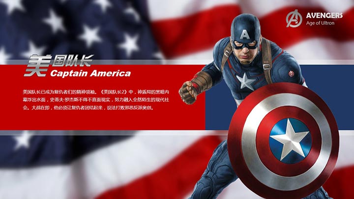
Captain America:
The whole set of PPT is darker in tone (usually the tone of sci-fi blockbusters), this Captain America is a relatively beautiful color scheme, so fresh in the dark! Background The American flag was the obvious choice for Captain, what background could be more suitable for him. In fact, the most obvious thing reflected from this page is the "level". When taking pictures, we should pay attention to the depth of field, and when designing PPT, we should also reflect the level. The figure in the front, the color block text in the middle, and the national flag background at the end are very clearly distinguished. Of course, if the national flag picture does not use the blur effect, this hierarchical relationship will be greatly reduced. Blurring the background is a very popular design technique at present, and if used properly, the effect is very eye-catching.
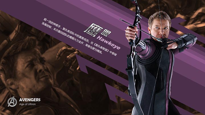
Hawkeye:
Of course, the archer page should highlight the existence of arrows, so this kind of oblique composition has become the first choice. The position of the lines must match the arrows in the hands of the characters, otherwise it will be very awkward. At the same time, the gradual transition of color also plays a role in guiding the audience's sight. The text also uses a slanted composition, which is only suitable for a small amount of text or titles. Long paragraphs of slanted text are tortured to read, and the display effect of the text is also reduced after the text is slanted, and it looks a little blurry, so this This form of typography should be used with caution. The purple color scheme on this page is not commonly used. The reason for choosing purple is to follow the method of color selection by drawing, and refer to the colors of the existing pictures for page color matching. Basically, they are relatively harmonious and there will be no major mistakes.
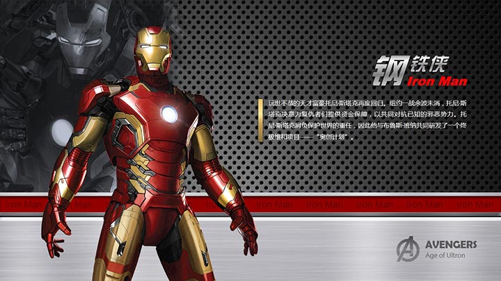
iron Man:
This page focuses on the metal texture. There are still a lot of such materials. Choose two metal materials with relatively high texture contrast, typesetting up and down, and transition with a red bar in the middle. The typesetting technique is very common, and the final effect is acceptable.
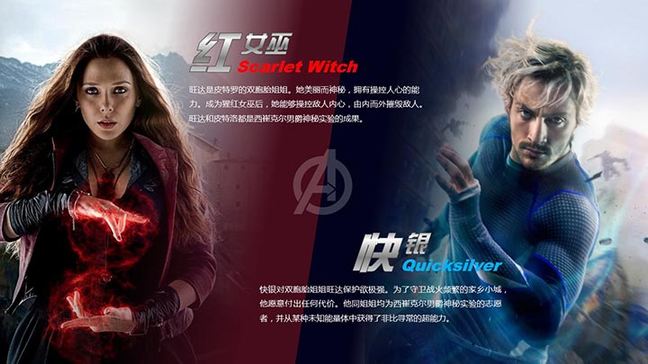
Scarlet Witch and Quicksilver:
It seems normal for two brothers and sisters to be placed on one page, but at the beginning of the design, I wanted to express them separately, but I didn't find a suitable picture material, and it was too troublesome to cut out the existing material (in fact, it was horizontal limited, can’t be picked out, huh) so the current form is adopted. If you put two square material images directly on the page, you will instantly feel very low. If you want a taller effect, you can’t let the audience see the square border of the picture. Enlarge the picture to solve some problems. The middle border needs to be blocked by design, so a gradient color bar is designed on the page. Of course, the color bar can’t be vertical. Place it so that the audience will still feel the existence of the boundary, so the color bar is tilted, which can be regarded as "crossing the sea". Coincidentally, the two brothers and sisters are one red and one blue, with contrasting color schemes, which are really suitable for such a typesetting composition.
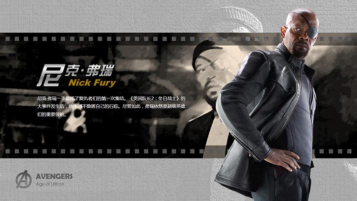
Nick Fury:
For some reason, seeing this old man always reminds me of the vicissitudes of life. So the expression form of film film was adopted. The specific production is very simple. The image processing is completed using the built-in functions of powerPoint2013. These effects seem to be of little use alone, but after combination and adjustment, the effect is still good when used in a suitable place.
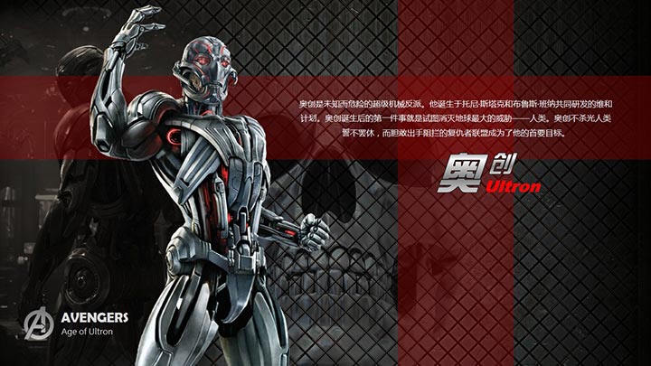
Ultron:
As the villain boss in Avengers 2, Ao Chuang is born with a dark style, so he chose a skeleton to match it, and the background metal mesh pattern also conforms to his metal material modeling characteristics. Use PS to fuse the skull with the metal background. Such a fusion effect cannot be achieved in PPT. In addition, all the cutouts of the characters in this set of PPT are done by PS. As a PPT designer, learn Photoshop Still very necessary.
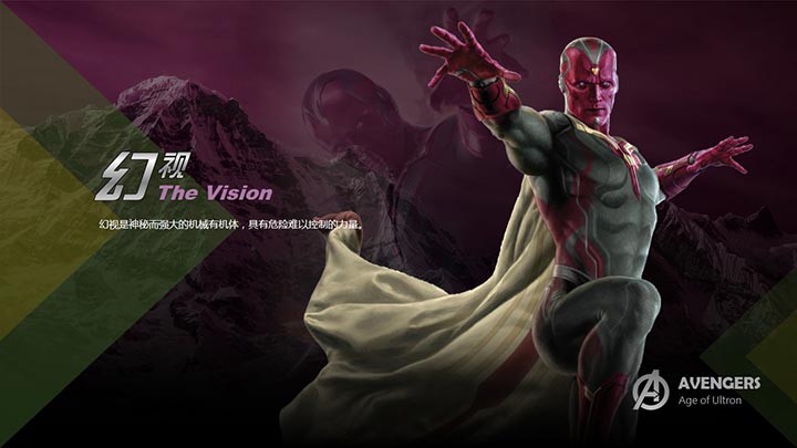
Vision:
This page can be used as a negative case. It’s a bit slack to do the last page, and I don’t know much about this character, so the design of this page is relatively rough. I chose an unrelated picture for the background, took two colors on the character picture, and made simple decorations with triangles. This page is designed in this way, and of course we can't expect any good results. Therefore, the experience to be learned is also obvious, and the word "seriousness" must be adhered to at all times, which is the basis for doing good things.
Finally, let me say one more thing, I can see that the friends here also really love PPT! Aren't you bothered by so much chatter? hehe! Finally, I sincerely hope that the above text can inspire and help you. thank you all!
Articles are uploaded by users and are for non-commercial browsing only. Posted by: Lomu, please indicate the source: https://www.daogebangong.com/en/articles/detail/Avengers%202%20PPT%20Design%20Essay.html
 支付宝扫一扫
评论列表(196条)
测试