Double exposures have been around us, everywhere, for a long time. This is an interesting photography technique that combines two or more exposures into a single image.
Let's learn this double exposure tutorial today! Very simple steps can have very dazzling effect!
Final effect:
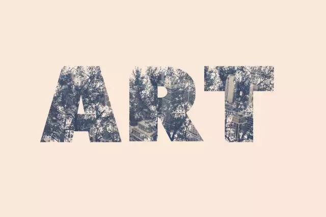
The following resources were used in the creation of this tutorial:
Peace Sans Regular font, font download address: http://www.fonts.net.cn/font-19120745552.html
Twig Image (CherrykaStock)
New York Building (Greg Becker)
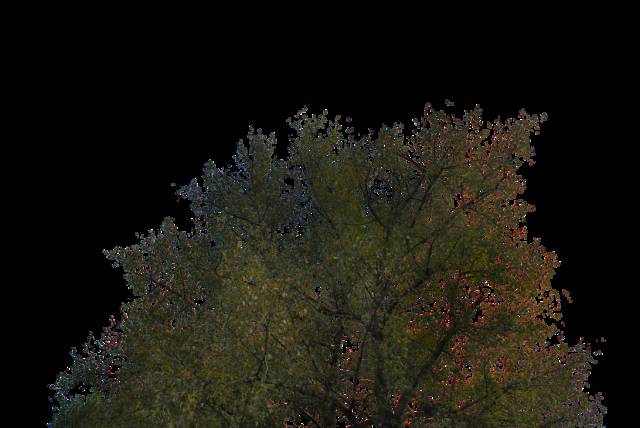

1. Create text
Step 1, first open our PS Daddy, click File to New, create a new 1500 x 1000 px document, and fill the background with white.

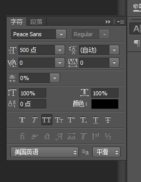
I posted the URL of the font before, you can download it, if you don’t like it, you can use your favorite font! The size here is set to 500 pt, you can set it as big as you like, the point is to be able to show the details!
Step 2, place the branch image on top of the text layer and resize it as needed.

2. Layer mask of branches
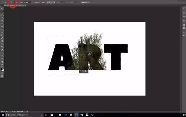
Step 1, Ctrl-click the thumbnail of the text layer to create a selection.
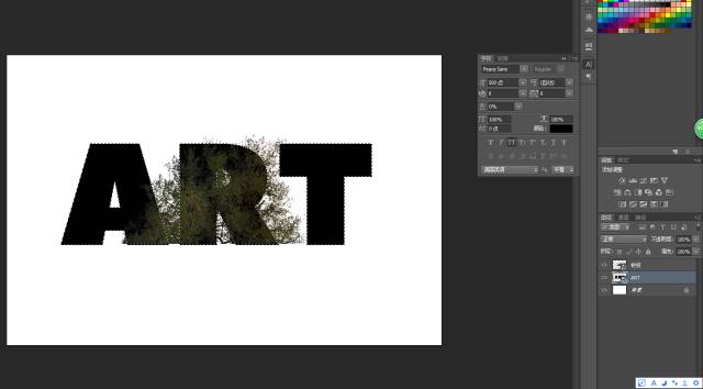
Step 2, select the rectangular marquee tool, and then click the Intersect with selection icon in the option bar to draw two rectangular selections and deselect the other two letters first.

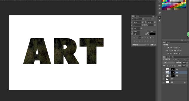
Step 3: After selecting the branch layer, click the "Add Layer Mask" icon at the bottom of the "Layer" panel to add a mask to the branch.

Step 5, place a new copy of the branch image, and then repeat the above steps for each remaining letter, but choose a different letter each time, pay attention to each Each letter must have its own branch layer mask.
3. Adjust the position of the branches in the mask
Step 1, Click the eye icon next to the layer to make the original text layer invisible.
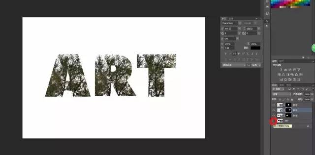
Step 2, click the chain icon between the layer and mask thumbnails to unlink them. Then you can adjust the image within the mask, rather than the entire layer at once. Press Command (CTRL)-T to enter Free Transform mode. Move, rotate and adjust the branches in the letters until you feel comfortable looking (however). If you feel happy and pleasing to the eye, you can press the enter key.

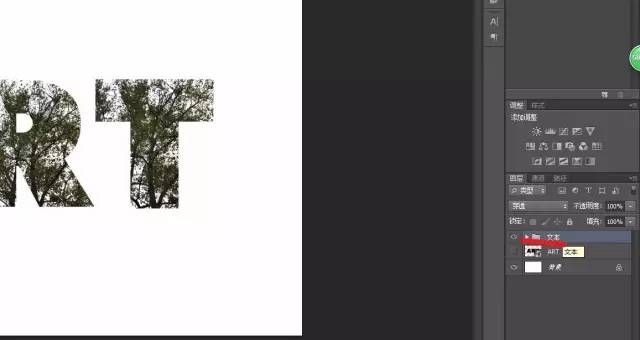
Step 3, repeat this operation for other letters, and don’t forget to relink the thumbnails when you’re done. Put all the branches' layers in a group and name it Text.
4. Add gradient map
Step 1, click the Create New Fill or Adjustment Layer icon at the bottom of the Layers panel and choose Gradient Map.
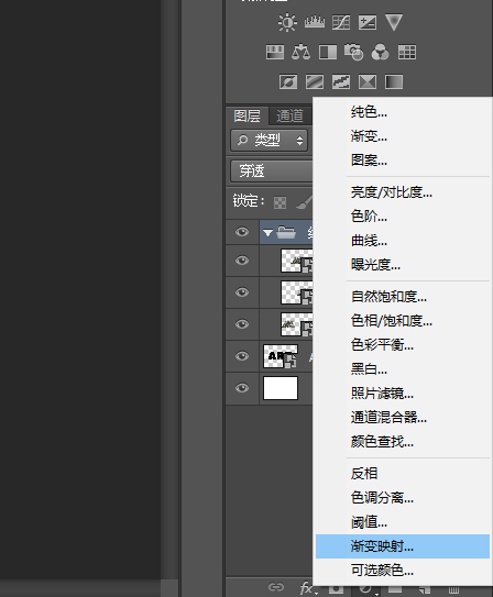
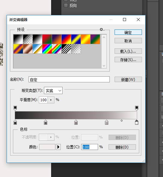
Step 2, click on the gradient box

To create a new gradient, you need to click below the gradient bar to add color stops, and when you click on each color stop, you can change its color and position value. The following are the color scale values used from left to right:
#282828 - 0%
#5c5353 - 25%
#877a7a - 50%
#ada3a3 - 75%
#f1eded - 100%
Step 3, place the New York building image above all layers, resize it as needed, and change its layer's blending mode to Lighten. Ctrl-click the thumbnail of the text layer to create a selection, then click the Add Layer Mask icon to mask the building image. To complete the double exposure effect, add more color adjustment layers to enhance the final result.

5. Adjust coloring
Step 1, add another gradient map adjustment map on top of all layers Layer, #48406e on the far left, #76747e in the middle and #fbc690 on the far right to create the gradient. Then, lower the layer's Opacity to about 35%.

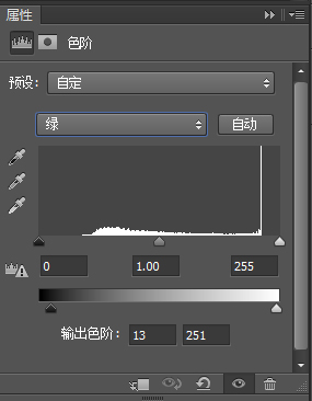
Step 2, pull a Levels adjustment layer on top of all layers, and adjust the settings for each channel, as shown below:


Done! Flowers, flowers!
Articles are uploaded by users and are for non-commercial browsing only. Posted by: Lomu, please indicate the source: https://www.daogebangong.com/en/articles/detail/As%20a%20designer%20dont%20you%20know%20how%20to%20do%20double%20exposure%20effects.html

 支付宝扫一扫
评论列表(196条)
测试