From the beginning of literacy in childhood, one gradually understands the strokes and strokes of Chinese characters to the radicals, which is the whole character. Chinese characters are structured, and the structure of different Chinese characters is its basic framework. From the perspective of calligraphy, Chinese characters also have different styles, including five basic fonts: seal script, official script, cursive script, running script, and regular script. The creation of calligraphy, no matter what kind of calligraphy is written, is written one by one according to the basic structure, from intangible to tangible, and falls on the paper to form a complete and tangible calligraphy work.
 Wang Xizhi's "Description Post"
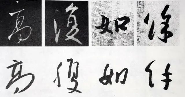
Take Wang Xizhi's "De Shi Tie" as an example, such as the red mark, the outline of the word tends to be round.
Kang Youwei proposed in "Guang Yi Zhou Shuang Ji" that "books are form studies." Kang's form studies here should include two levels of content-structure and shape. Chinese characters are composed of each dot painting, which is an independent individual. The process of combining and consolidating Chinese characters is modeling, and this process has both objectivity and subjectivity. Due to the difference in font structure, such as up-down structure, left-right structure, etc., the structure is fixed and objective. The method of concluding characters is subjective. It is dominated by the subjective consciousness of the writing subject, and the written calligraphy will have different shapes, which leads to the problem of different styles.
Writing calligraphy is an artistic process. Structure modeling is the most basic element of compositional layout. From structure to shape, there is a progression of time and space, from objective to subjective, infused with the subjective consciousness of the writer (author, calligrapher), which is the author's ideological and emotional aesthetic. The expression of consciousness is sublimated from the inherent form of Chinese characters to art.
 Deng Shiru's seal script "The Six Screens of Bai's Thatched Cottage"
We define a piece of created rice paper as a flat space, and a complete and tangible calligraphy work divides this space into many spaces. The first is the structural division space of each Chinese character, and then the space outside the shape of the character structure. If we observe the spatial characteristics of the structure, these spaces (two-dimensional spaces) have different shapes and sizes, some are completely isolated, and some are completely isolated. It still maintains some connections with other spaces.
Different fonts will produce different spaces, and each font, each style, and each work has specific characteristics. The characteristics of these spaces provide a new understanding of the ever-changing character structure. The shapes of these spaces form different spaces due to different book styles, and also produce different spaces due to different authors. Different spatial shapes give us different feelings, and there are simple and unadorned relationships between space and feelings, such as regular script and seal script. The feelings brought about by the complex combination of spaces are also more complicated, but the different feelings brought about by the word structures of different works are clearly discernible.
When we appreciate a certain calligraphy work, we don't look at each character, but look at the space division outside the character, and we will get different feelings. In addition, if a calligraphy work is reversed, the characters will become white and the space will become black, which will bring different feelings visually.
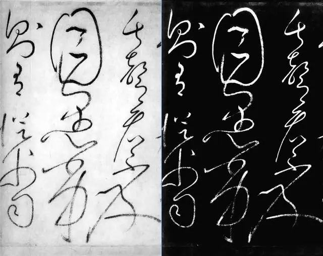
 Local Space Segmentation in Huai Su's Self-Reported Post
Then there is the size of the space division area. The size of the unit space inside the character structure is different, and their distribution can be roughly divided into two categories: uniform arrangement and non-uniform arrangement. The uniform arrangement refers to the similar space area of each unit in the word structure. Non-uniform arrangement refers to that the area of each unit space inside a word is not equal. Some spaces inside the word are larger, and some spaces are smaller, but if you observe carefully, you can find that the larger spaces have similar sizes, and the smaller spaces have similar sizes. If the unit space area is as close as possible, these word structures are just well-proportioned and stable.
With the passage of time, a certain grasp is formed, which becomes the long-term subconsciousness of the writer, and gradually forms a style.
This knotting style has become the starting point for us to observe the various knotting styles of calligraphers. With such a principle, judging the structural creation of a calligrapher can be used as a yardstick.
 Comparison of Badashan's character structure (below) and Wang Xizhi's character structure (before)
Observing the character structure through the shape and area of the internal unit space of a character, you will find the method that some calligraphers create on the character structure. The knot characters of Bada Shanren are very individual. Bada Shanren exaggerates the space of a certain part of the font. The exaggeration of a certain space inside a single character creates a strong contrast with other spaces, forming an important standard of Bada Shanren's calligraphy style. .
 Part of Zhang Jizhi's Buddhist Sutra
If you connect the endpoints on the outer edge of the character structure and observe the circumscribed polygon of the character structure, the shape of this polygon has an important impact on the character structure, and you can draw a conclusion that the works of different calligraphers will have a completely different representation. It's a completely different style. For example, the circumscribed polygons of the character structures of Wang Xizhi, Huang Tingjian and Mi Fu.
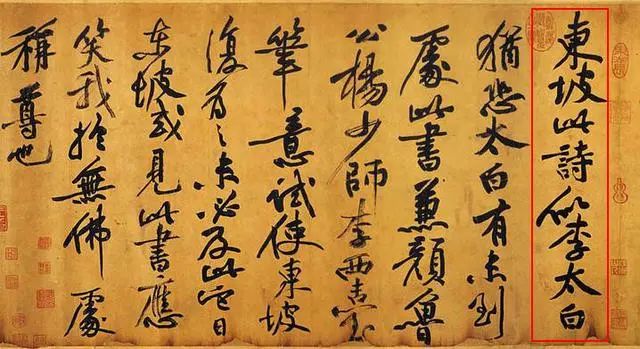
 Huang Tingjian's postscript on Dongpo's cold food poem
Wang Xizhi, approaching a circle; Huang Tingjian, a sharp and exaggerated polygon; Mi Fu: approaching a square polygon.
Because everyone has the habit of their own movements and the habit of using force when writing, such as writing and painting. The strokes drawn on the lower left have a habitual direction and rhythm. After the writing matures, this habit becomes a person's writing action pattern. It is formed in the subconscious during long-term writing, unconsciously, but very stable. This writing pattern is reflected in every word structure.
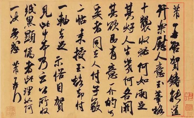
Appreciating "He Zhutie" in cursive script by Mi Fu
When appreciating calligraphy works, spatial characteristics such as unit space, circumscribing polygons, and parallel gradients in the works usually fall into the consciousness of the viewer, which has objectively affected the subconscious mind of the viewer.
When a connoisseur forms a formula for the works of every calligrapher in the history of calligraphy, he can grasp the style characteristics of the calligrapher and provide a benchmark for authenticating the works of the calligrapher. Human beings are not printing machines, and their own subconsciousness will be injected into the re-imagining of the writing. From this point of view, the authenticity of the work is the most important basis for judging the authenticity of the work from the style of the calligrapher. As for other forgery, paper, seals, old-fashioned, etc. have become auxiliary. It seems that it is not easy to develop a keen eye for appreciation. Will there be a vertical painting connoisseur who can't write or draw?! (one)
Articles are uploaded by users and are for non-commercial browsing only. Posted by: Lomu, please indicate the source: https://www.daogebangong.com/en/articles/detail/Appreciation%20of%20CalligraphySpace%20Segmentation%20and%20Style%20of%20Calligraphy%20in%20Font%20Structure.html
 支付宝扫一扫
评论列表(196条)
测试