I encountered such a requirement in the project before: the same page supports skinning of different themes. The background color and text color can be easily realized through CSS; some solid color small icons can also be converted into font icons first, and then use CSS to set the color and size. Another element on the page—Logo is a gradient icon. The traditional way is to cut Logo under different themes into pictures and then introduce them. The inconvenience of this method is that every time a theme is added, the picture has to be cut again. So I thought, can the Logo also use the font icon + to achieve a gradient color, so that it is convenient to use CSS to set the color and size?

Before describing the solutions to the above problems, here is a brief introduction to several usage methods involved in traditional small icons (as shown in the figure below).

Traditional: Image
The most basic but also the worst way, a small icon is a picture, which will inevitably increase the number of HTTP requests, which is also one of the directions for website performance optimization; and if it is used on the mobile terminal , but also consider the problem of 2x screen and 3x screen. Of course, the biggest advantage is the best compatibility.
Going Further: Sprite Maps (CSS Sprites)) span>
This method is to integrate some background images in the web page into a large image, and then use the CSS background positioning to display the part of the image that needs to be displayed.
Advantages: Reduces the loading of webpage images The number of server requests, thereby improving the loading speed of the page;
Disadvantages:The distance between small icons should be determined to avoid adjacent pictures in Sprite being "Exposed"; if the sprite map is complex enough, it will greatly increase the difficulty of writing and maintaining CSS code.
Now: Font Icon
A more elegant icon application method than CSS sprite technology, such as: Font Awesome, IcoMoon, Iconfont, etc.
Advantages:
Icon vectorization, no longer have to worry about distortion under 2x or 3x screen;
It is essentially a font, so you can use CSS to flexibly control the size, color, shadow, etc. of the icon;
There are many icons on all major platforms, so you can easily find what you need, and if you have customized needs, you can upload them quickly;
Files, converted to font icons.
Disadvantages:
The support for multi-color icons is not perfect.
2 with Iconfont as an example to describe the use of font icons
Step 1: Enter the Iconfont official website, select a suitable icon (you can upload an SVG file to generate an icon), add it to my project, click to download it locally, or directly use the online link;

Step 2: Use icons. Among the downloaded files, the following three files introduce the use of unicode, font-class, and symbol respectively. The introduction is very detailed and will not be repeated here.

Here is a brief comparison of the following three citation methods:
unicode (the most original, the best compatibility Ie6+, does not support multi-color .)

font-class (variant of unicode method , writing is more intuitive, mainly to solve the problem of unintuitive unicode writing and unclear semantics, good compatibility with Ie8+, and does not support multi-color.)

symbol (poor compatibility, supports ie9+ and modern browsers, supports multi-color icon)
A brand new way of using, it should be said that this is the mainstream in the future. In fact, it is a collection of svg.

2< span >The use of monochrome icons, multi-color icons, and gradient icons
Single Color Icon
All three reference methods are supported. It is recommended to use the font-class method, which is easy and intuitive to write.

Multicolor icons
Only supported in symbol mode. In the introduction of symbol, there is such a sentence: "Through some techniques, support like fonts, through font-size, color to adjust the style." In my own practice, I found that font-size Controlling the icon size is easy to implement, but color adjustment has been unsuccessful.
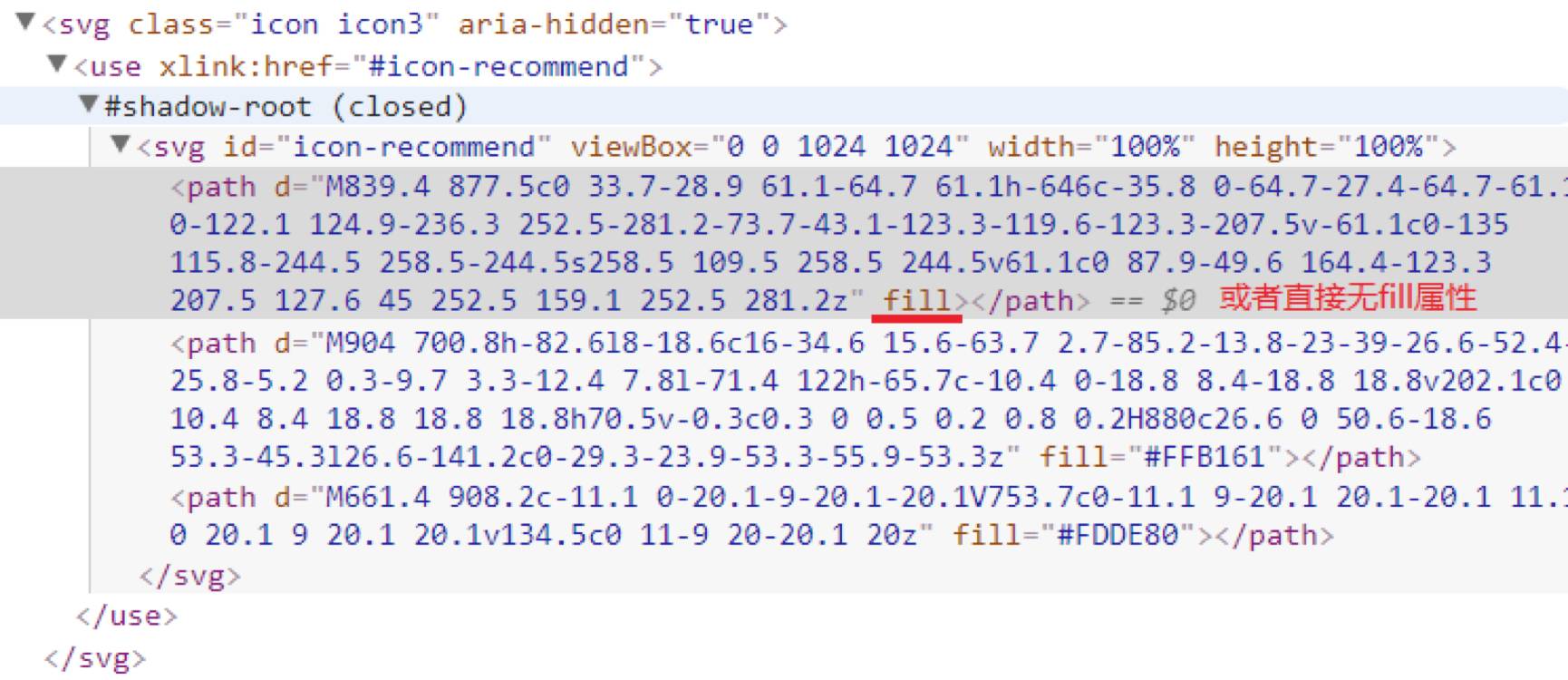
After several studies, it is found that the SVG file that generates the font icon contains one or more path tags, and each path can specify the fill color, which means that the color fills the entire path path, but Once the fill attribute is specified, even if the svg tag sets color, it will not change the color of the path. See the picture below for details:

Visible: the color: red set by the svg tag is not displayed on the icon.
Based on this, if you want to modify the color of a certain part of the font icon, there are 3 ways:
When converting the design into an SVG file, set the corresponding path not to be filled with color or to be filled with #000000;Find the corresponding path in the SVG file, remove the fill attribute, or set fill="#000000", and then upload the SVG file and convert it into an icon;
Modify iconfont.js, find the path corresponding to
, and remove the fill attribute.
Open in the elements of the browser console, as follows:

Next, you can happily modify the color of the multi-color icon~
But note: only the path (can have more than one) that does not specify the fill color can respond to the color of the svg tag.
The essence is: the color specified by the svg tag is rendered on all subpaths that do not specify the fill color.

The usage scenarios can be: normal state and highlighted state of the icon.
Gradient icons
Unicode and font-class methods are supported, it is recommended to use font-class methods.
This is achieved by using the gradient of the css3 background color. The inspiration comes from an article "Realization of Gradient Text Effect under CSS3" by Zhang Xinxu. First look at the effect:

The core idea is the following three sentences:

The first sentence: background: -webkit-linear-gradient(left bottom, #fb2c61 , #fac362); (The background color gradient effect is realized through CSS3. Here is a linear gradient from the lower left corner to the upper right corner. )
Second sentence: -webkit-background-clip: text;
(Specify the drawing area of the backgroundis the text part.)
The background-clip that I have been exposed to before has the following values:
background-clip: border-box (default)|padding-box|content-box;
Meaning respectively, The background is clipped to the border box | The background is clipped to the padding box | The background is clipped to content box.
background-clip andbox-sizingI feel the same way~
The third sentence: -webkit-text-fill-color: transparent;
(text fill color)
*Note that it must be defined as transparent, otherwise it will cover the background color at the bottom.
The -webkit- prefix is used here, Chrome and Safari can be used normally, and the new version of firefox can also be used normally after testing. Therefore, if there is a compatibility requirement, this method should be used with caution.


Articles are uploaded by users and are for non-commercial browsing only. Posted by: Lomu, please indicate the source: https://www.daogebangong.com/en/articles/detail/Application%20of%20Iconfont%20multicolor%20icons%20and%20gradient%20icons.html

 支付宝扫一扫
评论列表(196条)
测试