
Super detailed! Guests and theme introduction of the Android Bus Developers Conference
I haven't learned about the content of android fonts in detail. In actual development, I always pay attention to the spacing between the font and other controls on the design draft, and the inside of the font The line spacing of .
Font structure
In order to understand the font, we first need to understand what is in the font.
When analyzing the font, we basically only need to focus on the vertical direction, as shown below
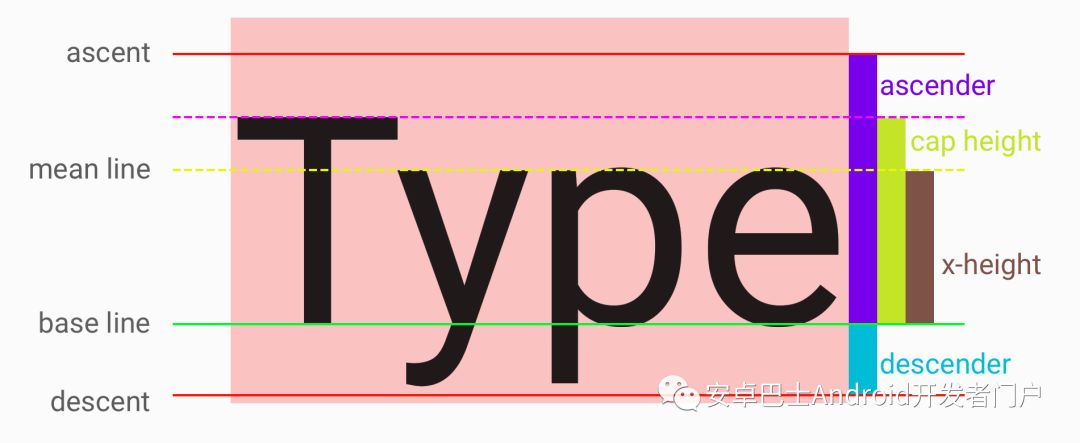
There are 5 key horizontal lines in the vertical direction.
The green horizontal line is the most critical baseline (base line), and the position of the font is relative to the baseline , so From the perspective of coordinates, the baseline is the coordinate axis of y=0.
The top (ascent) and bottom (descent ) are the upper and lower 'boundaries' of the font respectively.
Attention, although it is said to be a 'boundary', may exceed the boundary when actually rendering the font. I personally understand that these two lines are considered by the font designer at the design level< /strong>A reference value provided to the program. These two lines can be set by the designer when designing the font.
The area from the baseline to the ascent is called the ascender, which is the purple area on the right side of the figure.
The area from the baseline to the descent is called the descender, which is the blue area on the right side of the figure .
The yellow dotted line is the main line (mean line), which determines the height of the lowercase letters with no ascender, such as e, z, c, etc. This height is also called x-height ), which is the brown area on the right side of the picture.
The cap height of the rose red dotted line is the green area on the right side of the picture.
Em, UPM
In addition to the basic structure above, we also need to understand the concept of Em, which is also called UPM in some places. Simply put , There needs to be an abstract unit to describe the height of the font between the font designer and the program. In the era of metal movable type printing, there was Em to represent the height of a metal block, so it is used before Em is used to represent the basic unit of fonts.
Key knowledge points: In Android, when setting the text size, it is to set the size of 1Em.
Em isThe font designer decides to divide 1Em intohow many parts when designing, and then the distance in other fonts is described by the size of the relative Em strong>.
Many of the values mentioned above are set during font design, obviously these settings are saved in the font file, and in Android, the most commonly used font file format is .ttf(True Type Font), so it is necessary for us to understand this file a little bit.
TTF (True Type Font) file
TTF is simply a standard, used to describe the unified font.
Our purpose is not to design fonts , just want to find out how the settings in the font affect the display of the font in the Android TextView, especially want to find out how to calculate the space occupied by the font in the vertical direction according to the font file.
Attention, many of the following conclusions about Ascent and Descent are obtained through Code measurement, the ability is limited, and the principle is not clear, I hope friends who know can comment and supplement :P
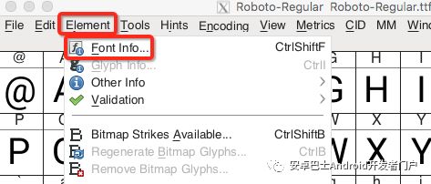
Analyze font file settings, we need a tool to view these .ttf files, I use FontForge here, use this software to open Roboto Regular, the default font of Android, and look at the font information .
After opening the file, select Element ー> Font Info to open the font information panel
Look at the General option first

As can be seen from the figure above, in Roboto, 1Em is divided into 2048 parts,
Actually, most ttf fonts divide 1Em into 2048 parts. Some fonts may also be divided into 4096 parts.
You will also see the values of Ascent and Descent here, but after actual measurement, these two are not Ascent and Descent that are actually used in Android. What is the difference between this)
Real in Android Ascent and Descent values need to see the OS/2 option
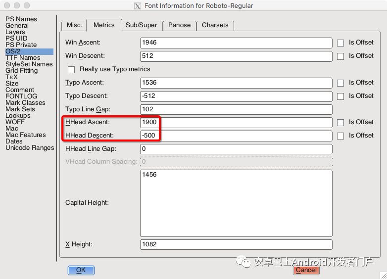
Measurement The conclusion is that the two values in the red box are Ascent and Descent in Android.
Win Ascent and Win Descent at the top of the figure represent the highest and lowest boundaries of all characters, but these two values do not correspond to the values in Android, the reason is unknown...
You can also see the values of x-height and cap height in this picture.
So what does this 1900 and -500 mean?
Pixel Counting
To calculate the height of a font, you need to keep the following in mind:
When setting the text size, set the value of 1Em
Roboto divides 1Em into 2048 shares
In Roboto, Ascent is 1900, Descent is -500
In the font, the baseline (base line) is the coordinate axis of y=0
According to the two points 1 and 2, we can know that the value of 1 part is(textSize / 2048) px, assuming text The size is 2048px, so 1 part is 1px.
And 1900 means that Ascent is above the baseline, and the distance is 1900 parts. -500 means that Descent is below the baseline, and the distance is 500 parts.
So theoretically, if the font The text size is 2048px, so for this Roboto Regular font
ascender = 2048px / 2048 * 1900 = 1900px
// Same reason
cap height = 1456px
x -height = 1082px
descender = 500px
Total height = ascender + descender = 1900px + 500px = 2400px
Open any software, use the Roboto Regular font in the text Enter a piece of text in the box, and it is easy to verify that this conclusion is correct. The following figure is a screenshot of the verification using Sketch
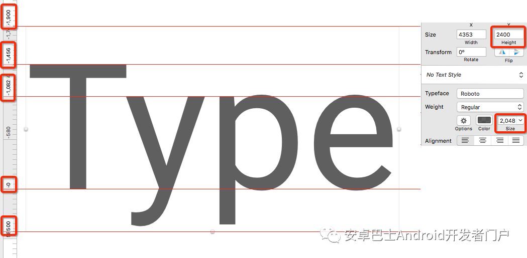
The baseline is 0, the distance between each line and the baseline can be seen on the left, and the total height of the text box is 2400px on the right, which is consistent with the calculated value.
Is it the same in Android's TextView?
The font structure in Android TextView
The values measured in each area in Android are also consistent, but the height of the font is not equal to TextView, as shown in the figure below

Pink is the background color of TextView, you can see that there is a little distance between Ascent and Descent before reaching TextView, which is the fontPadding marked with an orange square on the right.
Seeing this fontPadding, I can't help but have a few questions
What is this fontPadding? What is it for?
Who added these two distances? Is it the font designer or Android itself?
There is also the question we are most concerned about, how to calculate the value of these two distances?
Let's look at each question one by one.
font padding
I think the Ascent and Descent set when designing the font are just a reference value, because there are other fonts in the world besides letters and numbers, For example, fonts with umlauts at the top and artistic fonts need to occupy extra space, so font padding is this extra space to ensure that all fonts can be displayed in the area.
Actually, as mentioned above, the Win-Ascent and Win-Descent in the ttf file have this function, but they are not consistent with the actual values read in Android.
So how do these two values be calculated? The solution I found so far is to use Paint#getFontMetrics to get these two values through code.
FontMetrics
First briefly introduce this class, which contains 5 variables
top: The upper boundary, because in Android, the positive direction of the y-axis is downward, and the baseline is y=0, so this value is a negative number.ascent: The Ascent value set in the font file (that is, the HHead Ascent seen in FontForge mentioned above), is also a negative number, the reason is the same as abovedescent: The Descent value set in the font file (that is, the HHead Descent seen in FontForge mentioned above), a positive numberbottom: lower boundary, positive numberleading: Between two lines, the distance between the bottom of the previous line and the top of the next line, however, this value is always 0 and can be ignored.
For more specific instructions, please refer to this answer Meaning of top, ascent, baseline, descent, bottom, and leading in Android's FontMetrics
The top font padding is |top - ascent|, and the bottom font padding is bottom - ascent
Let's measure the following, and read the relevant values of the font through the following methods
public  static void printFontMetrics(Context context, @ FontRes int fontRes, int emSize) {
 Paint paint = new Paint();
 // Set font, use compatibility library to get Typeface instance through font resource id
 paint.setTypeface(ResourcesCompat.getFont(context, fontRes));
 // Set the font size to em size for easy viewing
 paint.setTextSize(emSize);
 FontMetrics metrics = paint.getFontMetrics();
 Log.d('metrics',
 'top = ' + metrics.top +
 ', ascent = ' + metrics.ascent +
 ', descent = ' + metrics.descent +
 ', bottom = ' + metrics.bottom +
 ', leading = ' + metrics.leading);
}
For Rotobo Regular , transfer
// From the above we can know that the em size of Rotobo Regular is 2048
printFontMetrics(context, R.font. roboto_regular, 2048);
The output is
D/metrics: top = -2163.0, ascent = -1900.0, descent = 500.0, bottom = 555.0, leading = 0.0
ascent and descent values and we get from the ttf file in FontForge The values of are the same, but the signs are opposite due to the difference in the coordinate system.
But top and bottom I didn't find the rules, I hope friends who know can give me advice.
However, it does not affect the conclusion. When textSize=2048, the top value of fontPadding in the above Android font structure diagram is 2163 - 1900 = 263, and the bottom value is 550 - 500 = 55, you can take a screenshot to verify it yourself. After getting the above value, we can calculate the upper and lower font padding of the font
// Rotobo Regular font
topFontPadding = textSzie * (2163 - 1900) / 2048
bottomFontPadding = textSize * (550 - 500) / 2048
< /code>
At the same time, you can also know the actual height of the font
// Rotobo Regular font
height = textSize * (2163 + 550) / 2048 = textSize * 1.3247
So why is the height of the font determined by top and bottom? Then we have to look at the implementation of TextView, and for ordinary text, the drawing is in charge of android.text.BoringLayout.
BoringLayout
The key code to determine the height of the text lies in the init method, which is actually very simple, and it doesn’t matter if you don’t read the following code
void  init(CharSequence source,
 TextPaint paint, int outerwidth,
 Alignment align,
 float spacingmult, float spacingadd,
 BoringLayout.Metrics metrics, boolean includepad,
 boolean trustWidth) {
 int spacing;
 // ignore non-key code
 // metrics are not FontMetrics, but the meaning is the same
 // spacing is the height occupied by a single line of font
 // mDesc is the lower boundary of the font
 if (includepad) {
 spacing = metrics.bottom - metrics.top;
 mDesc = metrics.bottom;
 } else {
 spacing = metrics.descent - metrics.ascent;
 mDesc = metrics.descent;
 }

 mBottom = spacing;

 // ignore non-key code
 / / Record top and bottom font padding
 if (includepad) {
 mTopPadding = metrics.top - metrics.ascent;
 mBottomPadding = metrics .bottom - metrics.descent;
 }
}
The logic is very simple, the key lies in includepad, this value is actually android:includeFontPadding, this value is true by default, so by default
The font height in Android is |bottom| + |top|, while in ordinary software (such as word, Sketch or other design software), the font height is |descent| + |ascent|, so the font in Android always occupies a little more space in the vertical direction than the design draft.
Analysis here, the solution is also obvious
For ordinary fonts, to perfectly reproduce the font height of the design draft, you should set android:includeFontPadding to false
Of course, you can also calculate the font padding manually, and then make an offset.
But there is a reason why this value defaults to true, because this distance is to ensure that the
font All 'symbols' can be fully displayed, so for special fonts, if this value is set to false, some letters may not be fully displayed, such as Heavenly Font, the comparison is as follows
The right side is the situation after setting android:includeFontPadding to false, some letters are not displayed completely.
So before using this method, make sure that the font can be displayed normally, but in fact, most conventional fonts do not need this extra space, and can be used with confidence in most cases.
Note, for text that is not supported by the specified font file, such as using an English font file to input Chinese, the style will use the default font style of the system, but the space will still be calculated according to the parameters of the specified font file Computed, instead of default font parameters.
Leading
Leading is the distance between the baselines of two adjacent lines.
The actual value of the default line spacing is equal to |Descent| + |Aescent| in font settings
For example, for Roboto Regular, when the textSize is 2048px, the line spacing is 500 + |-1900| = 2400px
In Android's TextView, you can modify the line spacing through android:lineSpacingExtra and android:lineSpacingMultiplier. The default value of lineSpacingExtra is 0, < code >lineSpacingMultiplier The default value is 1, with the following formula
Line spacing=default line spacing * lineSpacingMultiplier + lineSpacingExtra
I hope everyone can understand clearly that fonts occupy height in Android Calculation rules, if there are any mistakes, welcome to comment and discuss.
Everyone is watching
A detailed explanation of the complete development of Flutter (3. Packaging and filling)
Prepare to organize and share Android intermediate and advanced interview questions
Framework learning Android system source code download and compilation
Android Dex Subcontracting Journey
Welcome to Android BusBlogContribution, technology grows in sharing
Looking forward to friendsLeave a message< em >, discuss learning together
Articles are uploaded by users and are for non-commercial browsing only. Posted by: Lomu, please indicate the source: https://www.daogebangong.com/en/articles/detail/Android%20font%20a%20complete%20guide%20to%20Android%20fonts.html
 支付宝扫一扫
评论列表(196条)
测试