When it comes to common fonts, most people can say a lot: Arial, Verdana, Helvetica, Futura...
Fonts can be regarded as the facade of a fashion brand and a bridge between the brand and consumers. The alternation of creative directors often leads to font reshaping, which aims to convey specific emotions, power, and atmosphere, which means that fonts, as a visual language full of complexity, have become important for fashion, art, and design to express themselves. tool.
Today, let’s study which fonts are favored by the streets, fashion brands, singers and artists around us, and how these fonts feed back to users and become an important part of shaping the brand image.
Planet Kosmos
80s Retro
Previously "Ready Player One" entered the hearts of those born in the 80s and 90s, and it seemed to emphasize once again the resurgence of games, sci-fi and nightclub culture from the 1980s.
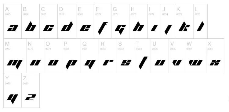
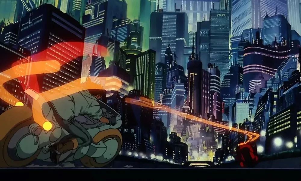
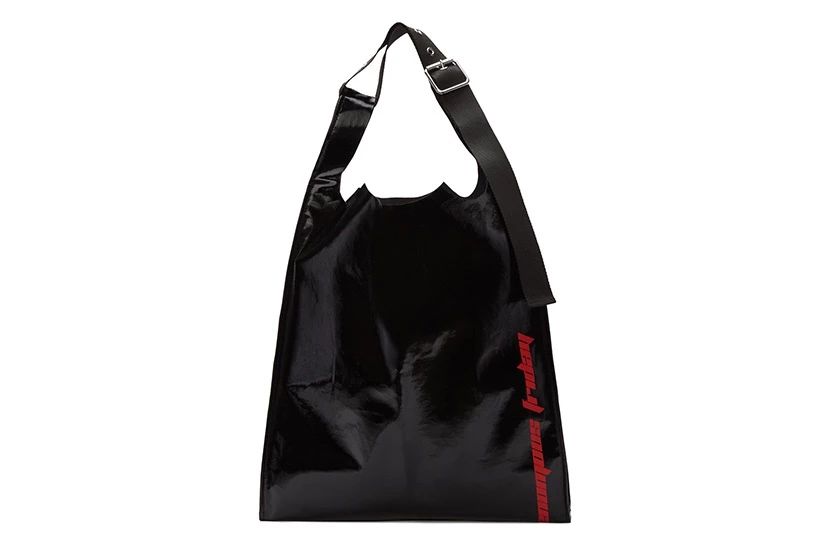
Planet Kosmos was born in 1996. Based on the style of Japanese comics, Danish graphic designer Mads Rydahl created this font with the charm of a super-speedy motorcycle. It not only has the style of Japanese comics, but also the lines Fluid and futuristic. Although it was originally created for a certain nightclub and has been freely available for download on the Internet for many years, it entered the public eye because the commercial copyright of the font was bought by CK creative director Raf Simons and Kanye West the year before last.

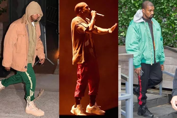
And Kanye West began to actually apply this font as early as the end of 2016. During that time, he frequently shared on social networks that he was wearing a pair of adidas sweatpants with Calabasas printed on it.
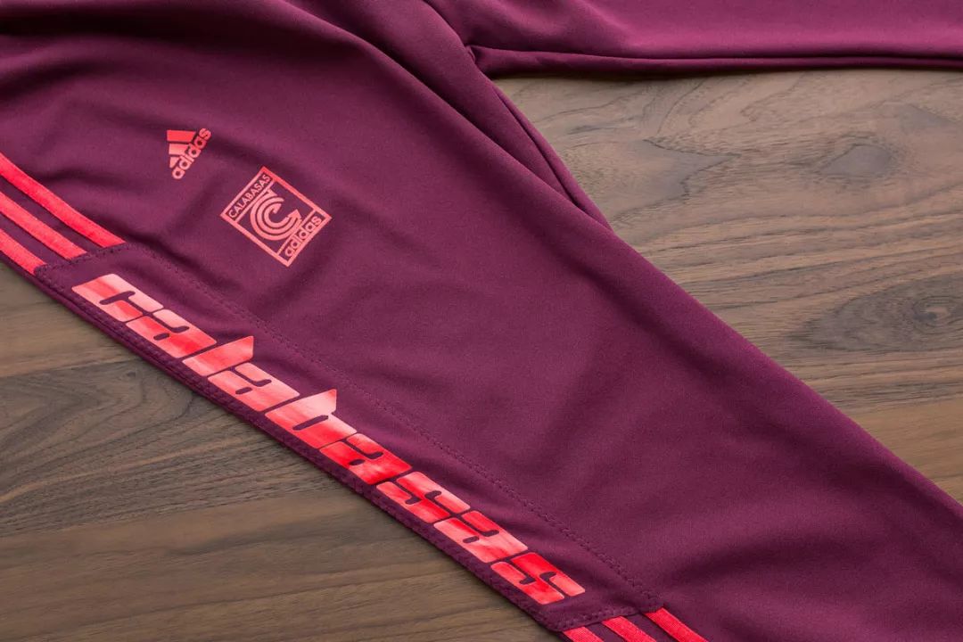
Calabasas is a cooperative project between him and adidas, using Planet Kosmos, full of speed and futuristic sci-fi style, not only completely hit Kanye's heart (he is the classic Japanese animation "Akira "'s loyal fans), also showed a near-perfect fit with the adidas third-line logo.

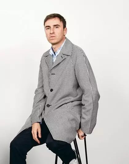
After buying the commercial copyright of Planet Kosmos at the end of last year, Raf Simons tried his hand at the brand of the same name, launching the theme of “Venomous Friday” The black sweater and Tote Bag are printed with the sci-fi Planet Kosmos font.
Interestingly, type designer Mads Rydahl told Racked In an interview with Racked he didn't want to study why fashion designers liked his type Cash was used as a reward, but some personal possessions were asked from the two designers, including newly designed shirts, reggae music albums and so on.
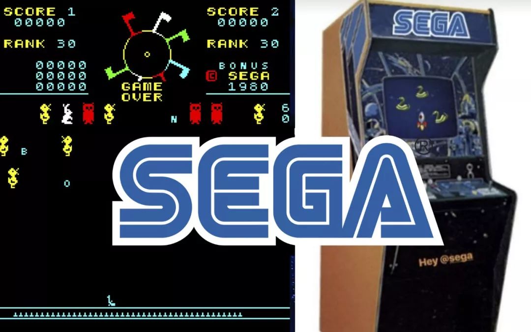
Sega
Return to the era of arcade games
SEGA Game Co., Ltd. is a Japanese electronic game company born in the 1950s. It produces home game consoles and game software. Four home game consoles”makers.
At the beginning of this year, “Cyborgin the operating room” was the Gucci 2018 autumn and winter fashion show, in addition to holding a human head, "Game of Thrones" Khaleesi's small dinosaurs and other elements play weird fashion, a brand new font Sega has also attracted the attention of countless fashion lovers.

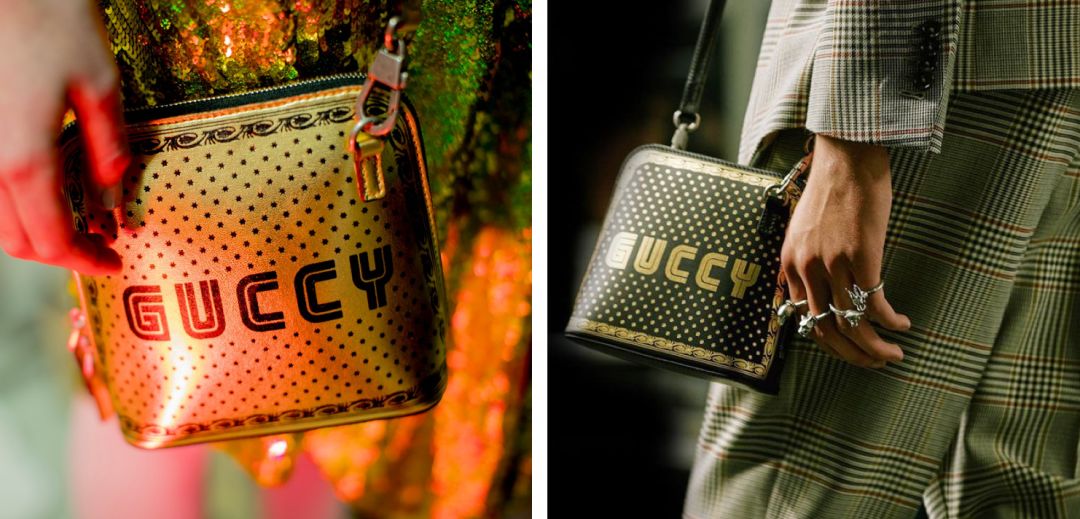
SEGA fonts were often seen in arcade game halls full of psychedelic colors in the 1980s. Creative director Alessandro Michele created 「 GUCCY ” uses SEGA on the words, paying tribute to the video game culture of the 80s.
Gothic
Old English Script
Gothic script is also known as Gothic Script. Before typography was invented, each book had to be copied by scribes for several months. In order to imitate these scripts, Gutenberg invented this artistry or Far larger than a serif for practical readability.
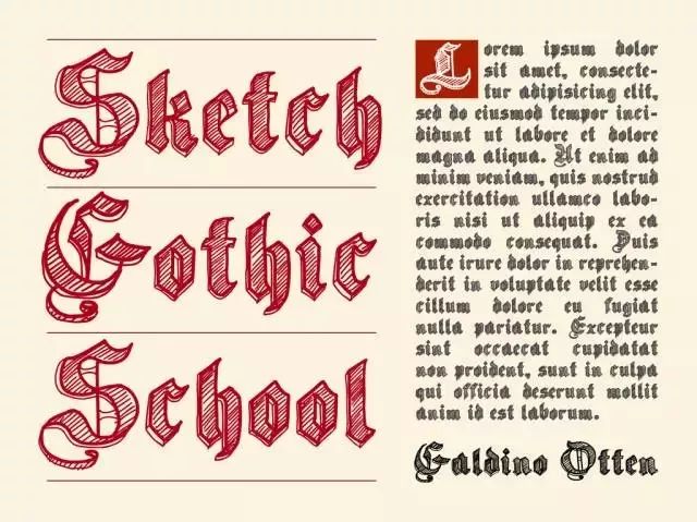
It is undeniable that the Gothic typeface, which originated in the 12th century, has set off a wave of "typeface frenzy" through the promotion of street brands, fashion, and pop music.
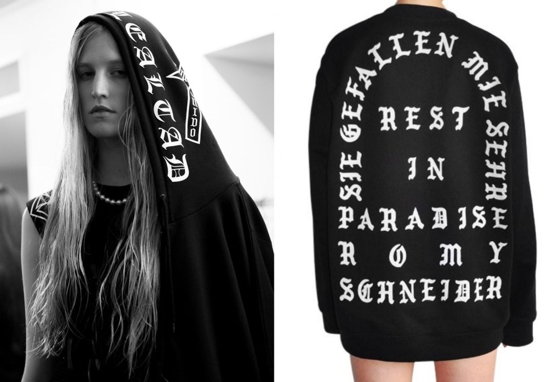
Left: Marcelo Burlon County of Milan SS17.
Right: Cali Thornhill Dewitt for 032c
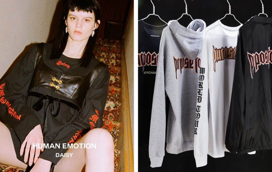 Left: Daisy
Right: Justin Bieber Purpose Tour Merch
From the A$AP Mob album, the New York brand SSUR, the creative unit BEENTRILL led by Matthew Williams, the silver jewelry brand Chrome Hearts, to independent design brands such as MISBHV, 424, Born x Raised... Street fashion brands really bring medieval The ancient text brought back to modern times.
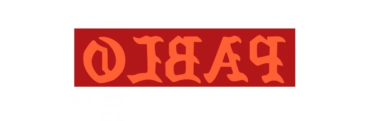
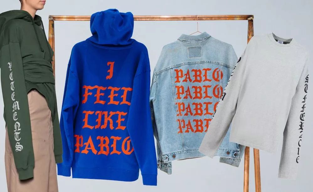
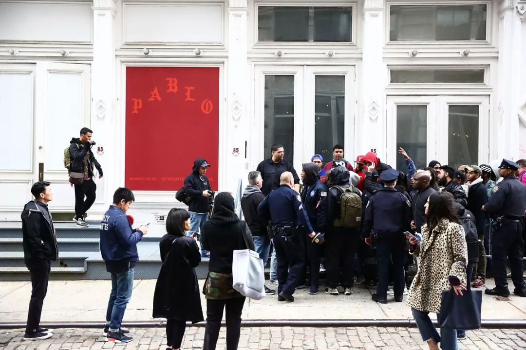
In February 2016, Kanye West teamed up with Los Angeles artist Cali Thornhill Dewitt to create a peripheral for the concert “The Life Of Pablo”——The Life of Pablo's clothing line of the same name, including T-shirts, sweaters and denim jackets, is designed with all Roman fonts and lyrics printed. Cali mentioned the revival of gothic fonts in an interview with the independent magazine 032c:

「This design is based on the gang culture of the 1980s and 1990s. Will make him a commemorative t-shirt like this.”< /span>
— Cali Thornhill Dewitt

Gothic fonts often appeared on tattoos and clothing of gang members in the 1980s, and were also used to print Bibles. Therefore, Westerners believe that they have the religious power to defend their homeland and have a sense of self-protection. mean.

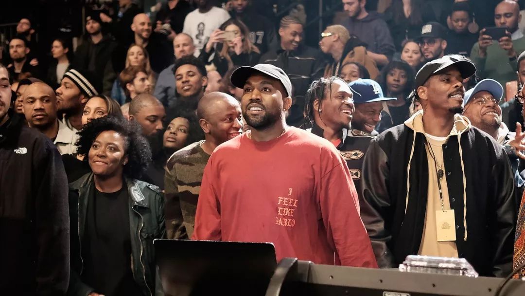
Kanye at the Yeezy Season 3 press conference Wearing a Pablo sweater
Subsequently, Kanye hit the iron while it was hot, and with the release of Yeezy Season 3, he successfully made the Gothic font a phenomenon-level popularity around the world. However, some designers have expressed concern about the excessive use of this font by the brand. How about those young people who step on Yeezy and wear Pablo, who really understands the story of the Rwandan genocide behind Season 3? Or the religious meaning behind the Gothic font, or the gang affiliation?
“Too many brands are using it today, especially in Los Angeles. ”
— Palm Angels Principal, Francesco Ragazzi

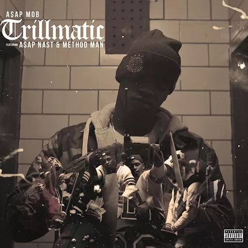
The special strokes of the gothic font are quite similar to the graffiti artists' graffiti tools, and it is no surprise that they can also collide with street culture. In addition to clothing, gothic font elements continue to appear on album covers and posters of musicians. For example, the singing group A$AP Mob printed gothic fonts on albums and peripherals long before Kanye West.

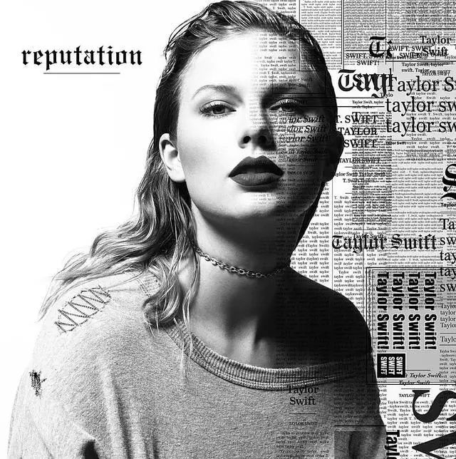
On August 19, 2017, Taylor Swift announced the new album "Reputation" shortly after the self-directed and self-acted annual drama-tear to the end with Kanye, and completely deleted the content of the social media account. Gothic font is used, and Gothic English letters can also be seen in the peripheral products of the new album.

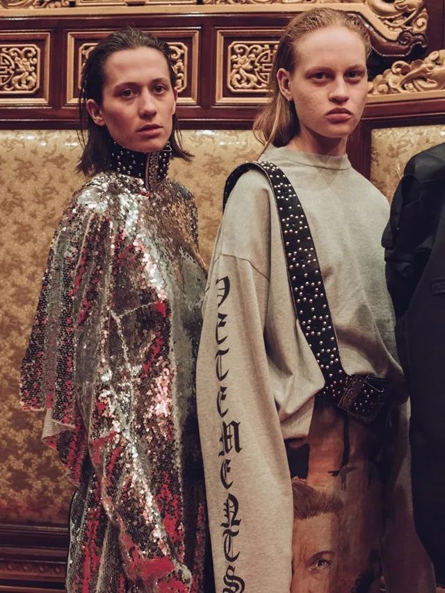
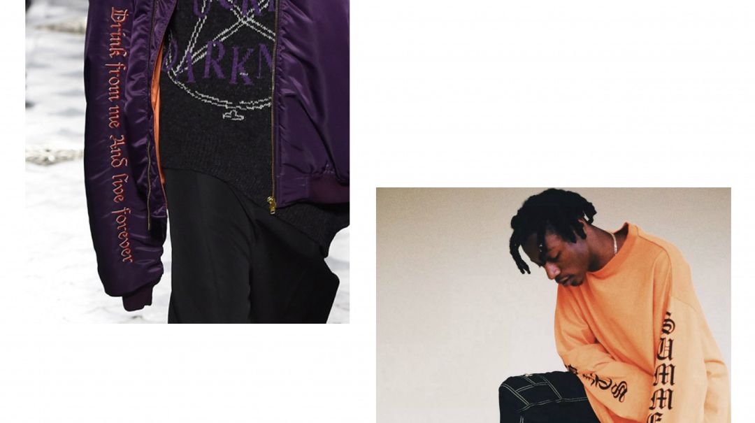
Vetements SS 16
Vetements 2016 SS / FW Slogan presented in Gothic font such as 「Drink from me and live forever」 was used in jackets, sweaters and pants Put it on, with a bit of dark and romantic color. The New York Times once pointed out: “Gothic font contains a very diverse culture, and reflects a kind of faith and rebellion.”
Vetements FW 16
The punk godmother Vivienne Westwood, who was the main force behind the punk movement, just chose the gothic style font named 「Starnberg」 as the personal brand Logo, breaking the regular visual image that fashion brands always leave to people.
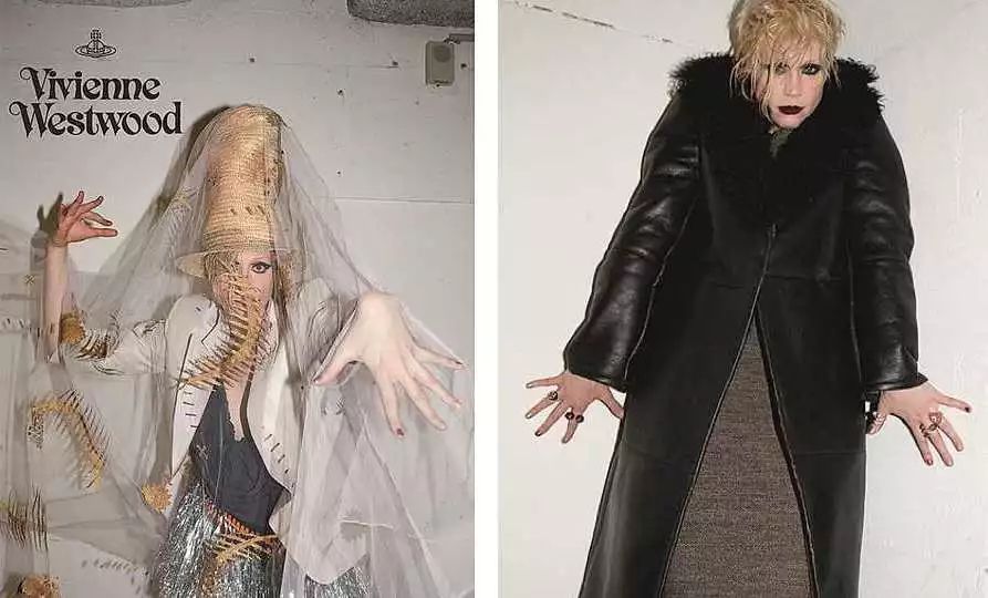
Vivienne Westwood 2015 F/W campaign

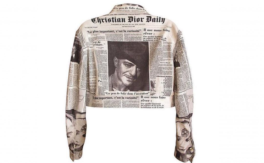
British designer John Galliano used gothic fonts on a large scale for his Autumn/Winter 2000 collection. He printed his photos, works and news on the ready-made clothes in the form of a newspaper, with the words "Christian Dior Daily" in bold Gothic font on the front page, an element Then it is used repeatedly in the product.
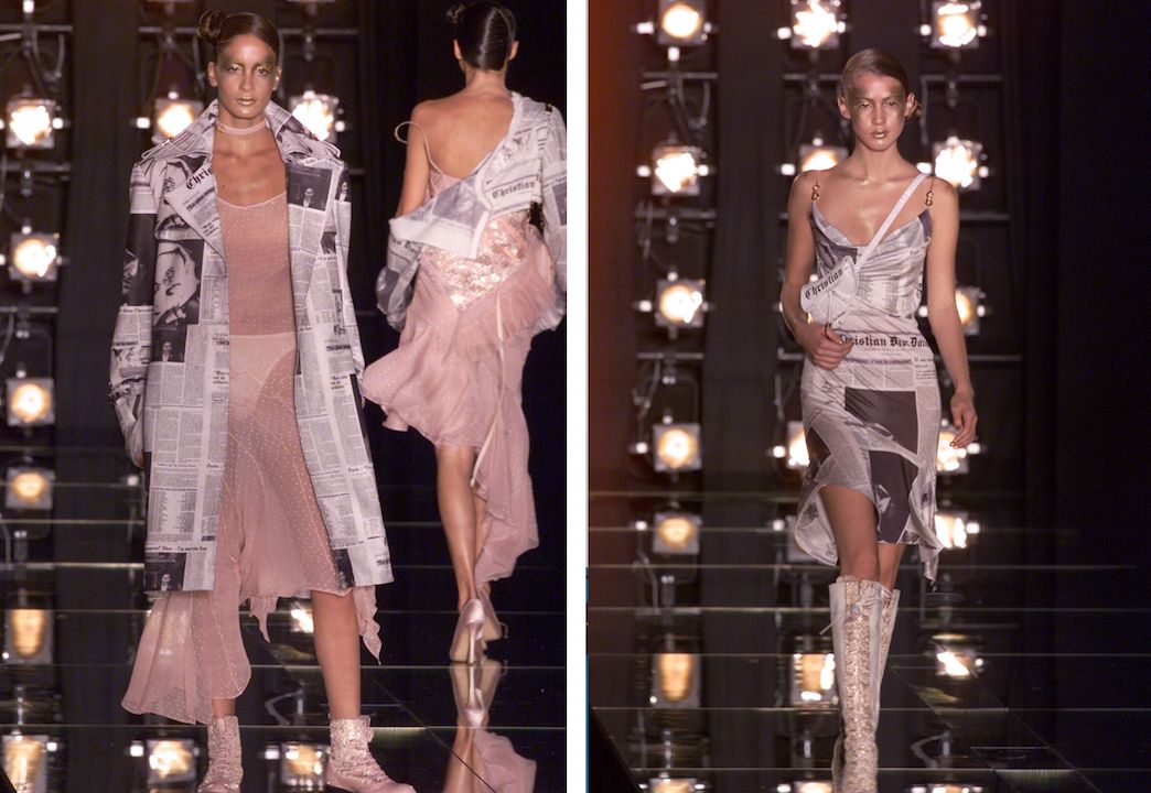
Christian Dior Fall 2000 Ready-to-Wear Collection
Helvetica
Rei Kawakubo font
In terms of history, it is inferior to Bodoni (Vogue magazine cover font); in terms of elegance, it is inferior to Didot with French origin; in terms of practicality, it is inferior to Times New Roman (special font for papers), But its influence on modernism is undoubtedly epoch-making, and it is also the first typeface listed as a collection by MoMA in New York for the first time: COMME des GARÇONS, RAF BY RAF SIMONS, American Apparel, Apple iOS 7 system, Panasonic Electric, New York subway stations are all Using it, B Magazine even had an issue dedicated to this typeface.
「Helvetica is everywhere. It's like air.You can't help breathing it in.”
— Graphic designer, Michael Bierut
In the first half of the 20th century, the Bauhaus movement swept across Europe, pragmatism influenced architecture, painting, industry and font design, and sans serif fonts entered the design world with their easily recognizable and readable fonts mainstream. Helvetica , known as “the ultimate form of sans-serif ”, is known as “upright” 's image, soft and neutral temperament and modernist atmosphere have been favored by countless designers and corporate brands.

Why Rei Kawakubo, who doesn’t follow common sense, uses Helvetica, which looks soft and neutral, as the Logo font. Many people may think that this is a bit of a cute and ironic thing. In fact, the clean and concise Helvetica has an indescribable tacit understanding with Rei Kawakubo:Soft and neutral, it supports open interpretation, while at the same time showing rich personality and unspoken confidence.
Writer Judith Thurman wrote in an article in The New Yorker:
「Rei Kawakubo and Coco Chanel both take equality as the premise, and believe that every woman should gain comfort and confidence from her own clothes.」
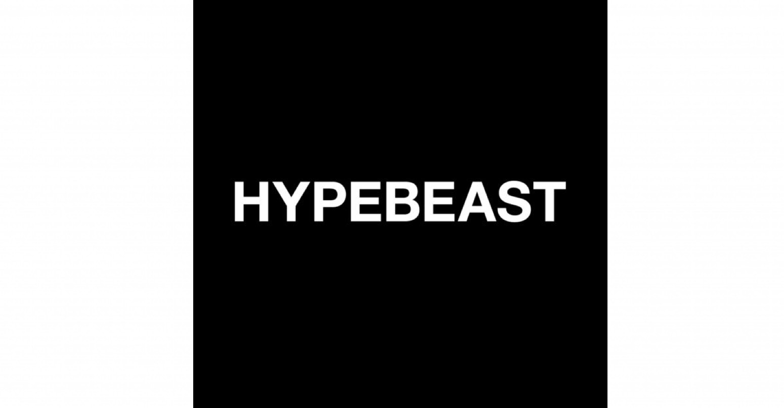
Because the relationship between the positive and negative shapes of Helvetica font is good, it not only shines in the fashion field that emphasizes uniqueness and originality, but the HYPEBEAST Logo that you are reading in your hands originally used this simple and clear, Classic font (the current Logo is an improved version of Helvetica).
In today’s Logoism, twill represents OFF-WHITE, Supreme with white letters on a red background, and VLONE, whose reputation is rising, what is the magic weapon to attract young people?

With its highly recognizable logo, you can tell what kind of brand identity it is at a glance. The role played by HBA back then is the same, and the visually striking white text “HBA” is performed by Helvetica.
The above HBA founder Shayne Oliver took over the old fashion brand Helmut Lang in 2017, and its Logo also uses Helvetica dramatically.
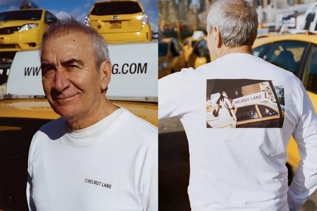 Helmut Lang 2017 Autumn/Winter "Taxi Project" Notes Series
In 1986, Austrian designer Helmut Lang founded his personal brand in Paris. Helmut Lang's name became a hot topic in New York in the 1980s and 1990s with his minimalist street style and avant-garde bold designs. Object.
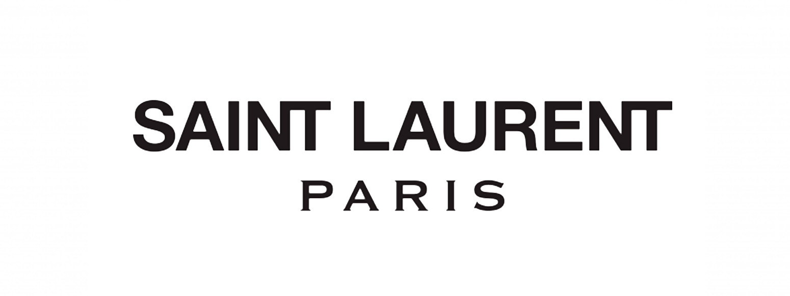
In 2012, Hedi Slimane, the creative director of Saint Laurent at the time, not only changed the brand name to Saint Laurent Paris drastically, but also changed the serif font of the original logo to Helvetica in one fell swoop, which caused an uproar.

Saint Laurent has long regarded itself as an elegant and traditional fashion brand. Hedi Slimane's innovation in fonts seems to have erased the traces of the founder. >Smoking outfit」The behavior of breaking gender and subverting imagination seems to be in the same line.
“Although there was a lot of controversy when the brand name was changed and the logo was updated...this change is not out of thin air, but traces the history and roots of the brand.”< /strong>
— Hedi Slimane
In the 1960s, after German designer Karl Lagerfeld took over FENDI, he not only designed the double F logo, but also used a slightly elongated Helvetica as the corporate logo and special font, leading FENDI in the 1960s. Blooming, Helvetica is undoubtedly a pivotal step on its way to become an internationally renowned luxury brand.
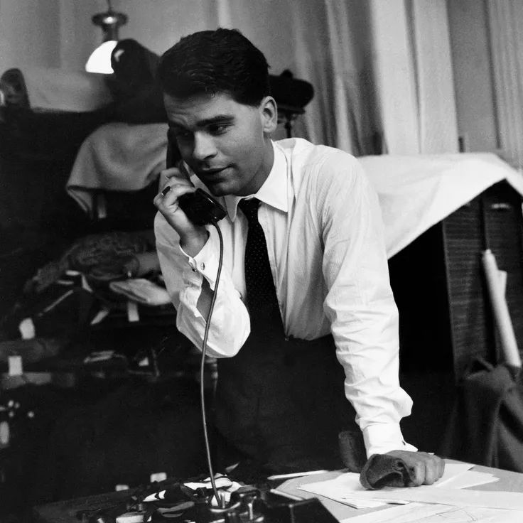
Lafayette Karl Lagerfeld was bornHe entered Fendi in the 1960s
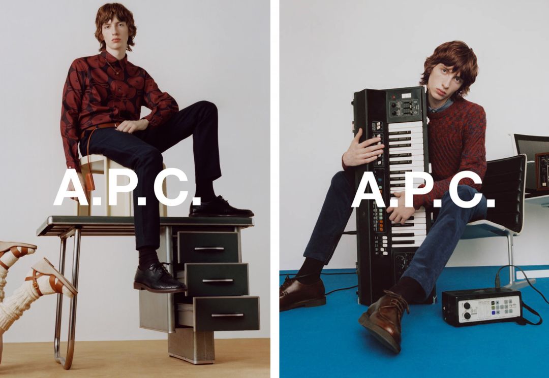
Since 1987, A.P.C. has become the base of Cool Kids in Paris looking for French neutral style. Philosophical ingenuity of doctrine and pragmatism. The restrained, eclectic Helvetica plays perfectly with the always-calm A.P.C.
FUTURA
Supreme favorite font
If Helvetica is a product of the Bauhaus movement, then Futura is a successful attempt by the pioneers of modernism in graphic design and font design.
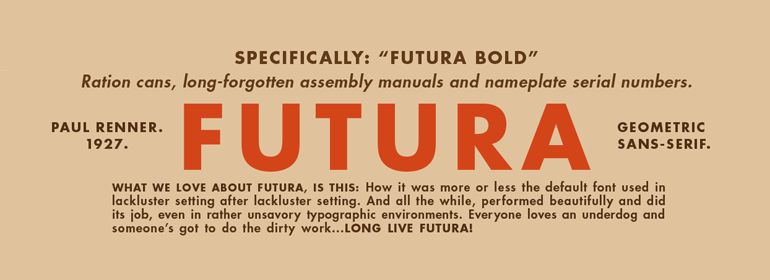
FUTURA font was born in the 1920s. Paul Renner, the designer who advocated the new sans-serif font, designed FUTURA based on simple geometric shapes. The bold font strengthens the geometric sense, with a strong sense of the future , just like its name, the name of FUTURA itself has the meaning of 「future」, which is more angular than Helvetica, which also belongs to the sans serif font, and has more personality in aesthetics .
「< strong >A good font design should not only be practical, but also aesthetic.< /strong>."
— Paul Renner
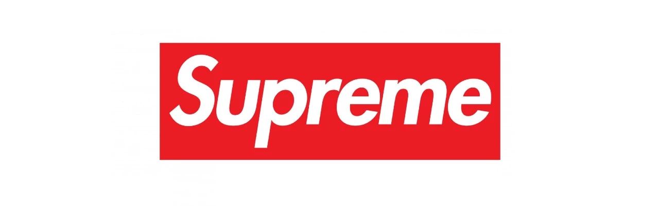
Supreme's iconic white logo on a red background uses Futura fonts. The font itself 's avant-garde and distinctive image really perfectly interprets the rebellious spirit of Supreme that breaks the rules and challenges the tradition. Inspired by the anti-consumerist, pro-feminist works of the famous American artist Babara Kruger in the 1980s, Supreme also angered Kruger herself.
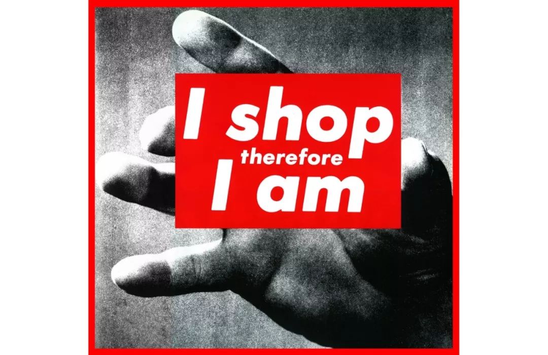
Babara Kruger's work quotes Descartes' famous sentence"I think therefore I am"
Although the Calvin Klein brand logo under the helm of Raf Simons is not the version we are familiar with, but when we mention CK, the line that appears in our mind is actually using Futura font.
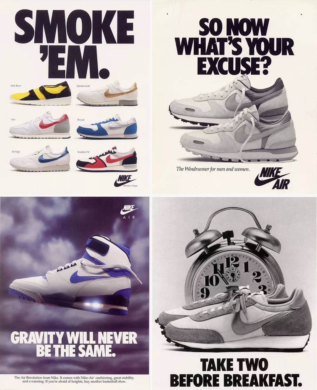
Nike uses Futura fonts in brand logos, advertisements and many products. It is understood that even Nike employees use Futura, which can be said to be Nike's royal fonts.
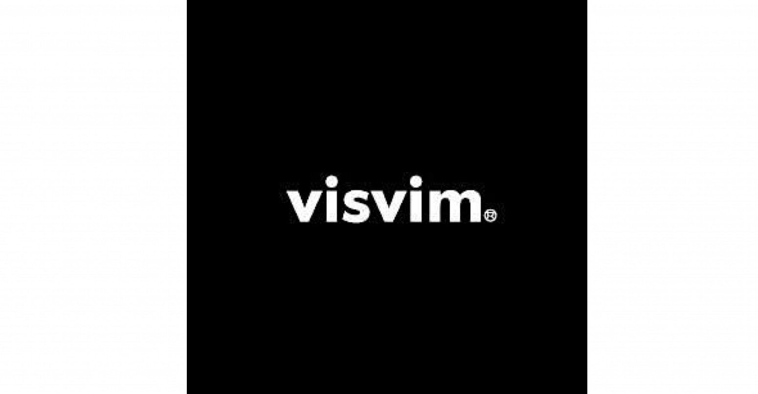
Visvim, a Japanese fashion brand created by Nakamura, combines Indian ethnic style and Japanese retro style, pursues traditional and high-quality fabric manufacturing technology, and is still sought after by everyone even though the price is high.

visvim-Fall-Winter-2018-Presentation
Hiroshi Fujiwara, Kanye West, Pharrell Wiiliams, John Mayer, etc. are all live ads. Its Logo uses Futura, which has a futuristic and modernist style, striking a balance between tradition and avant-garde.
Since the release of Ready Player One, many viewers have been re-watching the 1980 horror classic The Shining, where the trailer's title was written in Futura's font.
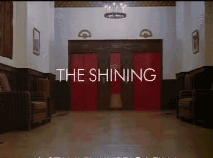
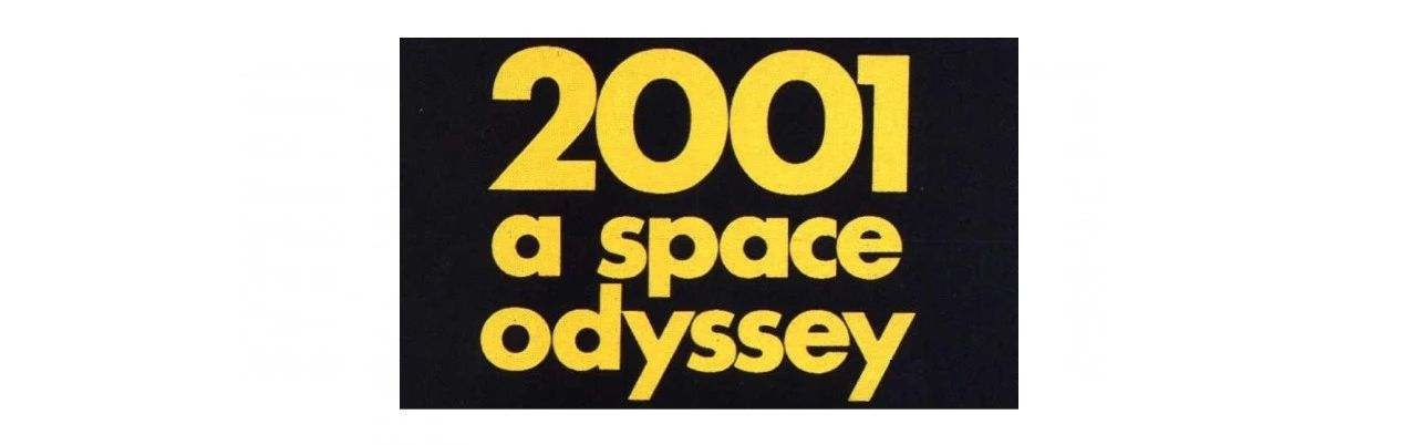
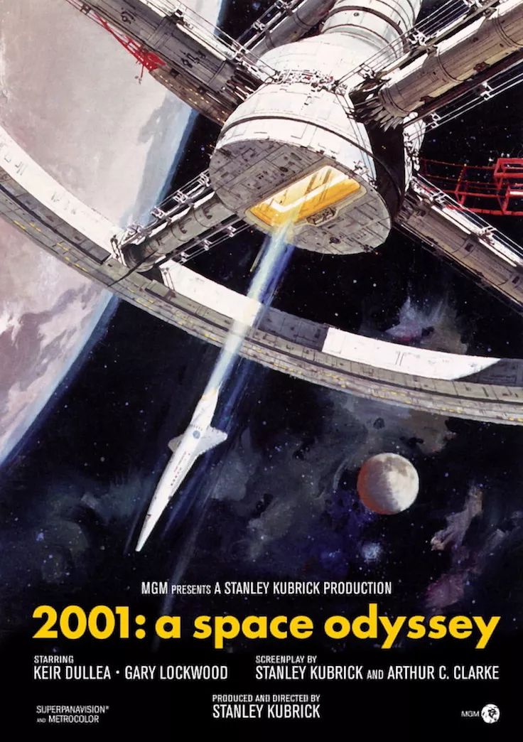
Director Stanley Kubrick himself is a loyal user of Futura. The classic sci-fi film "2001: A Space Odyssey", as well as its masterpieces "A Clockwork Orange" and "Eye Wide Opener" all use this font in different places.

Many people think that they are not designers, do not understand typography, and do not study the meaning behind fonts for no reason. As an important part of modern design, fonts are endowed with the self-expression of people in different eras and industries in the application of real environments.
As far as the fashion industry is concerned, whether it is a street fashion brand or a high-end fashion house, whether it is a designer or a consumer, we urgently need to peek into a whole new world through fonts. After all, if you only follow the visual effect of fonts without understanding the origin of culture, then the brand itself will also become a victim of industry aesthetic fatigue.
IMAGE CREDIT HYPEBEAST, RAVEN HAVEN , Dazed, ALURE, GQ TW

Articles are uploaded by users and are for non-commercial browsing only. Posted by: Lomu, please indicate the source: https://www.daogebangong.com/en/articles/detail/Analysis%20of%20the%205%20favorite%20fonts%20used%20by%20trendy%20fashion%20brands%20Can%20the%20logos%20of%20Supreme%20and%20CdG%20interpret%20the%20brand%20style.html
 支付宝扫一扫
评论列表(196条)
测试