

Reading a book or reading a newspaper, text has played its unshakable position since its inception, filling our daily life; however, in the complicated text design, jumping out of these designs is more It's time to see what the original text looks like, and cherish every transformation of them...

Chinese Font SongTi
At the beginning of writing, like Egypt, it evolved from pictures and hieroglyphs. But its evolution is different.
The evolution of our characters has always maintained the original painting or symbolic content, but when more characters are formed, various combinations are made on the basis of the original characters to form more characters, which is in the world culture Unique in history.
Song typeface has a square shape, horizontal and vertical strokes, horizontal thin and vertical thick, clear edges and corners, rigorous structure, neat and uniform, and strong stroke regularity, so that people have a comfortable and eye-catching feeling when reading.

Except for the first and most conservative old Song typeface of the four fonts in the above picture, the other three are derived Song typefaces. We can see that the chest line of the first two types is relatively large (the font is relatively open), which is obvious. A relatively modern font; while the latter two fonts have a smaller chest line and tend to be more traditional.
Traditional Song typeface, it can be seen that it retains many characteristics of italic script. The triangular scales (small triangle decoration) inside the small red circle are relatively rigid, and are composed of sharp-edged geometric shapes. People feel rigorous but it makes people feel too serious and formal, so in the application of modern design, everyone prefers to use other Song typefaces.
Long Song StyleThe scales are not so sharp, and the pause and turning of the handwriting can be vaguely seen at the place where the pen stops, which looks a lot rounder. Chang Song typeface looks longer than normal Song typeface, that is to say, the chest line just mentioned is relatively small; its horizontal and vertical thickness are similar, and its dots, strokes, strokes, picks, and hooks are relatively tall and straight, which combines the characteristics of the old Song Dynasty and the imitation Song Dynasty.
Dabiao Song, it is characterized by obvious contrast between horizontal and vertical strokes, moderate weight of strokes, not so tough, correct font, eye-catching and powerful, often used in text titles, The cover and ad design, with a modern feel (similar to a slab serif, will be mentioned later).
Imitation of Song Dynasty, the biggest feature is "horizontal and vertical equal width". It is thin, straight and straight, with hooks for horizontal strokes and dots for vertical strokes. It is like a dagger, and it is like a cutter. It's bold,
黑体 is characterized by equal width of horizontal lines and vertical lines, removing excessive decorative details and making it more concise. Due to the development of the printing industry at that time, Song typeface was used for the main text, and the bold type was developed to highlight the title part.


PS: The serif typeface will be mentioned later, because both the serif typeface and the sans-serif typeface are expressions that appeared in the development of Western fonts. When applied to Chinese glyphs, Song typeface is the serif typeface; black typeface is the typeface Sans serif.
English font with sans serif
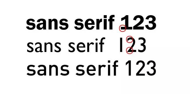
English letters are generally divided into serif, sans serif and other fonts. serif font, which means that there are additional decorations at the beginning and end of the strokes of the characters, and the thickness of the strokes will vary. The opposite sans-serif does not have these additional decorations, and the strokes are of similar thickness.
Serif fonts can be divided into traditional and modern fonts. The picture above shows traditional serif fonts (left) and modern serif fonts (right)
Traditional serif body, look at the thinnest part of the letter S, marked with a red oblique dotted line, it can be seen that its thinner part is always tilted, and also That is to say, the thickness of the strokes varies, and it looks more traditional. This is a basic font.
Modern serif style, stroke thickness is always consistent, relatively more rational, mechanical, and standardized. Let’s look at the bracket of the base (I’ll call it a bracket for the time being). The traditional bracket’s stroke connection is curved, while the modern one is straight and geometric. This can also be understood as an opposite presentation of sensibility and rationality.
Classic Sans Serif is the same as Traditional Song . The most prominent feature is that there are more decorative details and there are brackets at the bottom ( But because it is a sans-serif typeface, its biggest feature is that it has a modern sensibility and concise feeling, but also a sensual, slightly brushstroke, slender and delicate feeling.
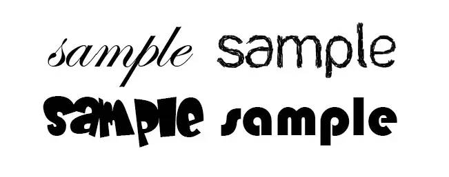
In addition to sans-serif, there are other fonts: for example, some curly, natural baroque handwriting, and some deformed fonts to cater to the design style

Here's a look at how these glyphs are used in real life:

The English font in the picture above is a kind of modern serif, "hairline serif". modern.

The ▲ title part of the picture above is a traditional sans-serif typeface. The screen reflects a picture similar to traditional industrial production. The selection of fonts caters to the needs of the atmosphere at that time and can highlight the theme. The thick serif font is chosen, which is rough, powerful and classical.

The title of the picture above ▲ uses a completely modern sans-serif typeface, and the layout is a horizontal design. The font uses a relatively slender sans-serif black body. The visual center is also in the center, which is the same as the picture on the left. There are corresponding detailed designs, and the fonts with larger accents corresponding to the smaller accents are easier to read, but the center of vision is relatively scattered, and the foothold of people's sight will be more open.

Compared to the font of ▲ above, this book binding design needs to use text to control the entire layout because it only has text on it. Here, the most important information on the information level uses a thicker font with a larger chest line, and uses the contrast of stroke thickness to attract more people's attention; put two fonts with extreme thickness together, and use this contrast The technique is used to highlight what should be highlighted and weaken what should be weakened, but it will not fill up the space.

Above ▲This invitation uses curly handwriting, which makes people feel very close, lively and cheerful.

▲This is a font on a Japanese poster. Ancient Chinese text records like to use vertical arrangement, arranged from right to left. Japan still uses it until now. The font in the picture above is somewhat similar to the Chinese Song typeface Thin gold book font, while maintaining its stroke characteristics, it is processed more smoothly, and the intimacy and naturalness are much increased.

The title of the book ▲ did not use thick linear black body with a strong sense of power to express it, but chose a medium black with moderate strength and a slender appearance; there are also fonts with contrasting thickness; attention-grabbing At the same time, it also pays great attention to the rhythm of power, and there will be no sense of forced reading. The vertical design is very traditional.

Articles are uploaded by users and are for non-commercial browsing only. Posted by: Lomu, please indicate the source: https://www.daogebangong.com/en/articles/detail/Analysis%20of%20Chinese%20and%20English%20fonts%20what%20you%20need%20to%20know%20when%20designing%20fonts.html
 支付宝扫一扫
评论列表(196条)
测试