
Author丨Lao Wang
Source丨Original wife of Lao Wang next door (ID: gebilaowangfuren)
I believe that many people in the workplace will be tortured by PPT for several days in a state of sleepy eyes. (To be honest, this is normal→Why is your PPT revised more than a dozen times, but the boss is still not satisfied?)
As the saying goes, PPT hates ugliness when it is used. If you can't stand a PPT yourself, how can your reportee be satisfied? Of course, the most important part of PPT is your content and logic, so I won’t talk about this part, just chat if you need help. In this article, we mainly explain the beautification of PPT.
(It is recommended to read for the first time for 15 minutes, and practice while reading for the second time)
Before learning how to beautify, you need to know what details will cause your PPT to be directly labeled as ugly.
1. If you are still using the 4:3 size
Although most people have become accustomed to the 16:9 widescreen size, there are still a small number of people who can't let go of the 4:3 template passed down from generation to generation by the company decades ago. Including that many companies uniformly install a lower version of office, the default size is 4:3, and it is also recommended that you install a new version of office, at least the 2013 version, otherwise many functions of the old version will not be implemented.
2. If you are still using the default Song typeface
3. If you make a PPT but you have to open several templates
I believe that everyone who makes PPT has more or less paid templates or free download templates, but sometimes you will find an embarrassing problem in the process of using templates, that is, the templates do not satisfy you For example, there are 7 main points in your article, but there are only 4 in the resulting template, or you need to put 5 pictures, but there are only 3 pictures in the template. So many people started to open other templates to see if there were any that matched in quantity, and used them directly. The final result is to disrupt the overall style of the PPT, that is, multiple sets of templates are applied indiscriminately.
4. If you think matching pictures is a very simple matter
5. If you think eye-catching colors can highlight the key points
6. If the form you make belongs to one of the following categories
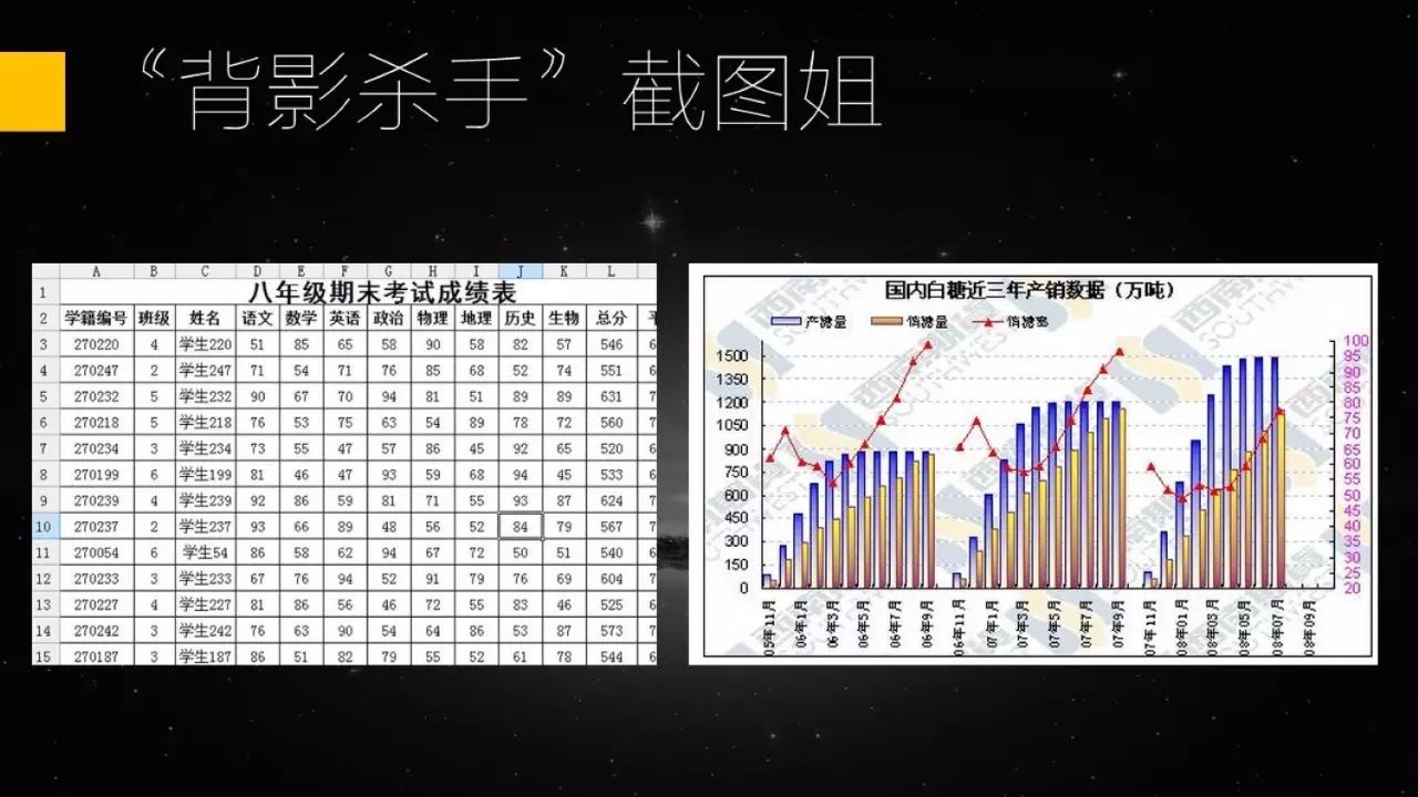
Screenshot form
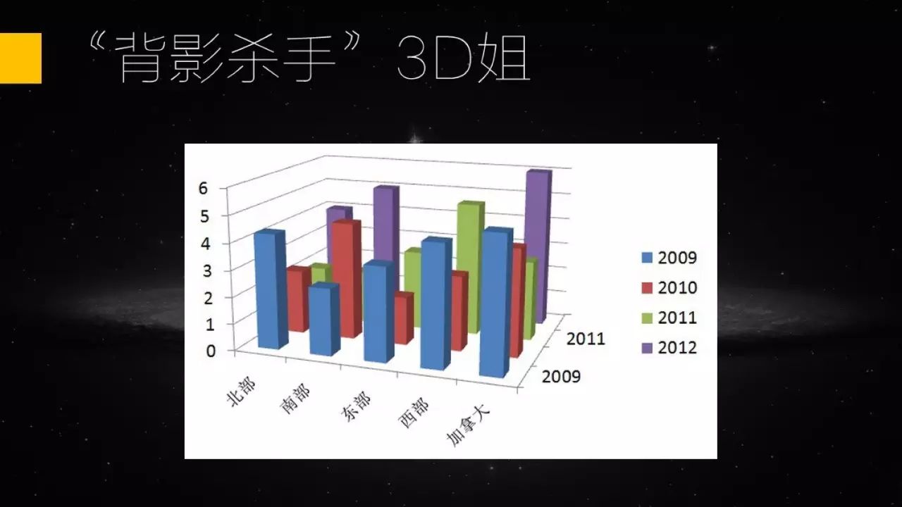
Unbearable 3D form
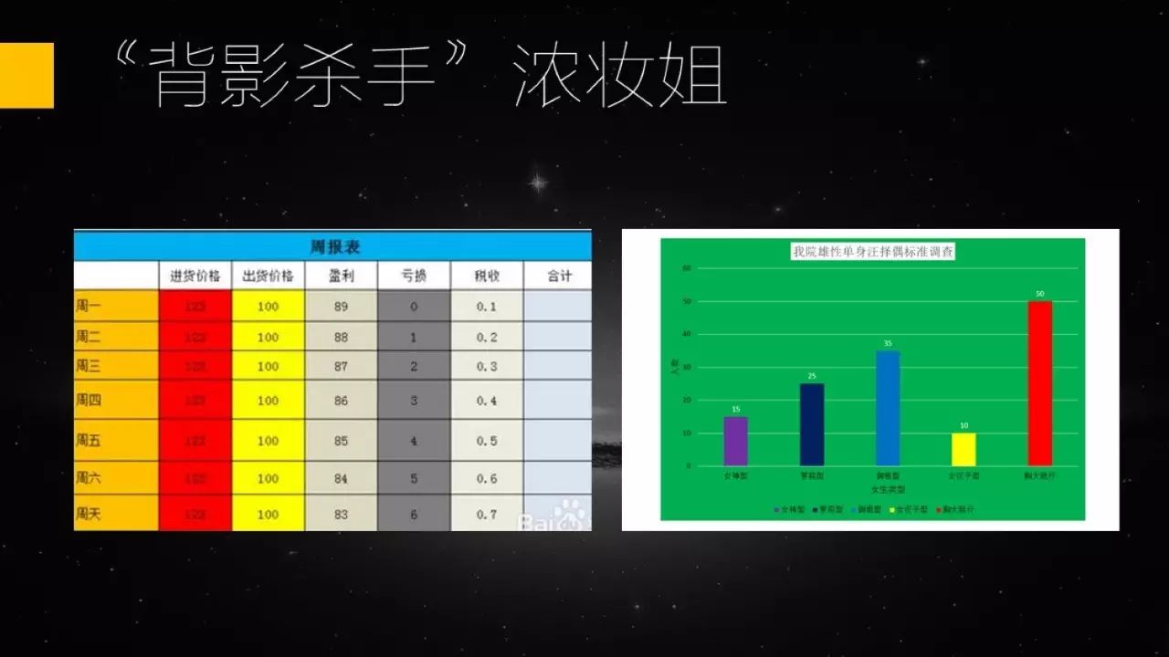
Colorful tables
The above are some typical small details that can make your PPT ugly in a second, and then start the formal class, How to make PPT more refined.
Picture
Whether it is an inserted picture or a picture used as a background, there are three basic requirements: Ensure clarity, maintain proportions, and be friendly to readers.
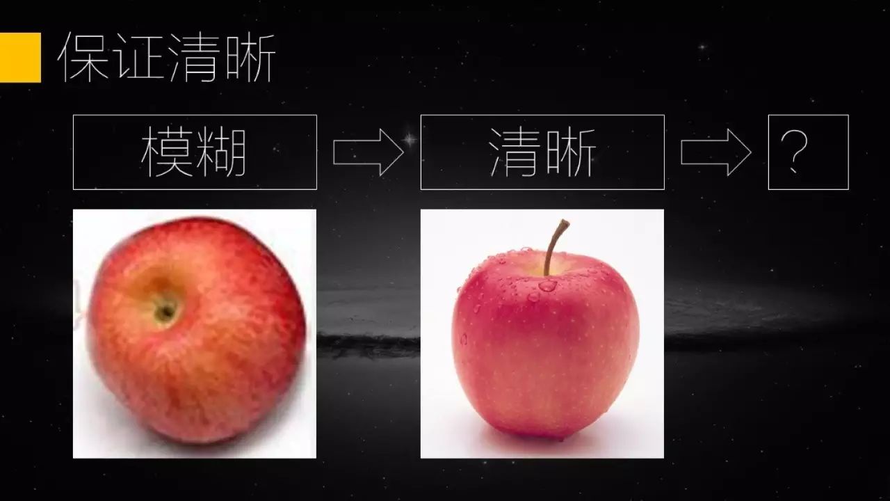
Let’s talk about clearness first. Many people drag the original picture material into the PPT and feel that it is not big enough. As a result, the picture is enlarged, causing the picture to become blurred. Which of the following two apples do you want to eat?

So, in order to ensure the clarity of the picture, it is recommended that all pictures inserted into the PPT should be only zoomed out and not enlarged.
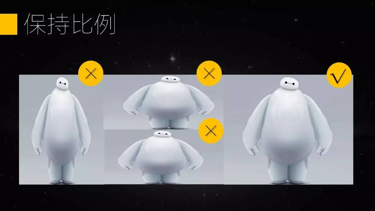
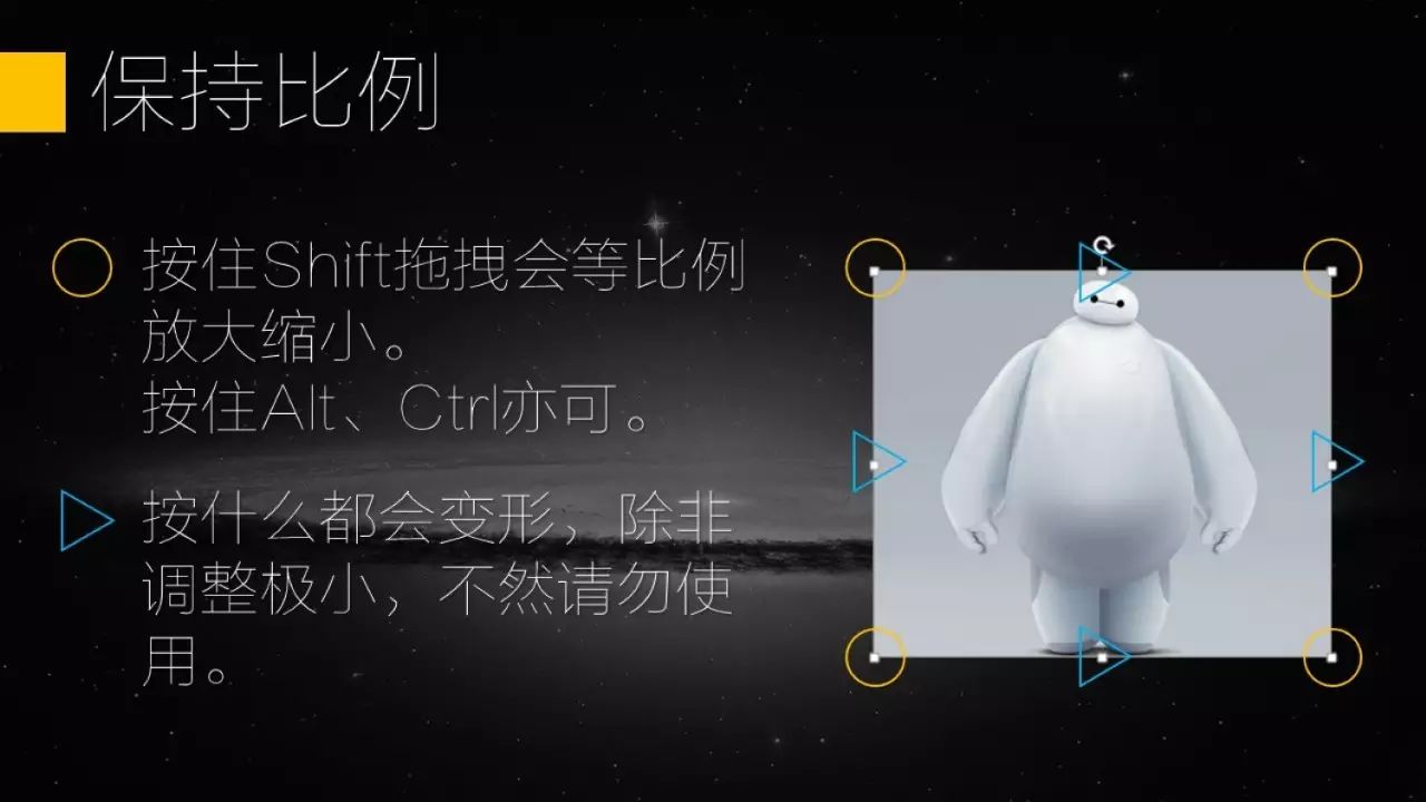
Let’s talk about keeping the proportions. Many people simply “fine-tune” the picture, making it slightly longer or wider, or they don’t know how to adjust it proportionally, which causes the content in the picture to be deformed, as shown in the figure below.
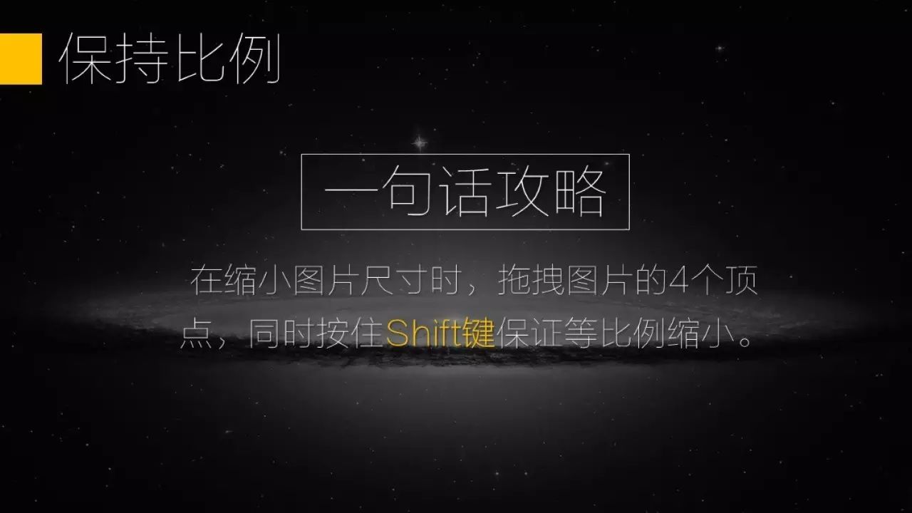
In order to prevent the image from deforming, when we resize the image, select the image and drag the 4 vertices of the image, and hold down the Shift key at the same time to achieve equal proportions zoom out.
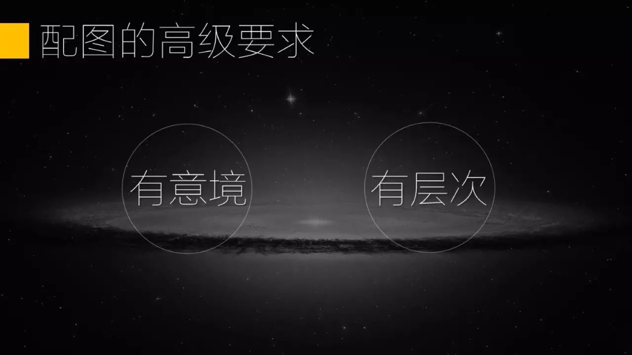
Finally, it is friendly to reading. There are many pictures. To be honest, it is better not to put them. Especially some pictures that make people look sick (in fact, many people like to use photos for visual comparison when comparing counterexamples, and deliberately choose some exaggerated, ugly, and disgusting pictures)
So what kind of picture should we choose? Artistic and layered. In addition, it is best to set the picture as the background (one is good-looking, and the other is to reduce the size of the PPT file).

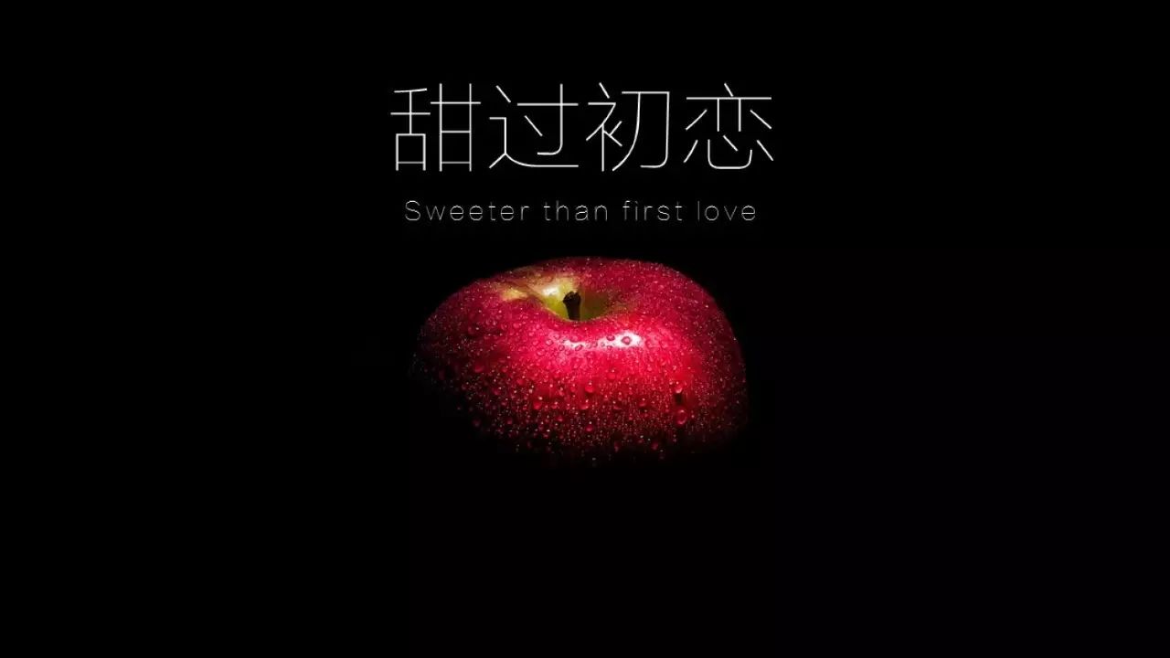
For example, when we choose an apple picture, it is not enough just to be clear. Let’s compare the following two pictures.
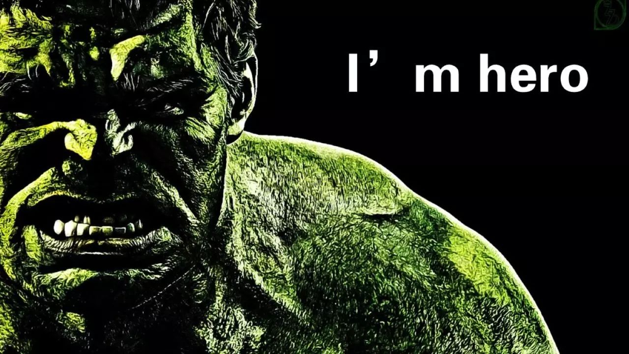
For example, if we want to use a character or animal material, the full-body photo is not as good as the partial photo below.
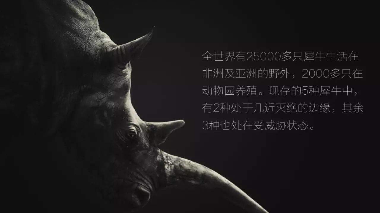
Where are these pictures?
Here is a simple recommendation, 500px, the website of the world’s top photographers, charges for downloading original images, but there is a black technology that can be directly downloaded for free.
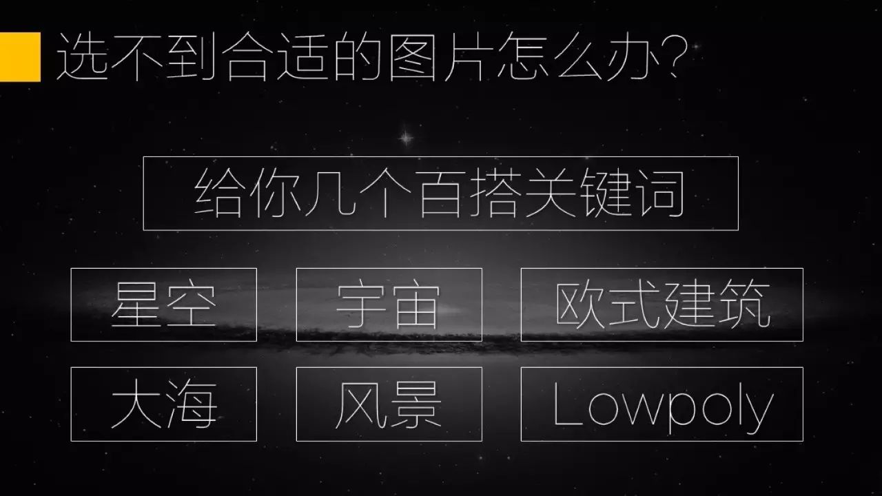
If you think the picture is too difficult to choose, here are some universal search keywords for you. Starry sky, universe, European architecture, sea, landscape, Lowpoly.
Sometimes we have a new problem after choosing the background picture, that is, although the picture is very good-looking, but the text is not clear after placing it, at this time you need to add a layer between the background picture layer and the text layer A layer of translucent film (usually insert a black rectangle the size of a PPT page, set the transparency between 30%-70%)
Copywriting
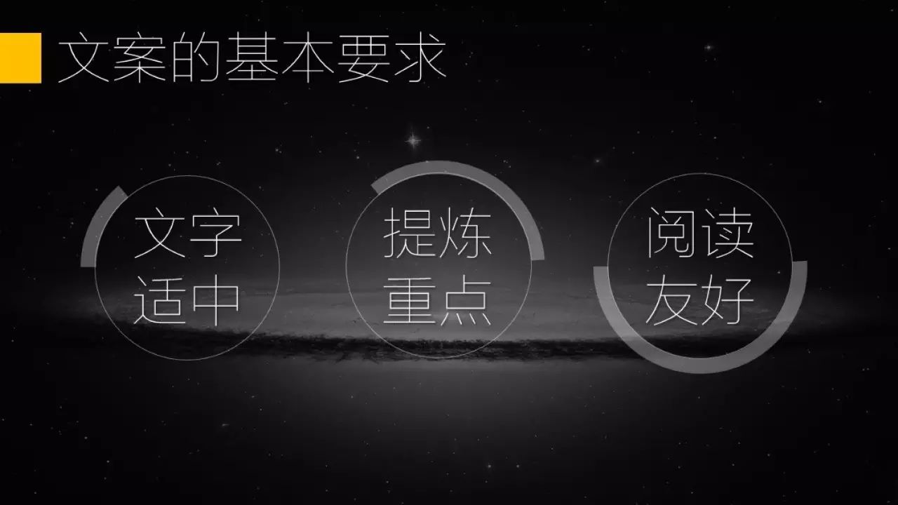
There are three basic requirements for PPT Chinese text: moderate text, key points, and friendly reading.

First of all, let me say that the text is moderate. Many people regard PPT as a horizontal version of WORD. After handing in a WORD, the leader said that it should be made into PPT. As a result, copying and pasting large sections turned into PPT. In fact, PPT is the most taboo The best thing is to pile up large chunks of text without any thought or modification.
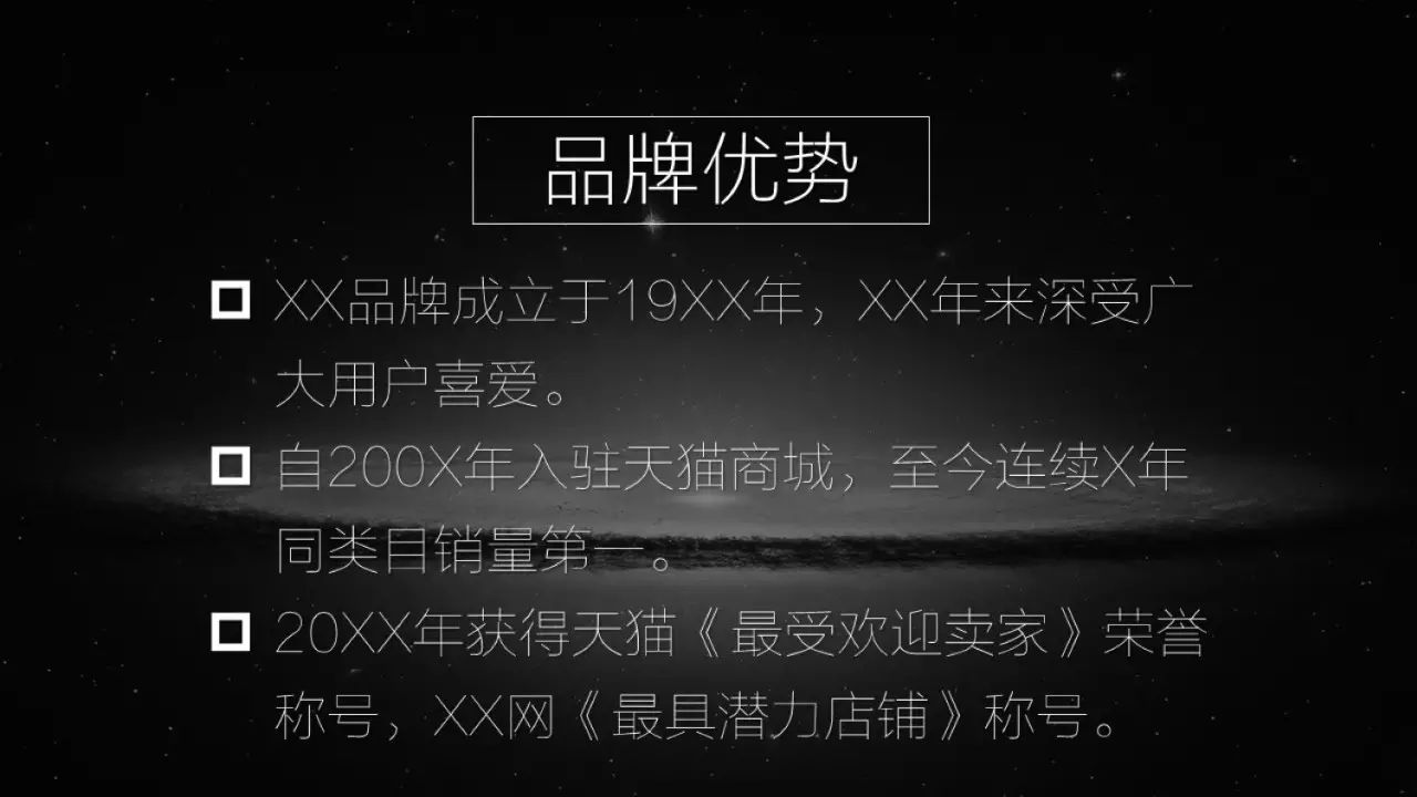
Let’s talk about refining the key points. If it is inevitable to put paragraphs and paragraphs of content in the PPT, the most preliminary optimization is to split the paragraphs of content into several different pieces of content, as shown in the figure below.
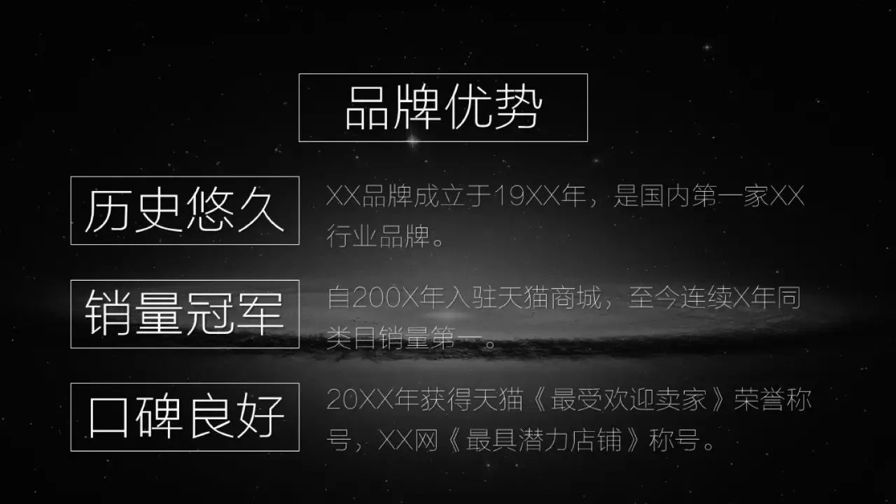
Then, refine a keyword from the content of each paragraph. It is best to keep the same number of keywords in each paragraph.

Finally, it is still reading-friendly, this is divided into 3 parts.
The first thing is to align, whether it is left alignment, center alignment, right alignment, choose an alignment method, and then unify.
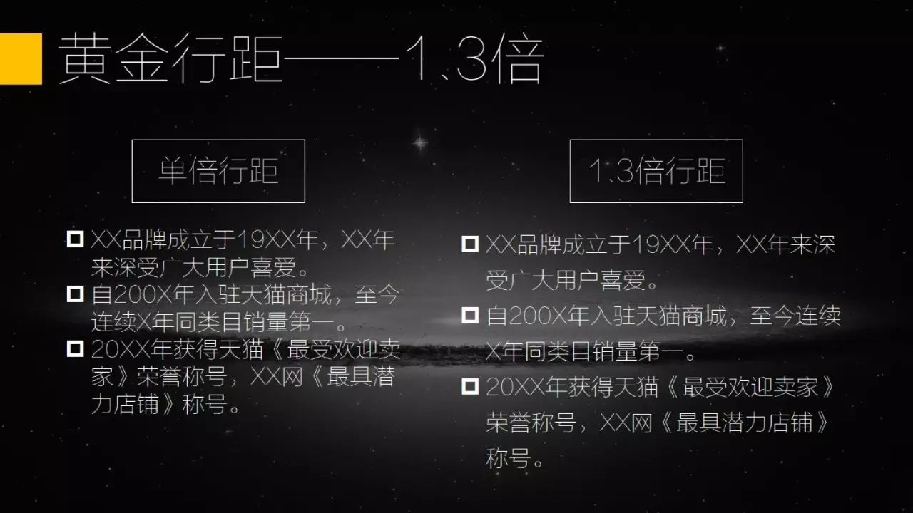
The second is the line spacing, especially the line spacing between the text content. It is recommended to set it to 1.3 times. The default single line spacing is too dense and unsightly.
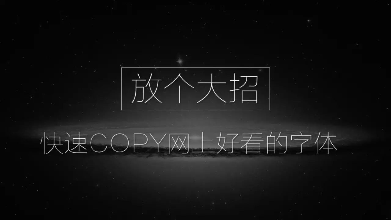
The last is the font, the default Song typeface is ugly with extreme aesthetic fatigue. If your PPT needs to send the source file to the report object, just change all the fonts to Microsoft Yahei. If you are using your own computer to report, or you just need to send the PDF to the reportee, it is recommended to use some better-looking fonts (such as Calligraphy, Founder series, Wordmaking Workshop series, etc.)
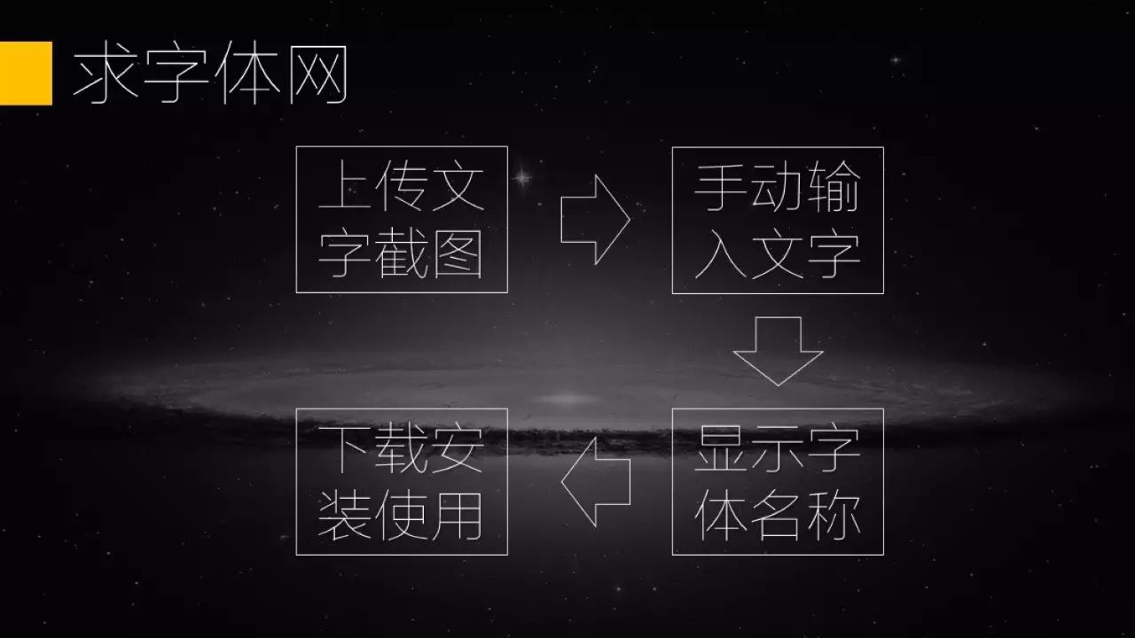
Sometimes we see some beautiful fonts on the Internet, but we don’t know what the name is. You can go to a website called Qiufont.com. You only need to take a screenshot of the font on the Internet and upload it, and then manually enter the text according to the prompts. It can help you analyze the exact or similar font names, and then download and install the fonts.
Charts
Charts are divided into tables and infographics. At the beginning of the article, three kinds of ugly tables have been summarized, so how can we make the tables simple and beautiful? There are two basic requirements: unity with the overall style, and the principle of subtraction.
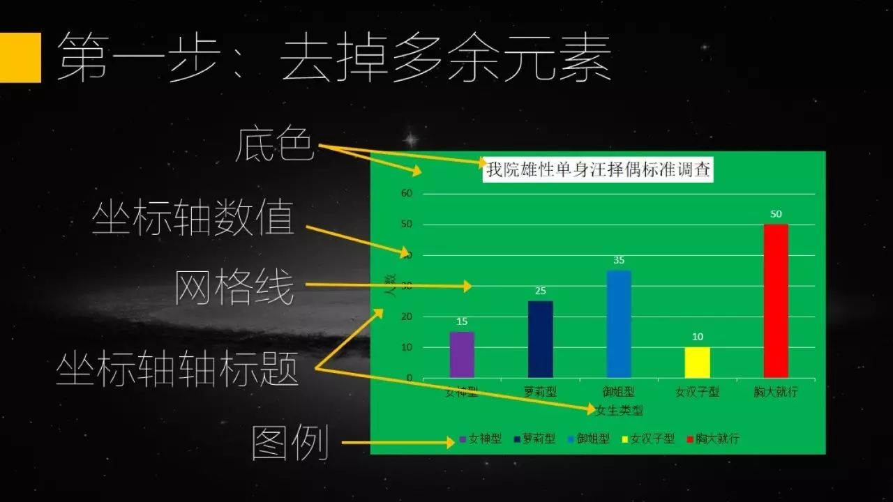
Unification of the overall style and the principle of subtraction can be understood at the same time, which is to make the elements in the chart less if the meaning can be clearly expressed The better, and The color of the main element is consistent with the main element of the PPT.
Which elements are redundant? The background color of the table, coordinate axis values, grid lines, coordinate axis titles, legends... are all unnecessary and can be removed.
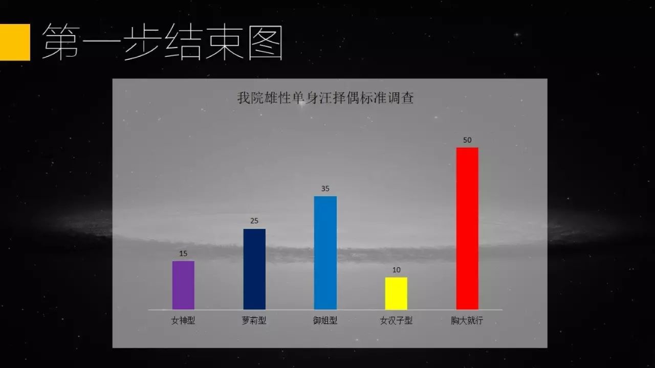
(The picture above is what it looks like after removing these elements. In order to see clearly, I added a layer of translucent white film)
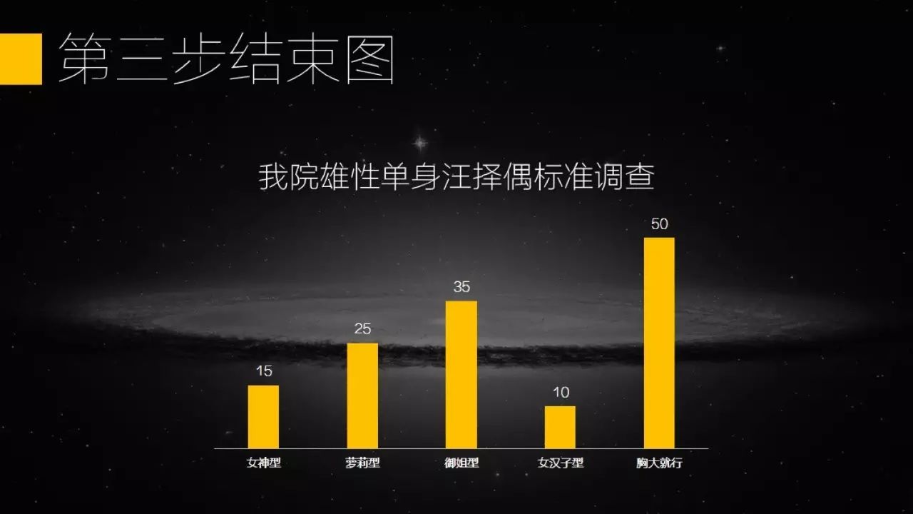
Then we will replace the font, the color of the font, and the color of the table elements uniformly.
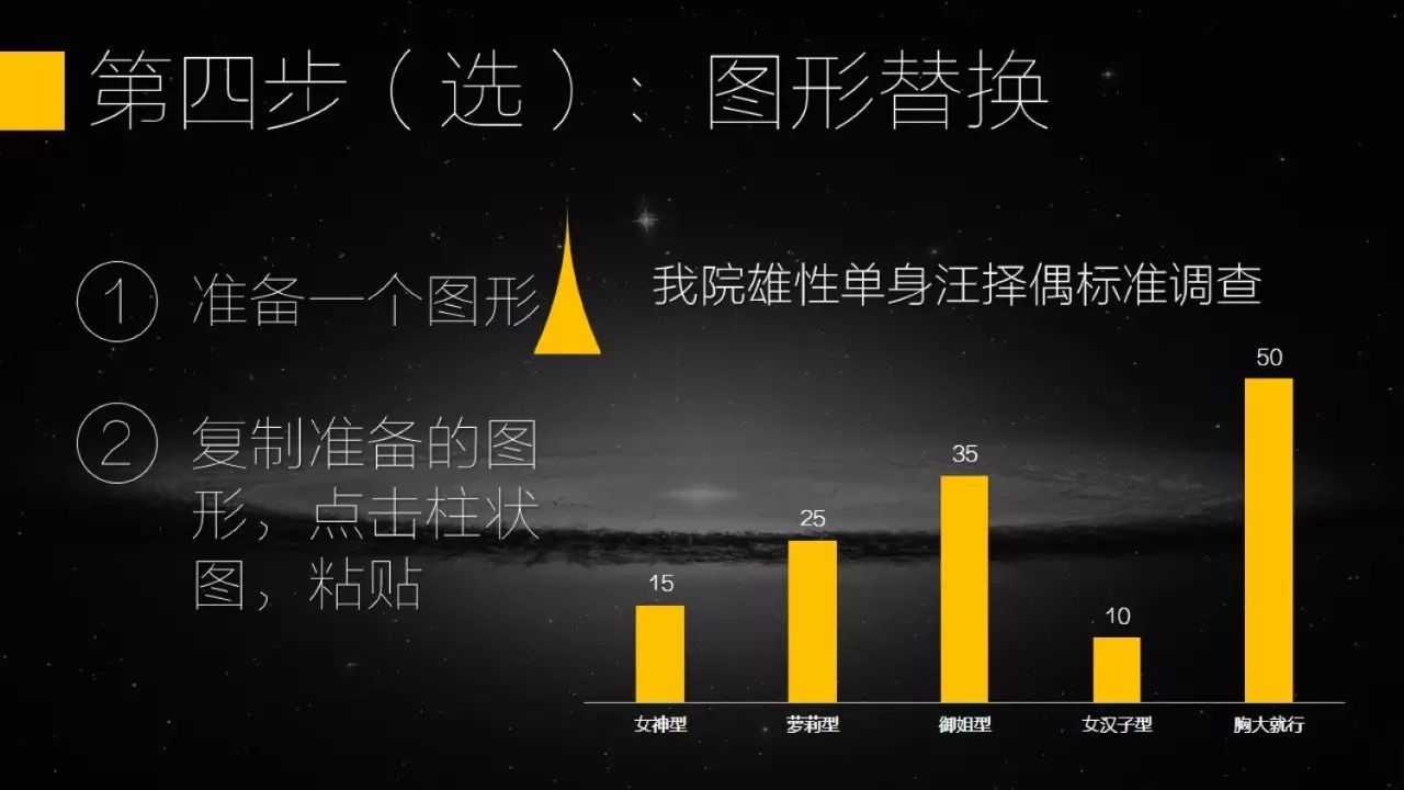
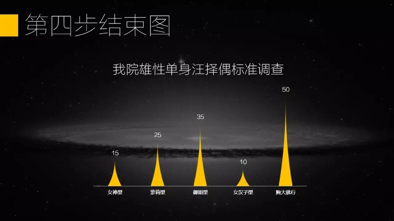
If we want to make it a little more beautiful, we can use graphics to replace the columnar elements in the table, copy elements-click the column graph in the table-paste.
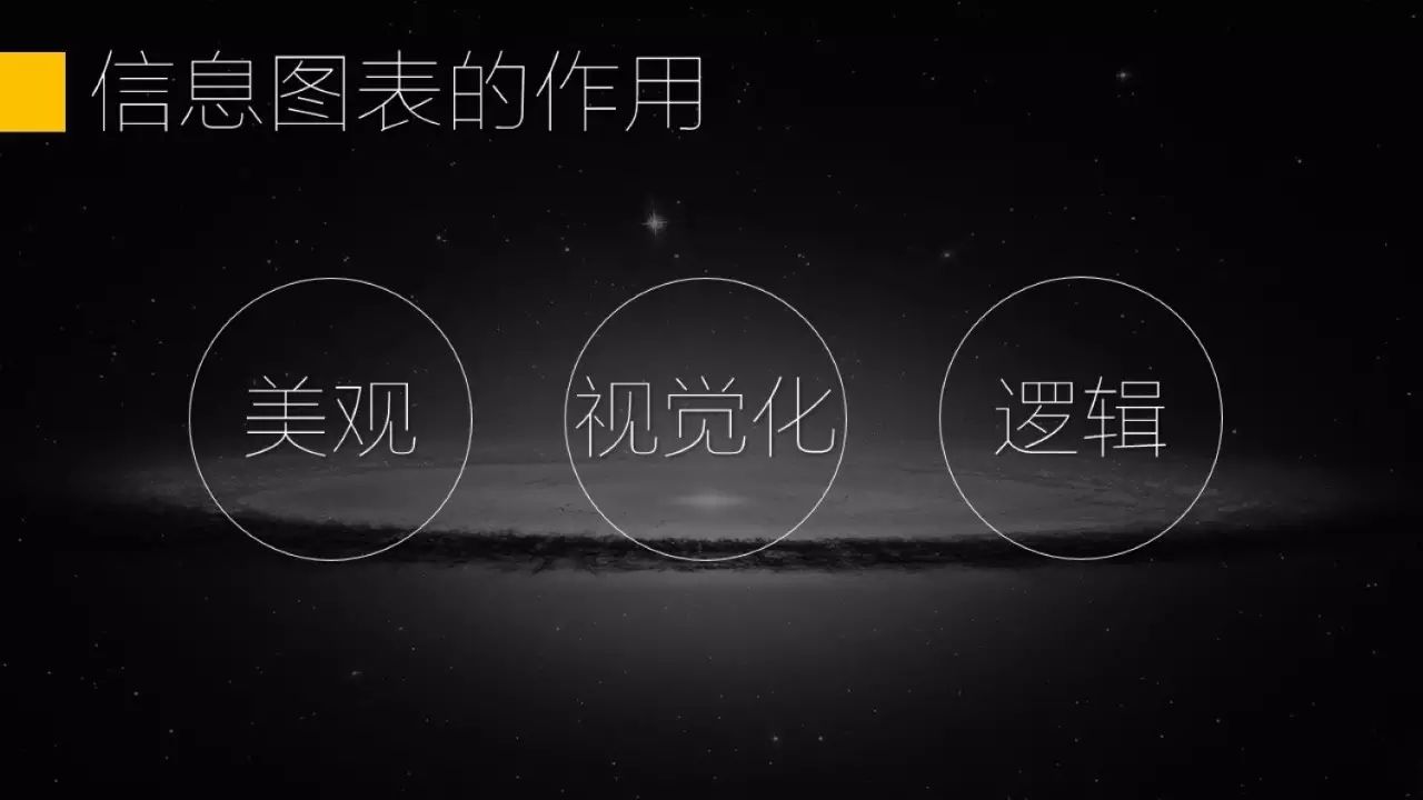
Next, let’s talk about infographics. Infographics can intuitively describe the relationship between several different things. In addition to being beautiful, its role is to visualize and express logical relationships.
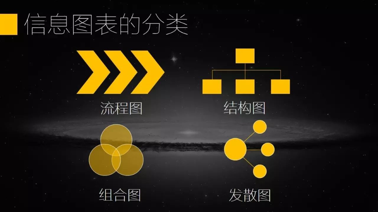
Information diagrams can be divided into 4 categories, flow chart, structure diagram, combination diagram, divergence diagram.
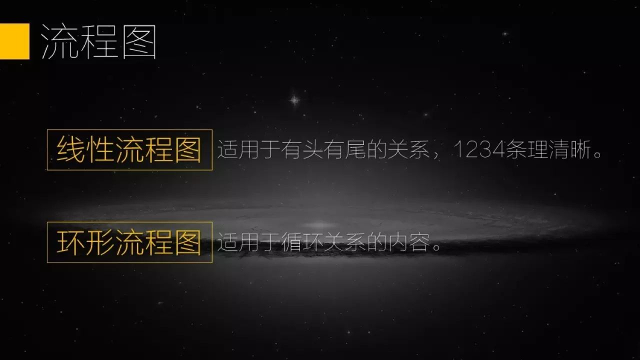
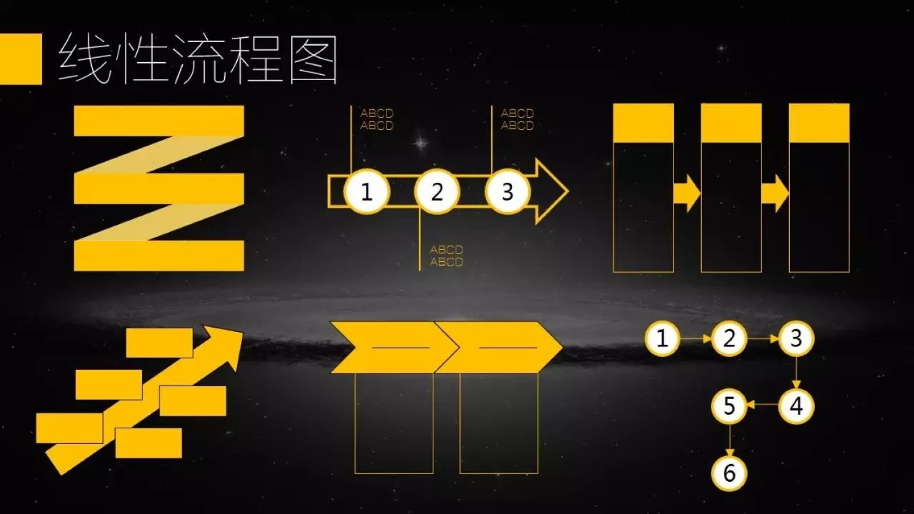
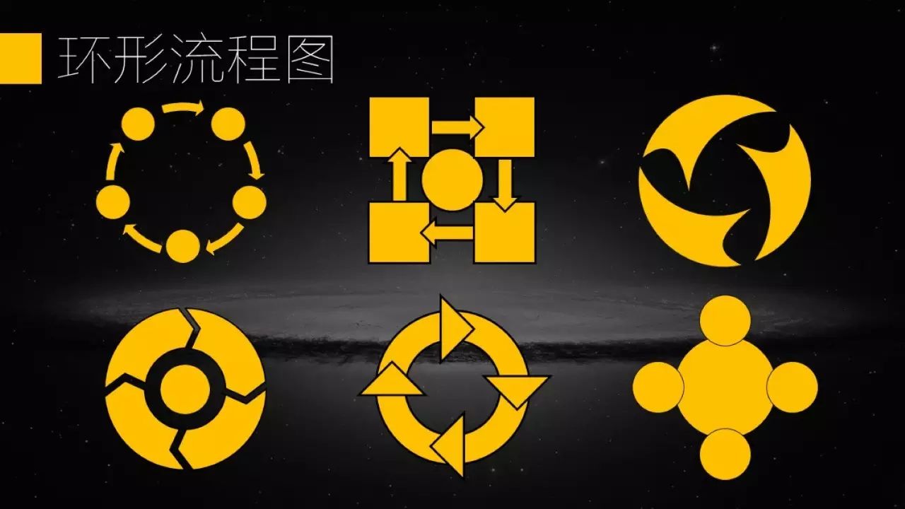
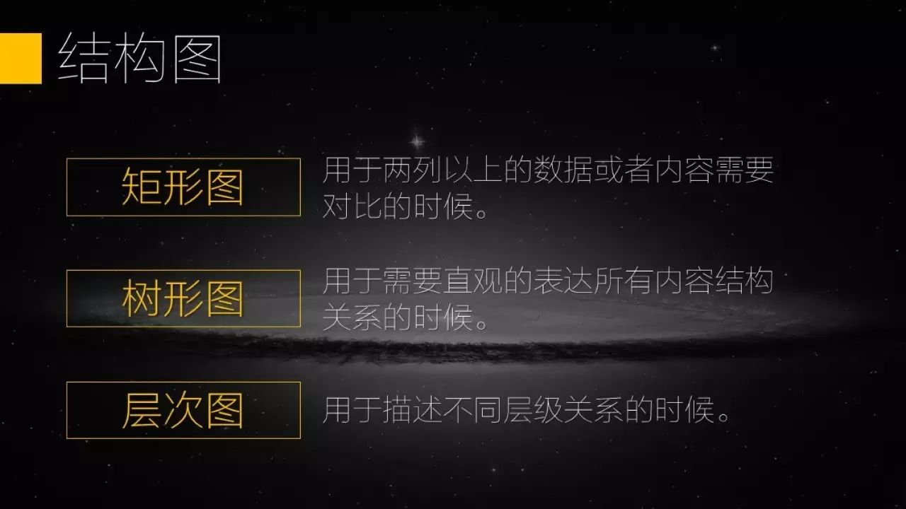
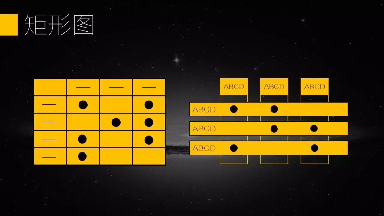

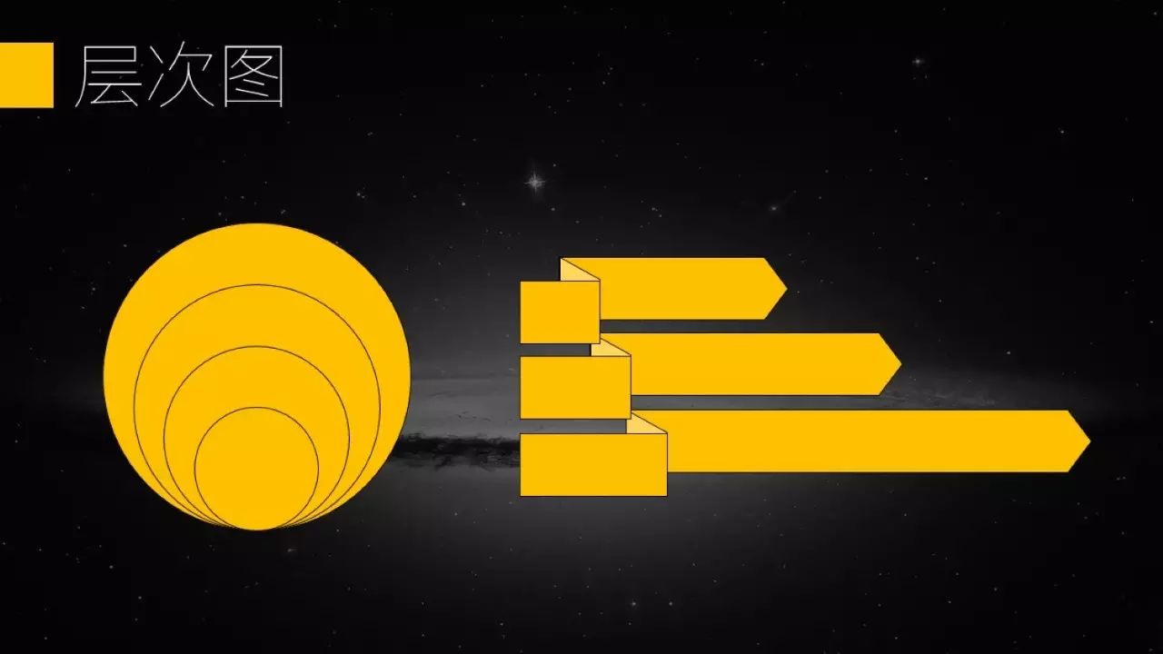
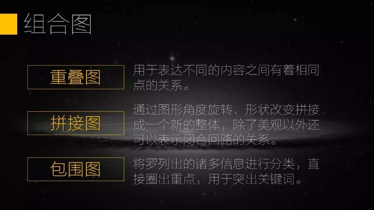
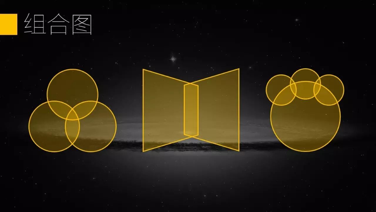
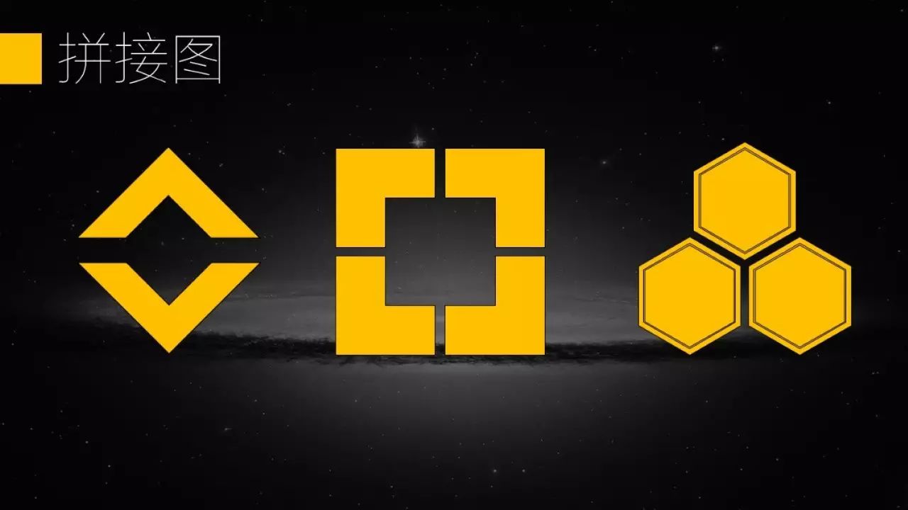
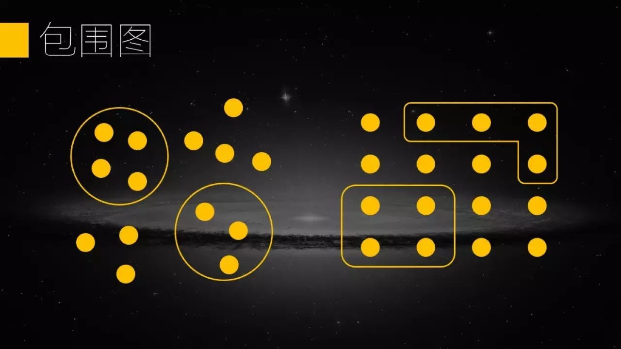
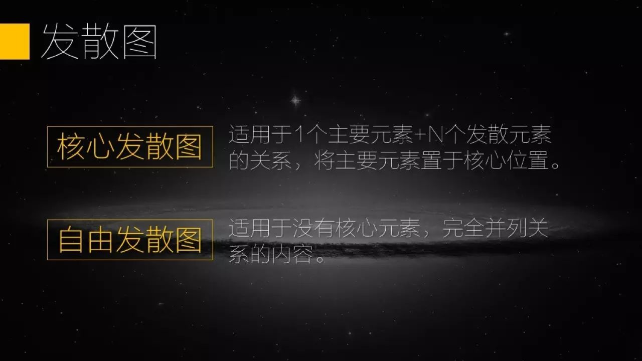
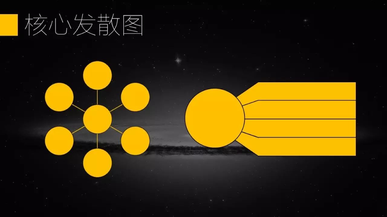

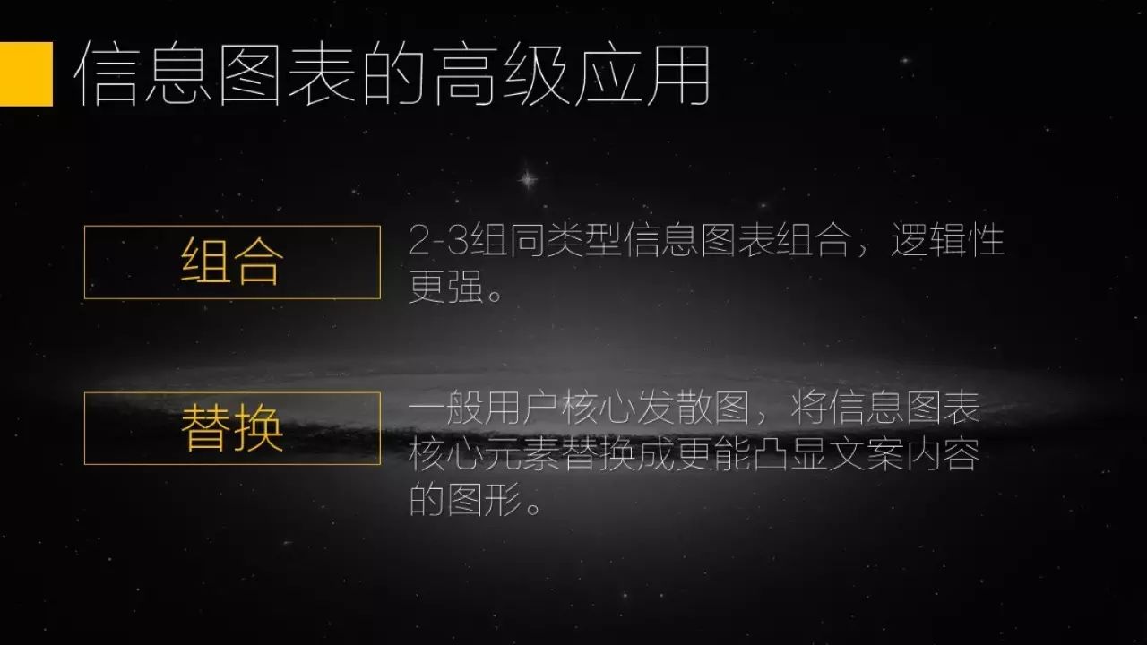
The above are basic infographic applications, as long as the logic used is correct, it is already very good. If we want to make it more beautiful, then we need to combine infographics with the same logic or replace elements.
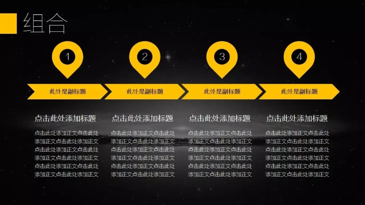
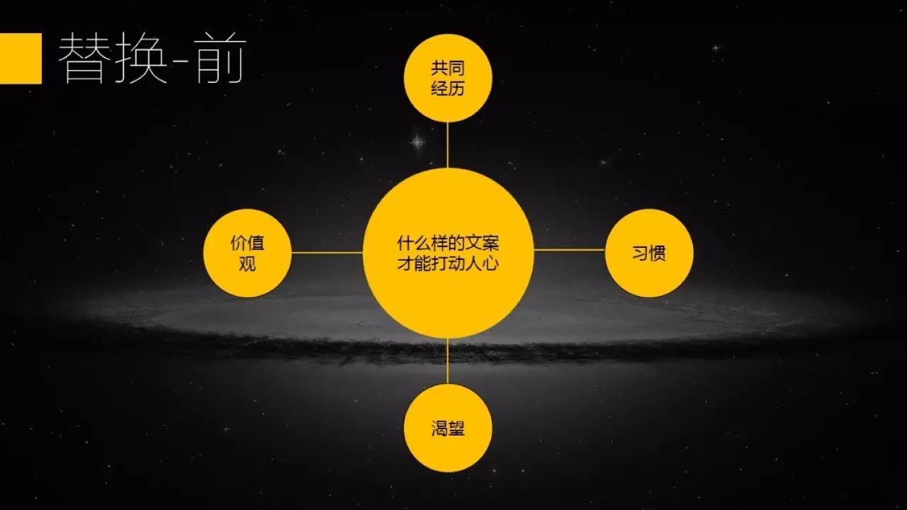
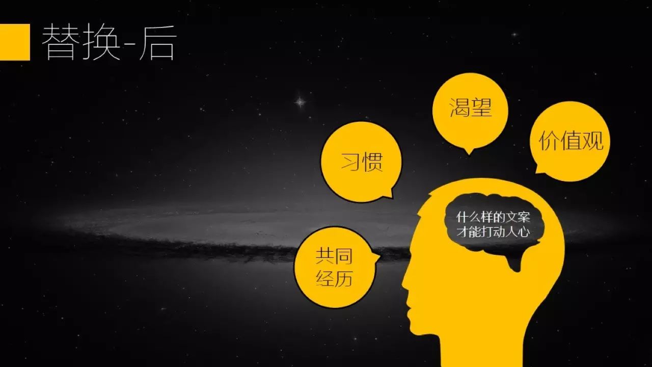
Some elements with special shapes can be obtained by making by yourself or downloading from the Internet. For online download, you can search for easyicon on Baidu.
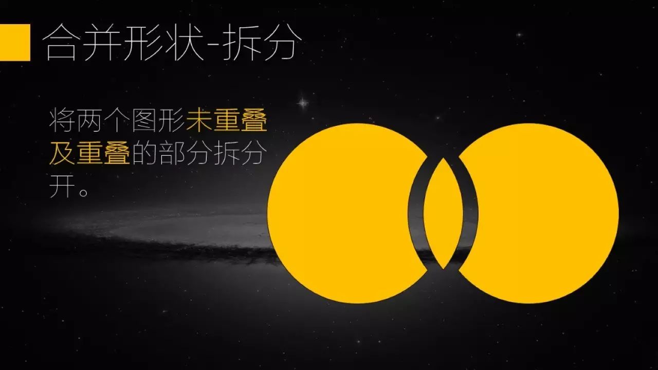
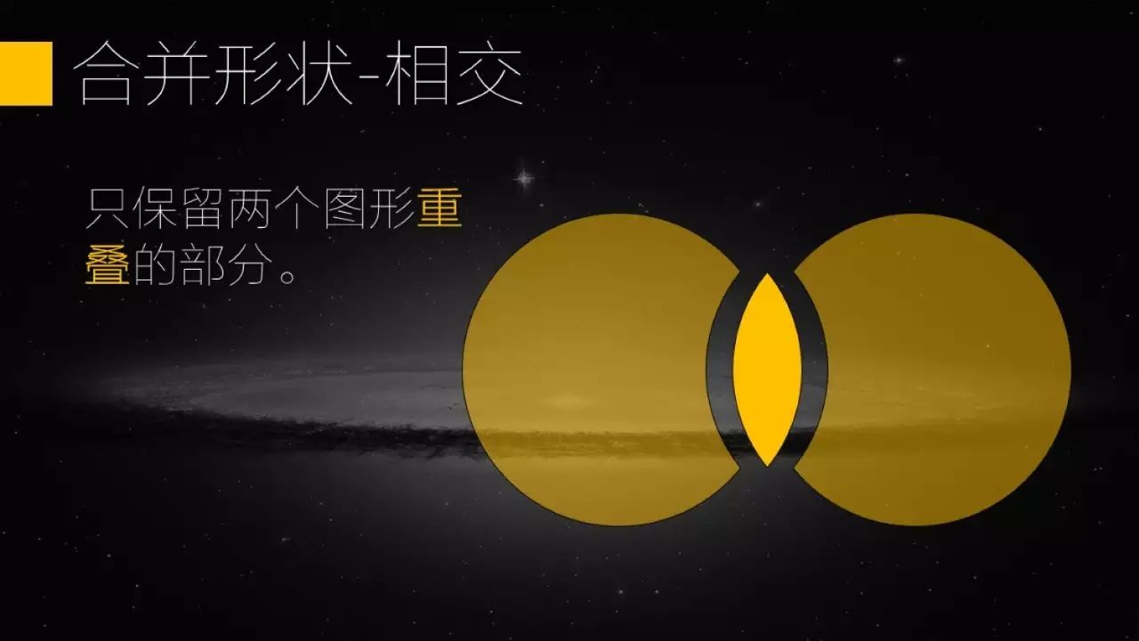
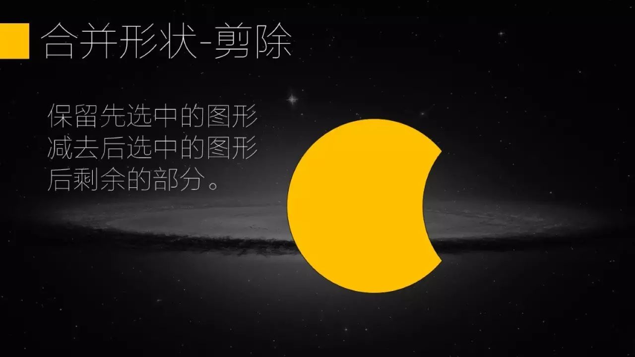
Color Matching
We all know that some content in PPT needs to be highlighted. Enlarging and changing the text color are common methods, but in terms of color selection,Many people rudely use some very eye-catching, even The color is very different from the background color, the final text is highlighted, but the whole PPT has also become a big stage in the country.
Another situation is that many people realize that the main color of PPT should be selected as the LOGO color of their company. This is not a problem in itself, but if your LOGO happens to be very ugly in color (in fact, many companies with a long history have this situation), go to your designer and ask for a Pure black or pure white LOGO file (PNG format).
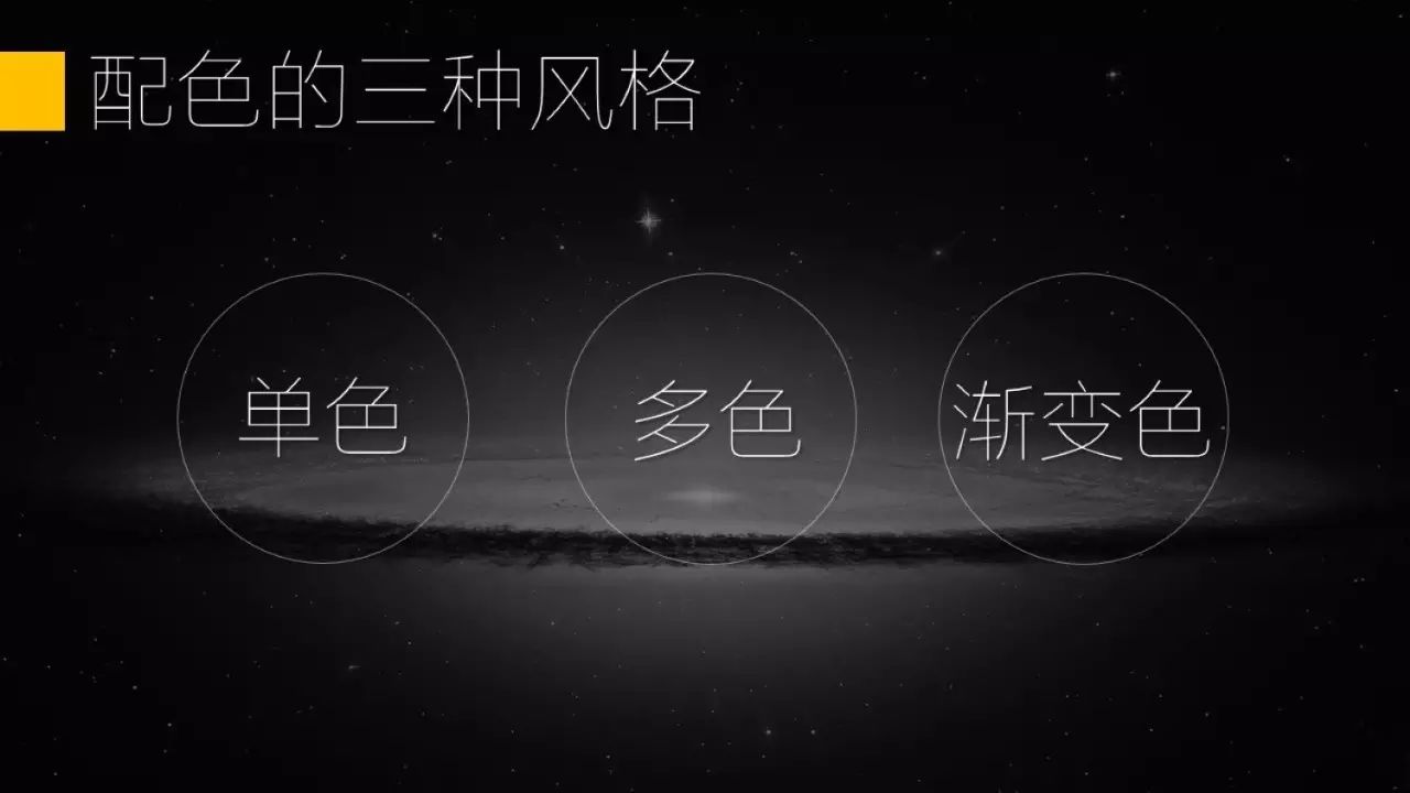
The color matching is divided into monochrome, multi-color, and gradient. From a practical and trouble-saving point of view, monochrome is the best choice, not only easy to unify the whole style, and it's not easy to make mistakes.
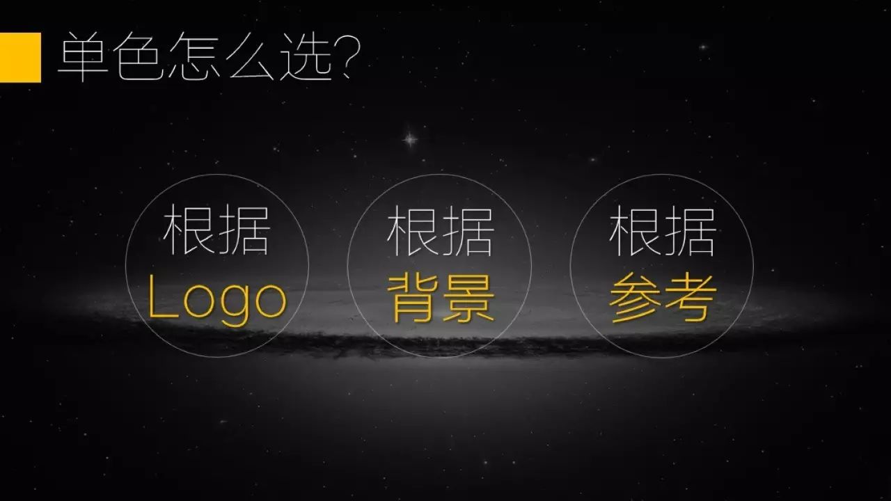
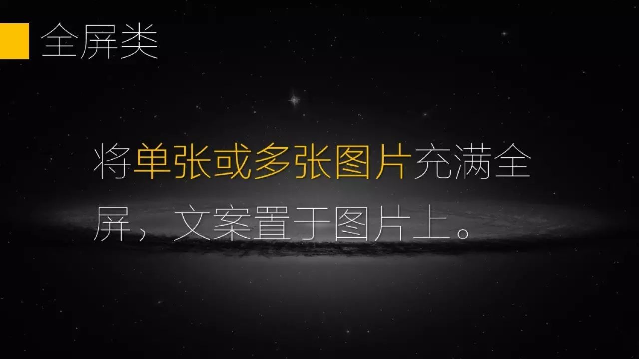
The most practical method is to choose the color according to the reference, the PPT color picker is very convenient You can copy the good-looking color schemes on the Internet.
Typesetting
Typesetting is a headache for everyone, especially single-image typesetting and multi-image typesetting. Typesetting is always the most difficult. We need to integrate typesetting according to all the content of a page of PPT (including background, pictures, text, and other elements), so here is what you do Here are some examples for reference.
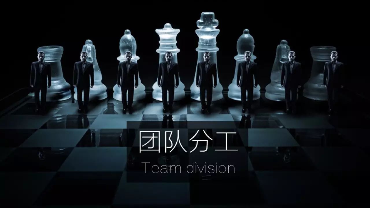
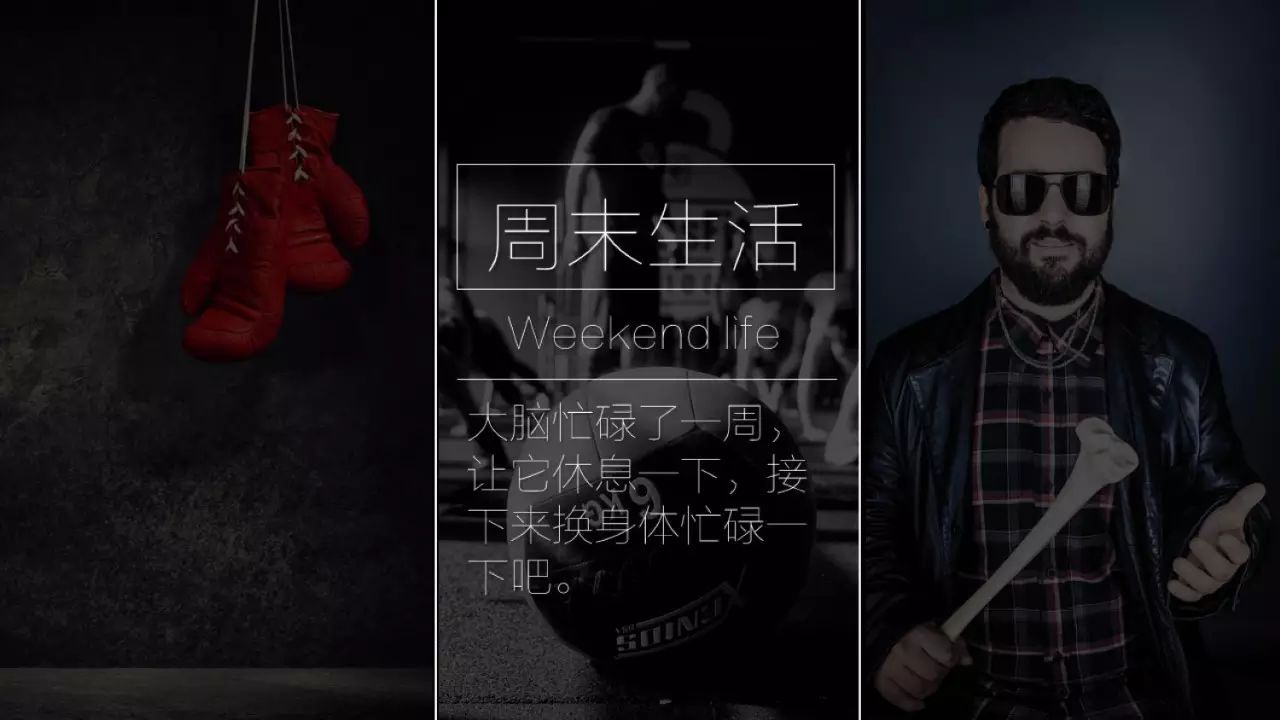
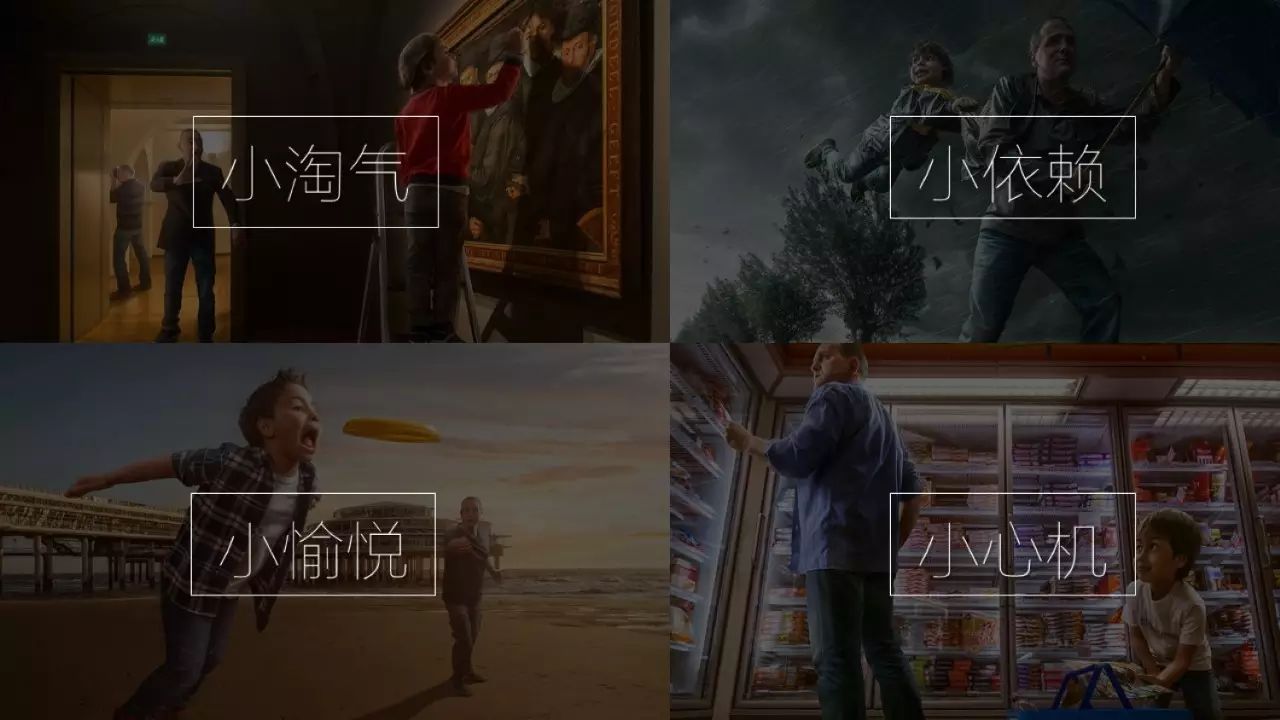
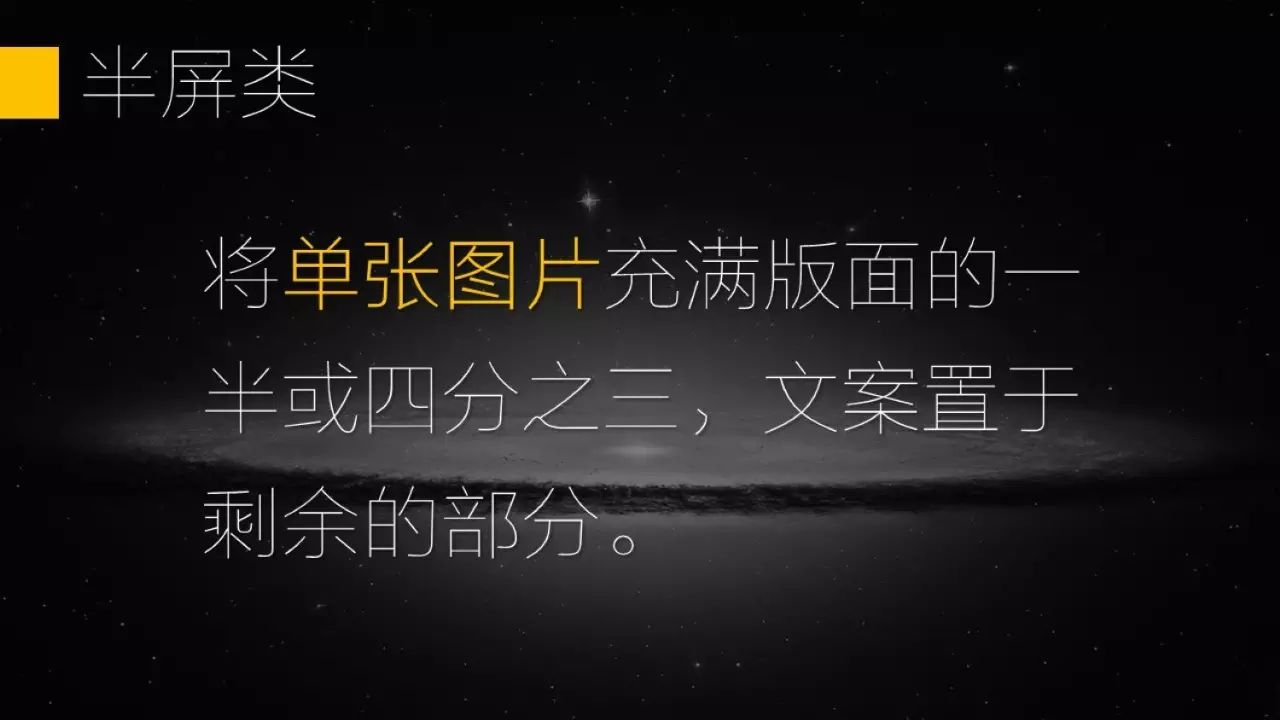
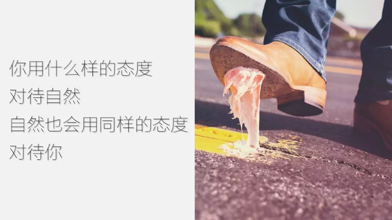
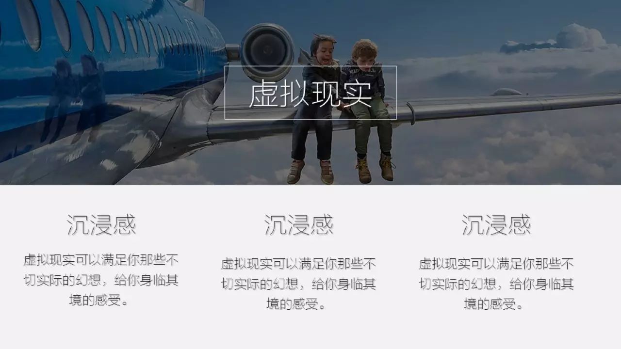
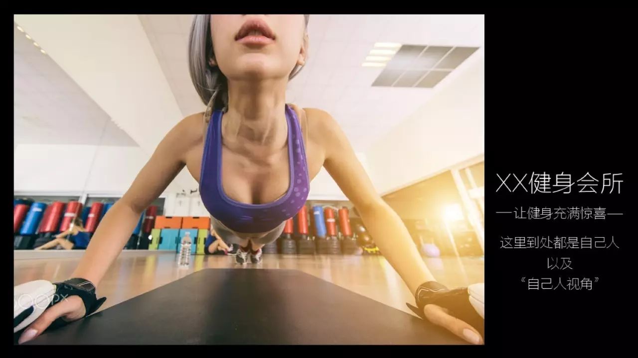
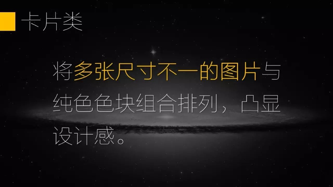
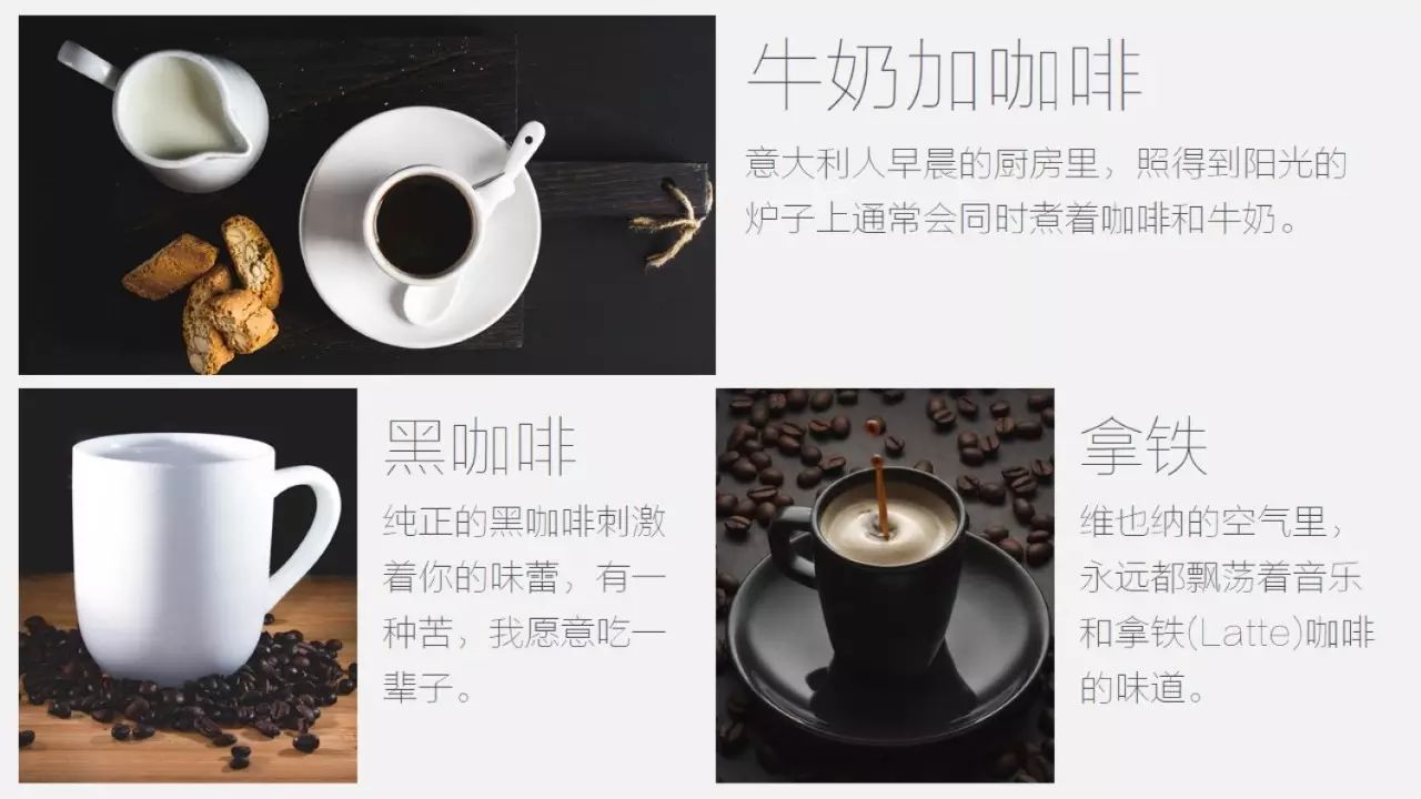
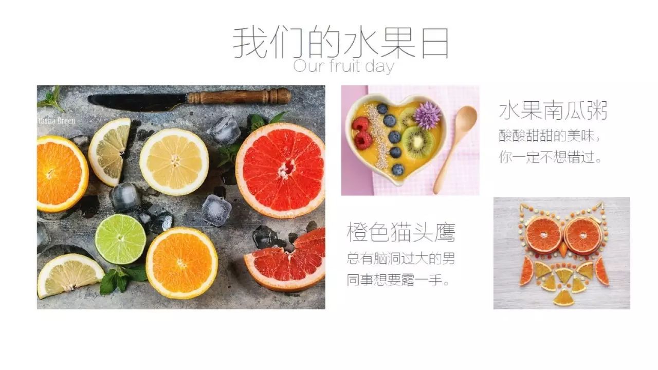

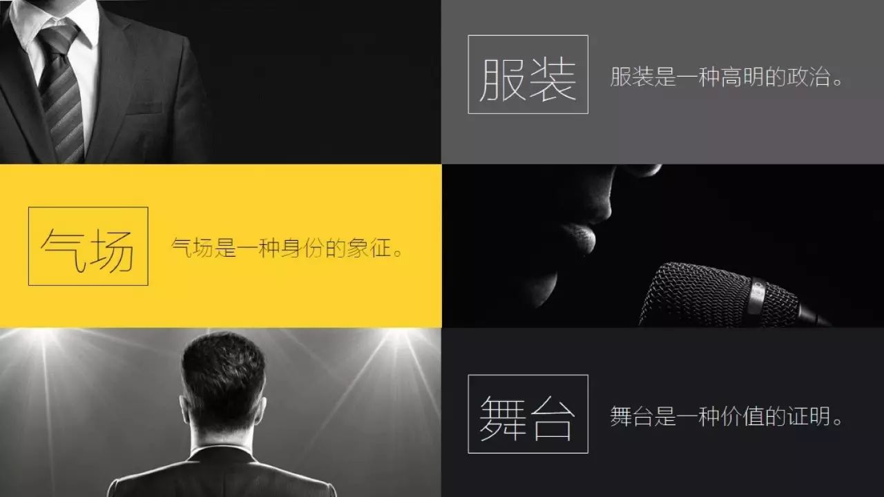

For typesetting, if you don’t have confidence in your aesthetic ability, then the best way is to imitate, focus on accumulation, all the billboards you can see on the way to and from work, and the focus you see when you visit Taobao The pictures, as well as the appreciation of some excellent works, are preserved and will be useful one day.
Written at the end
In the existing division of labor in the workplace, most companies do not have such a position as a PPT designer. Those of us who need to do PPT may have various identities, such as department leaders, planners, and products. Managers, it's HR, it's the market... everyone has countless "legitimate" reasons to think that they don't need to put more energy in PPT Customers come to me for customized cooperation). In fact, practicing PPT well is not just a thing for you to pretend, but it represents your attitude in doing things, your seriousness, and it can improve your efficiency and save time. No matter what stage you are in PPT.
I still clearly remember that since I made PPT customization, I made the first 50-page PPT for 4 nights, and after nearly 2 years of continuous training, I am now making a 50-page PPT It only takes 1-2 nights and it's more polished than ever.

About this article
Old Wang. The founder of PPT expert/Pharaoh’s wife next door to the official account,has served as the customer director of several companies (advertising celebrity Pony Song Company), Currently a senior brand manager of a listed group.
Public account: Mrs. Wang next door (ID: gebilaowangfuren)
Good lesson recommendation

Free micro-classes
Saturday丨Basic beginner piano, learn to play a favorite pop song in 1 hour
Monday丨Stanford University's most popular psychology course: Improve self-control and control your life!
Workplace charging treasure covers more than 1 million small partners who love to learn, welcome all kinds of business cooperation, please contact WeChat: kevinhe07 (remark: business cooperation)
▼Poke "Read the original text", the 2017 training camp is recruiting
Articles are uploaded by users and are for non-commercial browsing only. Posted by: Lomu, please indicate the source: https://www.daogebangong.com/en/articles/detail/After%20reading%20this%2072page%20tutorial%20dont%20make%20PPT%20ugly%20again.html

 支付宝扫一扫
评论列表(196条)
测试