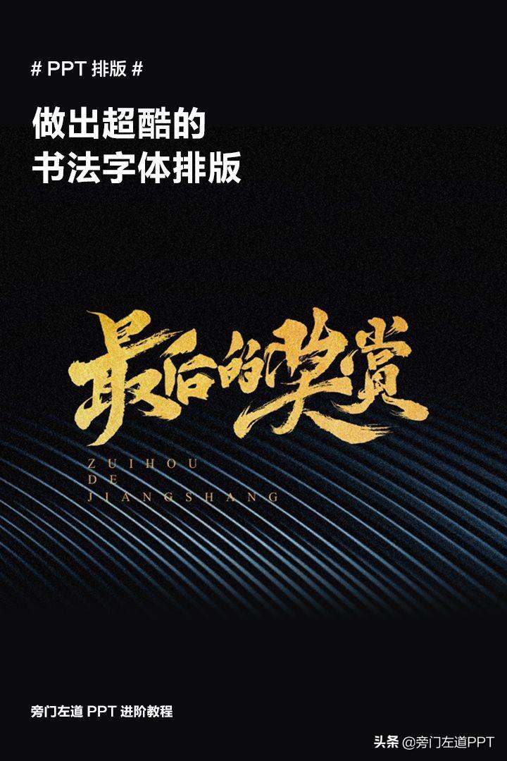
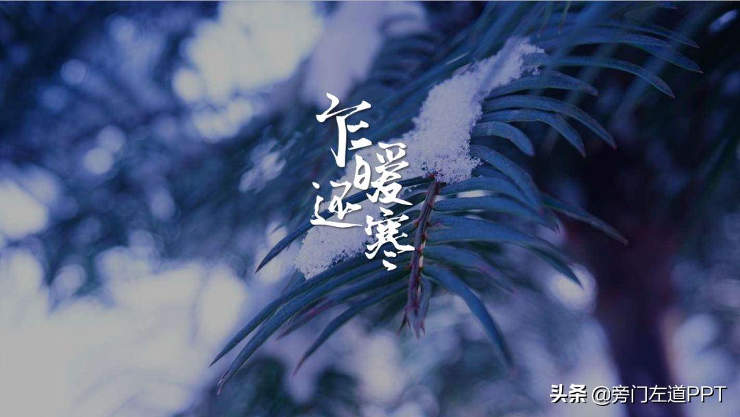
When we need to display a small amount of content on the PPT page, such as celebrity quotes, or corporate vision, or work perception, compared to ordinary Microsoft Yahei,< strong>Brush calligraphy font, in terms of visual presentation, will be more imposing and expressive. (There are big benefits at the end of the article!)


However, it is undeniable that calligraphy typesetting difficulty will be much higher, so that many readers, when making PPT , it is difficult to make a tall typesetting.
Therefore, this article, from font selection, typesetting style and text modification 3 aspects, let’s chat systematically with you, How to do a good job in the typesetting of calligraphy fonts.
Okay, not much nonsense, directly into the text.
01 Calligraphy font selection
This part, there is not much to say, I mainly recommend a few to you , a font with a large number of fonts and a more beautiful font style.
- Jin Meiyu Han Maokai

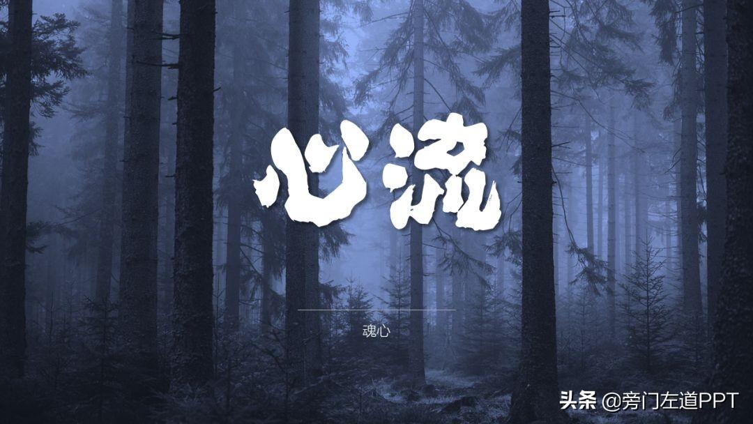
- Soul Heart
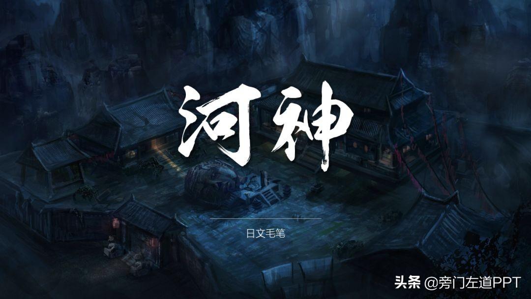
- Japanese writing brush
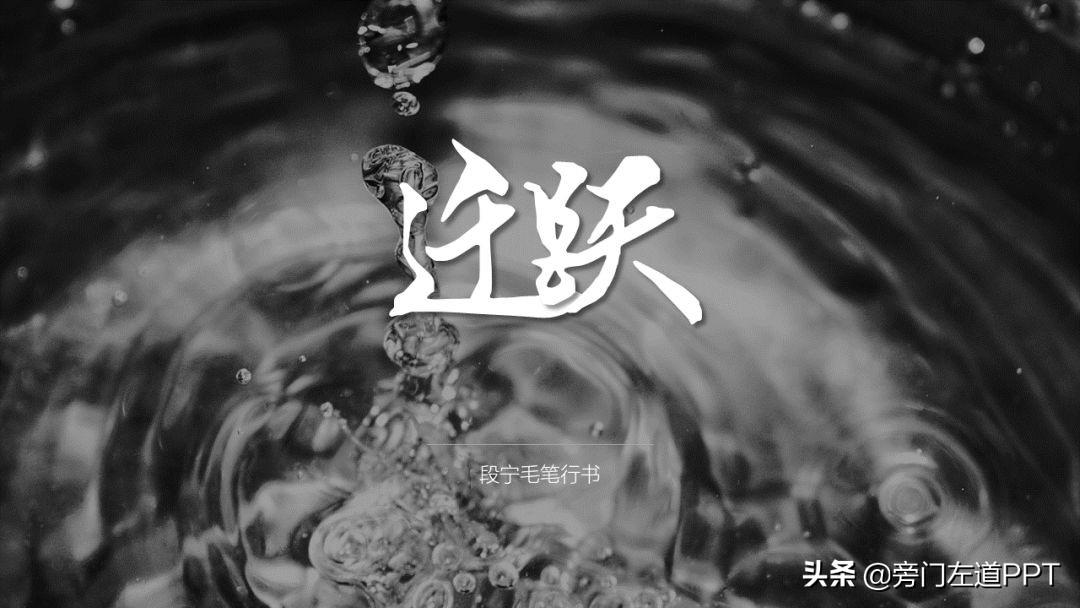
- Duan Ning brush running script
- Golden Dragon
- Founder Lu Jiande font

Of course, if you want more calligraphy fonts, you can click on my avatar and private message the keyword【 Brush font 】I have prepared a long list for you Awesome brush font!
02 typography style design
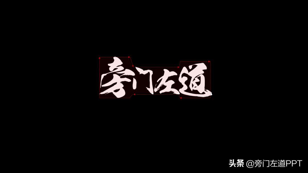
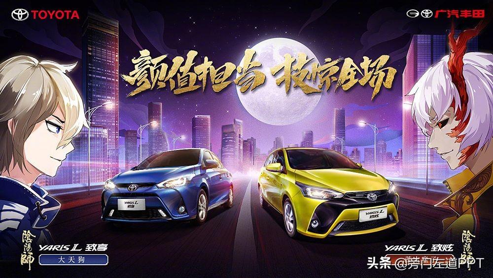
Regarding the typography of calligraphy fonts, if you simply line them up, see It will inevitably look a little flat. Therefore, the typography of calligraphy fonts is more about pursuing a staggered arrangement according to font size.
There are probably several commonly used forms.
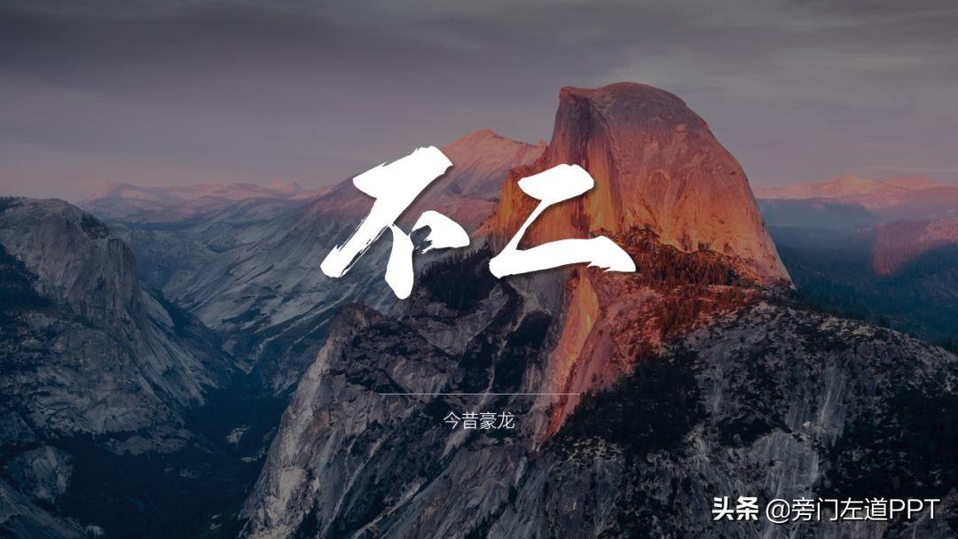
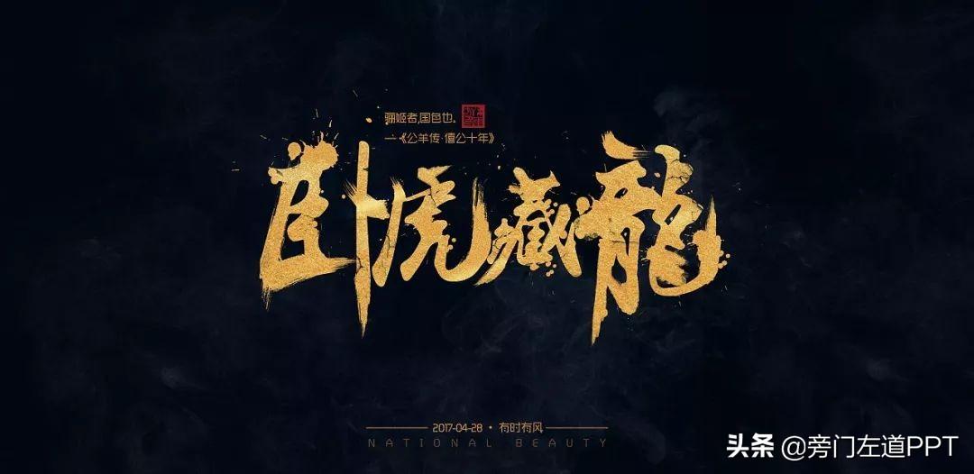
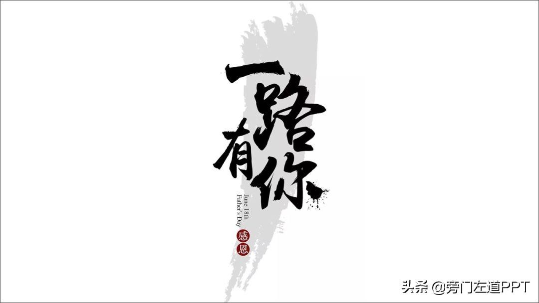
- High-low-high typesetting
suitable for 3 words typesetting

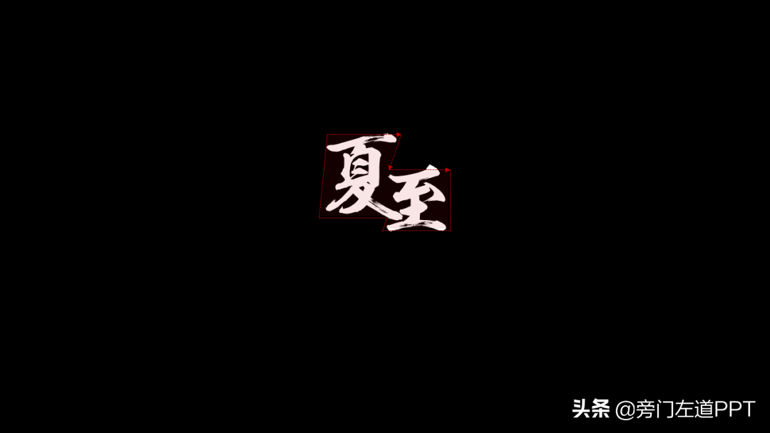
- High and low typography
suitable for two words typesetting

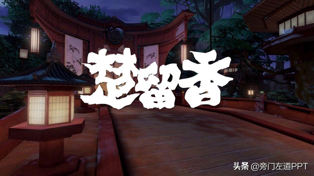
- Left and right typesetting
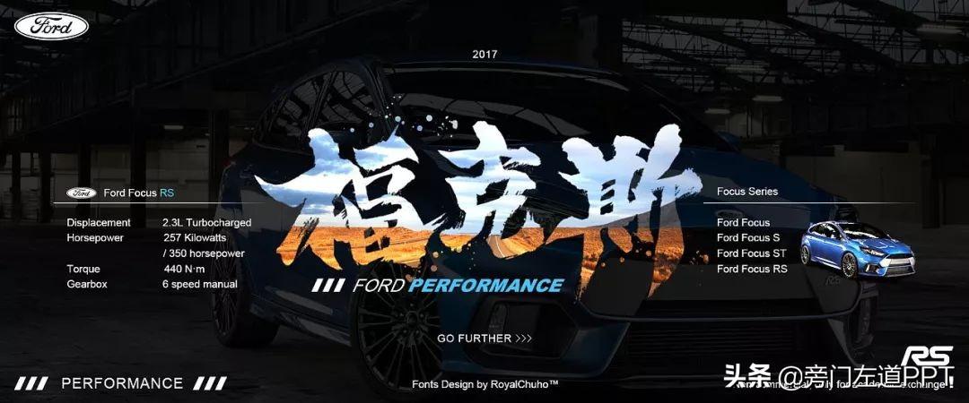
suitable for 4 words typesetting
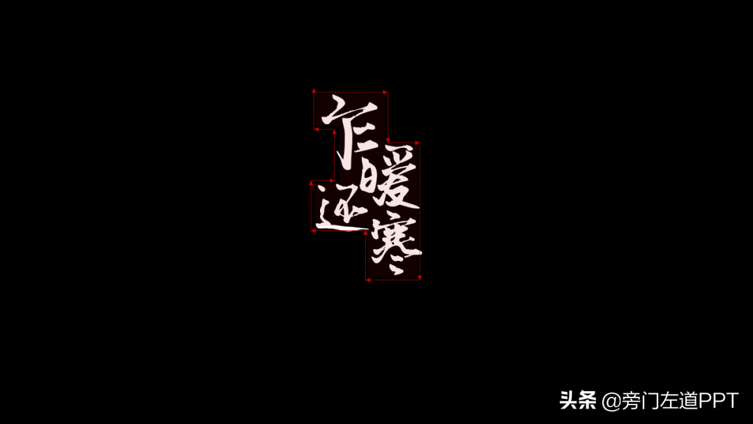
- High, low, low and medium typesetting
Suitable for multi-word typesetting
Of course, after the above two steps, the basic style of typesetting is basically completed, and the next thing we need to do is to carry out detail optimization.
03 Brush font modification
In order to present a better visual effect, Necessary modification is also inevitable. From my personal experience, I prefer to add modifications from the following aspects.
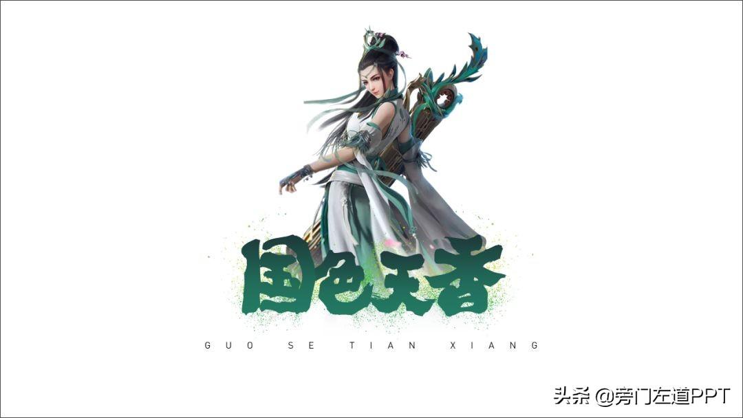
- Ink
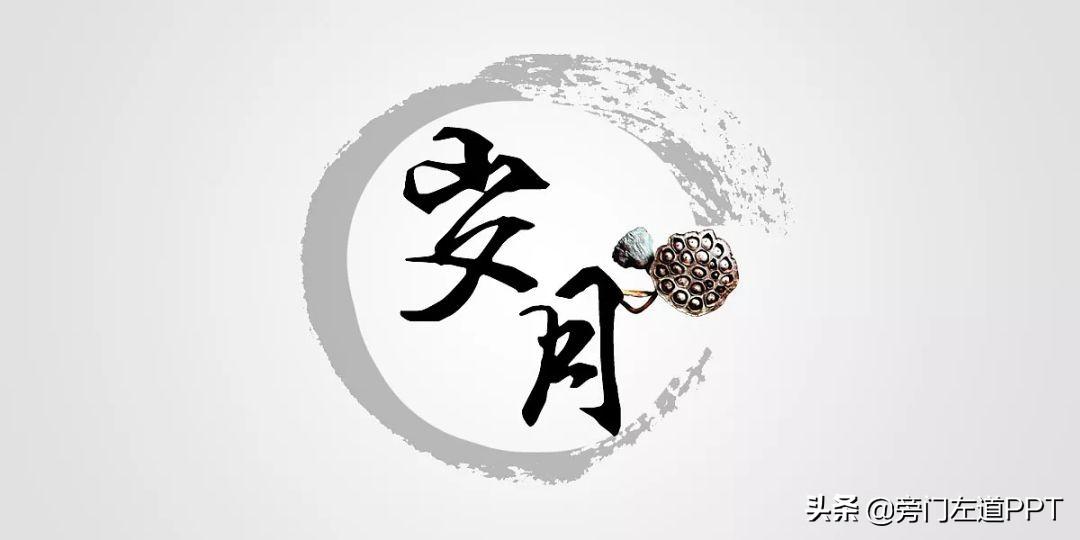
By surrounding the brush font, add Some simple ink point materials can make the brush writing effect more realistic.
For example, add some green powder:
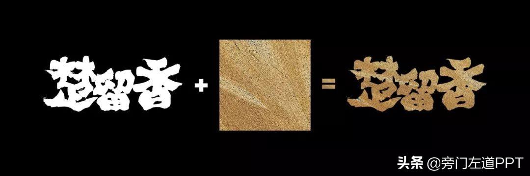
- Fill
In the brush font, fill some Textured texture materials, such as gold texture, can make text more visually expressive.
For example, fill the picture into the text:
Or fill the text with golden texture material:
Briefly explain how to fill the material into the text:
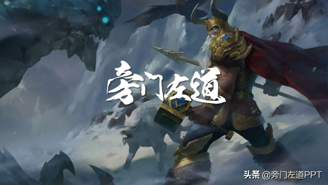
- Substrate
If the page is just empty Displaying a few brush fonts is somewhat monotonous. Therefore, adding some necessary substrates can not only enrich the visual effect of the page, but also focus the attention of the audience.
For example, add a brush brush:
Wait, there are still many ideas, I suggest you read more excellent works and make a summary.
Summary
The above is some experience of brush calligraphy text layout. Because the content is a bit trivial, here is a brief summary.
Choice of brush font
- Jin Meiyu Hanmao Kai
- Spirit and Heart
- Japanese brush
- Duan Ning brush running script
- Haolong< /li>
- Founder Lu Jiande font
Typesetting design
- High-low-high typesetting
- High-low typesetting
- Left-right left-right typesetting
- High-low-low-medium typesetting
Brush font modification
- Add ink material
- Picture filling
- Add substrate elements
Okay, one last word of mouth. Every time I write an article, it takes an average of 3 hours. If you are willing to spend 3 minutes reading it and take 30 minutes to practice, I believe that you can also quickly become a PPT expert. However, those who are most afraid of are those who learn without thinking, and think without practicing.
I believe you are not.
I have prepared all the brush fonts involved in this article, go get the resource pack now!
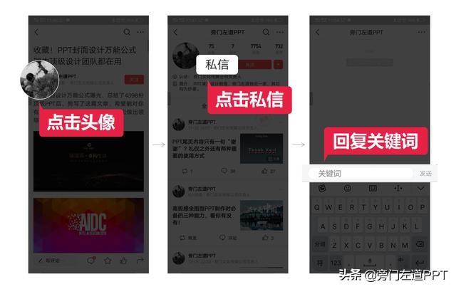
Click on my avatar, private message the keyword [calligraphy brush font], all fonts will be given to you with one-click installation package!
It is not easy to be original! Remember to like and comment! I will send it to you first! If there is anything you want to see, you can leave a message to me!
Articles are uploaded by users and are for non-commercial browsing only. Posted by: Lomu, please indicate the source: https://www.daogebangong.com/en/articles/detail/After%20reading%20500%20top%20PPT%20designs%20in%20China%20I%20summed%20up%20a%20set%20of%20super%20cool%20typesetting%20skills%20Absolutely%20amazing.html
 支付宝扫一扫
评论列表(196条)
测试