
Today, I would like to share with you the methods of PPT cover page design, which are all practical cases. Take a look next.
Cover beautification design 1
First look at the cover of this page, there are still many problems, this design method is relatively simple, and does not fit the theme, and the background is used sloppily.

At this time, according to the theme content, with the help of car design, due to the lack of cover title text , using a gradient effect, while the background is designed with light effects and gradient line elements to further increase the design sense of the page.

In addition, the car can also be enlarged and designed to make both sides symmetrical Effect.

There is also this typesetting method up and down, and the effect is not bad.

If you feel that the above effects are not outstanding, you can also use this diamond design at this time. And place the car in a diagonal design to create a speeding effect.

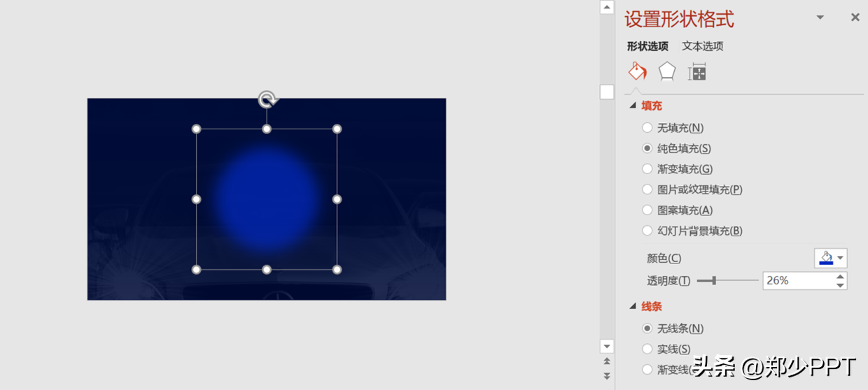
Here I would like to share with you about the production method of this light effect, Insert the shape first, then soften the edges.
Key points: shape—effect—soft edge—size

Finally, you can adjust the transparency and superimpose multiple effects, so that the light effect The effect is more intense.
Cover beautification design 2
Look at the cover page again. This kind of cover page is a relatively difficult type to design. Don't look at the lack of content, this is the difficulty.
The pictures and background used on this page do not match the theme at all.

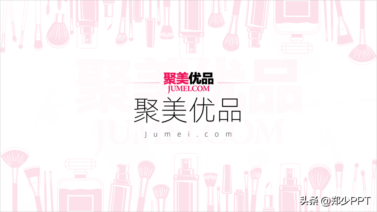
Since it is a beauty cover, you can use cosmetic graphics as the background design.
With this design, the page will not look single, take a look.
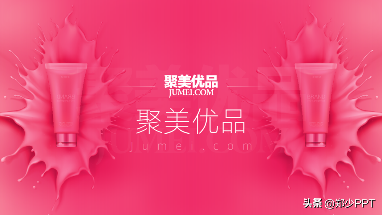
Besides, if you can't find many cosmetic graphics, then use physical pictures design.
is also a good method, if you don’t believe me, take a look.

If you still can’t find a picture of this type of combination, then use a single cosmetic Physical drawings can also be designed.
Then use the special position of the picture to put the text on it.

Originally, the color of this picture is not dark enough, it does not match the theme, so we need to use gradient Masking.

In addition, this symmetrical effect can also be designed. In short, to make the page more exciting, don't be too single.
Cover beautification design 3
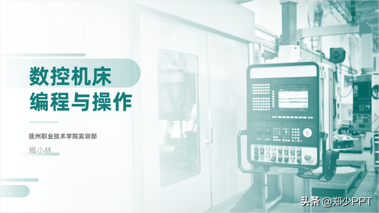
Look at the cover page again, the problems of this page are clear at a glance, the theme is not prominent, the content is too complicated, and there are no core problems such as contrast.

At this point, simplify and remove irrelevant background and other elements, with the help of darkmode Design the layout picture, and decorate it with lines to make the content of the title clearer.

In addition, if you want the page to be more concise, it is also possible. Go straight to this light background design and then re-layout the header content.
Cover beautification design 4
Look at the cover page of this page, this is also a relatively common single-type cover page, that is, plain text.

First of all, set the layout here, and fix the layout of the design, here use Centered typography.

After the layout is set, use this creative shape to decorate and strengthen Overall visual effect.

At this time, the elements on the page already have a sense of design, but the title is still relatively simple ,Right.
It's very simple, just use the small elements in the basic shape.

Finally, combined together, the page effect can be greatly improved.

Or, add a gradient effect to the title, these are the details .
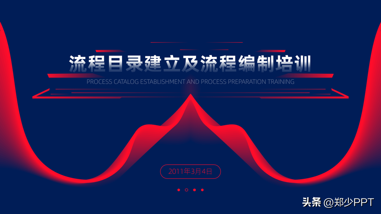
Finally, there is another way to change it. Adding a picture background is a routine.

For another example, the overall design of this cover page looks very empty.

At this point, first extract the content and elements for simple processing, as shown in the figure Show.

At this time, it is relatively simple, find the latest in the KOPPT plug-in [cover page], Just updated a lot of covers with a sense of design, take a look.

Next, just put the processed content on it, as shown in the figure shown.

For example, this cover page, in fact, the layout is not bad, but the elements are missing decorate.

Here, let’s make it simple and typesetting first, so that the content level can be opened.

After adjusting the content, open the [KOPPT] plug-in and select a 【Color block type】Cover import.

After replacing the previous content, is it much richer and no need Too strong a sense of design.

Cover beautification design 5
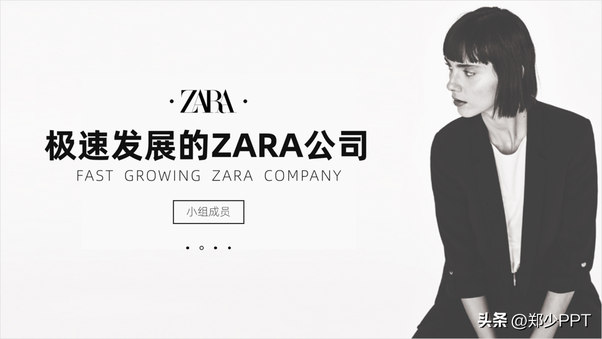
Look at the cover page again, the design style of the cover page is still relatively old-fashioned.

At this point, simply optimize the content of the title to the following effect to make the theme more Simple and clear.

Secondly, it is the place to display details, adding modified elements to it, such as changing Look at the pictures on the official website.

In addition, you can also use a dark mask to highlight the theme.

Finally, this character can also be used for left and right typesetting, and the effect is very simple. atmosphere.
Cover beautification design 6
Finally, there is still a lot of content on the cover of this page.
There is still room for optimization in this display effect.

First of all, give it a "makeover" and make the cover page content primary and secondary.
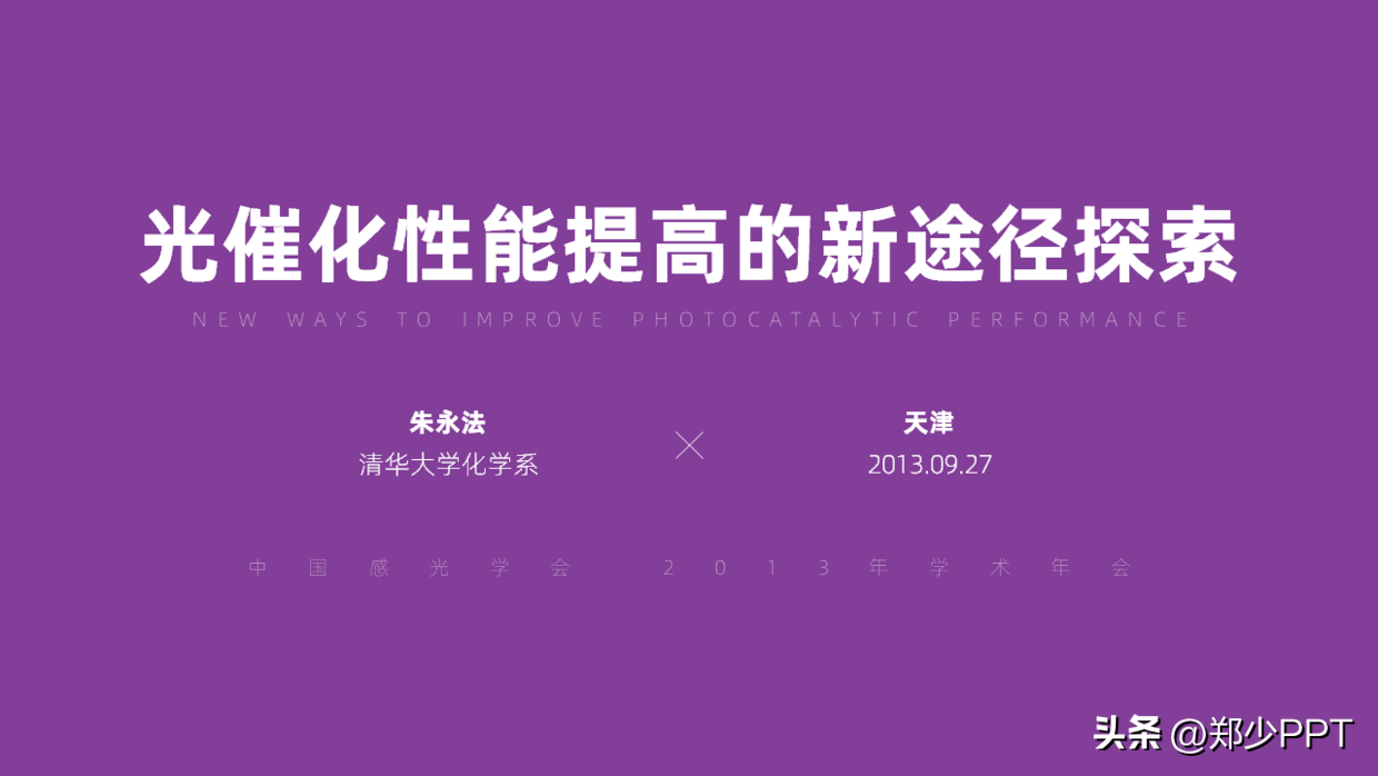
Secondly, when the content of the page opens up the contrast relationship, the background is less layered, Line building optimization is used here.

Put the line building at the bottom and adjust it with a gradient mask.

Finally, I thought of the word [photocatalyst] and added another Display of light effect elements, take a look at the final effect.

There is also a light color effect, which looks good overall.

Cover beautification design 7
Another example is the cover page of this page. This PPT uses yellow as a whole. The color is not very good. Warm colors always give people a dry and hot visual sense.
Try to use cool colors for medicine to give people a calm feeling.
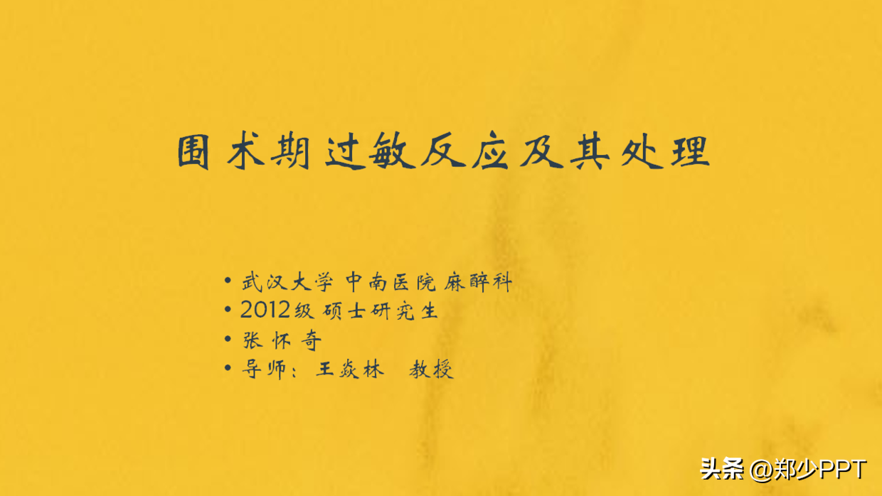
Find a suitable medical picture for design, and the color in the picture should be as close to the theme as possible color.

Because the above picture is not the whole picture, let’s use gradient color to process it here.

When the background is done, put the text on it and expand the layering.

Finally, you can also use the ring to optimize it to break the monotony of the page.

The above pictures and case materials are all from network sharing, intrusion and deletion
I will share so much about this theme, I hope it will be helpful to you .
See you next time!
Articles are uploaded by users and are for non-commercial browsing only. Posted by: Lomu, please indicate the source: https://www.daogebangong.com/en/articles/detail/After%20reading%201000%20pages%20of%20PPT%20I%20squeezed%20myself%20dry%20and%20shared%208%20cover%20design%20cases.html

 支付宝扫一扫
评论列表(196条)
测试