:After more than 100 revisions, the fonts used by WeChat and Alipay...-knowledge base免费ppt模版下载-道格办公

After more than 100 revisions, the fonts used by WeChat and Alipay...

Digital fonts do play an important role in design, especially in finance and e-commerce. Numbers are not only the expression of information, but also the embodiment of emotions and design details. The fonts used in apps such as WeChat and Alipay have been


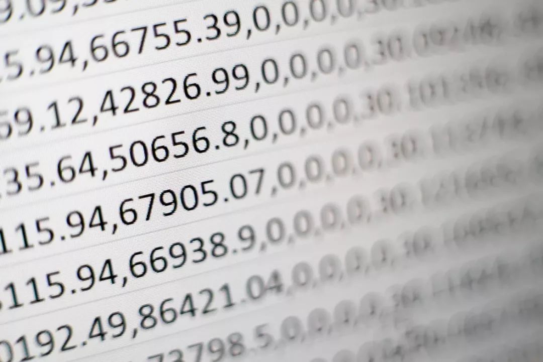
Many articles have talked about Chinese fonts and English fonts before. This time we talk about digital fonts. Numbers actually account for a large proportion in design. Especially in financial and e-commerce design, it has always been the transmission of emotion and the embodiment of design details.
Then I will share with you today What are the commonly used digital fonts in business design and financial design, how are the fonts of those big companies designed, and the fonts are packaged at the end of the article. In addition, there are more materials and essence articles to share in the planet to help everyone Design more conveniently.

< strong > 01. The skeleton of the font

1. Structural part

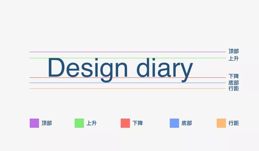
Before sharing, we need to understand the font structure:

Top: The maximum distance above the baseline of the tallest glyph in the font

Ascent: Suggested distance above the baseline of a single letter

Descent: Suggested distance for individual letters below baseline

Bottom : the maximum distance below the baseline of the lowest glyph in a letter

Line spacing: refers to the distance between the baselines of font lines

Basic English fonts are composed of these units, so after understanding these foundations, it will be more convenient for us to choose fonts in our design.
2. Body parts

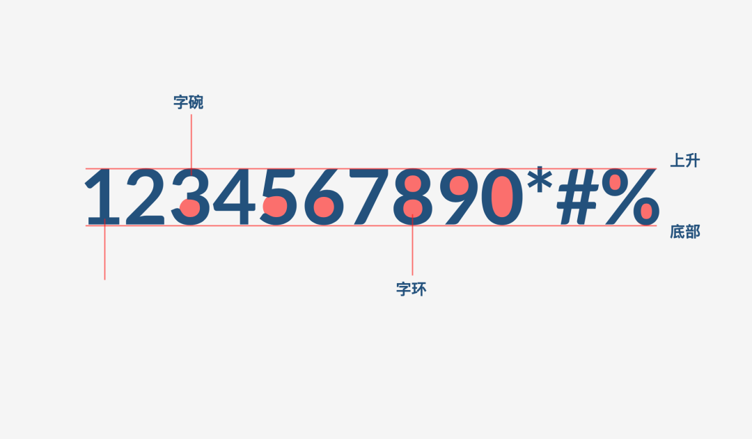
The previous picture is the upper and lower structural relationship of the font, so this picture is more about the elements that the font itself is composed of:

Torso: that is, the horizontal and vertical strokes of the number itself, relatively straight strokes

Character bowl: As the name suggests, with curved strokes

Word ring: the space where the font is wrapped< strong>
3. Word spacing

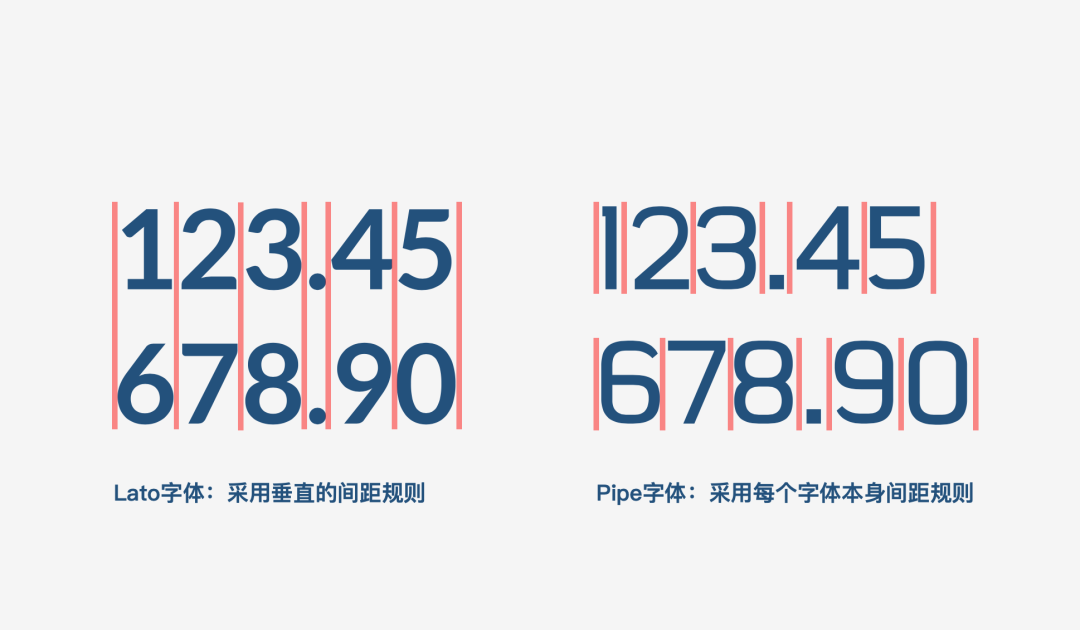
In terms of kerning, there are two approaches in the industry,One One is that each font has the same size, such as the lato we are familiar with, There is also a method that is based on the size of each letter itself strong>, for example, 1 will be smaller and 9 will be larger. These two layout methods have advantages and disadvantages. I personally recommend the former, and the spacing between each letter is the same!
02. Points to note

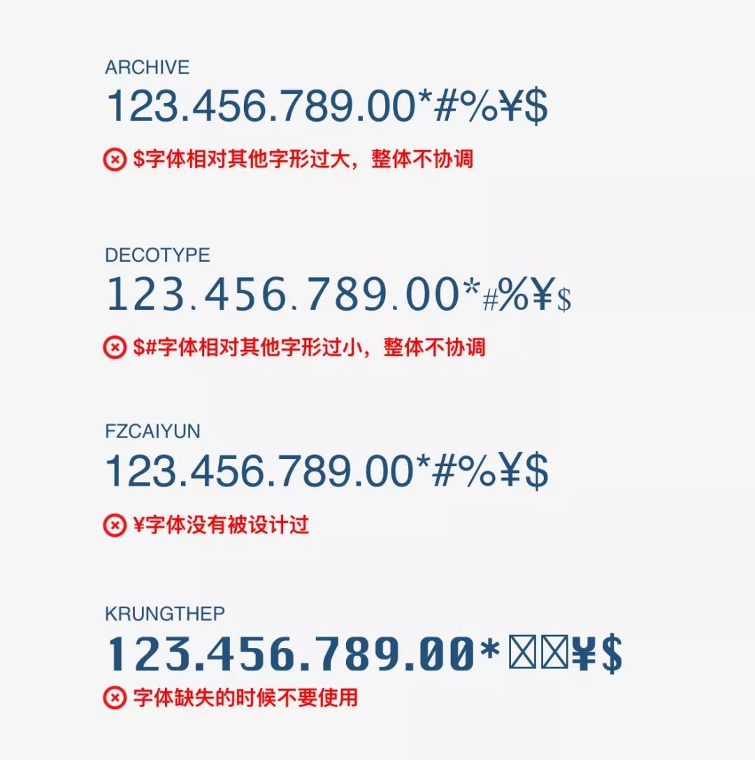
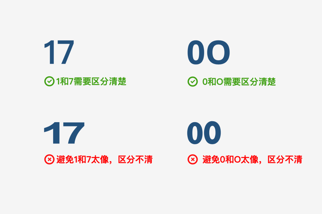
Usually when we find some digital fonts online for free, or choose several popular fonts,We must pay attention to check "$" and "% ""¥" symbol.

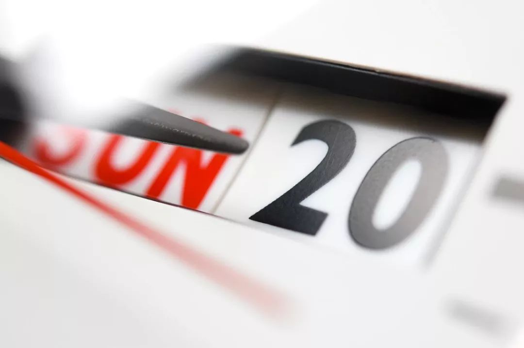
In addition, when choosing a font, you must carefully check each character,For example, the most confusing number is 1 and 7, 0 and O.
03. Common digital fonts < /section>

So when we do financial design or e-commerce design, which digital fonts should we use? Before choosing, let's take a look at which fonts Internet companies are using.

Apple system: SanFrancisco font used
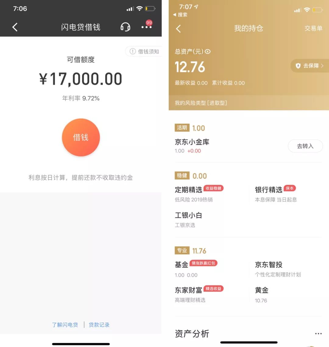
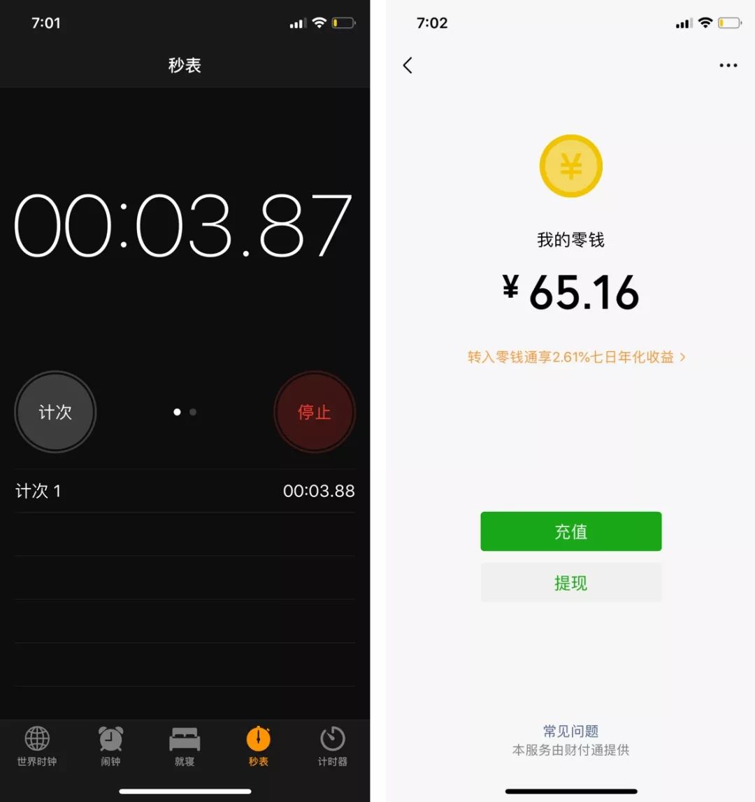
WeChat: fine-tuning based on DIN font

China Merchants Bank: DIN font

JD Finance: DIN font, redesigned
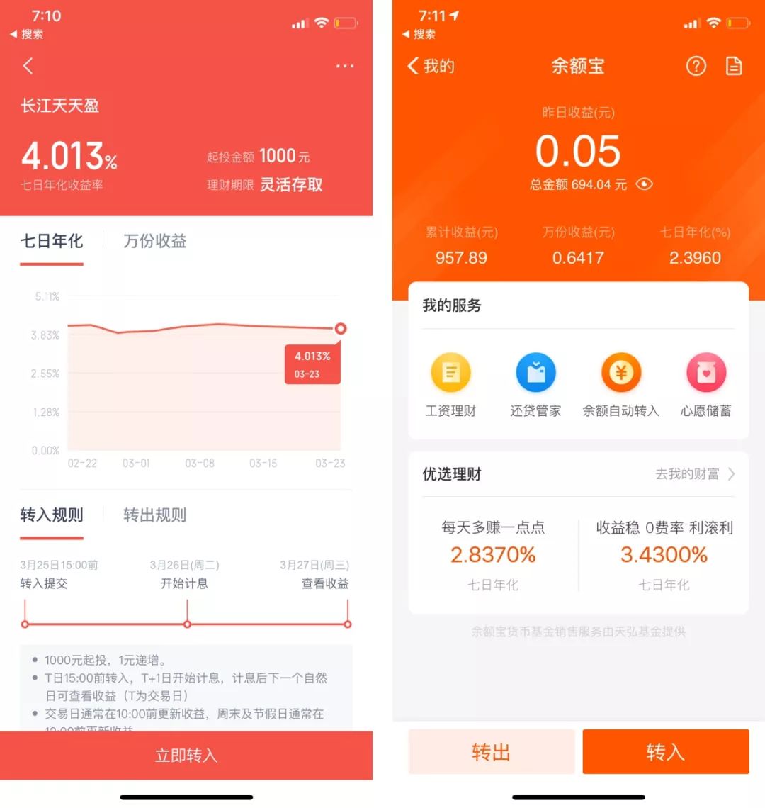
Baidu Finance: Adjust 6.9 on the basis of DIN font

Alipay: Apple's native Helvetica Neue
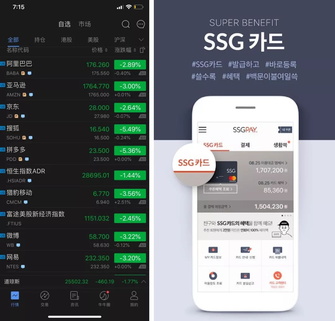
Futu: Apple native Helvetica Neue
South Korea SSG: Apple native Helvetica Neue
Through the above simple research, it is not difficult to find that most of the digital fonts of financial products at home and abroad now use Apple's own digital fonts, andDin This font is basically adjusted, so why is the font Din so popular with designers?

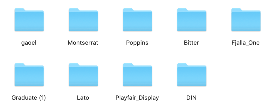
In addition to the Din font we often use, there are also some other good digital fonts, which are all packaged for everyone. The font is only for reference and learning. If necessary, you can add Jingle Cat to reply "Number" to receive it. If you already have Jingle Cat, you don’t need to repeat it Add to.

Long press to scan the QR code to add jingle cat reply:Number
04. Din< span >
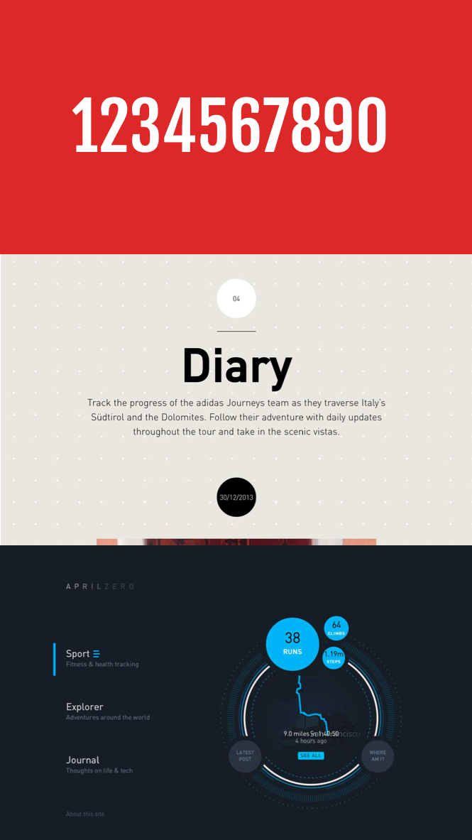
DIN is the acronym for German Standards Institute, Deutsches Institut für Normung. Since 1975,The German government has adopted DIN as a national standard system, and DIN standards have been widely used internationally and in Europe. DIN fonts have inherited strictness and high recognizability, and are widely used.

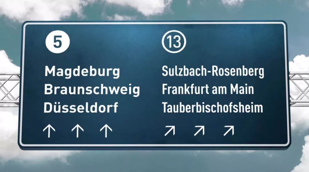
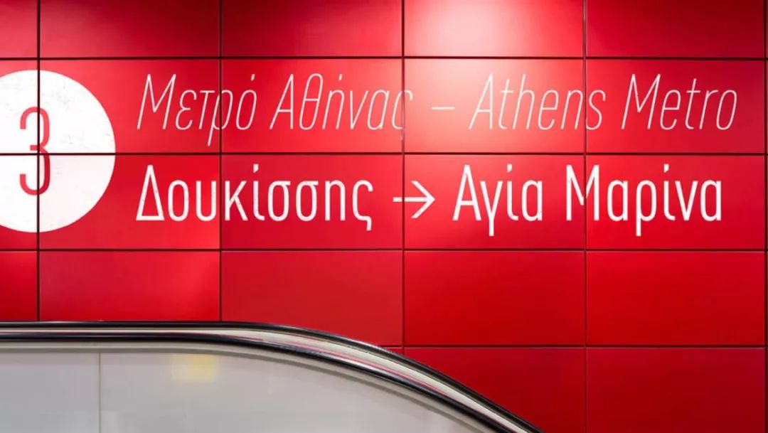
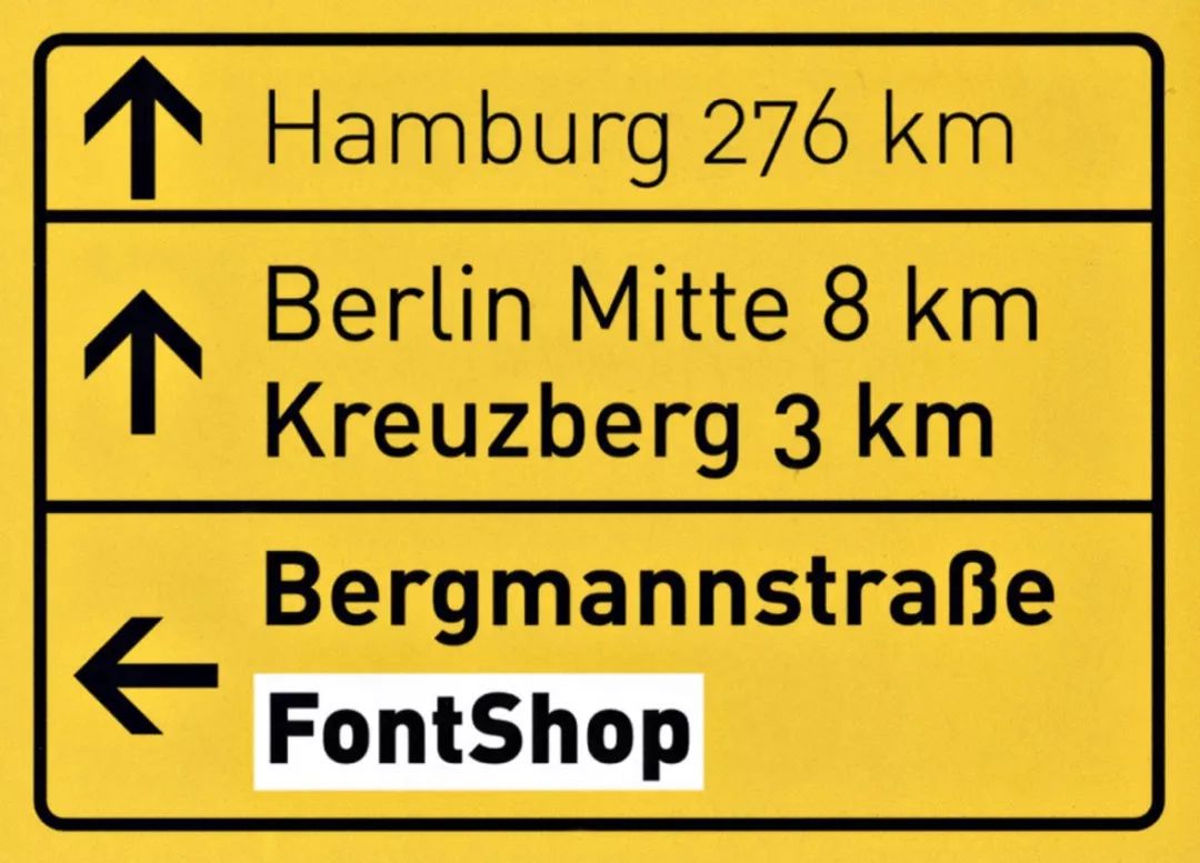
In German road signs, airports, and maps, most of them use Din fonts as guide fonts.

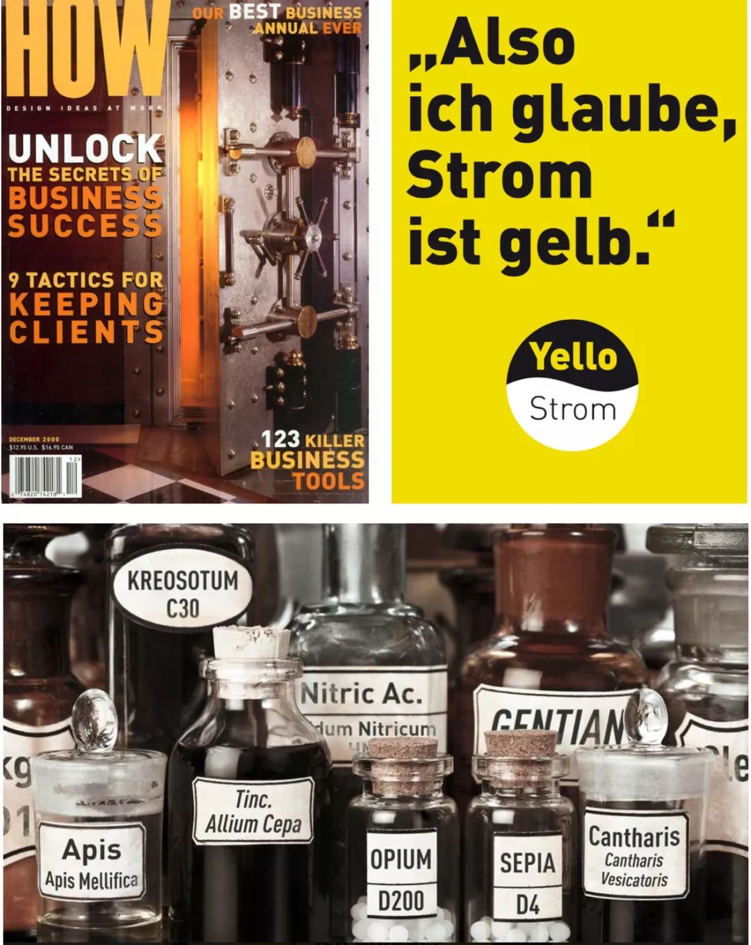
In the packaging of many magazines, a large number of Din fonts can also be seen. The rigorousness of the Germans is vividly reflected in this font.

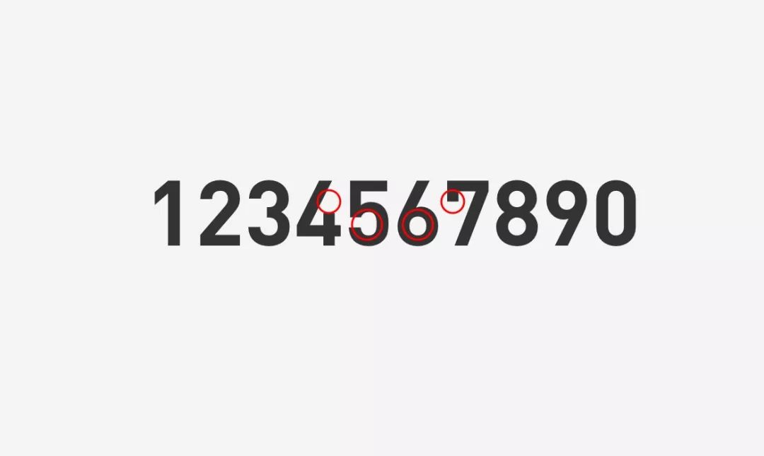
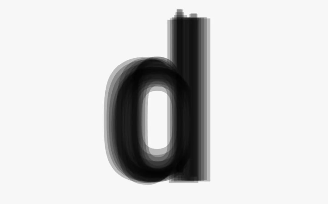
Defect: As we said earlier, DIN is used a lot in highways, magazines, and graphic design, but DIN is not so perfect when it is directly used in various complex scenarios in Internet APP design, such as In the figure, 4 has a large beginning, and the circles of 5 and 6 fonts are not consistent enough, and the recognition of 7 is problematic after shrinking, so many companies will carry out secondary design based on these problems. It is also mentioned in the previous analysis of competing products, why WeChat, JD.com, and Baidu will redesign on this basis.

05. < /span> Common digital fonts < /strong>
If only one digital font was recommended, I would definitely recommend Din, but Din is not free, the price It’s not cheap, if you need to use it, there will be a lot of fees every year, so if the company is not willing to buy it, you can redesign a version based on Din, or use some other good digital fonts, and then recommend some free copyrights for everyone in use!

1.Gaoel< /strong>

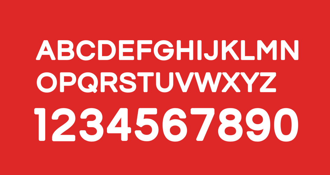
If you use Din, it is easy to get tired of looking crooked. I especially like the one recommended first.The overall font design is very round , youthful and cute are very suitable for some younger products, and the font weight is very suitable for the font weight effect of financial products!

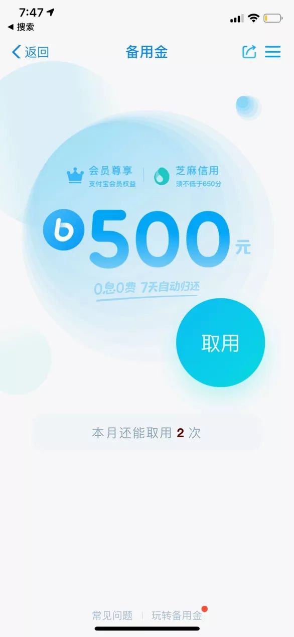
In the Alipay reserve fund page, a similar rounded and lively digital font like this is used! You can try the effect of this font in your interface, and you will not be disappointed.

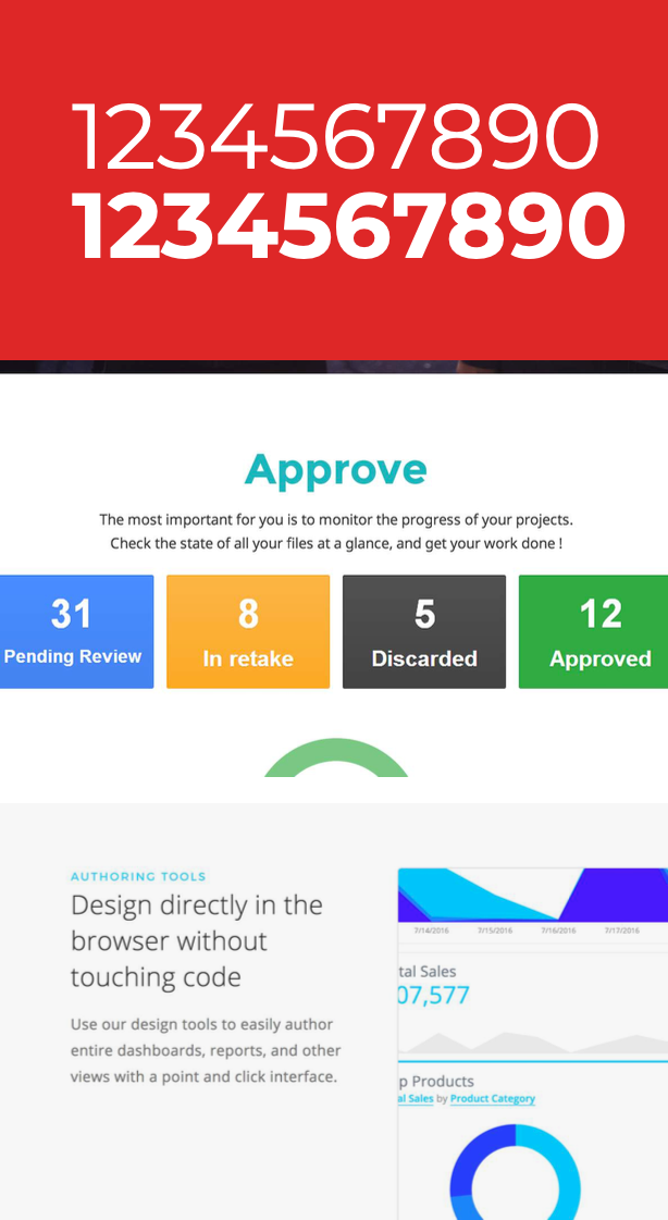
2. Montserrat< span>

Google Free FontsA very elegant font, it is very elegant when used in numbers or in the interface.

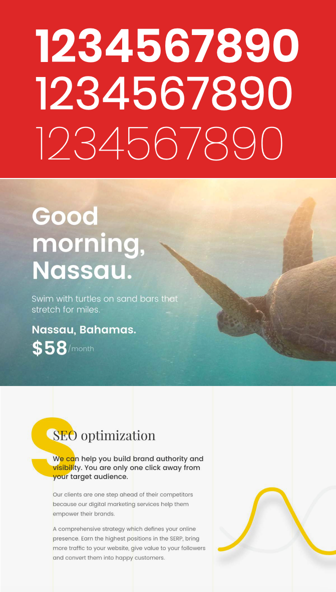
3. Poppins< span>

A font that is often used in Google Free Fonts,It is quite modern except 9 is a bit clumsy .

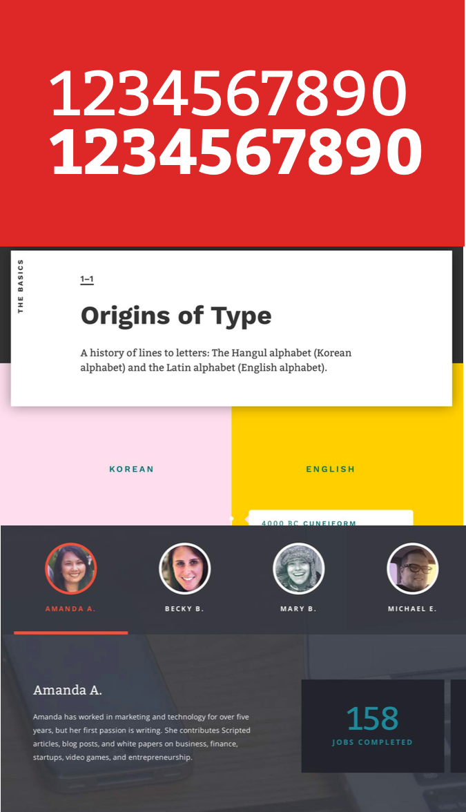
4. Bitter

Google’s is also widely used in various designs, and both fonts and English fonts are very easy to use.

5. Fjalla One

An alternative to the Din font that many people have been looking for. If the company is unwilling to buy the Din font, then this font from Google is a perfect substitute Products, the effect of using it will not be much different from Din.

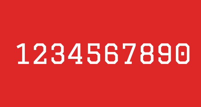
6.Graduate< span>

Google's free,A digital font with a very British style and preppy style , the effect is very good when used in posters or some personalized event pages, of course, it is also very advanced as an English typesetting.

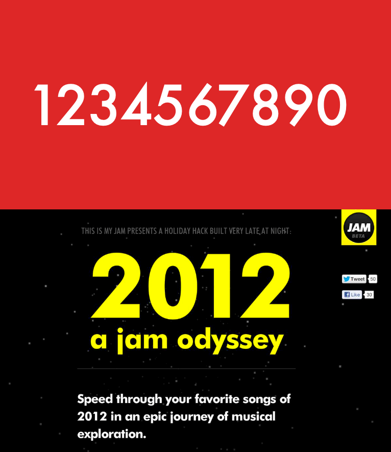
7. Futura< span>

This fontWhether it is English or digital, it is very modern, a very clean and neat font, and the effect in PPT is very good good.

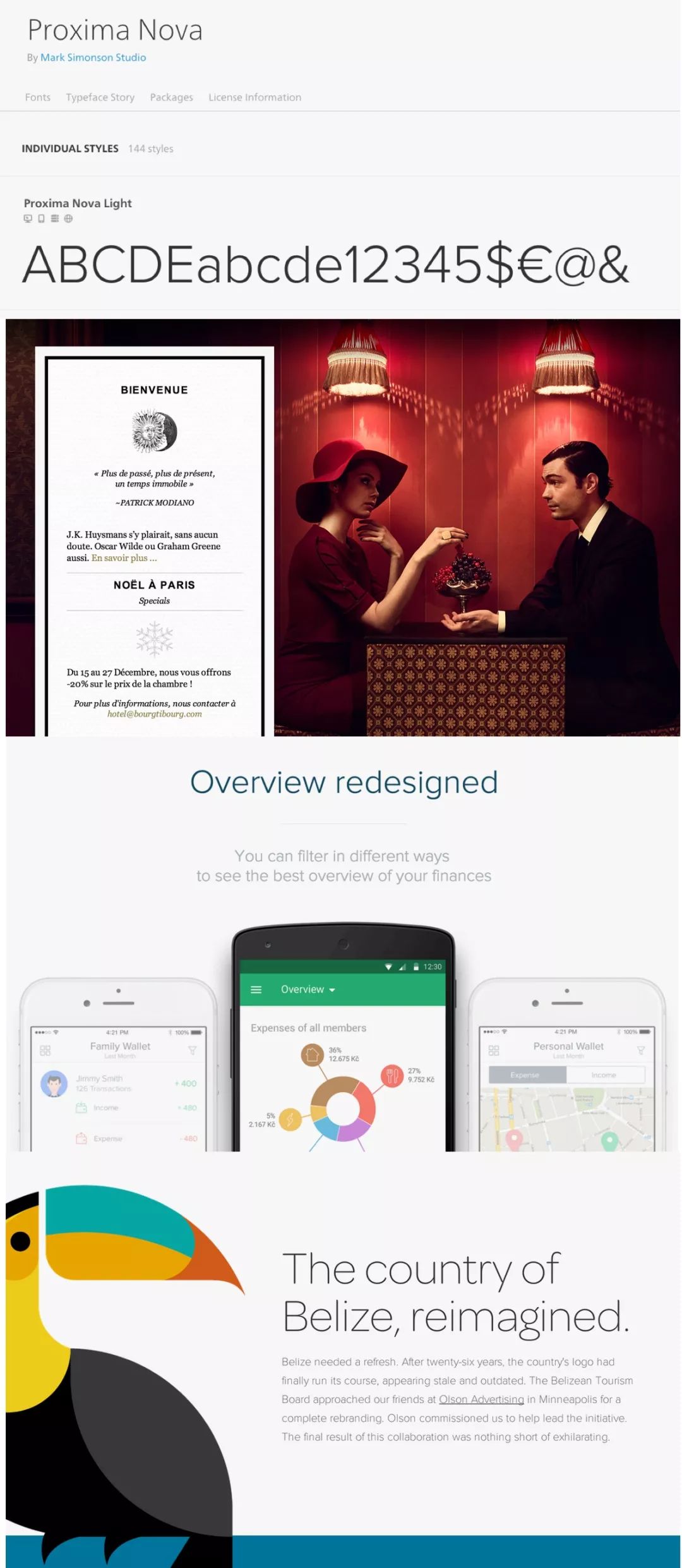
8.Proxima Nova

This one is not free, of course the charge is very worthy of its price, the effect you can see for yourself,Very elegant and modern .

9. Gotham< span>

It is very suitable for press conferences, minimalist website design, or posters,A very modern and clean font, the effect is as follows As shown in the figure, this font can’t run in all kinds of good-looking designs on dribbble.

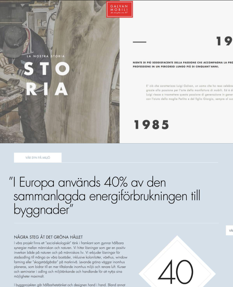
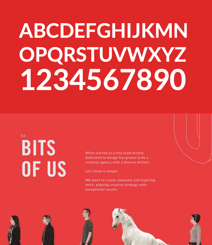
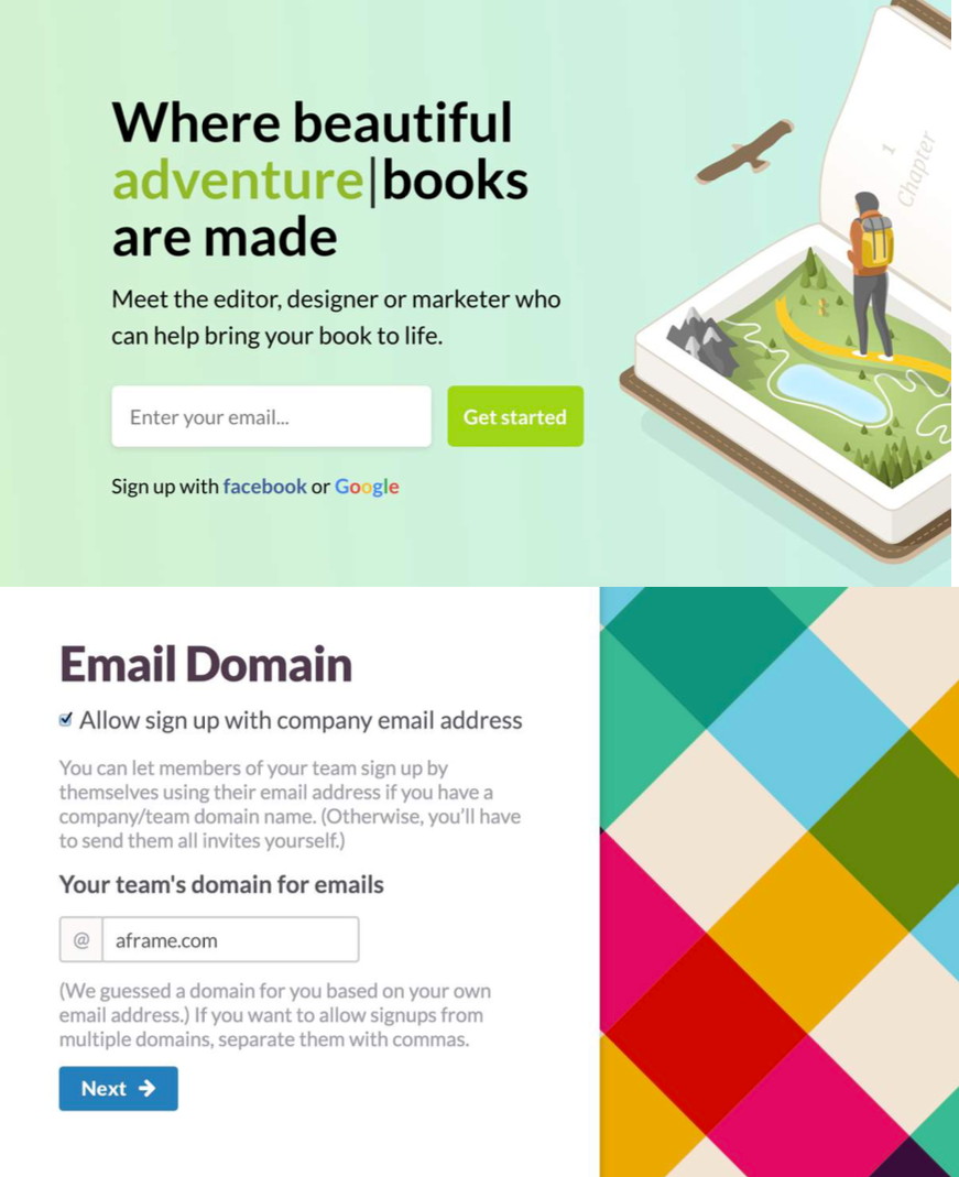
10.Lato< span>

A font with a very modern sense of technology,The font used by countless well-known apps , also from Google, is a font that guarantees that you will not make mistakes. It has been used by Tmall before, and the effect is very good.
06.< span > serif font

Playfair Display

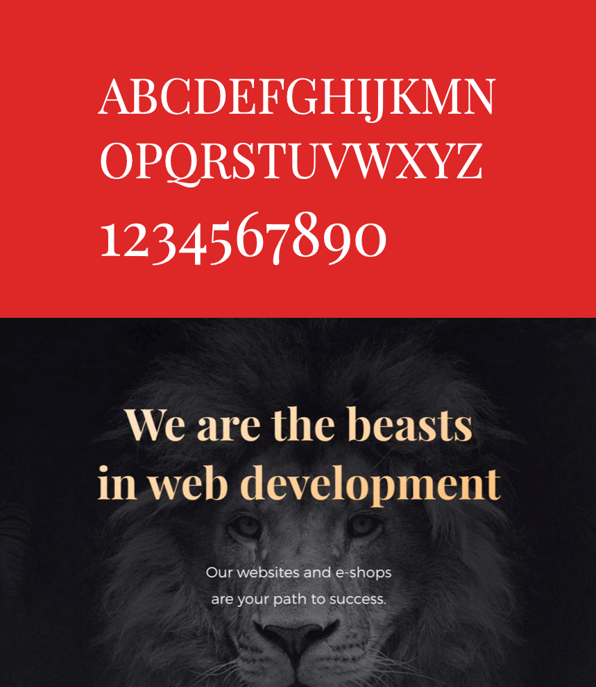
If I can only recommend a serif English font, it must be Playfair Display. My favorite font combines classic and modern elegance. I don’t know how many big names have been using this font. Typography for design.

If you have been looking for a serif English font, then this must be the first, the effect can be seen directly in the picture!

This is the end of the font series in the interface. Basically, these fonts cover our commonly used Chinese and English. It is enough to master these two.

07. Last

Hope that today's sharing can help you improve the use of fonts in UI design.

The digital fonts introduced in today’s article, including our common Din font, are all packaged for everyone. The fonts are only for reference and learning. If necessary, you can click " Looking", add jingle cat reply "Number< span >” to receive, If you already have Jingdong cat, you don’t need to add it again.

Long press and scan the QR code to add Jingle cat reply:Number


Long press to identify the QR code below, and join 16000 designers
Turn other people's experience into your basic skills

////// END //////
A lot of students left messages asking me questions in the backstage before. Sorry, there are a lot of messages, so I can't reply one by one.
If you have any questions, please pay attention to my video account. In the future, when the video account is live, you can answer questions online, chat with everyone on the video account, and cheer together !

Articles are uploaded by users and are for non-commercial browsing only. Posted by: Lomu, please indicate the source: https://www.daogebangong.com/en/articles/detail/After%20more%20than%20100%20revisions%20the%20fonts%20used%20by%20WeChat%20and%20Alipay.html

Like (810)
Reward 支付宝扫一扫 支付宝扫一扫
single-end

Related Suggestion