The following article comes from Lord Onion, author Lord Onion

Focus on practical design dry goods.

Useful丨Interesting丨Products丨Informative
Pay attention to design obsession and find good design
www.shejipi.com
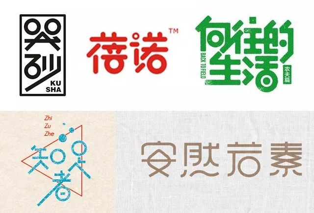
Many novice designers will encounter such a situation when designing fonts, that is, they don’t know how to go deeper after outlining the bones of the text, so that the designed fonts lack design sense and professionalism, as shown below:< /span>

So, how to solve this problem? Mastering some useful radicals, radicals, and stroke processing techniques is an effective breakthrough. The following are the 21 stroke processing techniques summarized by Mr. Onion. I hope it will be helpful to you. 1. Replace the stroke "dot" with "horizontal".

This is done to make the shape of the text strokes more uniform, and also to facilitate the alignment of the strokes between the texts.

2. Turn the "日" radical into two concentric circles.

In pictographic characters, the word "日" is written like a sun, that is, a dot is added in the circle. This writing method is actually simpler and more beautiful than the current writing method, and will naturally be favored by designers.

3. Replace the horizontal stroke in the frame with a vertical stroke.

For some fonts with more strokes and more complex structures, we usually need to simplify them. For example, in some characters containing radicals such as day, order, and month, the horizontal lines in the frame can be replaced by vertical lines .

4. Make the horizontal strokes in the frame vertically inclined.

What should I do if the designed font is too common? We have to find a way to deliberately make some changes, such as vertically tilting the horizontal strokes wrapped in the frame, which can effectively increase the sense of design and dynamics of the font.

5. Round off one corner of the stroke endpoint.

The stroke endpoints of bold fonts are generally two right angles, and if the font design needs to be elegant and feminine, then the sharpness of the right angles is not suitable, and one of the stroke endpoints is processed into a rounded corner effect will be better.

6. Turn vertical hooks into vertical folds.

Designing vertical hooks, vertical hooks, oblique hooks, and curved hooks into vertical folds is also an effective technique to simplify fonts and increase the sense of design.

7. Replace "口" with a circle.

The mouth is actually a square, and changing from a square to a circle is also a simplified process, which can make the font more graphical.

8. Add a little serif to the stroke.

The strokes of Song typeface characters have serifs, so they appear more complicated, while the strokes of boldface characters have no serifs, so they lack details. It can increase the details of the font without appearing too complicated.


9. Omit one side of the "口" radical.

Omitting some strokes of text is a technique often used in font design. Since a word is a square composed of four sides, subtracting one of the sides will not have much impact on its recognition.


10. Treat the bottom or top edge of the "口" radical into an arc shape.

I mentioned the method of designing the mouth into a circle. In fact, designing the bottom or top edge of the mouth into an arc shape also has a good effect.

11. Use dots or circles instead of stroke "dots".

This is a very common stroke processing method, which can effectively increase the fun and contrast of fonts.

12. Connect the balance stroke with the dot on the upper left or upper right of it.

This is a technique for connecting strokes inside a font. The strokes whose endpoints are relatively close are naturally more suitable for connection.

13. Make arc chamfering at the intersection of strokes.

In the design of round characters, the endpoints of the strokes are rounded, so if the intersection of the strokes is rounded, the overall style will be more unified and gentle, and it will also give the font a little Chinese style charm.

14. Process the left and right strokes into the effect of wide top and narrow bottom.

Different from the strokes in Song typeface that have a wider end and only one corner at the other end, a little thickness is reserved at the narrow end, but the thickness will be much smaller than the other end. The method is used more in feminine font design.

15. Design the eight or human radicals as upward arrows.

Many fonts contain people or eight radicals. Simplifying them into upward arrows can also increase the design sense and simplicity of the font.

16. Convert cursive initials into two plus signs.

In fact, the beginning of the cursive is cut from the middle, making it into two abstract grasses, which not only increases the fun of the font, but also makes it richer.

17. Omit the upper left vertical stroke of the radical of "虫".

In order to make the font more breathable and the lines smoother, the "corpse" radicals contained in the font are often cut.

18. Design the radical "日" as a back-shaped pattern.

The "日" radical in the text can be turned into a zigzagging pattern after simple processing, which is often used in handwritten characters and Chinese-style fonts.

19. Simplify the single side into a horizontal fold.

This is also a way to simplify the font, which is similar to removing the right part of the vertical stroke and only keeping the left part.


20. Connect the last three points in the four points of water.

The four dots of water in the printed font are all independent, so they appear a bit scattered and complicated. Connecting the three dots of water in the back can solve this problem without affecting the recognition of the text.

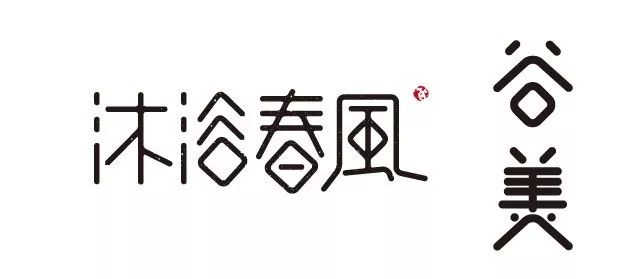
21. Design the oral radicals into a diamond shape.

The rhombus-shaped kou radical is generally designed to be more coordinated with other strokes in the text. For example, the strokes in the upper part of the Gu character are inclined, while the strokes of the "口" radical are horizontal and vertical. Therefore, if the design is made into a rhombus, the trend of the strokes will be more uniform.

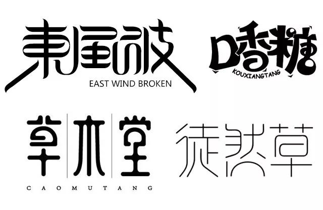
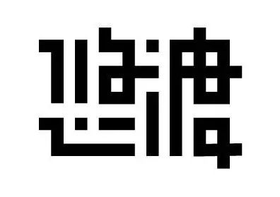
The font design tips listed above are common and effective, but it does not mean that excellent fonts can be designed by using these tips. Just like the font design works listed above, they are all in A lot of effort has been put into every aspect. In any case, whether the shape of the font is coordinated and beautiful, and whether the tonality conveyed by the font is close to the design requirements are the most critical.
This article is authorized to be reproduced from Congye’s WeChat official account (ID: congyenanian)

Get to know the latest and hottest design trends in the world for the first time, just 3 steps to design your obsession "Set as a star" and you are done
↓
Cooperation: 15210428522
Pay attention to design obsession and find good design
Long press to identify the QR code to follow
Articles are uploaded by users and are for non-commercial browsing only. Posted by: Lomu, please indicate the source: https://www.daogebangong.com/en/articles/detail/After%20learning%20these%2021%20stroke%20processing%20skills%20font%20design%20is%20much%20simpler.html

 支付宝扫一扫
评论列表(196条)
测试