
On May 28, Adobe announced a brand update. In the past few weeks, Adobe and its product icons have been updated.
Adobe has always been a leader in the field of digital art, with a wide range of products to meet audiences with different needs.

Adobe wanted to keep the brand fresh, keep the products fresh visually at all times while making the entire portfolio easier for customers to understand and differentiate.
Since Adobe introduced the red capital "A" icon in 1993, it has become the company's most powerful symbol.
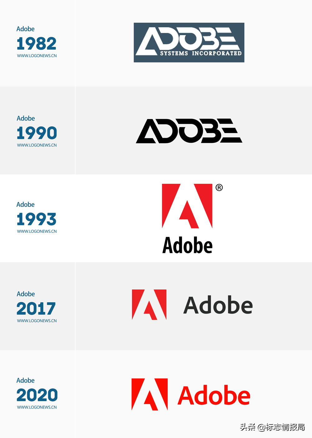
Adobe LOGO evolution history
Three years ago, Adobe changed the company's LOGO, adjusted the proportions and details of the "A" icon, and developed the 24-year-old wordmark into a brand font called "Adobe Clean" and applied it to the new version of the LOGO.
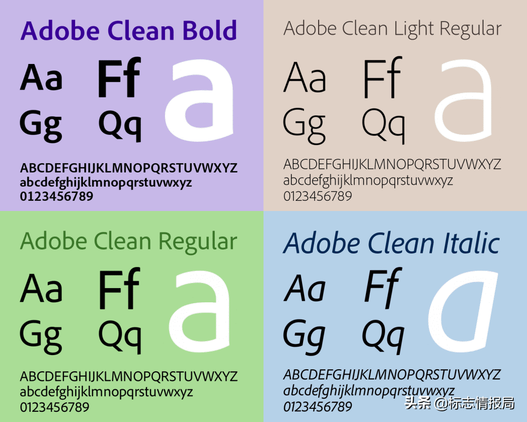
Adobe Clean family of fonts
But for a long time, the old and the new have co-existed. The new version with a lighter and modern font is used on the website, and the old version will often appear in the media.
Today, three years later, Adobe has updated the brand LOGO again. According to Adobe's official blog,The highlight of this update is not the change of the icon, but the new change of the iconic red color.
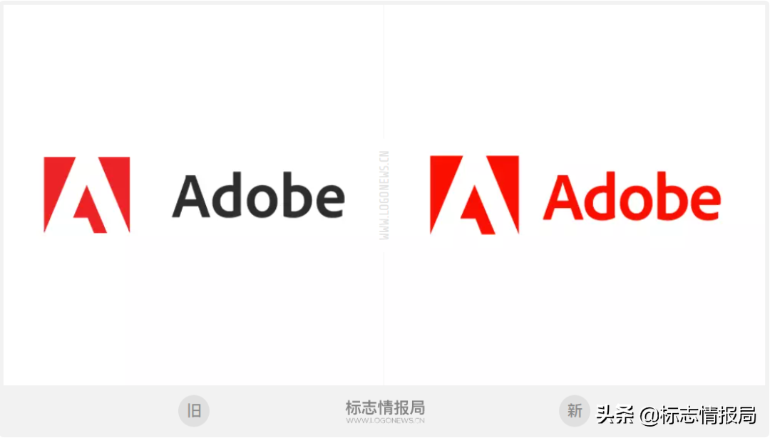
Adobe's new and old LOGO comparison
On the LOGO combination, you can see that the distance between the icon and the text has become closer, and "Adobe" has changed from dark gray to a new red.

In addition, Adobe unified the text of the upper and lower version of the graphic and text that was used in 1993, and changed it to the new "Adobe Clean" font.
It should be noted that although the fonts used in the vertical and horizontal graphic combinations are the same, the fonts in the vertical version are obviously higher, giving people a feeling of stretching.
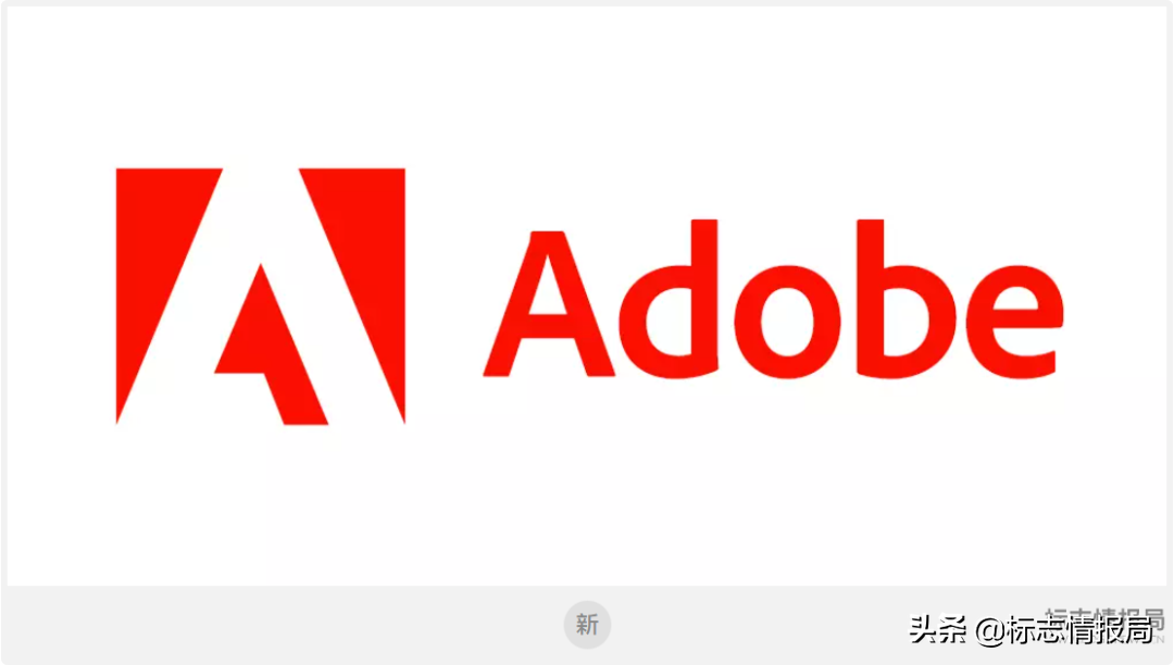
Adobe's new LOGO
Moving from multicolor to a single, all-red logo ensures good fit at all sizes and in all environments.
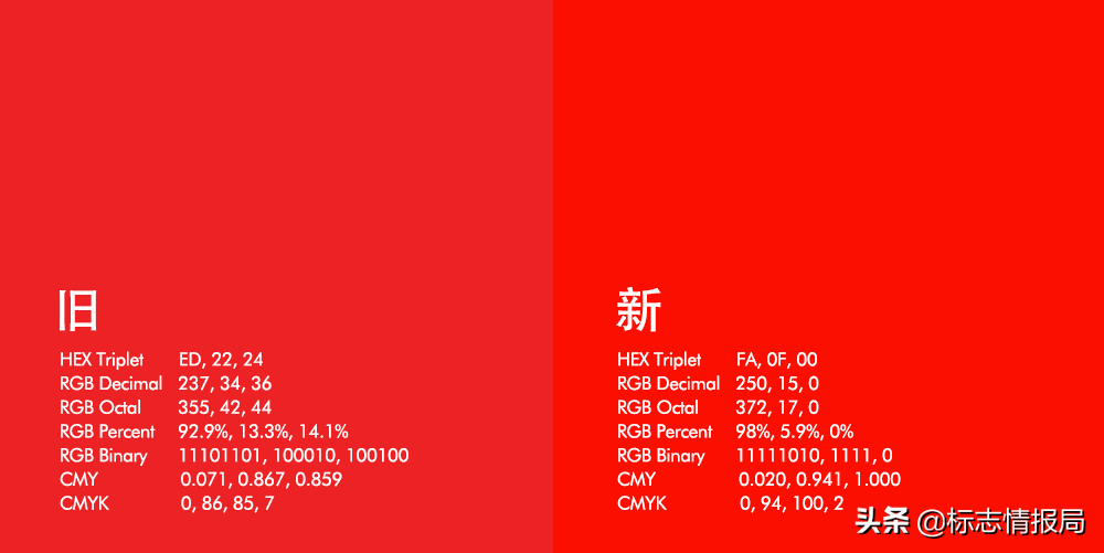
New and old brand color contrast.
Tips, the above color values are converted from official hexadecimal color values, and the data are for reference only
If you don't compare the old and new reds side by side, it's hard to notice the change brought about by the new red. In contrast, the new colors are more vibrant and bright (hex color code FA0F00) for a more modern and warm look.

Adobe company A word icon (new color)

Adobe Inc. A letter icon extension pattern
Adobe Creative Cloud upgrade
Next up is an icon update for the Adobe Creative Cloud creative applications.
In order to express the numerous creative product tools in Creative Cloud, the new Creative Cloud replaces the red background color with a gradient color without changing the graphics.
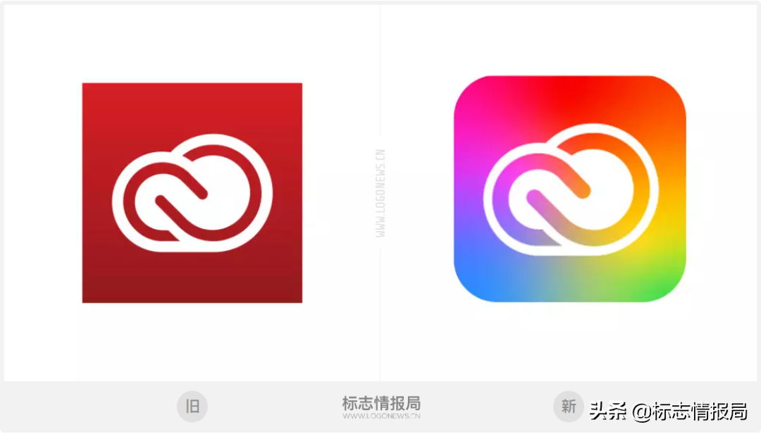
Comparison of old and new Creative Cloud icons
It is reported that the new gradient color is a fusion of the brand colors of all Adobe products and the brand new red that the company has just updated, representing the importance of creativity.
Adobe Product Icon Upgrade
For product icons, Adobe has been using two letters throughout the product as a mnemonic for each product, and this time it will also add a three-letter mnemonic.
For example, Adobe Photoshop (Ps) and Adobe Photoshop Camera (PsC), PsC is a mobile application launched by Adobe, which can easily have the powerful functions of PS on the mobile phone. As shown below:

Another biggest change is that all product icons included in Creative Cloud will have rounded corners, remove the border, and use a clean monochrome background, which can be flexibly adapted to various operating systems and devices.
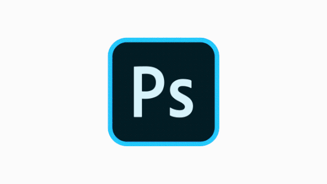
Adobe Photoshop new and old icon changes
Adobe Document Cloud upgrade
The trefoil icons for Adobe Document Cloud, Adobe's cloud service, will be distinguished from each other by different background colors, such as red for Adobe Acrobat Reader and purple for Adobe Scan.
This method can not only enhance the direct relationship between products, but also easily distinguish products.

Document Cloud old and new icon comparison
Adobe Experience Cloud Upgrade
In addition, the icon of Adobe Experience Cloud, Adobe's one-stop experience solution platform, has also been upgraded.
The new icons are simplified directly on the basis of Adobe's "A" icon, and all icons also have rounded corners and no borders.

Comparison of old and new Experience Cloud icons
At present, the updated new brand visual system has begun to promote, and I believe that we can see the appearance of the new icon in Creative Cloud in the near future.
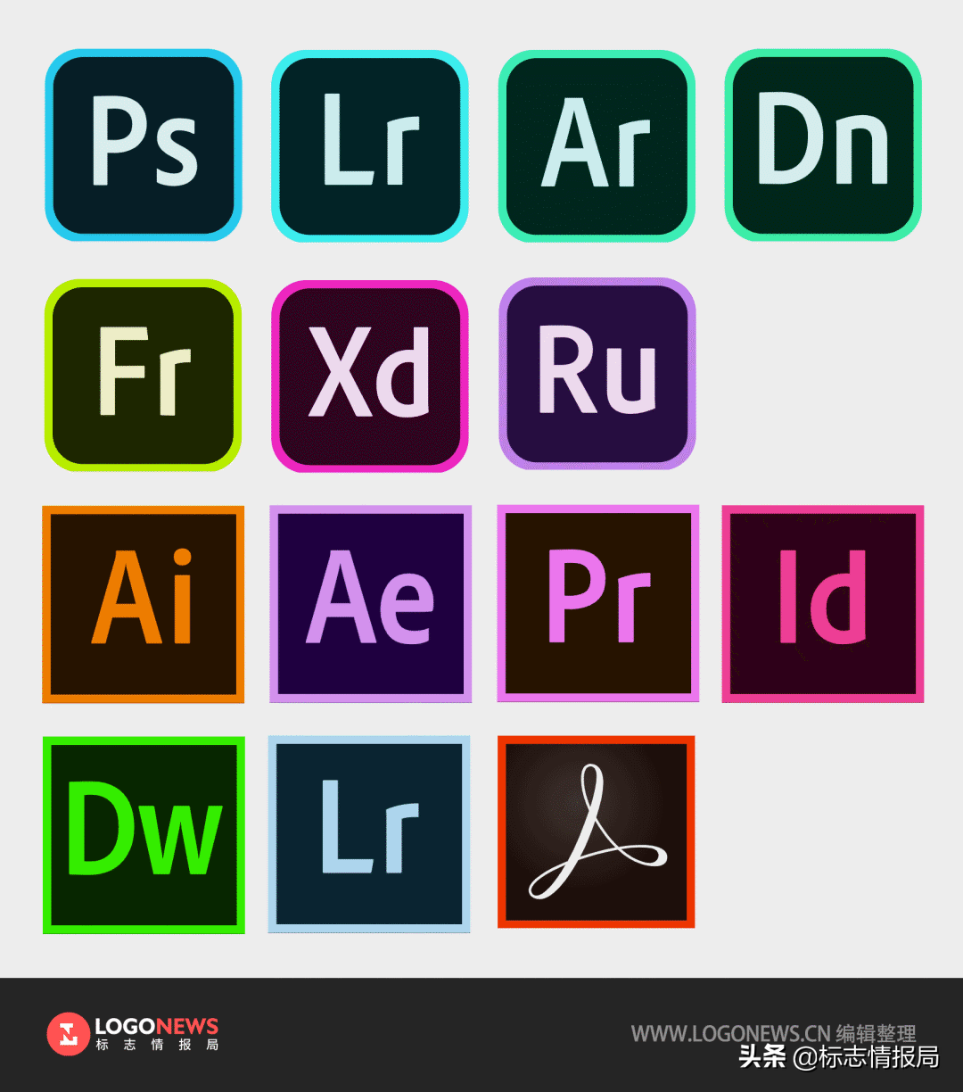
Icons for the latest versions of all current Adobe products:
Some pictures in this article are from the Adobe blog
https://theblog.adobe.com/evolving-our-brand-identity
The pictures involved in the article are only used for news reports, and their copyrights belong to the owners. If your rights are violated, please contact us in time.
Articles are uploaded by users and are for non-commercial browsing only. Posted by: Lomu, please indicate the source: https://www.daogebangong.com/en/articles/detail/Adobe%20changed%20its%20LOGO.html
 支付宝扫一扫
评论列表(196条)
测试