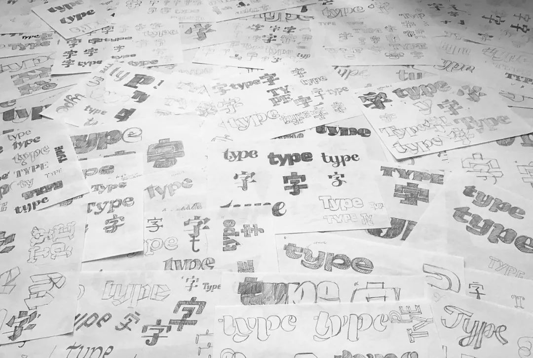
Recently, I have received proposals from many small partners, hoping to share a content related to font design. Although my ability is limited, I can still share/recommend a font designer that I especially admire, she is her?

Tien-MinLiao (Tien-MinLiao) currently lives in New York. She is an independent graphic and font designer. She is committed to exploring the unity of bilingual personality. She is good at custom font design, brand standard font design and LOGO Chinese characters/Chinese local change.
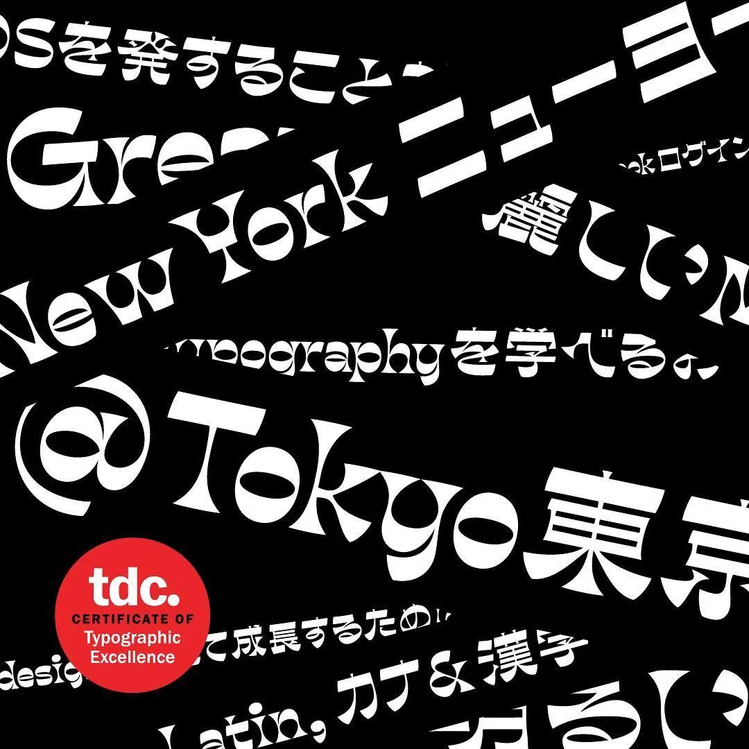
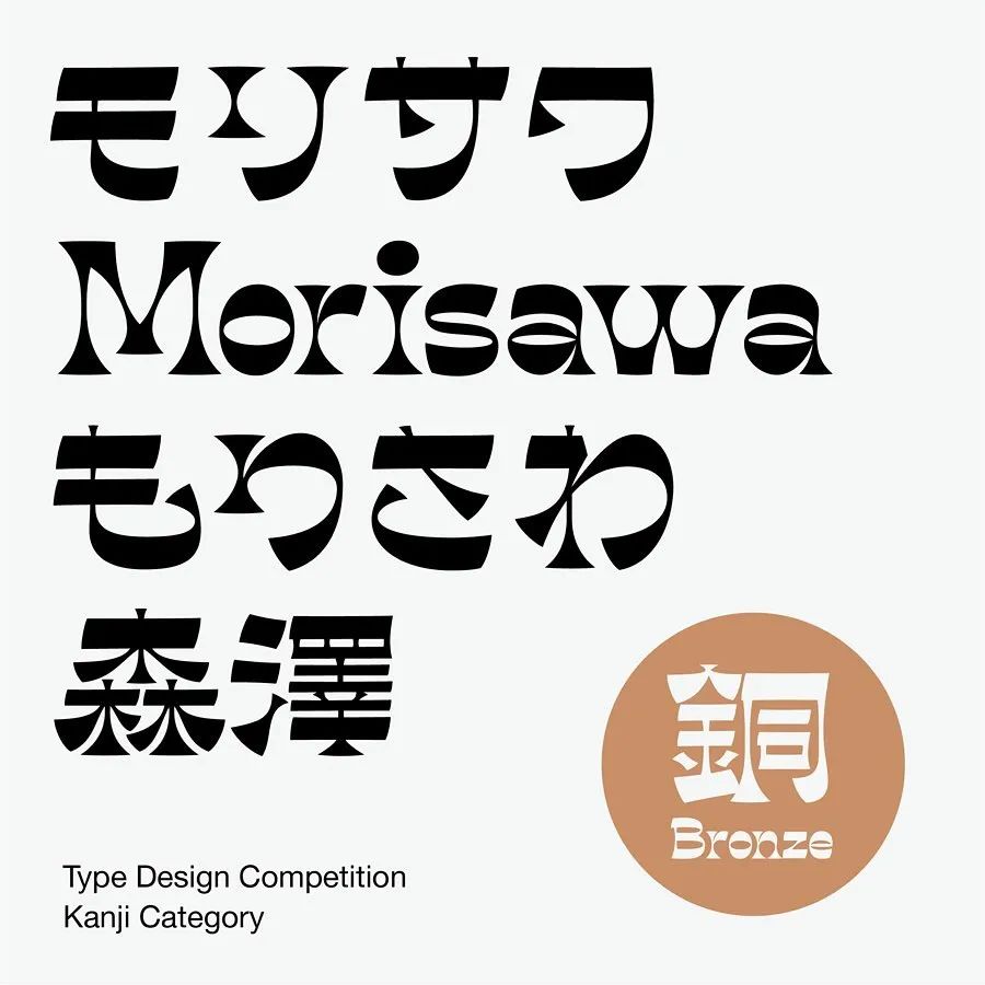
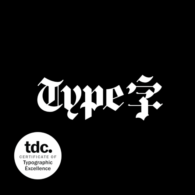
Her work has been recognized by TypeDirectorsClub, TokyoTDC, and MorisawaTypeDesignCompetition.
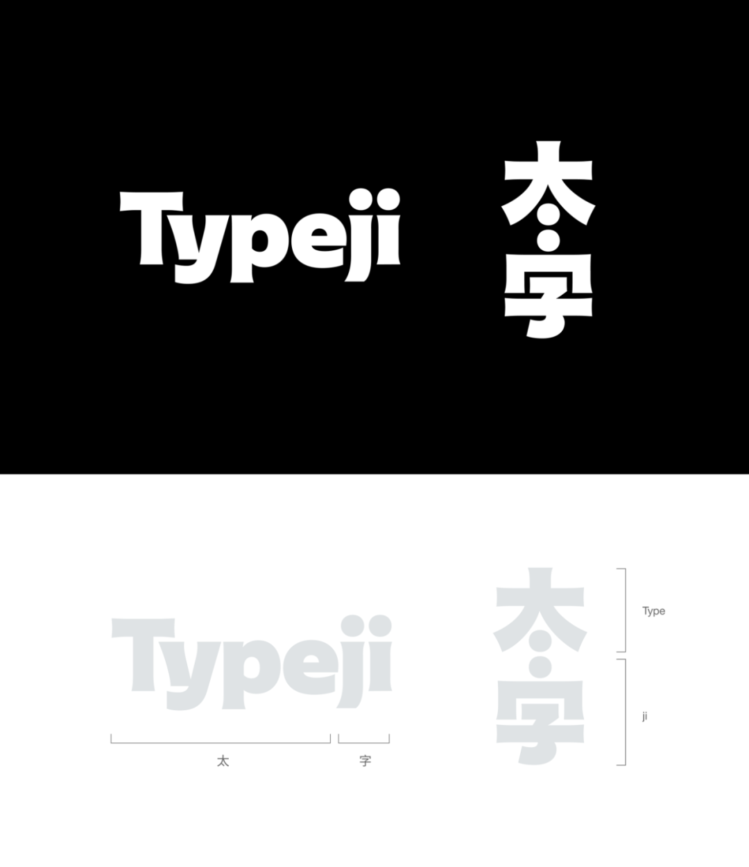
The following is an excerpt/arrangement of some of her works and related content, but it is really difficult to share the complete creative experience and more stories behind the design in one article. So I strongly recommend you to pay attention to her Behance(behance.net/TienMinLiao) and website(typeji.com)< /span>, I believe that if you are interested in font design, you will learn a lot from it.
Ribaasu>
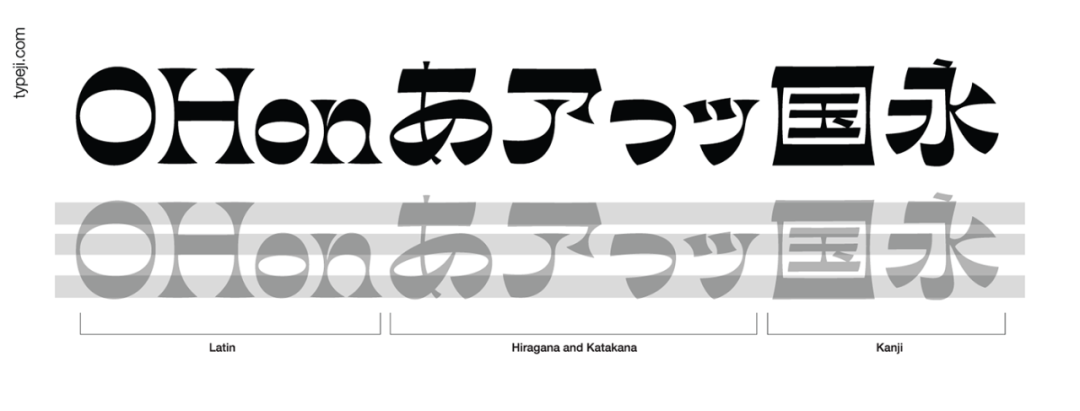
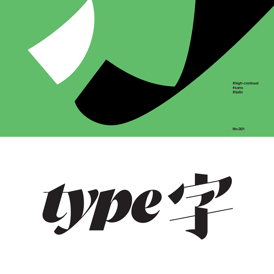
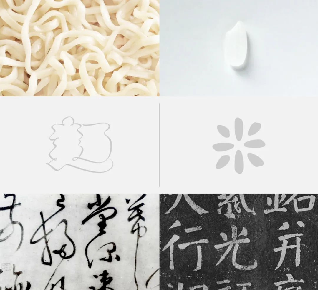
Reverse Contrast can be traced back to the 19th century, and its main purpose is to use the quirky personality (Quirky Personality) caused by the reverse contrast effect to attract attention.
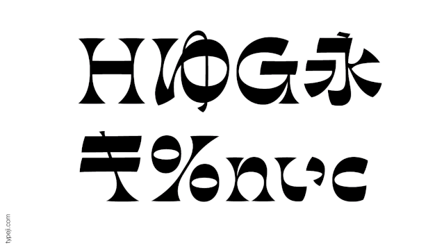
It is characterized by a strong sense of horizontal connection and consistency, and the weight of strokes is also constantly distributed in the upper, middle and lower areas. Reverse-contrast fonts do not exist in the design of Chinese characters or kana.It is a design rule extended from the unique structure of Latin characters.
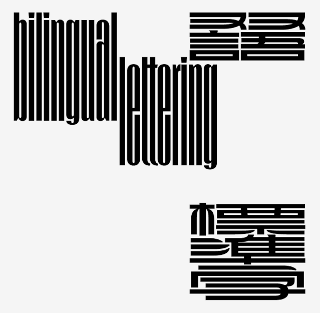
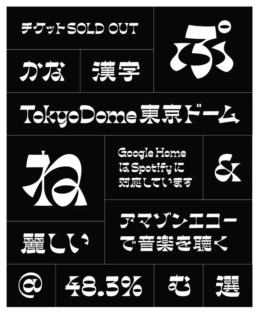
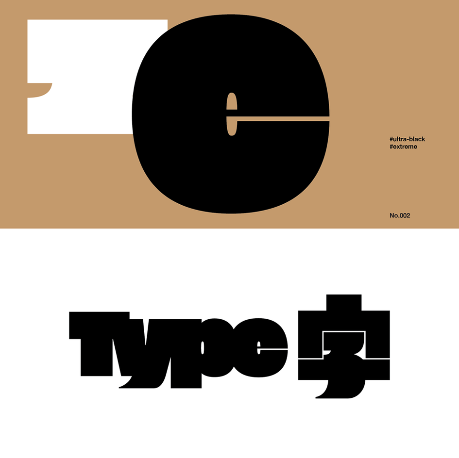
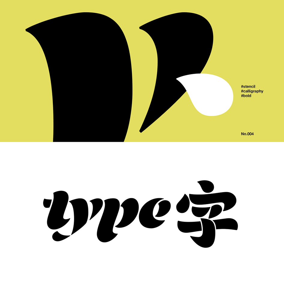
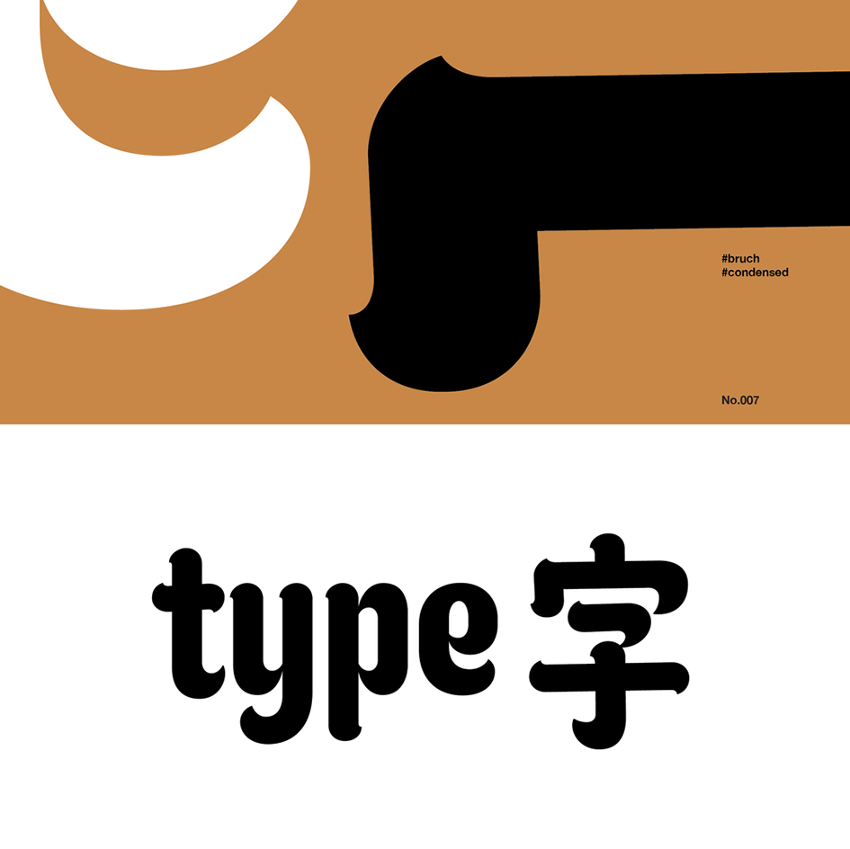
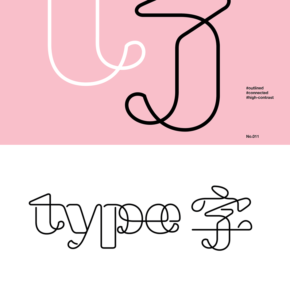
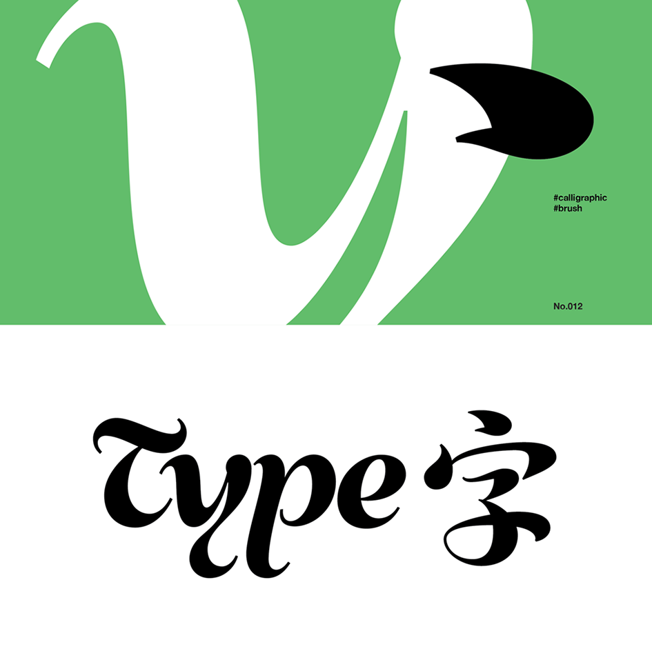
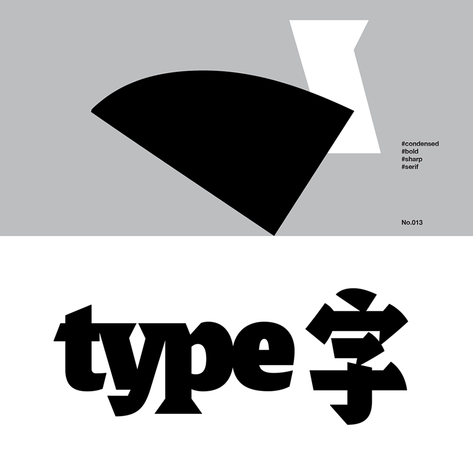
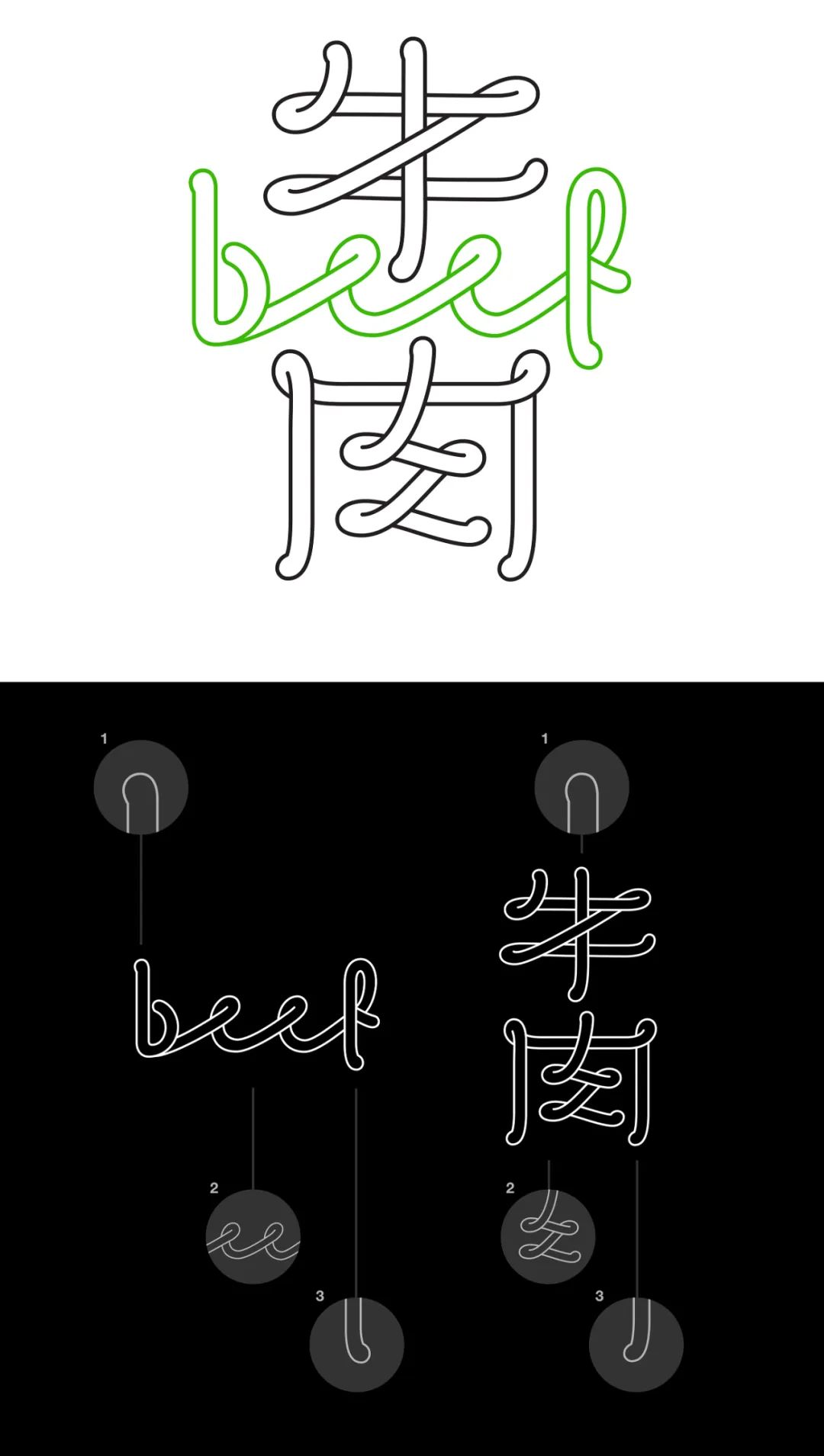
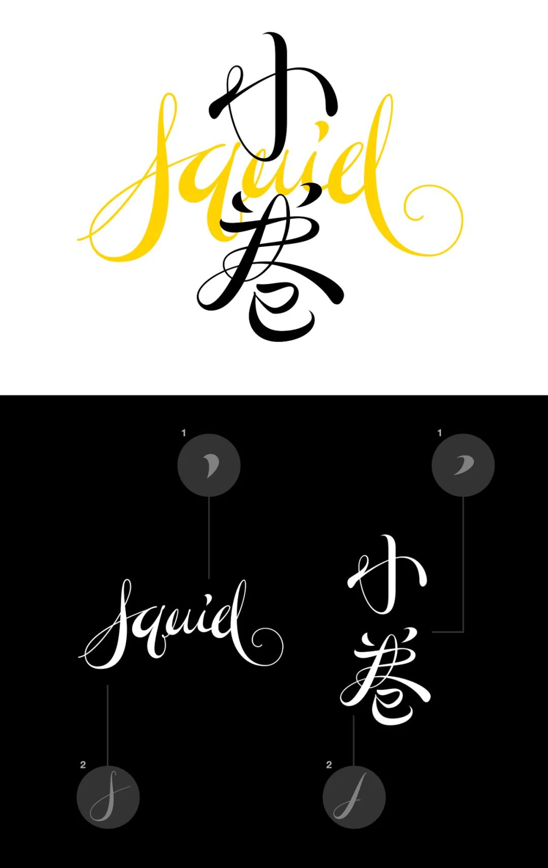
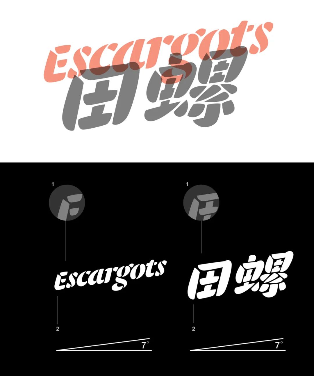
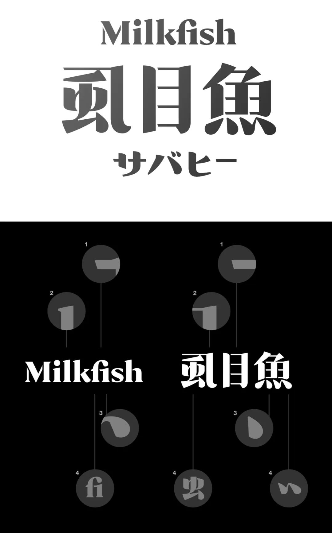
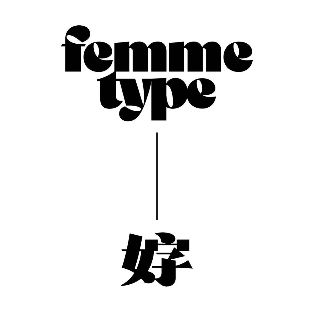
The "Bilingual Standard Characters" project is a series of discussions on the style correspondence of Owen-Chinese bilingual standard characters, thinking about whether some specific rules can be used to convey a consistent visual form of characters in different languages personality.
The corresponding relationship between these bilingual standard characters is not applicable as a systematic design suggestion for the internal text, but "TYPE(type)" and "character" The result of "tailor-made" between the two.
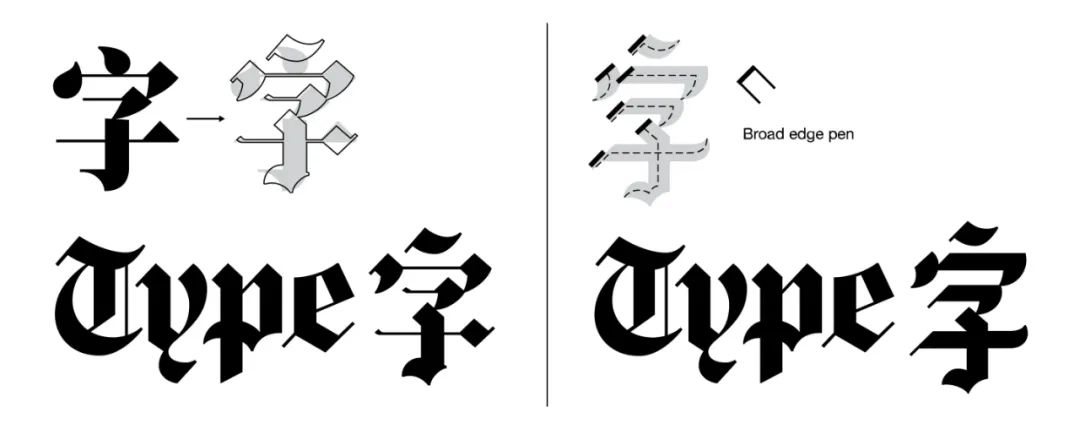
Due to the fact that the two kinds of characters traditionally use different drawing tools and the structure of the characters is also quite different,"Bilingual standard characters" sometimes coordinate with each other The result of the concession is to be able to show the same character and characteristics.
It can be said that each set of bilingual standard characters is a unique special case, and it is not the only solution.
The bilingual standard characters discussed here refer to two languages can play a role in conveying the brand personality and can play the same level of importance, without discussing standard words that are dominant in one language and used only for labeling purposes in the other.
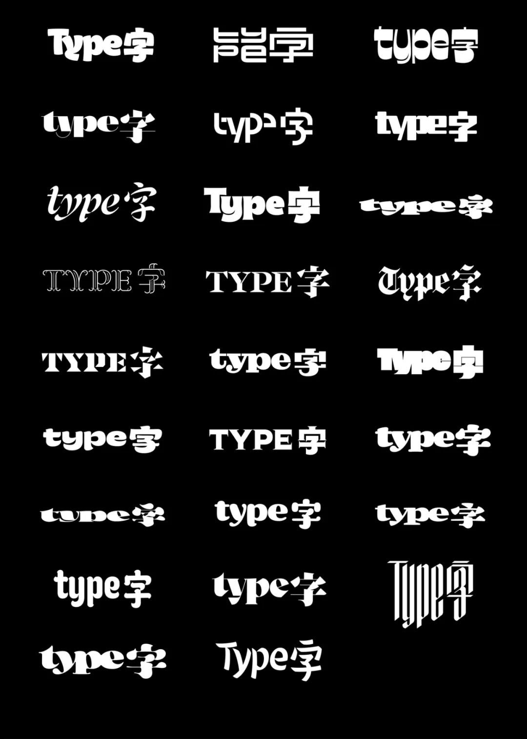
Liao Timmin has included more than 50 sets of samples on the website, as well as the production notes obtained during the repeated revision process. It is divided into four parts: "observation", "production", "coordination", and "alternative plan". This article is only a brief quotation, please visit (bilinguallettering.typeji.com) to view the full content.
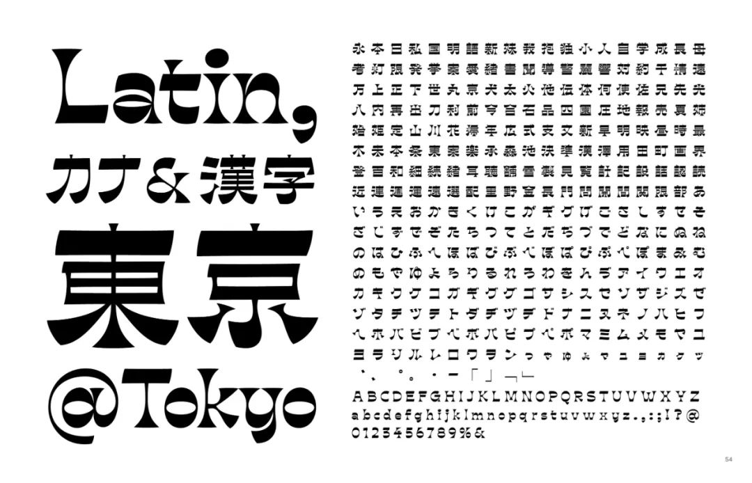
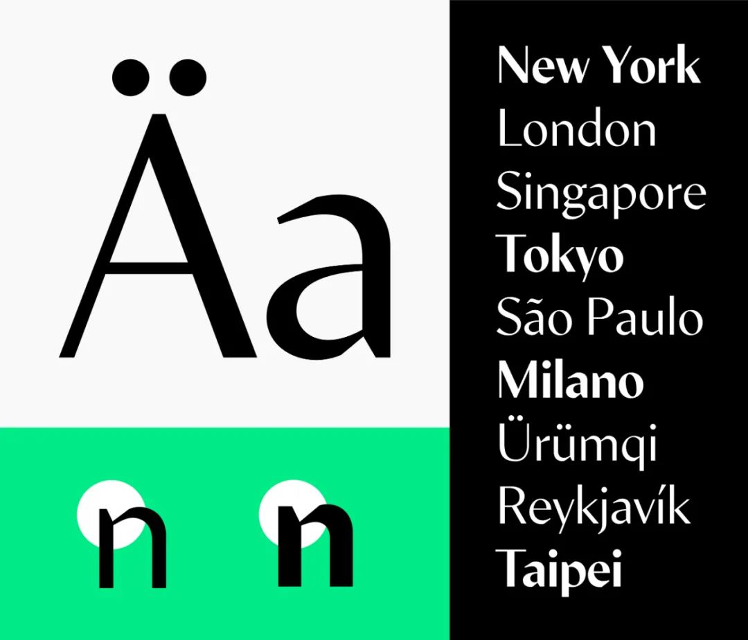
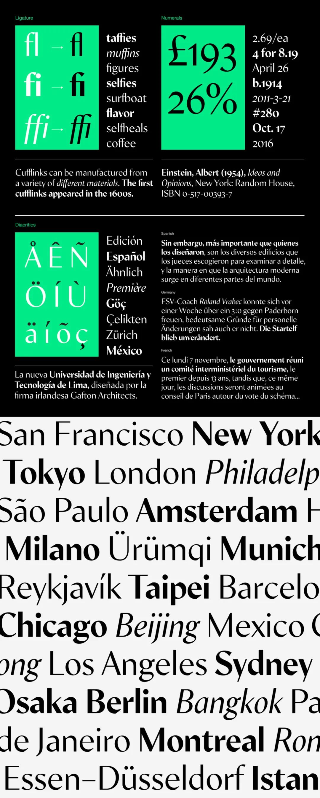
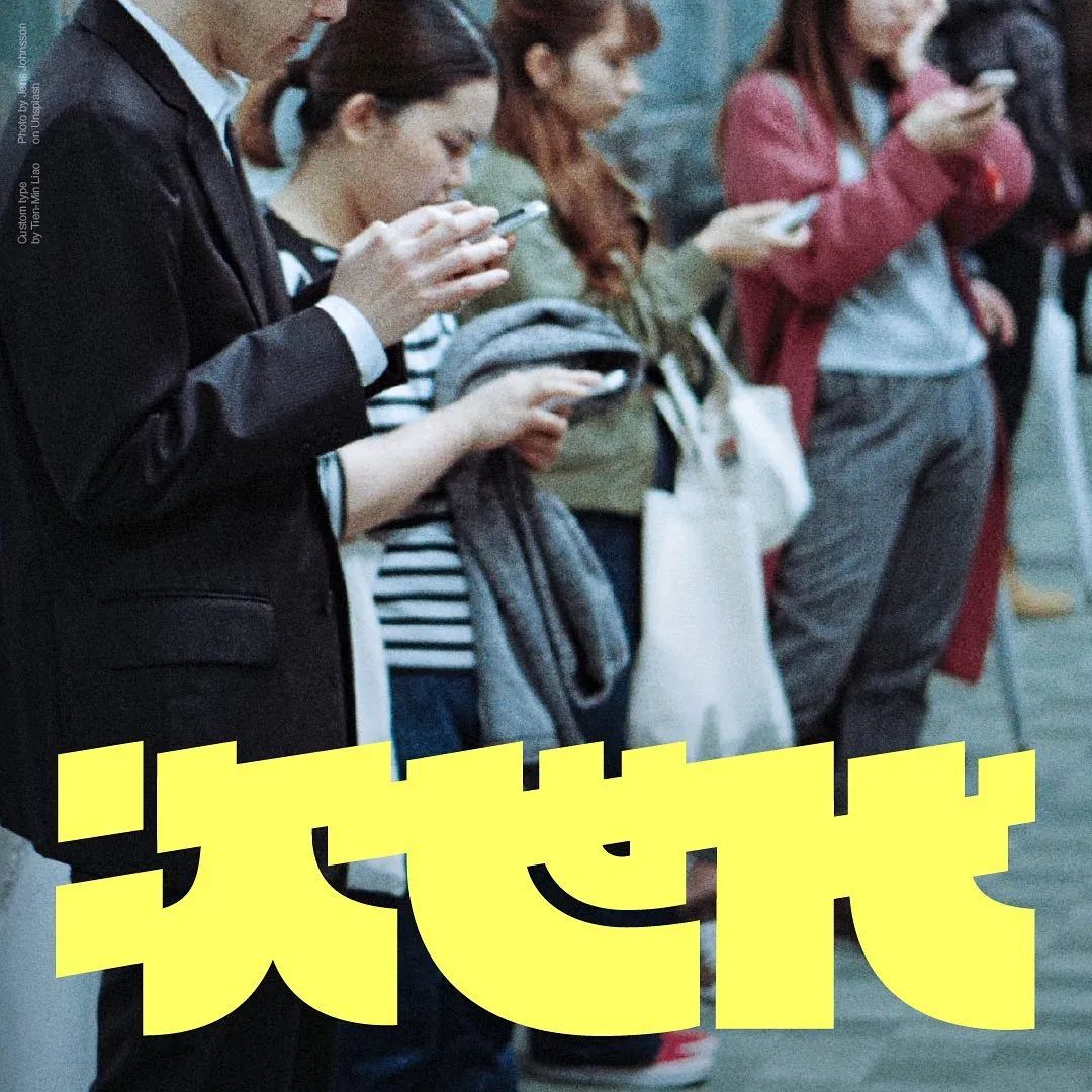
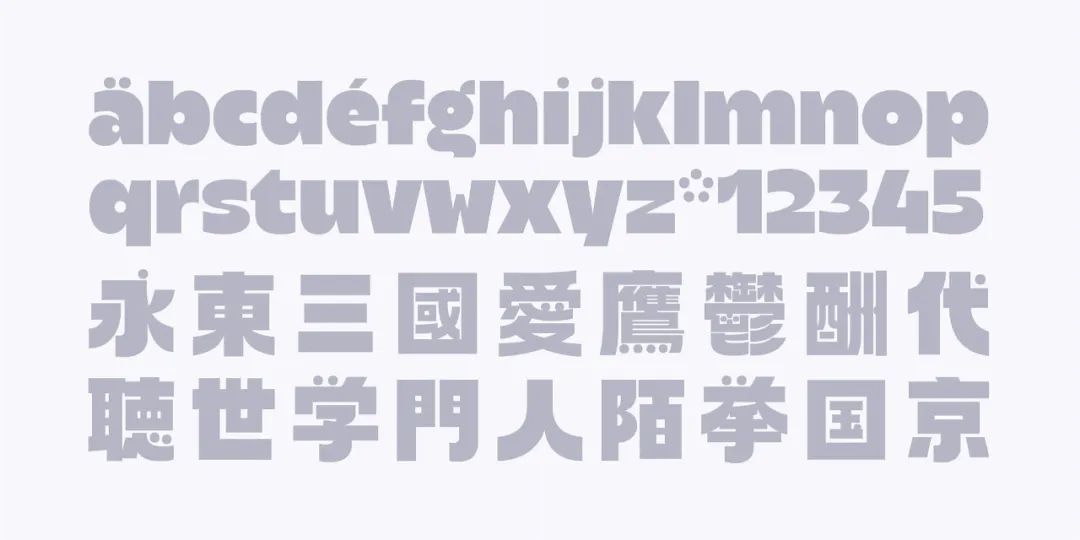
This is her latest in FutureFonts The new font MinSans (Latin font), released on the website, currently has two weights, regular and bold, and she hopes to expand the font to more weights in the future.


Articles are uploaded by users and are for non-commercial browsing only. Posted by: Lomu, please indicate the source: https://www.daogebangong.com/en/articles/detail/Adaptive%20design%20of%20Chinese%20and%20Western%20fonts%20I%20only%20obey%20her.html
 支付宝扫一扫
评论列表(196条)
测试