
Dengdengdeng, little babies, big babies
How long has it been since you read a book
Xiaohua has recently become obsessed with practicing calligraphy
In this era where everything is inseparable from computers
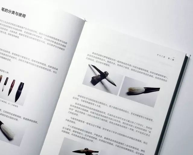
Many people hold that pen
Do you feel unfamiliar?
When I was young
Mom will buy a lot of copybooks
Let me practice at home during summer vacation
I felt so boring at that time
Other children are playing outside
I want to bury my head in writing
So I never wrote with my heart
I regret it when I grow up
I have practiced so many words
I was criticized by the teacher in the end
No pen style

Xiaohua always feels
How does the teacher write
Iwill change with it
(Typical can't sleep because the bed is crooked)
Let's chat today
Those things about handwriting

Give me a few chestnuts
handwritten refers to
Text written by hand with soft or hard pen
represents the essence of Chinese character culture
Articles published in the last issue
Many people leave messages in the background
How difficult is the typesetting of Chinese characters?
Not really
The most important thing about Chinese characters is not typesetting
It's the shape
handwriting and what we often use
The difference between fonts in computer fonts
There are roughly the following three points
varies in size
various shapes
Expressions are more varied

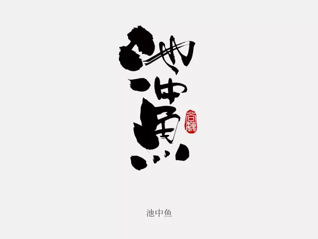
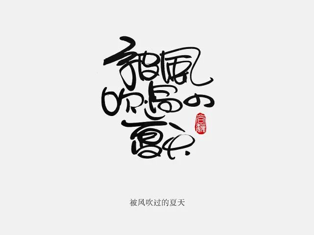
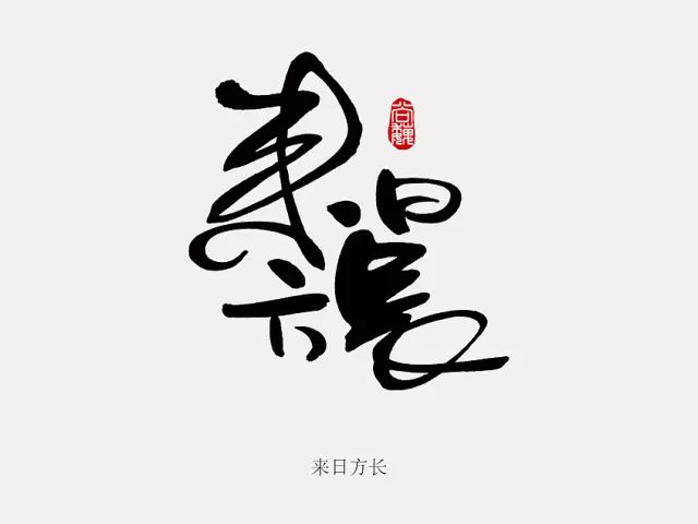
I want to make an effect like the picture above
First we need to use handwritten form
Express glyphs
(a word may be written many times)
We can pick out
I feel the most suitable
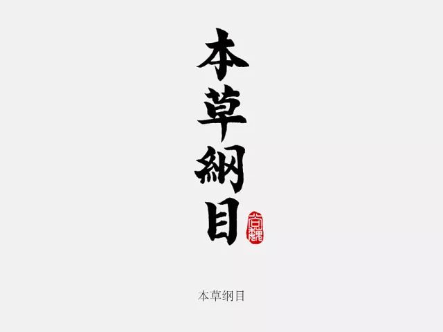
By scanning or taking pictures
Generate Electronic Documents
Use software for post-processing and production

Before making a handwritten lettering design
We need the final rendering of the text
The design effect has sufficient analysis and judgment
For font design
The more detailed the analysis
The rendering effect of the later glyphs will be more exciting
For example
In font design
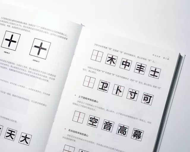
The center of gravity is the structural center point of the entire Chinese character
can be a point
can also be a line
Xiao Hua gives you a chestnut
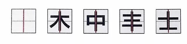
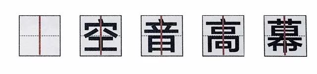
(the center of gravity of a single character)
The font contains the stroke "vertical"
Single-style characters with "vertical" strokes in the center
The center of gravity is in the stroke "vertical"
(the center of gravity of the upper and lower structure fonts)
The font is up and down
or top-middle-bottom
center of gravity
both upper and lower parts are required
Stay on the same vertical line
Guarantee both upper and lower parts at the same time
Vertical Justification

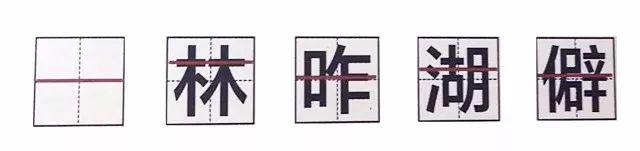
(the center of gravity of the left and right structural fonts)
When the glyph has a left-right structure or a left-center structure
The center of gravity of the font should make the left and right parts
on the same level
Make the Chinese characters themselves harmonious and balanced
In the entire handwriting font design
Pay attention to the details of each stroke
For font design
Every change in detail will affect the combination of glyphs
affects the expression of font emotion
so the details are important

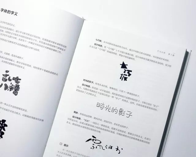
The so-called glyph arrangement refers to
Sorting a certain number of Hanzi
A font design expression
A good font design
Often need to pass between words
Reasonable arrangement to enhance visual aesthetics
Often we need to put the text in a clear and clear
The combination and arrangement are displayed
enhance its design appeal
making it more visually appealing
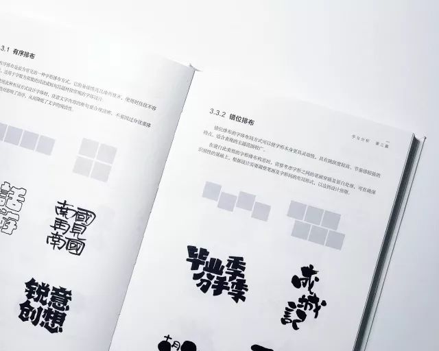
Common font arrangement
There are the following four
orderly arrangement
Misalignment
disorderly arrangement
Echoing arrangement
(orderly arrangement)
This is one of the most common glyph arrangements
Highly legible and neatly arranged
It is often less error-prone when used
(echo layout)
The font layout of this arrangement
Can make words blend with each other
Take 5 characters and 7 characters as an example
Available
"up two down three"
"up three down two"
"Upper two, middle three, lower two", etc.
Glyph layout

(shuffle)
According to font design requirements
The arrangement of a group of words can also be disordered
At this time, you can ensure the overall font
When visually reasonable
Enlarge or rotate text
for emphasis
The above Xiaohua summed up the three arrangements for everyone
There is also a misplaced arrangement
You need to go by yourself
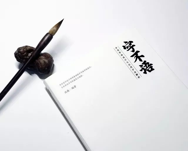
Xiaohua recommends to everyone
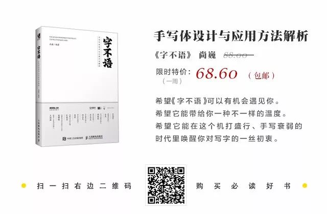
"Words Without Words"
Looking for insight in this new book
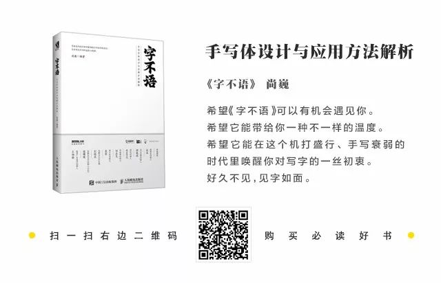
In this booknot only introduces
Analysis of fonts
And more about font design
Principles, Performance Elements
Design methods, practical exercises
...
one
Book Introduction
In this book, there are many methods and experiences about handwriting font design, which are the things that the author has finally retained through continuous trials and denials. There are many design methods. The author has written all his summaries into this book. I just hope that these summaries can bring some inspiration and help to beginners, so they will be satisfied.
Through this book, we can learn:The development process of fonts, the analysis and expression methods of fonts, the usage characteristics of various tools, the full analysis and explanation of different fonts, Example application of commercial fonts.
Applicable people: Beginners in font design, design enthusiasts, graphic designers, and students majoring in related design.
two
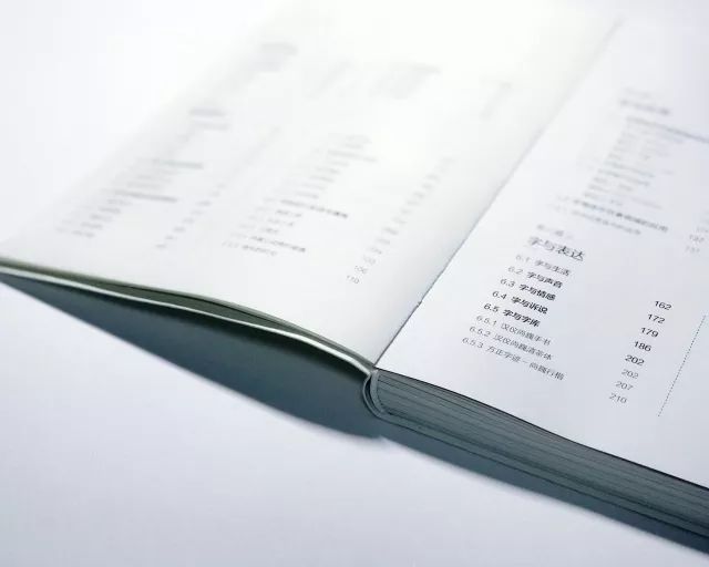
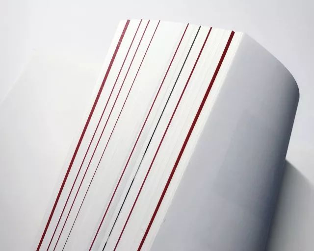
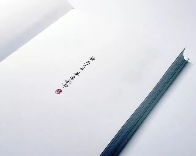
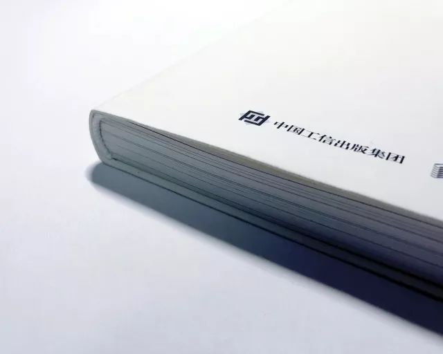
Inner page display
(Multiple pictures are coming, it is recommended to view in a wifi environment)
three
How to buy
We contacted the publishing house directly, and negotiated a group purchase price for everyone. In the case of guaranteeing genuine, we negotiated with the publishing house to give everyone a unified free shipping.
(Recognize the QR code in the picture below to purchase )

Four
Free order activity
This book was published by @People's Posts and Telecommunications Publishing House, which we have appeared in more times, so there will be no shortage of free orders. This issue will be among the serious study babies who bought this book Draw three free places~
The lucky ones who are free of charge in this issue can check it out by replying "free charge" on the WeChat public account next Saturday night~
Have a nice weekend everyone
There are good books
Welcome to recommend to Xiaohua
Xiaohua will help you negotiate a discounted price
Articles are uploaded by users and are for non-commercial browsing only. Posted by: Lomu, please indicate the source: https://www.daogebangong.com/en/articles/detail/About%20font%20design%203%20little%20secrets%20that%20the%20predecessors%20will%20never%20tell%20you.html
 支付宝扫一扫
评论列表(196条)
测试