
Hello everyone~ Following the last issue, let's continue to talk about the niche English handwriting fonts.
Looking back at the previous issue, we mentioned Roman cursive, island lowercase, Merlot and Gothic cursive.
Link:About English handwritten fonts that you have never seen before (on)
What fonts will we mention in this issue?

■ Flemish (Flemish)
Flanders is a modern typeface used in the16-17century.
This typeface combines various features of Batad typeface, broken stroke typeface, Gothic cursive typeface and round typeface.
The wreath of writing sometimes overrides the content of the article, and the overall artistry has surpassed practicality.
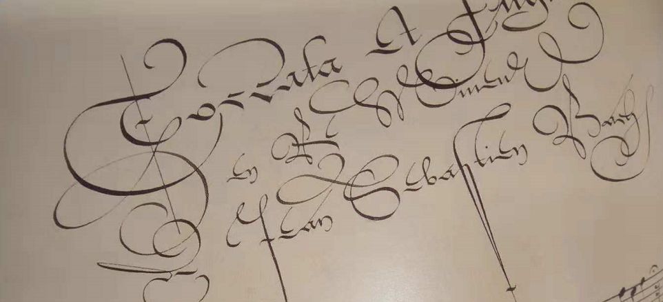

Flemish
The Flanders font developed later, went astray, and evolved from a shorthand-like font to an artistic decoration. There are many font forms, and the gap between the orthodox writing (such as humanism) at that time is getting bigger and bigger, making it extremely difficult to read. Later it will be gradually eliminated.
In this font, c has a variety of magical shapes, and the rising strokes of d are extremely exaggerated. eBasically unrecognizable. f and s are very, very long, running through three or four lines. q and g are not easy to distinguish.
So although this font looks good, it is recommended as a calligraphy art dog, but it is best not to use it as an art or practical writing that you want to promote.

■ Beneventan (Beneventan)
Benevento fonts began to be widely used in the 6th century ADCentury AD, but there are not many manuscripts left.
This typeface originated in Southern Rome. It has been used for a long time, and it was still used in the 15th century AD.
The writing of this font is relatively simple. The uppercase letters are not decorated, but the color and size are simply distinguished. But the initials are usually clay gold characters, which are extremely luxurious.


Beneventan
The characteristics of Benevento font are similar to that of Semi-Uncial, most of the letters can fit together, and the coherence is good. The closed strokes are connected together, and it looks like a series of circles from a distance, and some other strokes are extended near the circle to distinguish different letters.
The reading difficulty of this font is not low, because there are many ligatures, and the commonly used lettersa and t have almost the same shape ( The last three letters in the picture above are tan), which makes it difficult to distinguish many words.
e height and a, c, m, n, etc. should be consistent and belong to the character height of the reference line height. But Benevento's e, the writing height is consistent with b, h, k, etc.
There is no v, w, j in the Benevento font, and there is no such thing in English at that time a few letters. And k does not have a standard writing method, the writing method can be regarded as a combination of h and c.
But this font looks great together. Neat and uniform, excellent coherence. It is a niche font recommended by Gouzi.
■ Island Display Capitals (Insular display Capitals)
The island display uppercase is used for writing titles, etc. in the island font.
This kind of font is basically drawn, there is not much to introduce. It is recommended that when drawing, it is best to use a ruler as a reference. Gouzi wrote on it in order to hurry up and draw it directly. It looks a bit uneven when zoomed in.

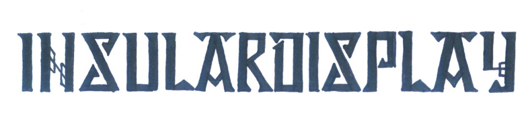
Insular display
■ Schwabacher (Schwabacher)
Schwabach font and broken script are twin brothers. Appeared at the same time and used at the same time.
Fraktur and Schwabacher are almost identical in lowercase, but slightly wider. But the capital Schwabacher and Fraktur are quite different.
Fraktur and Schwabacher are both handwritten fonts, and both are commonly used in lead printing. So this typeface is both handwriting and print.


Schwabacher
The capitalization of the Schwabach font is very individual. More alternative letters should be F, H, S.
FLike ordinary writingSA horizontal line is added in the middle. HLike an Arabic numeral5It is tilted a little to the left (see the third letter in the picture above). SThe lower strokes are directly sealed to form a circle (see the first letter in the picture above).
That’s all for the niche fonts in these two issues. After Ergouzi finds more magical fonts in the future, I will share them with you~
Past recommendation
About an English handwritten font you haven’t seen before (top)
Transition fonts in English
How to distinguish fonts under the "Gothic" category? (recommended collection)
◆ ◆ ◆ ◆ ◆
For friends who haven’t followed yet, follow one before leaving~~
Articles are uploaded by users and are for non-commercial browsing only. Posted by: Lomu, please indicate the source: https://www.daogebangong.com/en/articles/detail/About%20English%20handwritten%20fonts%20you%20have%20never%20seen%20below.html
 支付宝扫一扫
评论列表(196条)
测试