Source files and materials, see the end of the article for details on how to obtain them
Let's take a look at the original poster:

This poster seems to be the 1/n poster asked by the group partner @小鸟
Maybe it's because I think I'm free all day
Hahahahahaha, joke joke (this sentence is a joke)
Let's take a tutorial, I hope you will like it.
If you like it, just punch in "Looking" at the end of the article~ Meme~~
Un/authorized/authorized/prohibited/stopped/any/any/flat/platform/reposted/loaded
-Welcome to forward to Moments-
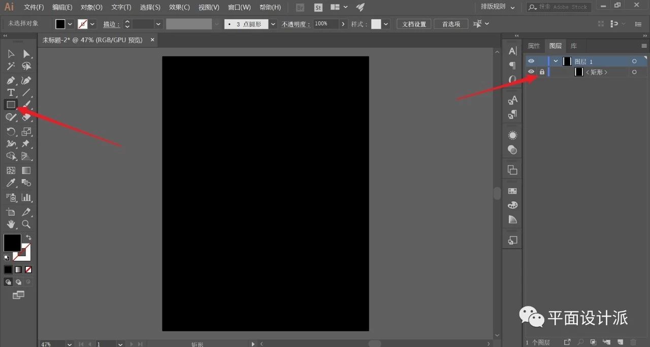
First, open ai and create a new artboard. Select the Rectangle Tool, pull out a rectangle with the same size as the canvas, fill it with black, and use ctrl+2 to lock as the background:
Select the Ellipse Tool, hold down shift and pull out a small perfect circle with only white strokes, as shown in the picture:
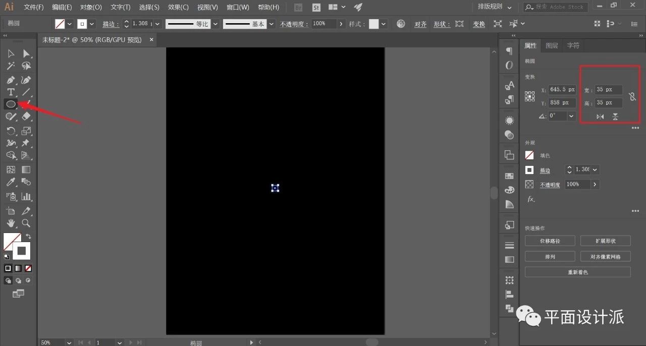
Appropriately adjust the thickness of the stroke, I set 2.5px here:
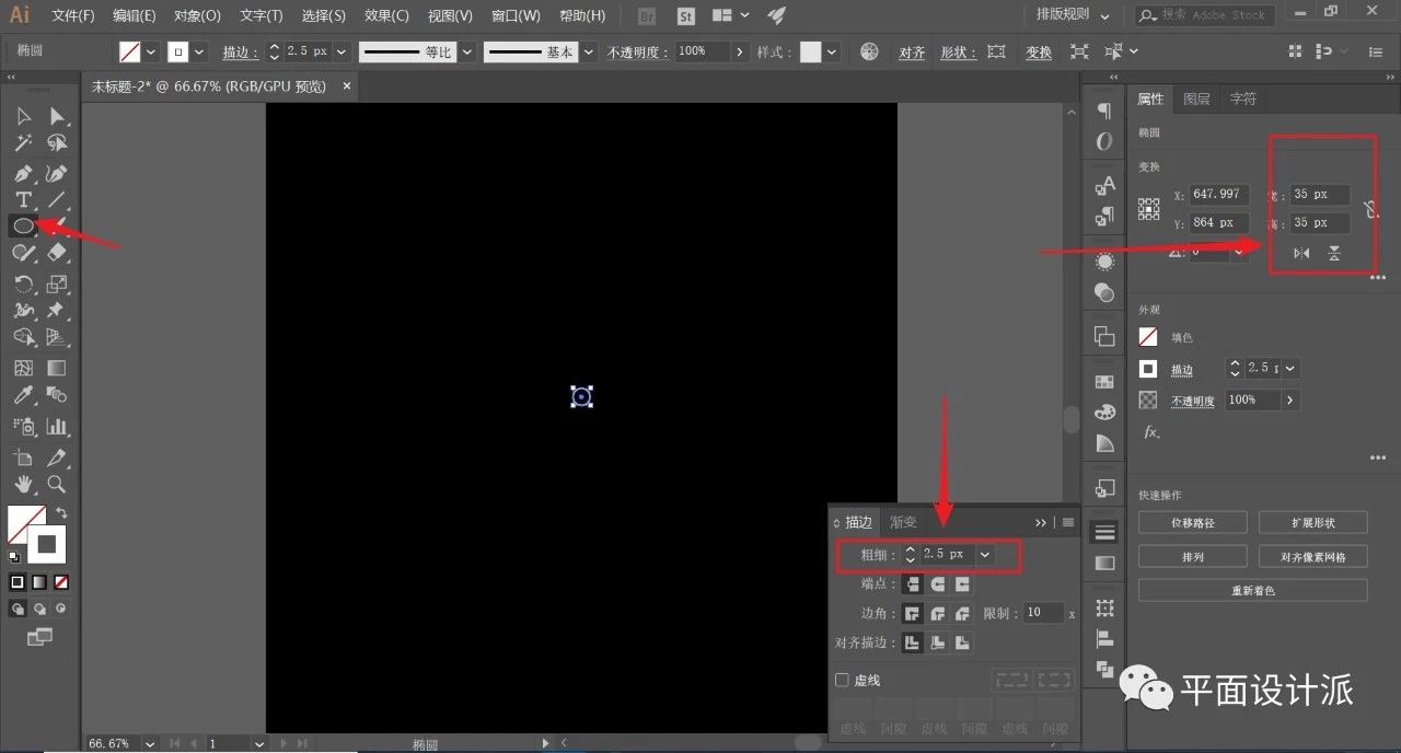
Similarly, pull out a concentric circle with a white stroke (2.5px) surrounding the canvas, and the centers of the two circles are centered at the center of the canvas. Double-click to select the Blending Tool, and adjust the parameters, as shown in the figure:
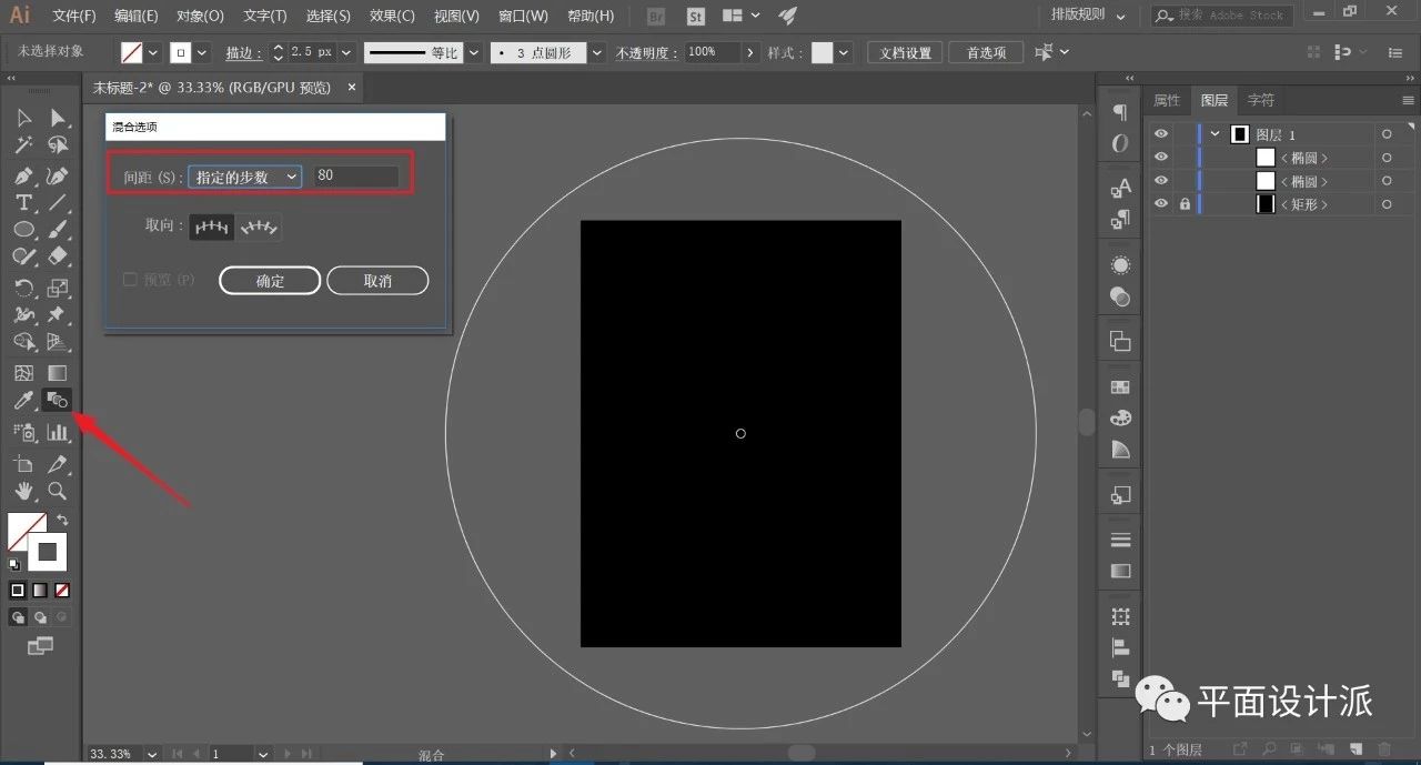
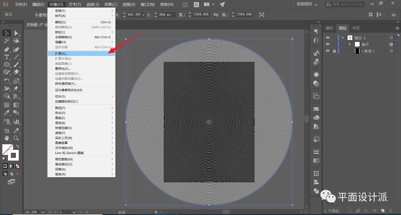
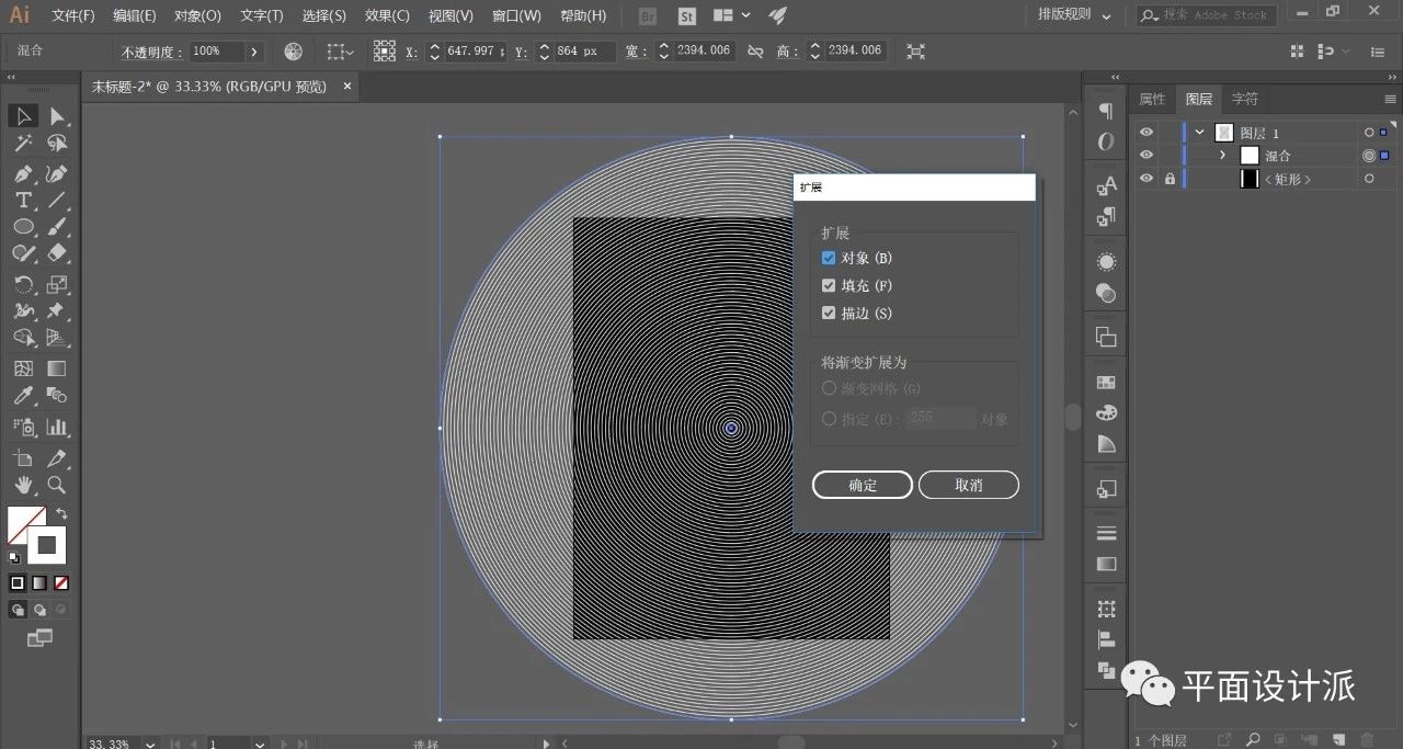
Blend the two perfect circles, then execute Object—Extend:
Just keep the default, OK:
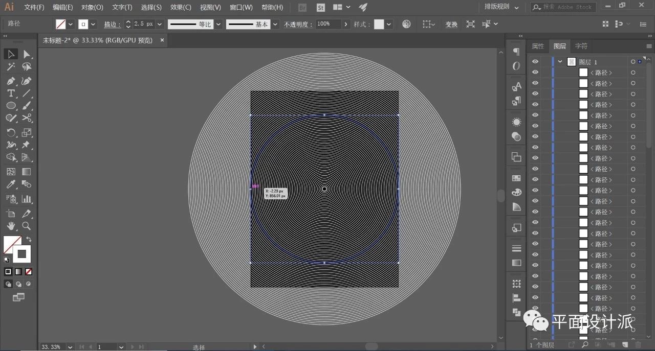
This way we get circles that exist independently:
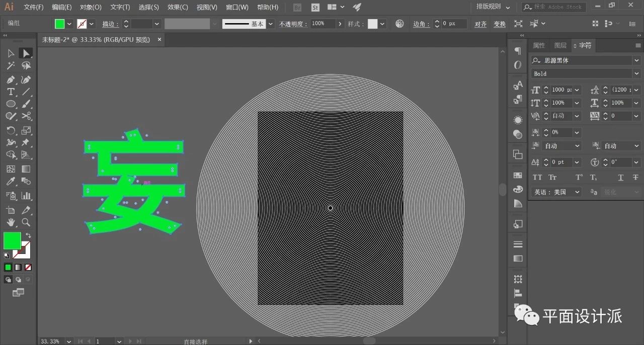
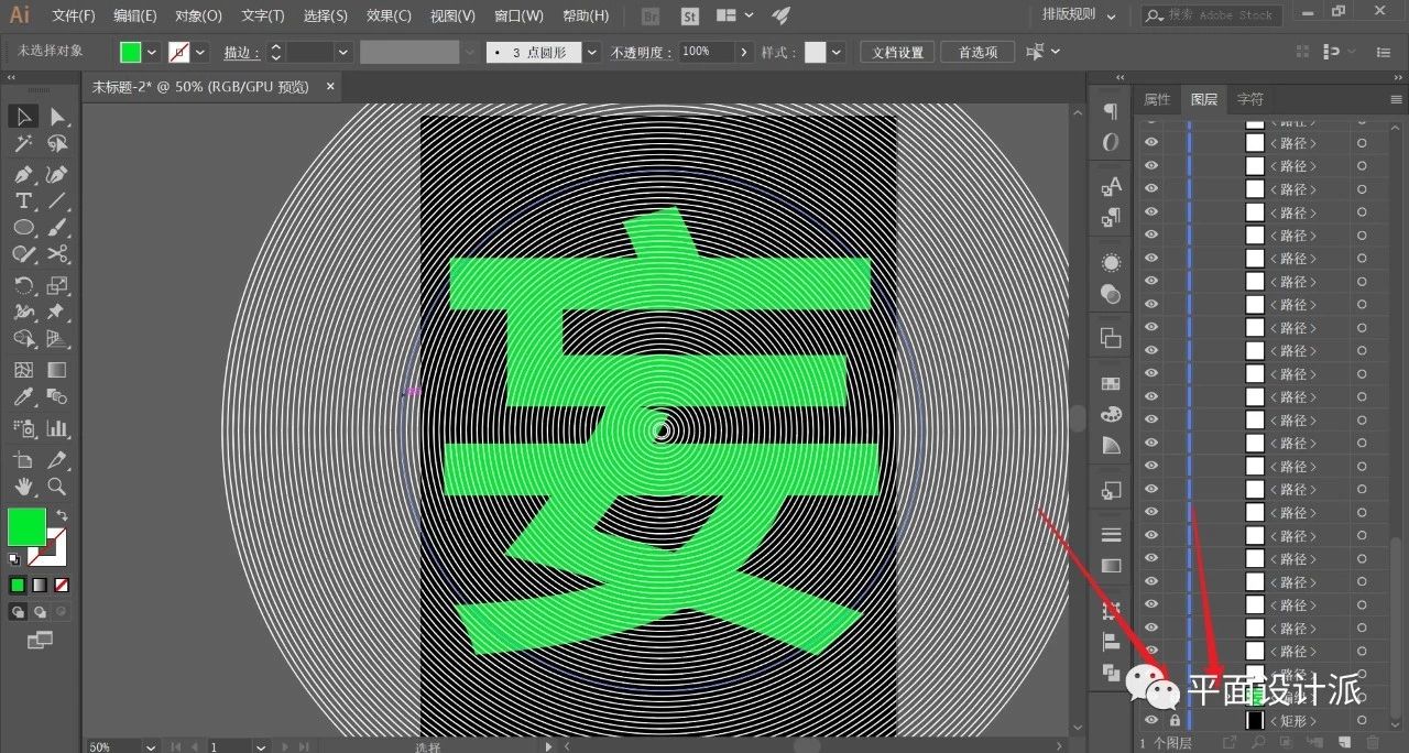
Select the Text Tool, for the convenience of viewing, I deliberately changed the text color to green, and shift+ctrl+o outline the font, as shown in the figure:
Similarly, center the text, put it on the bottom layer of all circular objects, and lock it, as shown in the figure:
Select the Scissors tool, the critical moment comes:
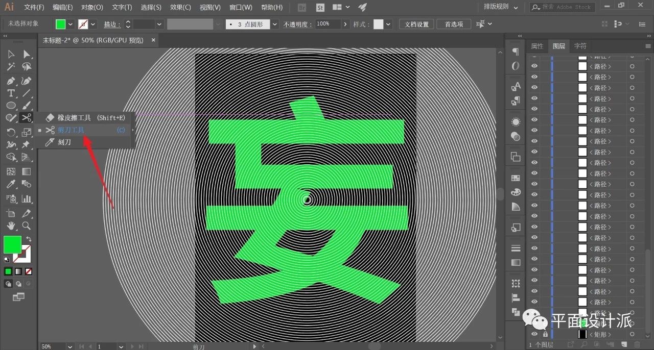
Use the scissors tool to cut the lines that partially overlap with the font. What needs to be emphasized here is that we cannot cut mechanically according to the outline of the font, which will make the font too rigid. It should be cropped randomly, but the text "Center of Gravity" cannot be offset. For the convenience of viewing, we can change the required line part to red, as shown in the figure:
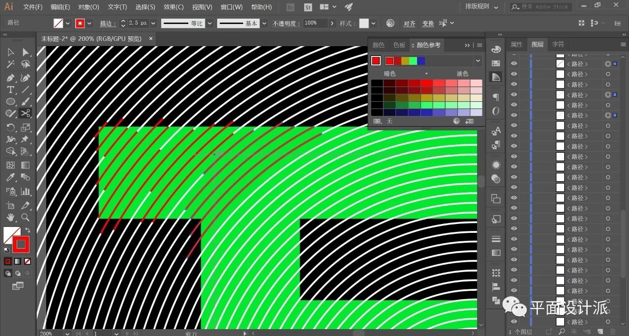
If you do it carefully, the effect will be great. The final cropped effect is like this:
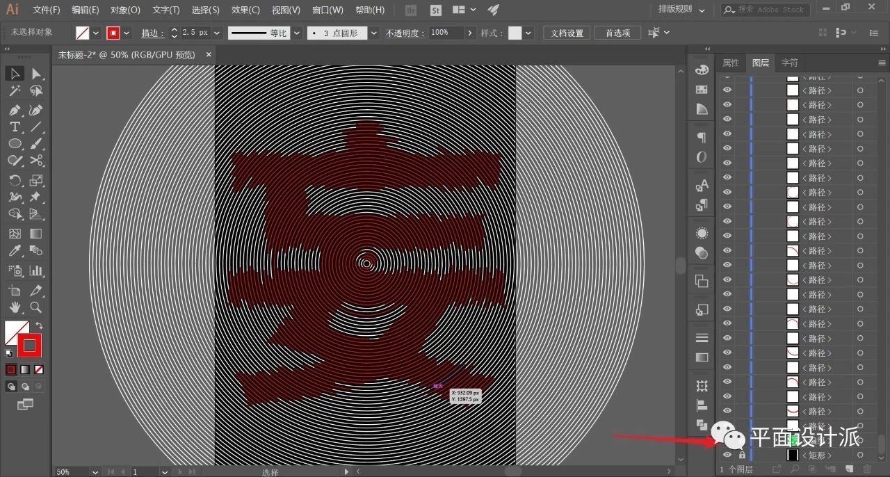
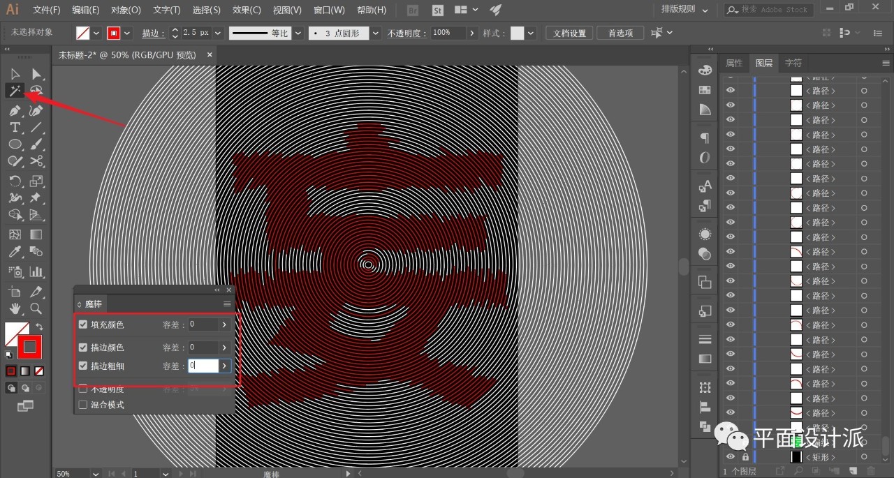
Next, we double-click to select the Magic Wand Tool. Set the parameters as shown in the figure:
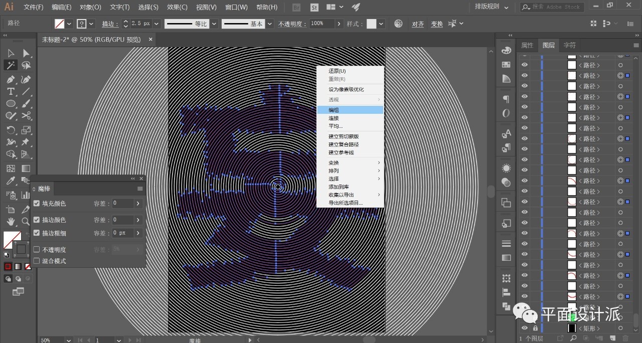
Click on the red line so that we can select all the red lines at once and group them:
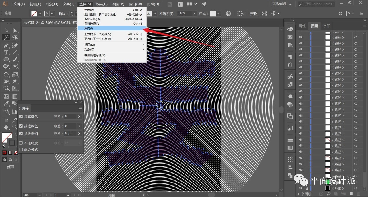
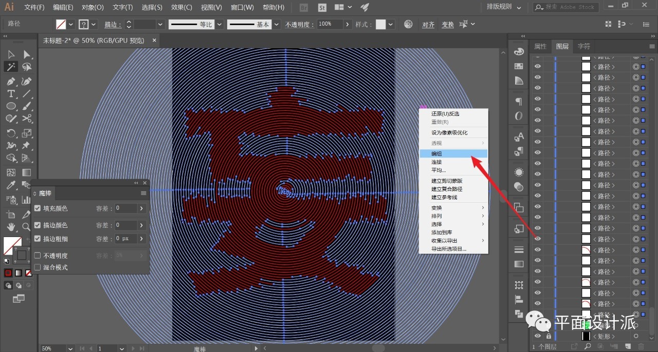
Execute Select—Reverse to invert other objects and group them:
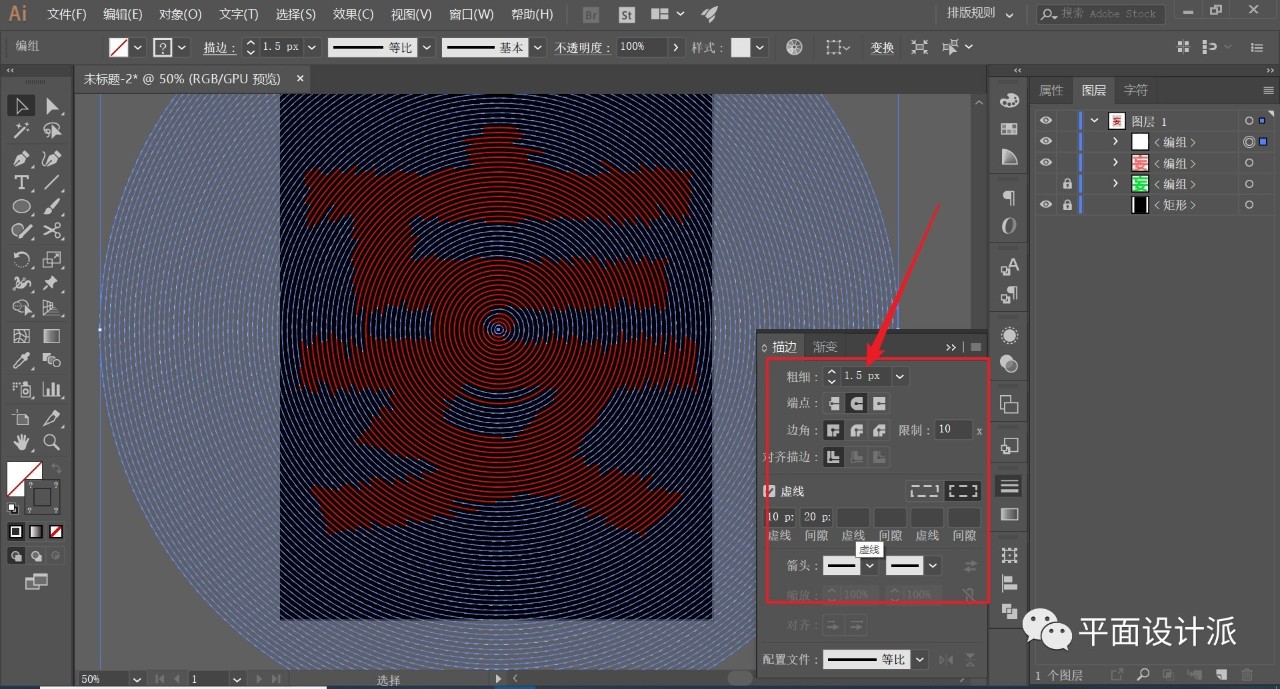
Select the white line object and open the Stroke panel. Check Dotted Line to set the line, where the stroke thickness is 1.5px, and other parameters refer to the figure:
Now we work on the font part.
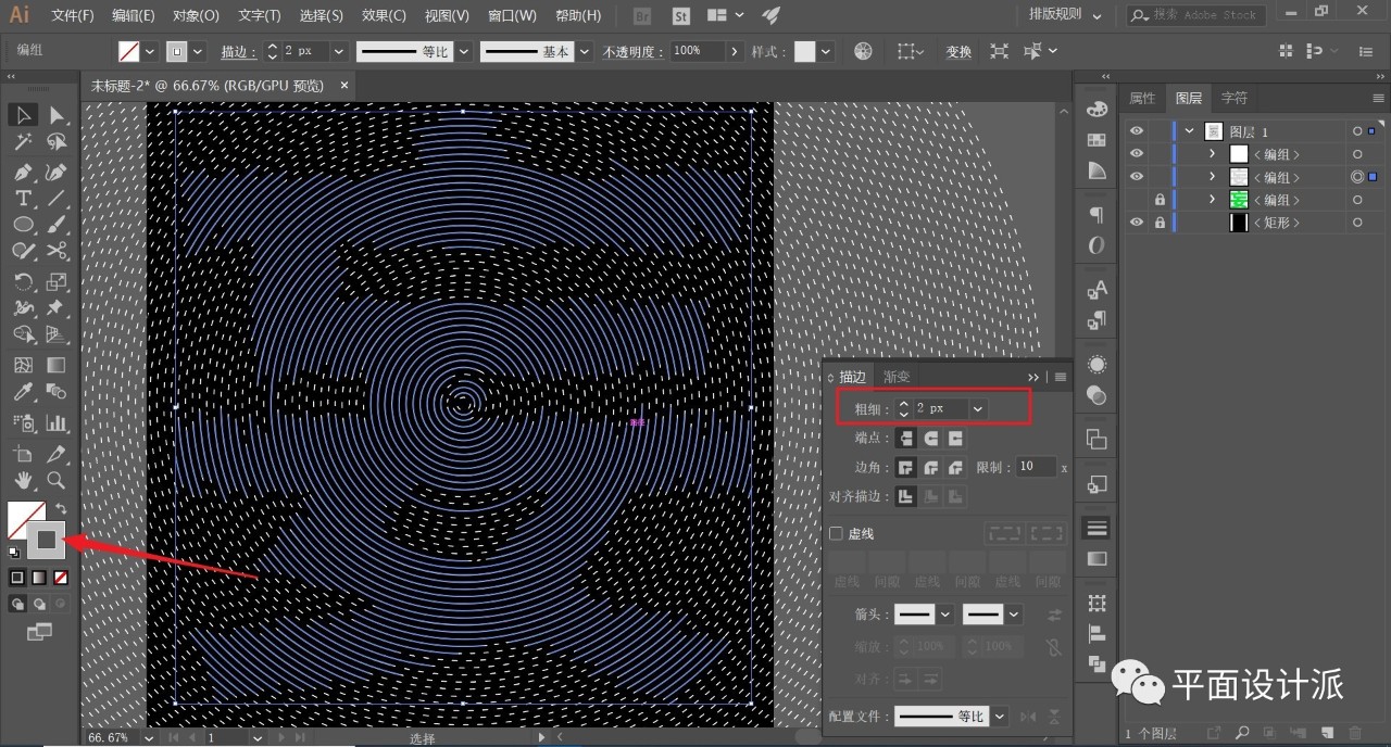
I personally don't like the effect of pure white, so I changed the color of the stroke to light gray, and the stroke is appropriately larger than the thickness of the dotted line, set to 2px:
Finally, make a small graphic as shown in the middle part, and I won’t be cumbersome here:
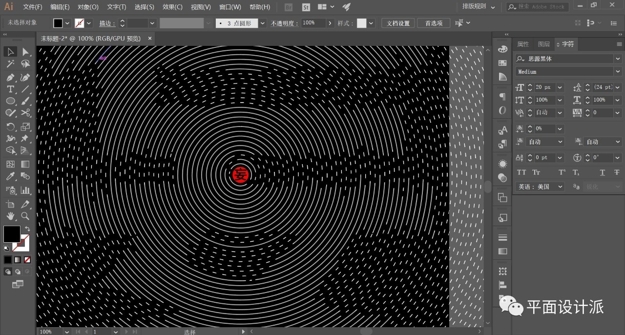
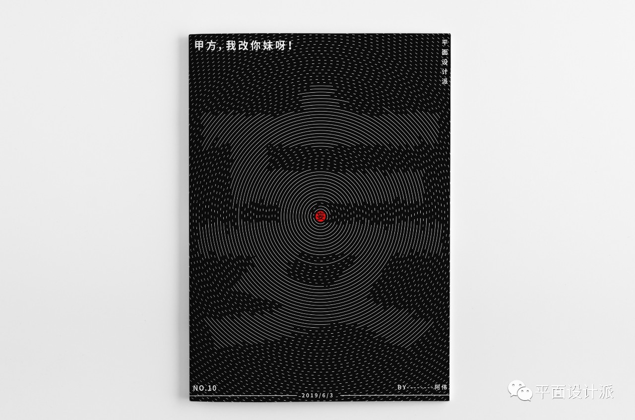
The old rules, proper typesetting of code words, and the renderings:
For more content, please pay attention to the official account:
WeChat Public Account: Graphic Design School
Awei WeChat: zdczawei
This article was published by "Graphic Design School"
Please contact Awei before reprinting
private transfer must be investigated
Articles are uploaded by users and are for non-commercial browsing only. Posted by: Lomu, please indicate the source: https://www.daogebangong.com/en/articles/detail/AI%20Tutorial%20School%20%20How%20is%20the%20font%20composed%20of%20arc%20strokes%20designed.html
 支付宝扫一扫
评论列表(196条)
测试