@刘柏坤
Why does everyone love Times New Roman? What kind of magic power makes Song typeface thousands of people love all over the body? This issue will explore the Song style characters for you. Like the previous articles, the principle is to clarify ideas, explore key points, and pitfalls. In this issue, four Song style cases are specially produced. I believe that the examples will be able to answer your questions.
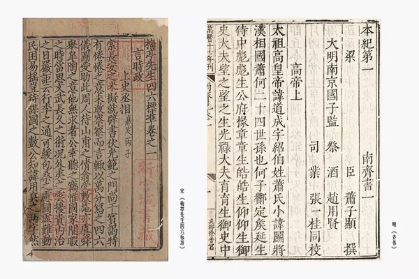
Picture 1 Left: Song "Mr. Meiting Four Six Standards" Right: Ming "Book of Qi"
Let's first briefly understand the origin of Song-style characters. In fact, the name of Song-style characters only appeared in the Ming Dynasty. Because the literati of the Ming Dynasty highly respected the "Song Block Edition", the publishing industry in the Ming Dynasty reprinted the Song Block Edition, but it was not the original Song characters with strong Kai flavor, but after a certain "simplification", it finally formed a font specially used for printing. In the twelfth year of Kangxi, it was stipulated: "From now on, all square scripts are called Song style characters, and regular scripts are called soft characters." The name "Song Ti" comes from this.
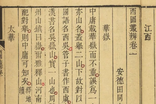
Picture 2: "Xipu Congbian", a periodical periodical of Qianlong in the Qing Dynasty
In the comparison in Figure 1, we can clearly see the changes in the calligraphy styles in the engraved editions of the Song Dynasty and the Ming Dynasty. The printed characters in the Ming Dynasty were closer to what we are familiar with now. The stereotype is basically the same as the modern Song typeface (Figure 2).
After understanding a period of history, look at modern Song-style characters. I think the reason why everyone loves Song-style characters is because each stroke has a history of thousands of years, and no matter how it changes, it has roots.
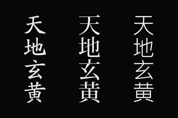
From left to right: italic, Song, bold
It is not easy to do a good job in Song typeface with high value. Although the body decoration features in the strokes are obvious, it is really difficult to control, which is why it is recommended for beginners to start with isoline fonts. So what should I do if I want to do a good job in Song Dynasty? Below, I specially made four different styles of (Pan) Song-style characters. I hope to talk about Song-style characters based on the font style. I don’t guarantee that you can get started immediately after reading this article, but I believe it will make you have a clearer understanding of Song-style characters. Awareness, fall in love with Times New Roman a little more.
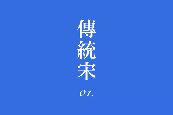
1. Traditional Song
If you want to do a good job of Song typeface, you must understand the basic stroke characteristics of Song typeface. There are many types of Song-style characters on the Internet, but if you observe carefully, you can choose some more traditional Song-style characters for copying and learning, because the traditional-style Song-style characters basically retain all the characteristics that Song-style strokes should have.
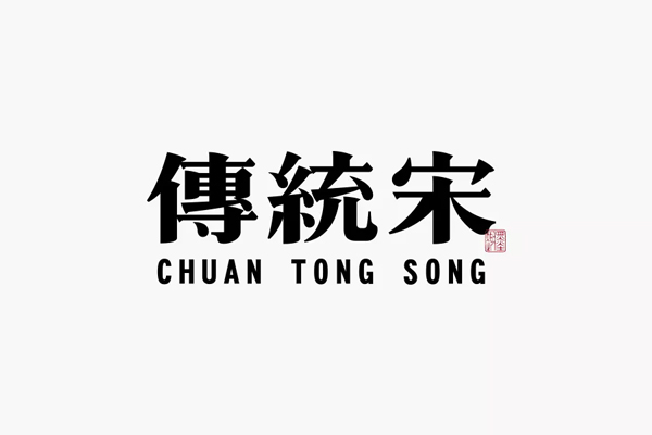
The structure of the traditional Song Dynasty is correct and regular, the strokes are thin horizontally and thick vertically, and the details are rich and delicate, like a knowledgeable elder. It can be observed that the group of characters made in the above picture is more traditional and thicker. There are two difficulties in this type of font: one is that the strokes must be handled properly, and the other is that the structural space must be rigorous.

a. stroke processing
Unlike some black-faced characters with horizontal and vertical strokes, the strokes of Song-style characters have many turning points. Why do many people's Song-style characters not look good? A large part of the reason is that the basic strokes are not paid attention to, such as common problems: uncoordinated body decoration proportions, unsmooth turning lines, unsmooth movements, etc. Each stroke is like a component. Only when each component is qualified, can it work perfectly when put together.
The left side of the above picture is the vertical hook of the Song style characters in the font library, and the right side is the vertical hook of the group of characters I made. It is almost carved out of the same mold, but it can be said that there are many changes. The traditional Song Dynasty also It's not just copying the previous set, there can also be changes. To make Song style characters, you can first make the basic strokes: horizontal, vertical, left, right, and dot.
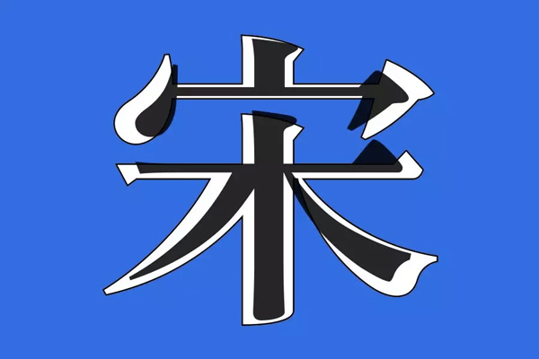
b. Structure space
Referring to the structural space of some Song typeface characters in the font library is definitely a simple and effective method! The frame structure of the Song typeface is relatively fixed, just like the black one in the picture above is the "Ming Dynasty typeface" in the font library, and the white text below is almost the same except for a little fatter. The basic strokes are built up, and then adjusted appropriately.
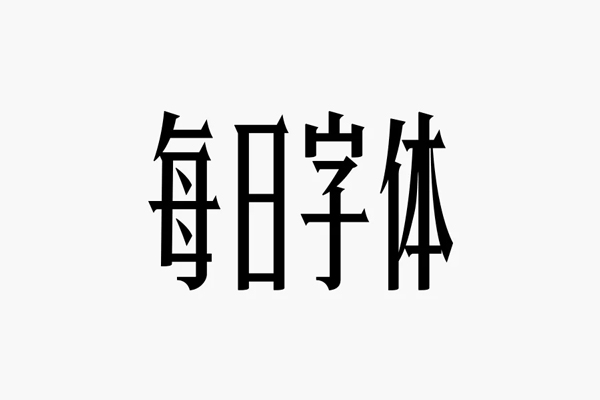
In addition, the automatic flattening or raising of the structure can also add a lot of color to the characters, so try it. The character structure in the picture above is obviously high. If the same strokes are made into "square characters", the personality may not be so prominent.
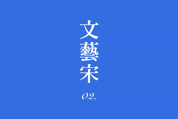
Second, Song Dynasty
The structure is loose but not loose, airy and open, the strokes are neater and cleaner, and Song typeface can also become a literary youth in seconds. Many strokes are slowly transitioning to the state of bold characters, and occasionally a few strokes can't help breaking out of the "frame".
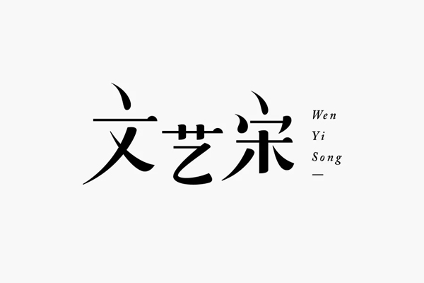
The above group of words is obviously more feminine, so everything is treated "lightly". The structure is not as tight as the traditional Song Dynasty. Some strokes are deliberately disconnected, the space is opened up and more blank space is left, which will naturally give people a more "relaxed" state.
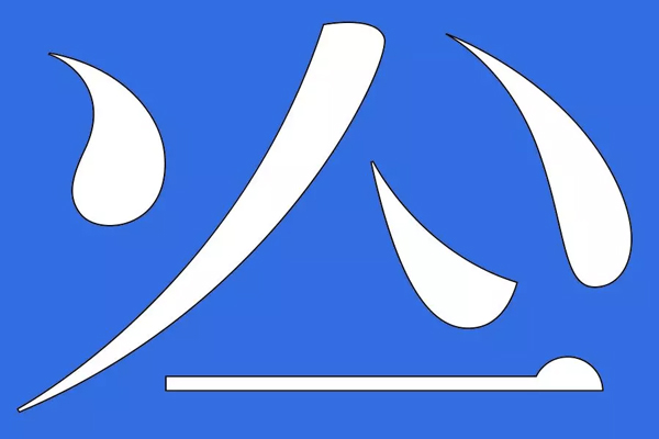
Strokes are selectively simplified. There is no fixed range. Sometimes, some small features in Western languages can be used in Song Dynasty. The strokes are soft and smooth, mostly with curves, which looks more elasticity.
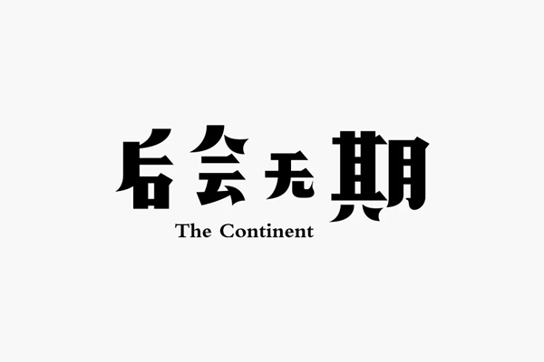
There will be no period in the future. This group of literature and art is more powerful. Compared with the previous group of curves, this group of right-angled straight lines is the main theme. Curves only appear in the strokes of the strokes. Different and different, it can be said that the same literature and art have different auras.
Third, Mengmeng Song
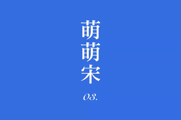
Just listen to the name to see if it has already been cute, but I didn't expect that Song typeface has this side! In my previous article, I mentioned several ways to make fonts cute, and the methods are also applicable here. You just need to incorporate some characteristics of Song typeface into the strokes. It seems very simple to say, look at the group of characters I made below .
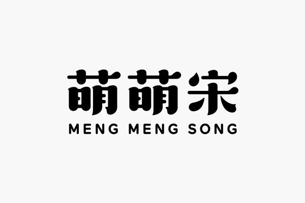
This is by no means the cutest state, and the structure is still a bit rigid, but fortunately, most of the strokes are curved. If we follow the standard mentioned above, why is it not a literary state? Another point mentioned earlier is that "lightness" reflects femininity, and the strokes of this group of characters are definitely not light, they are as naive as baby fat.
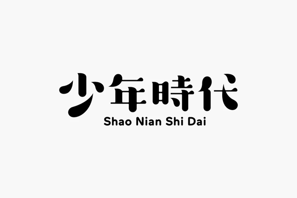
The same routine is used in this group of characters, can you observe any specific details that have changed? Thick strokes are actually relative, and generally follow the characteristics of Song characters of "thin horizontally and thickly vertically".
Fourth, Mashup Song
In fact, some of the characters in front of it are between Song typeface and Hei typeface. There may be more black fonts, and it is really reluctant to attribute it to Song fonts, but there are indeed many friends who prefer this style.
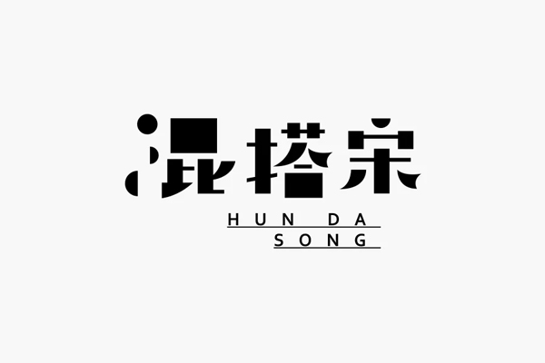
HeiTi + SongTi + Geometric graphics are mixed together to get the same typeface as above. Usually, the combination of HeiTi and SongTi is not new, but if you add a little graphic embellishment, it will make the whole work more decorative It's more like a "rebellious teenager".
The graphics don't have to be too complicated, the basic geometry is simple and easy to use. In addition, you will also notice that I will choose different pinyin collocations for each of the above different Song typefaces. This is definitely the strongest support when used properly. A good layout can make the font work more complete and more compelling!
The rules of mixing and matching Song are actually easy to find. Generally, some Song fonts are left behind, and the remaining black fonts or others.
Summary
There has never been a fixed routine in font design, and the title "Various Songs" is by no means exaggerated, even too conservative, so it must not be changed too much. The above are the Song typefaces I sorted out for you in four common styles. Every time I write it, I call on everyone to try it out, because after reading so many articles and tutorials, there are still not many people around. Maybe it’s not because the article is not well written. , but you did not act!
Articles are uploaded by users and are for non-commercial browsing only. Posted by: Lomu, please indicate the source: https://www.daogebangong.com/en/articles/detail/A%20wave%20of%20cases%20teaches%20you%20how%20to%20play%20with%20everchanging%20Song%20typeface.html

 支付宝扫一扫
评论列表(196条)
测试