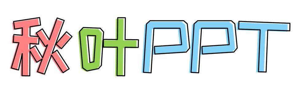
There are many possibilities for font design. Sometimes filling the text with a new color and superimposing a border can give people a new look!
Today, I will take you to explore the lovely journey of Youyuan fonts. Of course, it’s not just Youyuan, the effect can still be used if you change the font!
A few days ago when I visited the JD.com page, I saw my favorite food topic. I clicked on it, except for my favorite snacks, and found that the page design was actually designed with a small round font that we have always hated~

Why do I always dislike Youyuan? This font is too thin for the title, and it is not easy to read when it is the text. But I didn't expect that with this effect, Mengmengda is actually pretty good-looking!
How to do this lovely font effect?
01 Choose the right font
The system’s built-in thin circle is too thin to make a title. In this case, we used "Founder Square Thick Circle". The "Siyuan Soft Heibody" recommended in the article of free commercial fonts can also choose a suitable bold font. Use fonts~
(The font used in the case is "Founder, Thick, Round and Simplified")
Dismantling this effect, we found that there are two texts superimposed here, and then we will fix them one by one.
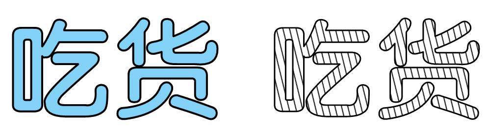
02 Add styles to fonts
The text on the left is very simple, just set the text to be filled with blue and black outline. How is the second striped font realized?
There are two ways: pattern fill and picture fill.
Pattern Fill
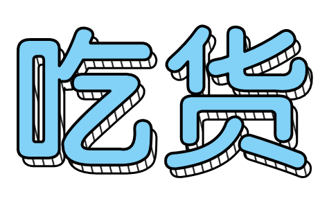
❶Insert the text box and enter the word "食货", right-click to select [Format Shape] - [Text Options] - [Text Fill] - [Pattern Fill].
❷ Select [Diagonal Line: Wide Lower Diagonal] in [Pattern Fill], and change the color of [Foreground] to black.
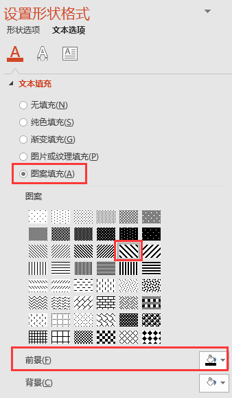
You can get the effect of slash filling text~
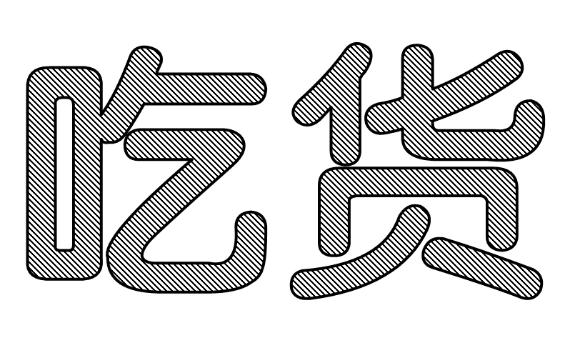
Using the built-in pattern fill effect, the thickness and distance of the lines cannot be adjusted. So, we can try the second method.
Image fill:
❶ First insert a diagonal line with a line weight of 1.5 points.
❷ Use plug-ins such as iSlide or Landscaping Master to copy the lines horizontally. The copied size should preferably be the same size as the text box of the word "foodie", so that it can be filled later.
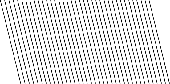
❸ After copying, combine the lines and copy and paste them into picture format.
❹ Select the word "食货", right-click to select [Format Shape] - [Text Options] - [Text Fill] - [Image or Texture Fill].
❺ In [Picture or texture fill], insert a picture from [Clipboard], check [Tile picture as texture], and select "Center" for alignment.
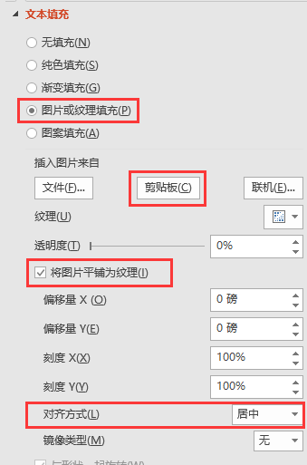
You can get the effect of slash filling text~
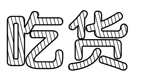
❻ Then insert the word "食货" with the same font size, fill the font color with blue, cover the text box filled with lines, and the text overlay effect will be done~

PS: Pay attention to the staggered distribution when superimposing. It is recommended to hold down the arrow keys to make fine adjustments to the text box more conveniently.
03 More creative ways to play
❶ Three-dimensional rectangular frame
Once the text overlay effect is done, the rectangle box overlay effect is even easier, and it only takes three simple steps:
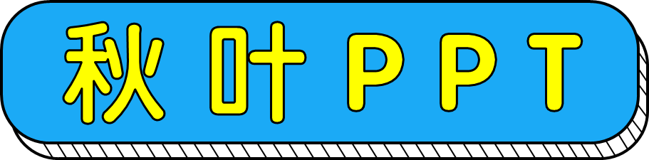
The first step is to insert the "Autumn Leaves PPT" text box, and insert a rounded rectangle of appropriate size according to the size of the text box.
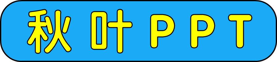
The second step is to copy a rounded rectangle of the same size, fill the shape color with none, place it on the bottom layer, and adjust the position of the bottom rectangle frame to create a sense of error.
The third step is to add line decoration. At the white border, add lines according to the direction, which can also be quickly copied with the help of plug-ins such as iSlide. You need to manually adjust the details at the corner, don't be lazy~
You see, isn't it easy to make such text overlay and wireframe overlay effects?
❷ Get the character introduction
We can use the superimposed wireframe to apply to the character introduction page to make the introduction lively and interesting~
This lively design is especially suitable for promotion and introduction of event guests on online platforms such as Moments, Qzone, and Weibo.
We don't have to limit our thinking for the order of the methods introduced. Changing the font and stacking order is another new effect.
❸ Vivid dialog box
Disassemble the picture below, it is actually two solid color wireframes superimposed~
❹ Poster Text Effects
Change the font to "Zhanku Happy Font", put the text box filled with color on the bottom layer, and the text box filled with transparent color on the top layer, and adjust the staggered position of the two text boxes, you can easily create a pop poster font effect~
❺ Cover Page Title
It’s perfect for a cover at a party event or a relaxed self-introduction scene~

How about it, does this way of processing text make PPT more flexible?
If you want to know any text or picture tips, you can leave a message and tell us~
Articles are uploaded by users and are for non-commercial browsing only. Posted by: Lomu, please indicate the source: https://www.daogebangong.com/en/articles/detail/A%20superimposed%20effect%20of%20one%20trick%20makes%20the%20small%20round%20fonts%20that%20you%20dislike%20cute.html
 支付宝扫一扫
评论列表(196条)
测试