Editor: Green Onion Author: I am Design Wet
Among the English fonts, there is a special type called "decorative fonts", which is similar to the experimental fonts in the Chinese fonts. .
There are a huge number of English fonts, and a relatively large proportion of them are moving forward in the direction of exploration, and decorative fonts are a big direction.
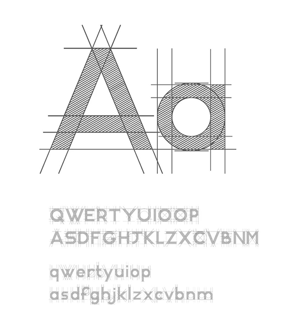
But I found a very interesting thing. In many fonts, the English letters typed out are not the corresponding characters, but various irregular symbols or graphics. Therefore, the font file format only appears as a carrier, not a literal font in the actual sense.
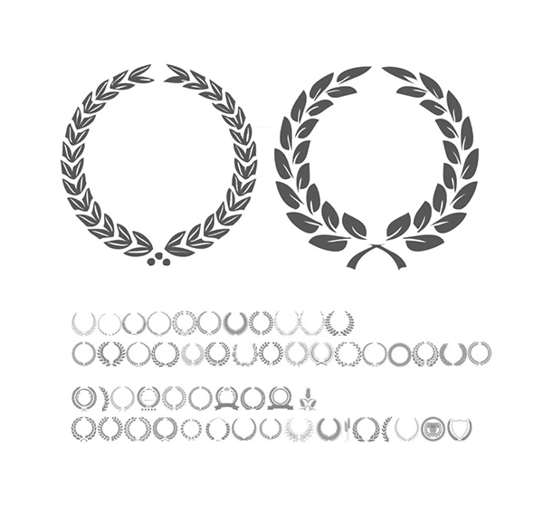
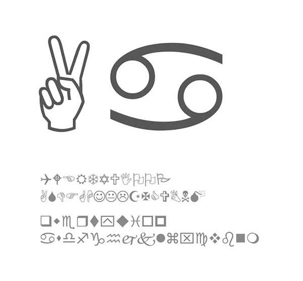
This is worth pondering, so I had a whim, whether it is possible to develop associations in the form of color matching, and each character uses a color matching, and it appears as a carrier of the font library. Thinking of this, I'm already getting ready to go.
First of all, it is determined that my goal is to be oriented by color matching, not identification. In the case of being really powerless, the first thing I may have to give up is the expression of the characters themselves. Because once you want to balance the two perfectly, sometimes you may not be able to continue due to various factors. First, make the determination to cut off your own arm, and things will be a little easier.
The first character is often the hardest part, because once the design of the first character is completed, the general design direction of the font has been determined. I decided to try to use geometric figures to run through it.
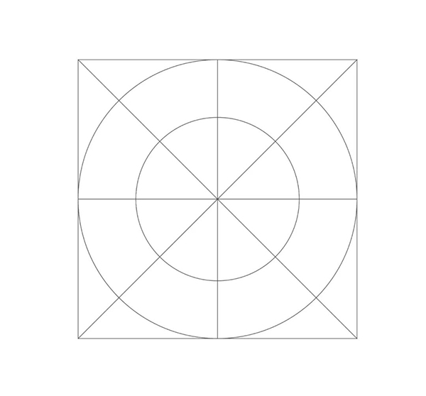
Try to match the color scheme. I plan to use four to five colors for each character in the color scheme. Because we rarely use more than five colors to design, the layout is difficult to control, so the narrowing of the scope is more practical.
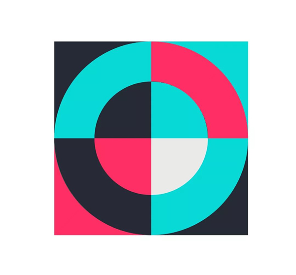
Then this character can be the number "0", or the letter "o", which can be expressed in this form. Of course, this is just the beginning part. My original intention is to make it richer, so that it can be a picture in itself, a provocative and interesting graphic. I'm going to try to add some texture and see how it changes.
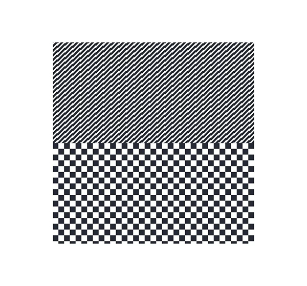
So here is a brief introduction to the "pattern" creation function in AI software. First of all, it needs to be understood that pattern creation itself is a basic algorithm arrangement, which also means that it deals with texture processing with a sense of order. Algorithms are divided into five types.
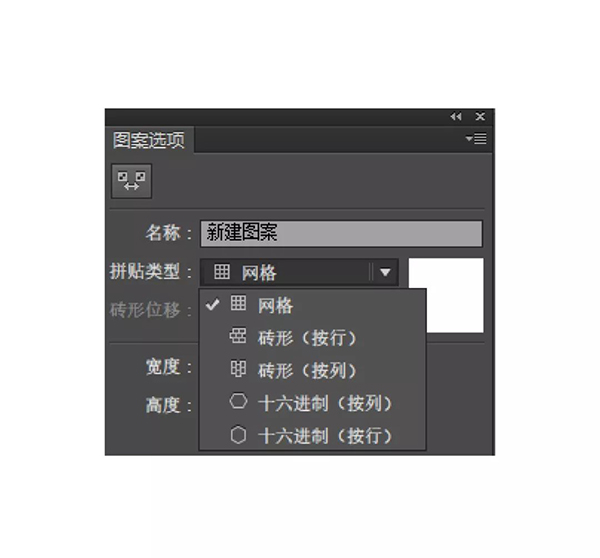
Tell me how to create a pattern
Step 1: Create a basic minimal pattern unit. like a circle.
Step 2: Object-Pattern-Create, you can find the pattern options panel and choose the arrangement method.
Step 3: Adjust the distance size.
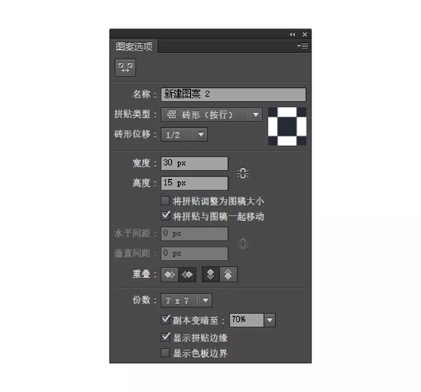
It should be noted that the size setting of the minimum pattern unit is preferably an integer, which is convenient for calculation. For example, in this pattern, I set it to be 15px by 15px. Here I have set a total of six texture processing according to my own needs.
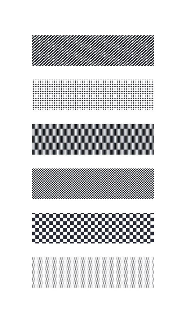
Then try it on specific individual characters to ensure that the color distribution is even and the arrangement is balanced. Here are several color matching and texture processing methods for a single character. The results are not unique.
Note: Because it is the relationship established by the pattern, as the figure is enlarged or reduced, the texture details are relatively reduced or increased.
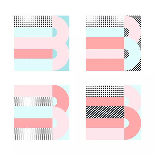
Next, let's take a look at the final design results of all the characters, the first is the number part.
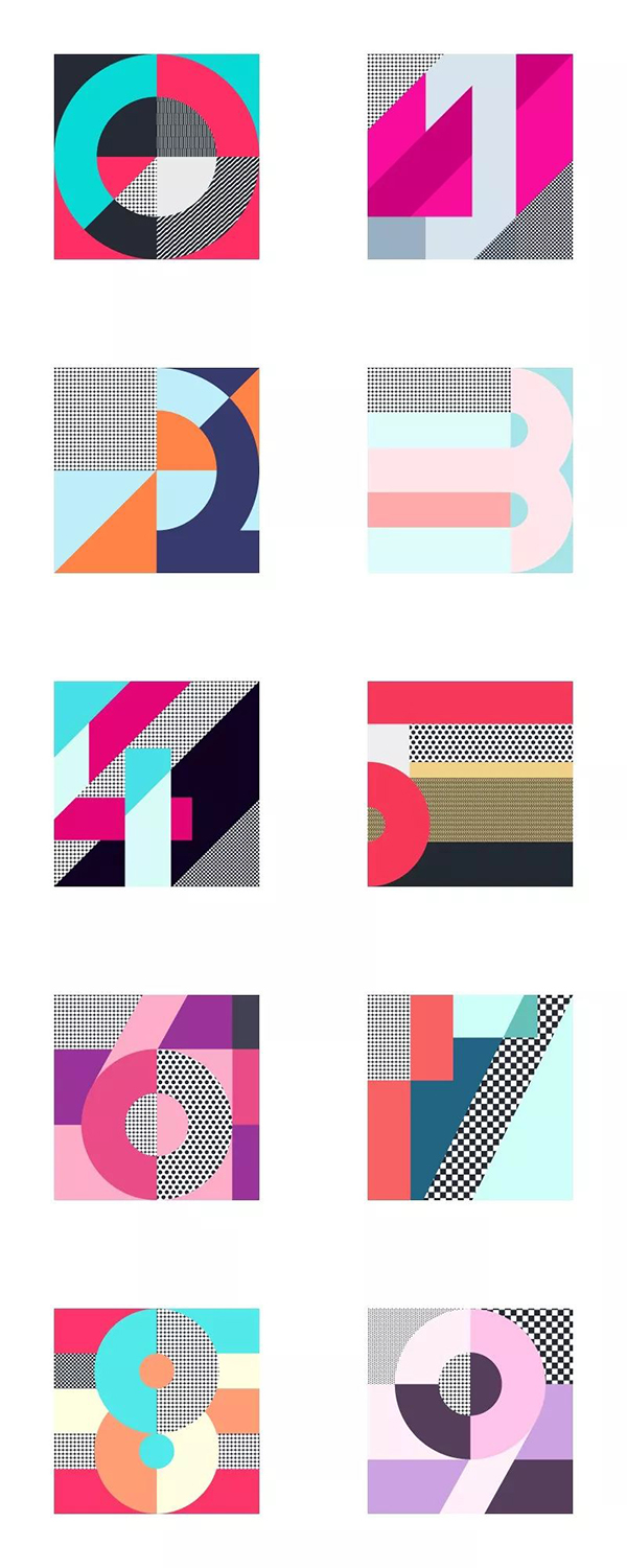
Let's look at the processing of English characters again. Only the uppercase part is done here.

In fact, this kind of geometric figure processing is relatively more used in Swiss design. Swiss poster design has a large number of geometric figures and color applications, minimalist, accurate and rigorous. The exploration in the square inch space is very extreme.
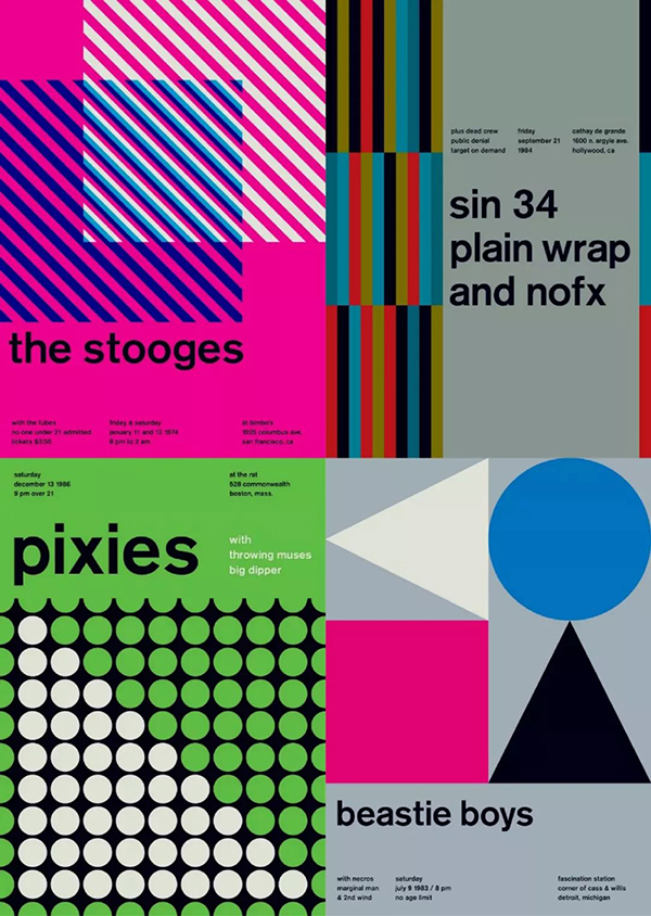
Of course, it is not only applied in posters, but we often see similar processing techniques in brands. As a form or style, the relationship between graphics and colors is always worth exploring.
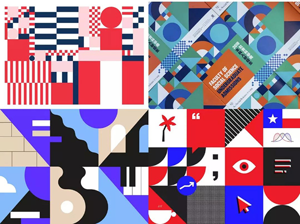
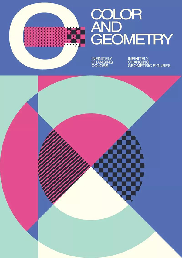
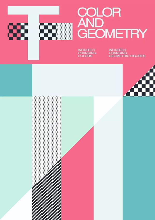
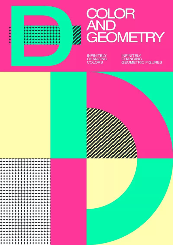
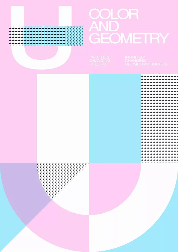
In the end I made a few simple typography effects for posters. I hope you all gain something.
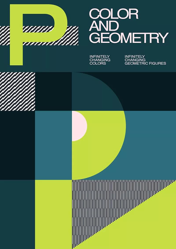

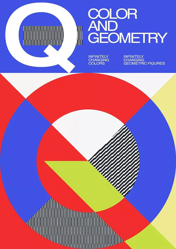
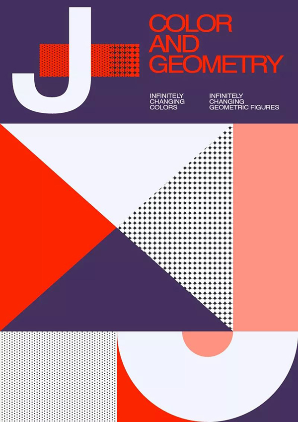
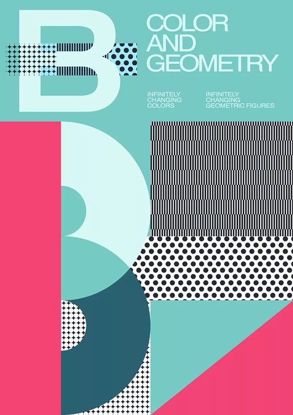
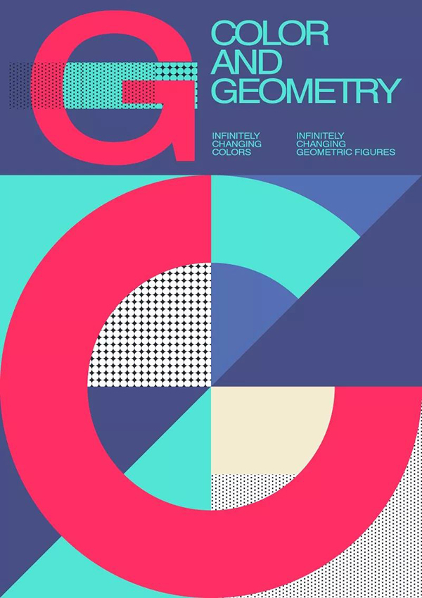
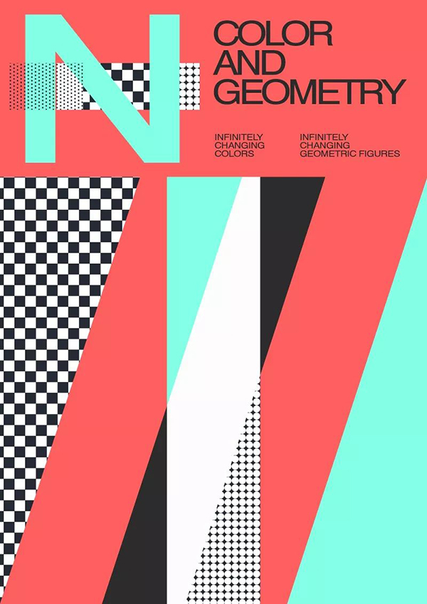
At the end of the article, send a source file of "36 English color combinations", you can follow the author's official account, and reply to the keyword [English color] in the background to download~
Articles are uploaded by users and are for non-commercial browsing only. Posted by: Lomu, please indicate the source: https://www.daogebangong.com/en/articles/detail/A%20set%20of%20English%20fonts%2036%20color%20matching%20schemes%20please%20take%20it%20away.html

 支付宝扫一扫
评论列表(196条)
测试