Author: Font Design
Entering the digital age, numerous screens have become a new medium for reading. With the development of intelligence, screens are getting smaller and higher, and the resolution is getting higher and higher, which puts forward extremely high requirements for the presentation of fonts.
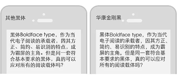
Heiti, as the carrier of contemporary e-reading, has become the protagonist of the dominant screen because of its square, simple, and easy-to-recognize characteristics. But can the same set of blackfaces that meet the basic requirements really deal with all reading media?
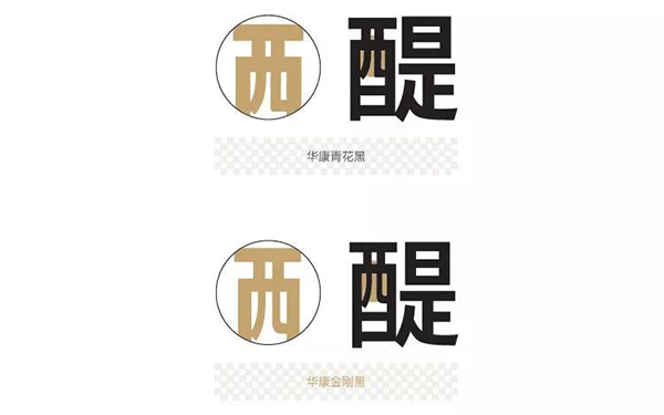
Huakang King Kong Black
Font is the visual symbol of text. The design process should not only pay attention to the aesthetics of each word, but more importantly, provide readers with a unified and comfortable reading experience through arrangement and presentation. Different carriers are extremely different. Greatly affects the reading experience.
The recently released Huakang black body series has evolved into three different black bodies with the screen, which innovatively solves the impact of the reading carrier on fonts, and opens the trend of adapting different black bodies for different screens!
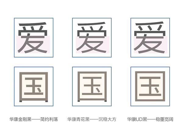
Visual differences of the three Huakang black bodies
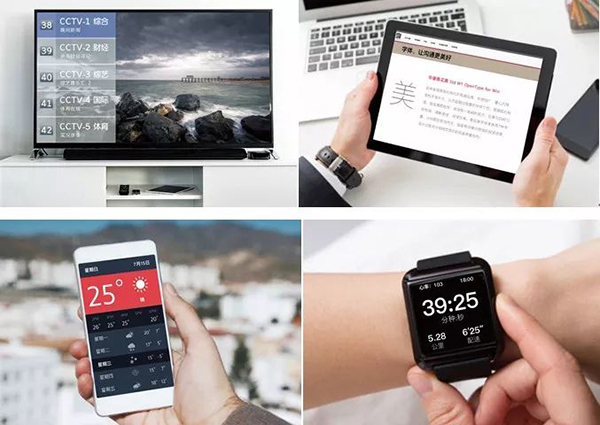
Focus on the small screen: give your thoughts room to breathe
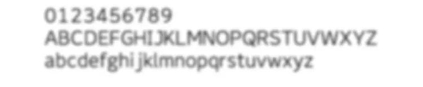
Small screens such as mobile phones, IPADs, and smart watches have limited space, and the dense font arrangement is not only difficult to distinguish, but it is more likely to cause eye fatigue when reading for a long time. For this reason, Huakang King Kong Black came into being, with simple and refined lines, clear structure, moderately enlarged characters, and a transparent and clear sense of space, which has become an exclusive solution for small screen reading.
For the cross-age design concept, Huakang King Kong Black won the Best Design Award of the 2018 Golden Pin Design Award.
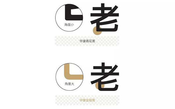
The neat black body strokes add the arc rhythm of modern aesthetics.

Modern style, simple and neat strokes

Leave evenly and display clearly

The center of gravity is on the upper side, and the vision is straight and bright

Segmented width control to avoid blurred characters
Leave evenly and display clearly
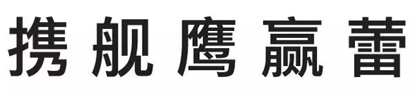
In a consistent font structure, Huakang King Kong Hei has developed 6 font weights, supports 15 languages around the world, and ensures the visual unity of cross-cultural reading to the greatest extent.
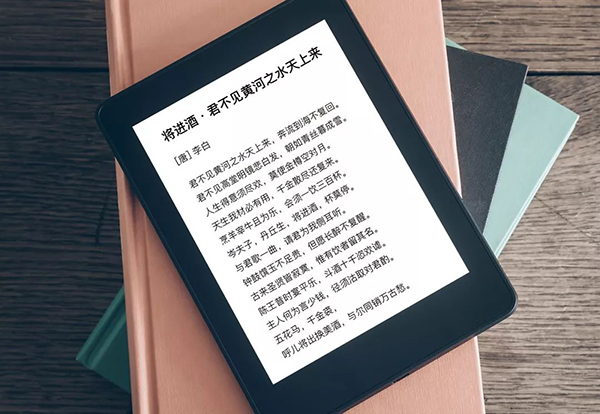
Optimized webpage display: soft and calm pure look and feel
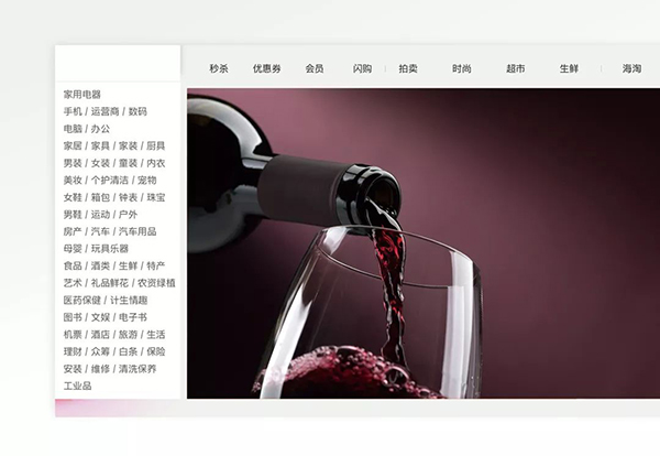
Entering the era of information explosion, the display of web pages is often tedious, messy, and colorful. If you use too sharp fonts, it will increase the burden of reading.
For this reason, Huakang has specially created a soft, clear, and highly functional neutral black body——Huakang blue and white black. Its calm, generous, and unpretentious characteristics restore the purest dimension of reading.
Huakang blue and white black takes symmetry and uniformity as the core of the design. The strokes are simple and neat, and the arc is smooth and natural; high sex.
Compared with Huakang King Kong Black, Huakang blue and white black characters are enlarged, and the webpage display is clearer and clearer
Huakang blue and white black large characters can still maintain the original balance of the font
The Huakang blue and white black corner arc is narrowed to enhance the sense of stability at the large character level
Strengthen indicator description: Make message delivery easier and better
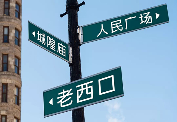
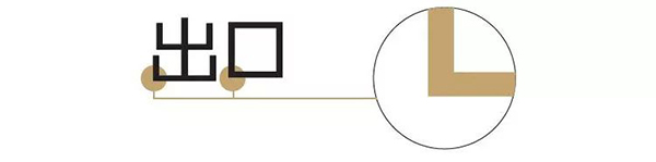
Huakang UD Black adopts a series of optimized designs, including increasing the literal rate, optimizing strokes, enhancing the uniqueness of characters, etc., focusing on the easy-to-read function, making the index content In noisy environments, it can also be easily identified.
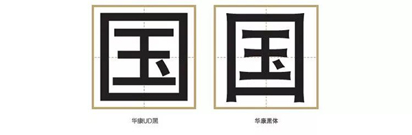
The space inside the character is increased, effectively increasing the recognition

When moving at high speed or covered by obstacles, it also maintains good recognition
Simplifies traditional writing, effectively increases white space, and has good recognition

It can avoid blurred characters caused by small characters or strong light sources
Good design originates from life and is higher than life. It is the Huakang HeiTi series that adheres to the most basic rules of character creation and combines rigorous professionalism with humanistic feelings to create a new design. The practice of customizing the best reading solutions according to different carriers is bound to lead a new trend in the industry.
Articles are uploaded by users and are for non-commercial browsing only. Posted by: Lomu, please indicate the source: https://www.daogebangong.com/en/articles/detail/A%20font%20that%20looks%20more%20comfortable%20than%20Pingfang%20was%20born.html
 支付宝扫一扫
评论列表(196条)
测试