Written in the front: The days of learning font design with the master, continue to share font design today, hoping to make progress together with everyone on the road of learning font design.
Font Name: Tiantian Orchard
Industry: Wholesale and retail of fresh and fruit
Creative ideas and methods: The fruit industry is a fast-moving consumer industry. What is needed is fresh appearance, delicious taste, fresh and beautiful every day, and the font shape should be concise and clear, easy to identify, highlighting a new and fast dynamic . The color editor still prefers green. Green brings you more health and positivity.
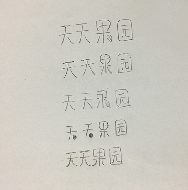
The following are some creative points collected by the editor, hoping to inspire you. The editor didn't have time to organize it into an electronic manuscript, so I simply drew a sketch with a pencil for everyone to read.
Idea 1: Combine graphics
After designing the basic font, adding graphics, such as adding leaf elements, can convey more vivid information, so that everyone can see at a glance that this store is related to fruits. This is a common design technique. (Sketch 1, Sketch 3)
Creativity 2, disconnect strokes
In the basic font, disconnect the similar strokes of these four fonts. Everyday Orchard, these four fonts have a horizontal line. If the horizontal line is broken, the font on the right becomes a horizontal fold. The overall look is smoother and has a sense of design. Leaning can be added at the end to impart a sense of fast movement. (Sketch 2)
Creativity 3, graphic replacement
Replacing the right side of the sky with the origin, the whole is more lovely and very friendly. For everyone who consumes fruits every day, the relationship with everyone is closer. (Sketch 4)
Creativity 4, clever connection
According to the characteristics of the strokes of the font itself, the strokes between the fonts are cleverly connected together. For example, the characters "Tiantian" and "Guo" in "Tiantian Orchard" both have Na and Zuo. The radians can be connected together, and the whole is more harmonious. The sketches are relatively rough, but when drawing with ai, the arc can be drawn more carefully, and the distance between fonts is more compact, and the effect of this connection is obvious. (Sketch five)
It's late at night, friends, if there is any better panacea, call me anytime. I am waiting for you in the group, group number: 439833287.
Articles are uploaded by users and are for non-commercial browsing only. Posted by: Lomu, please indicate the source: https://www.daogebangong.com/en/articles/detail/A%20font%20design%20idea%20about%20a%20fruit%20shop.html
 支付宝扫一扫
评论列表(196条)
测试