1. In ppt, you need to know four websites related to fonts:
Find words: www.zhaozi.cn
Seeking Font Network: www.qiuziti.com
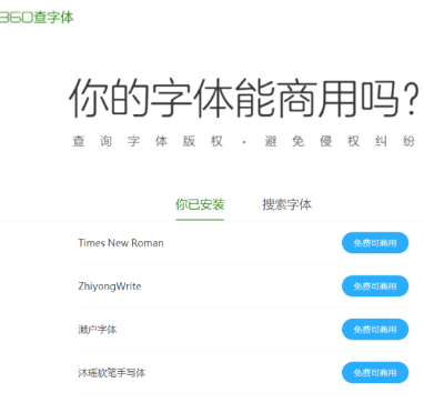
360 font copyright inquiry: http://fonts.safe.360.cn/
Calligraphy fans: http://www.shufami.com/
Font installation method: 1. Copy the font file to C:\WINDOWS\Fonts. 2. Just right-click, and then click Install. Just double-click a font. After installation, restart ppt to use it.

Free commercial fonts: including script fonts, Seto fonts, Zakuku happy fonts, etc.
Non-free commercial fonts: more than 5,700 fonts, but it is not recommended to install too many, otherwise the computer will be very Easy card.
If you need to download fonts, add WeChat official account (Chunge PPT)—data download—font download, just click to enter .
1. Font type
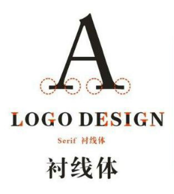
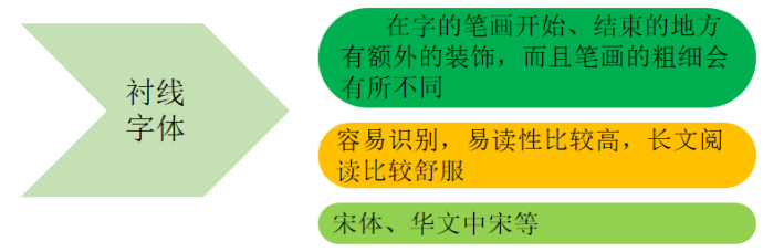
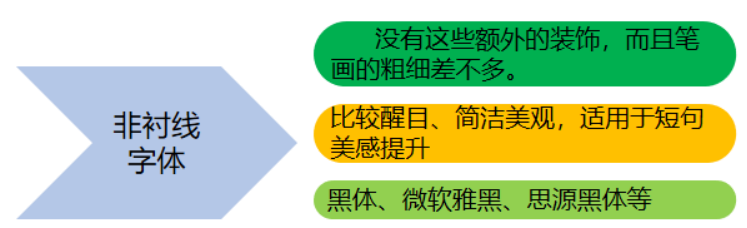
Serif font: easy to recognize, it emphasizes the beginning and end of each letter stroke, so it is more legible, sans serif font It is more eye-catching. In the case of reading the whole text, it is suitable to use serif fonts for typesetting, which is easy to read on new lines and can avoid reading errors between lines.
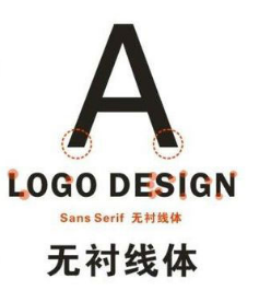
Sans-serif font: without these additional decorations, and the strokes are of similar thickness.
One 2. When choosing a font, in addition to considering its legibility, more consideration is whether the font can accurately convey the unique temperament of the product. Not only the font hastemperament and characterSaid, EnterpriseWebsite design Same thing.
So, what is font character? In fact, it is through the differences in font structure, strokes, and details to create a variety of fonts, so as to give people different visual feelings. A good font design can always accurately convey the emotion of the font at the first time, which is the charm of the character of the font.
(1) Flat VS thin and tall : The thinner and taller fonts are more literary and feminine, while the flatter fonts have a lower center of gravity and are more stable and solemn.
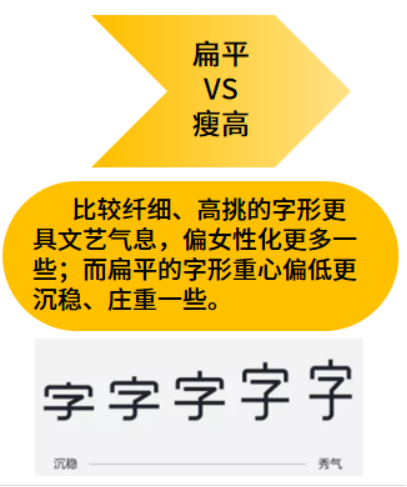
Flat: Steady, compact, solemn, speed, etc.
Thin and tall: female, delicate, Elegance, art, etc.
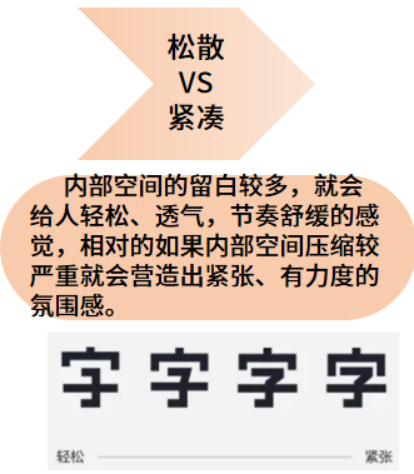
(2) Loose VS compact: If there is more blank space in the internal space, it will give people a feeling of relaxation, ventilation, and soothing rhythm. In contrast, if the internal space is compressed more severely, it will create a tense and powerful atmosphere.
Innocence and liveliness are the nature of teenagers, and there are not many rules in the world of children. Children's fonts also appear immature and lively. Therefore, handwriting with loose structure is often used in children's subjects or in a relaxed and humorous reading environment.
As the name suggests, regular script means a model, Fang Zhengjun is elegant, and the law is strict. It also symbolizes the standards of human beings in traditional Confucian culture, with good conduct and integrity. Therefore, regular script with strict structure is often used in solemn calligraphy or inscriptions.
loose: airy, ethereal, free , relaxation, etc.
Tight: rhythmic, fast, tense , serious, etc.
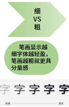
(3) Thin VS thick: The thinner the strokes, the lighter the font, and the thicker the strokes, the more weighty.
Thick strokes are vigorous, dense, Powerful, like a thunderbolt; the strokes are thin, light, and delicate, like a weak willow supporting the wind, which is the most direct and shallow impression.
Thick stroke fonts will appear in typography Form a high-density text block. This is because the strokes are thicker, the negative space of the font will be reduced, the visual area will be increased, and a sense of oppression will be formed, which will form a visual center of gravity and produce an emphasis. Therefore, bold fonts are often used in titles and slogans, occupying a conspicuous position and creating emphasis.
Fine: eye-catching, trustworthy, weight , formal, etc.
Dark: technology, lightness, quality , ventilation, etc.
(4) Curved VS Straight: If the strokes are mainly curved, it will give people an elegant and soft feeling. On the contrary, the strokes are straight, including the corners are mostly folded corners. Such fonts are crisp and neat, with a sense of speed and strength.
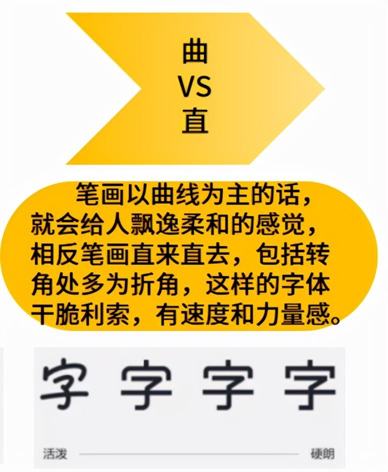
Font strength and elasticity. Straight lines are cliffs, falling rocks, towering ancient trees, or vast plains, thousands of miles of clouds. Straight lines represent magnanimity, crispness, and courage, but they may also mean rigidity and paranoia. The straight line gives the font a masculine temperament, while the curve represents the feminine side. The curves are soft silk, floating clouds, and willows, and they are nine-curved ileum, which is more tolerant and tactful.
Most fonts are not created by Simple straight lines or simple curves, horizontal and vertical are straight, left and right are curved, only curved and straight can appear rigid and soft, powerful and elastic. For example, the starting point and the turning point of the regular script of the Northern Wei Dynasty are like cutting gold and breaking jade, crisp and neat, the whole font will appear upright, vigorous and heroic, and there are beautiful curves at the part of the stroke and the stroke. The more rounded, the more rounded. Elegant and agile.
And super rigid black is a A typical pure linear font. The thick strokes and sharp lines make the font have an unquestionable and resolute attitude. If the curve is removed, there is no room for maneuver.
Music: soft, cute, elegant , closeness, etc.
Straight: crisp, direct, sharp , willfulness, etc.
(5) Classical VS Modern: Also known as complex and simple, the simple and complex mentioned here are not simplified and traditional, but the complexity of stroke details. The more cumbersome the strokes or the more structural changes, the more classical and age-like, and vice versa, the more modern.
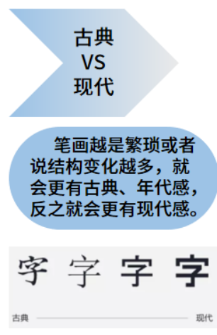
To give the simplest example, serifs are relatively better than sans serifs The details of the line body are more complicated, and the Song typeface is also more complicated than the Hei typeface. Just as the complex and gorgeous patterns are typical features of classical furniture, and the simple and practical IKEA furniture is a model of modern life, the complexity and simplicity of fonts also represent the trend of classicism and modernity to a certain extent.
Classical: Vintage, Period, Culture , introverted, etc.
Modern: modern, trendy, future , simplicity, etc.
Articles are uploaded by users and are for non-commercial browsing only. Posted by: Lomu, please indicate the source: https://www.daogebangong.com/en/articles/detail/A%20few%20basic%20information%20about%20related%20fonts%20I%20hope%20you%20need%20to%20know.html
 支付宝扫一扫
评论列表(196条)
测试