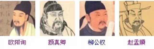
The Four Masters of Regular Script is the collective name for the four calligraphers who are famous for their regular script in the history of calligraphy, also known as the Four Great Regular Scripts. They respectively refer to: Ouyang Xun (European style) of the Tang Dynasty, Yan Zhenqing (Yan style) of the Tang Dynasty, Liu Gongquan (Liu style) of the Tang Dynasty, and Zhao Mengfu (Zhao style) of the Yuan Dynasty. The four major regular scripts are distinguished in the strictness and subtlety and the handsome atmosphere. Today, we will focus on the differences and comparisons of the four major fonts for you.
1. Ouyang Xun (557-641), courtesy name Xinben, was born in Linxiang, Tanzhou (now Changsha, Hunan). The regular script is rigorous and powerful, and it is known as "the number one regular script in the Tang Dynasty" in the world.

European style: The font is based on the "two kings", blending the aftertaste of calligraphy in the Han, Li, Wei and Jin Dynasties, absorbing the strengths of various schools, seeking to see the danger in the middle, and creating it yourself Innovative, unique. In terms of brush and stippling, the square brush is basically the main one, and the round brush is used occasionally. The writing is easy and natural, clean and neat, the strokes are slow and reserved, there is no pause, and the finishing is meticulous. Dot painting pays attention to echoing and coherence, and the strokes pursue changes. The dots are like triangles. Square pens are often used for horizontal and vertical pens, and round pens are often used for writing. The brushstrokes are flexible and vivid. The method of hook painting is based on Li, with full posture, vigorous momentum, and most of the turning points are square with round momentum, showing both square strength and vigorousness. In terms of structure, it should be slender, with four sides even and firm, tight on the sides, more prominent peaks, tight on the left, stretched on the right, vertical as the main body, horizontal as a pattern, and strict laws and regulations. The center is well-distributed and dense (the middle palace is tighter), and most of them expand to the right, while the center of the characters is generally slightly to the left, dangerous and ingenious, calm and rigorous, and impeccable.
2. Yan Zhenqing (709--785), courtesy name Qingchen, a native of Jingzhao Wannian, whose ancestral home is Tang Langya Linyi, is the most accomplished and influential calligrapher after the two kings. Changing the ancient method, reversing the calligraphy style of the early Tang Dynasty, turning thin and hard into plump and vigorous, with a broad body and magnificent momentum, which fits with his noble personality. It is a perfect example of the perfect combination of calligraphy beauty and personality beauty. Representative work "Yan Qin Li Monument"
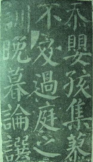
Yan Ti: Extensively absorbing the techniques of the Six Dynasties, Sui, and Tang calligraphers, and integrating them into one furnace. It follows the predecessors but is stupid and innovative, and creates a new style. Change, dense at the top and sparse at the bottom, like the towering of Mount Tai. The strokes of the pen are vigorous, the pen starts with a hidden front and turns round, the pen is centered, and the ink is light and heavy vertically. The Nai pen has the state of "silkworm head and swallow tail". The turning point mostly presents an inner square and an outer circle. The strokes of the hook pen are mostly in the shape of a bird's beak, the structure of the characters is broad, square and full, the left and right are basically symmetrical, dignified and stable, showing a graceful, open and majestic spirit. Yan Kai especially strengthened the role of using the wrist in brushwork, and made more use of the Tibetan front to form the characteristics of solidity, plumpness and strength. The strokes of Yan Ti are generally symmetrical, but the vertical strokes tend to be inwardly and environmentally friendly, with a slightly curved shape. The shape of the official script is full of meaning, which means that the whole character has a round and deep appearance, with a strong inner meaning, and has a profound artistic effect.
3. Liu Gongquan (778-865), courtesy name Chengxuan, a native of Jingzhaohua in the Tang Dynasty, from the official position to the prince and grand master, known as Liu Shaoshi in the world. The calligraphy structure is strong, and the words are rigorous and meticulous. The regular script has a vigorous style and strong bones, and the running script and regular script are the most exquisite. Representative works "Mysterious Tower Stele" and "Shence Army Stele".
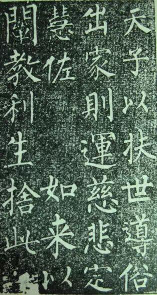
Liu Ti: Famous calligraphy in the late Tang Dynasty. Learn the "two kings" for the first time, then learn the brushwork of various schools in the Sui and Tang Dynasties, and then further change the use of color and style, and find a new way to innovate and create a school of its own. The book style is rigorous in structure, sparse and open, with a square layout, strong and straight, strong in bones, and handsome in spirit, so it has become a model for future generations. Its stippling is strong, strong and flexible, and the horizontal and vertical strokes are extended to all sides. The general situation is open. fill. Horizontal paintings are mostly collected from the square, and vertical paintings are mostly used to start against the peak. After stopping the pen, lead the peak to go down. Naiduo has a certain arc. Although he is tall and straight, he has internal bone strength. Use the pen to carry out the press and press it vigorously. Based on the face style, the characters are compact and bold, the central palace is tightened, and the four sides are open, tight but not restricted, sparse but not scattered, full of changes in the regularity, and occasionally dangerous and strange in the regular.
4. Zhao Mengfu (1254—1322) styled Ziang, nicknamed Songxue, Taoist Songxue, a native of Wuxing, Zhejiang today. He is good at seal script, official script, true script, line script and cursive script. Regular script is round and elegant, upright and rigorous, without losing the elegance and beauty of running script, known as "Zhao style" in the world, and the representative work "Xuanmiao Temple Rebuilds the Three Gates".
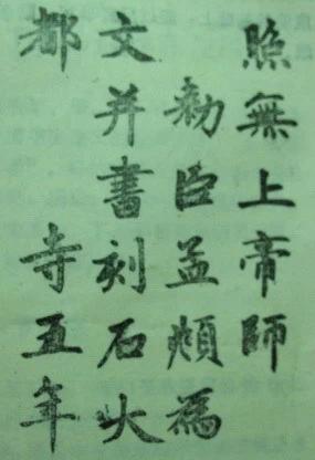
Zhao Ti: The artistic achievement of regular script is the highest. The regular script is done, and the pen is used by the center, which is smooth and smooth. The structure is well-proportioned, so that it is charming and plump, graceful and graceful, and its beauty is obviously different from the styles of Ou, Yan, and Liuzi. Its representative work is "Banba Tablet". Zhao characters are characterized by various postures, round and vivid, echoing looking and looking, but actually coherent, drawing horizontally and vertically, walking with the pen slightly raised in the middle, retracting the pen back to the front, and the whole movement of the pen is calm and decisive, generally upward to the right. Vertical paintings are mostly vertical, often with a slight left arc according to the needs of the structure, and the arc surrounds the center of the character. The folding method is at the intersection of horizontal and vertical. After a short pause, the stroke will be straightened down. This is different from Yan Liu's writing method of starting from scratch and gaining momentum. Bo Nai's brush strokes are fast, and his strokes are sharp, most of which are not exposed. The structure is well-proportioned and comfortable, the strokes are dense and dense, and the side parts are coordinated and blended. However, it should be emphasized that the Zhao style characters are smooth and round, but the strokes are relatively fast. When writing, the writing should not be frivolous, weak, and sharp.
For more exciting content, please search and follow our WeChat public account:
One Favorite
Articles are uploaded by users and are for non-commercial browsing only. Posted by: Lomu, please indicate the source: https://www.daogebangong.com/en/articles/detail/A%20Comparison%20of%20the%20Characteristics%20of%20the%20Four%20Regular%20Scripts%20of%20Ou%20Yan%20Liu%20and%20Zhao.html
 支付宝扫一扫
评论列表(196条)
测试