1. Colorful text and fonts
Although most minimalist pages use black and white text, it is an indisputable fact that colored text has more tension.
Colorful fonts are eye-catching enough in most places. In many design projects, colored fonts are presented as the most important visual elements.
Now, there are more and more colorful fonts with editable color attributes, you can find them in "New Ways to Use Fonts!" These popular colorful fonts are becoming standardized" to learn more about colorful fonts in this article.
Bright colors and a variety of colors are very attractive, which also makes the transmission of information more effective enough to establish an iconic identity and attract users to participate in the design.
2. Simple and Bold Sans Serif Fonts

Typography doesn’t have to be flashy to impress.
Sans-serif fonts with thicker strokes have become more popular in the past two years, and the probability of appearing in various websites and apps is very high.
They were chosen largely because they are readable enough and provide a good contrast to the background and other text elements.
3. Highlighted fonts
Highlighted fonts are one of the most surprising trends to see right now, a design technique that emphasizes text and makes it the focal point.
From simply highlighting text with a highly saturated color, to highlighting text with an underline, designers have taken different approaches.
However, no matter how the design is designed, it is hoped that users can see important text content first. This design is suitable for using shorter text blocks so that they can be highlighted without causing information overload.
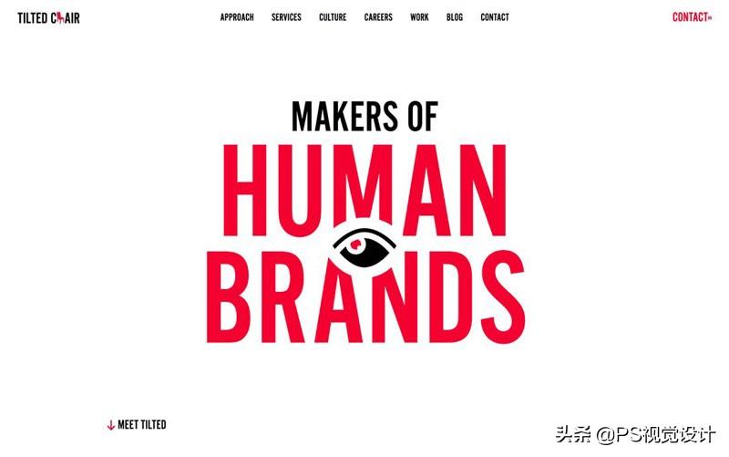
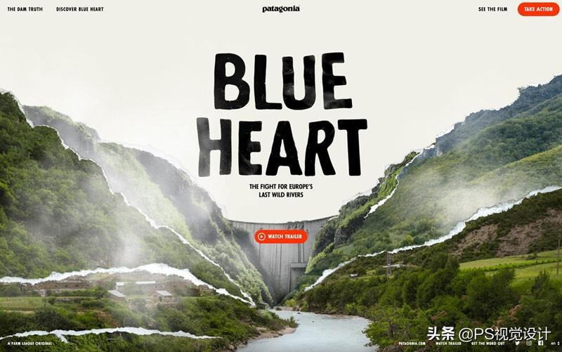
4. Cut and overlay effects
Design effects achieved by cutting and overlaying can create enough interesting and impressive effects.
Whether it is superposition or cutting, it is basically achieved by layering, which makes the design look less flat, and it would be a good choice to achieve such an effect on the font.
The cut and overlay effect means that the text font is not filled with color, but a layer is superimposed on the background, the text part is cut out, and the image of the underlying background can be seen through the cut part. Just like the case in the above picture, the underlying dynamic picture can be seen through the text.
This design usually requires the use of bold capital letters and a controlled amount of text content. This is the only way to ensure that the text content of the foreground clipping is clearly conveyed to the visitor, and also allows the underlying graphic content to be presented.
The underlying content, whether it is pictures, textures or videos, can be well presented to users, and because of the size of the text, the overall amount of information will not be too large and will not be overloaded.
5. Intersperse with other layers

In most designs, the layer where the text element is located is usually used independently, such as on the background, next to the picture, and so on. But now many designers have completely different ideas on font design. Simply stacking up and down and parallel layouts are no longer enough to meet their needs. Interspersing text elements with other visual elements makes the seemingly thin text It has a physical texture, as if it is real. This design allows users to perceive the "weight" of the text, and it is easier to notice the information in it.
Just like in the above case, the characters and the text are interspersed to make the text look like a real existence, creating a more immersive experience.
This design technique is closer to graphic design, it is not difficult in design, and it is very popular. It makes full use of the Gestalt principle, so users will not be unable to obtain information in the text due to partial occlusion.
6. Text and Gradients
Gradients are probably one of the most underappreciated design trends. Gradients didn’t have a very good reputation before the rise of flat because they were not used correctly in many designs. But now everyone's pursuit of "subtlety" has made gradients a very usable design technique.
There are many reasons to choose a gradient, and its advantages are described in detail in the article "These 10 Reasons Why You Should Use Gradients in Your Design".
Subtle gradients can give people a modern and fresh feel, and in the above case, the designer just added gradients to the keywords in the title to create a rather memorable experience. Of course, such a design is more suitable for use on minimalist pages. If the page contains too much information, it will be difficult for such a design to stand out.
7. "Too retro" effect
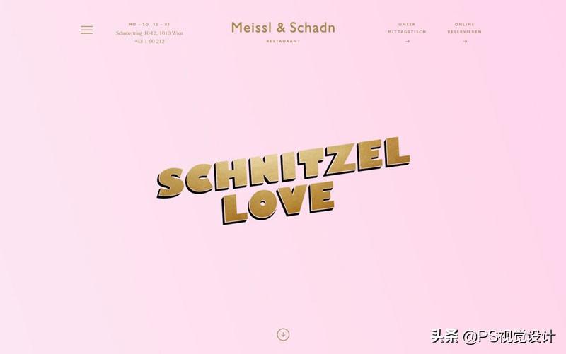
Of course, when it comes to design techniques, some relatively older design techniques are rarely mentioned. These design techniques often make people feel too "retro", but in some occasions, they can work.
Usually, designers will make the text have shadows, bevels, relatively more pronounced gradients, and rare colors. This design makes the text have good readability and a unique "retro" atmosphere that makes it difficult to look away. However, such a design is more suitable for a minimalist page layout, otherwise it will only make people feel uncomfortable.
8. Fully Customizable
Different projects require different fonts to match, mixing up fonts or using them incorrectly can make the whole design look weird. Designers can achieve a variety of different feelings and experiences by customizing the font design. All-round customization of fonts is also one of the current font usage and design trends.
While fully custom fonts are fun, they can be expensive to design and can take a long time to implement. For big brands or corporate organizations with larger budgets, it is not a big problem.
[Benefits]
I am Xiaoyong, to give back to fans for their support
A set of PS cutout video tutorial, logo design, font design video tutorial
After liking + commenting on this article, private message I will receive the tutorial
Articles are uploaded by users and are for non-commercial browsing only. Posted by: Lomu, please indicate the source: https://www.daogebangong.com/en/articles/detail/8%20font%20design%20and%20typography%20skills%20easy%20to%20help%20you%20get%20the%20design%20done.html
 支付宝扫一扫
评论列表(196条)
测试