Author: Qian Hao Hawking
When you design standard characters, you will always hear the client say: "I want that kind of high-end design." At this time, many designers will be confused and look confused...
Sense of grade? ?
What the hell! ! !
I have no direction! ! ! !
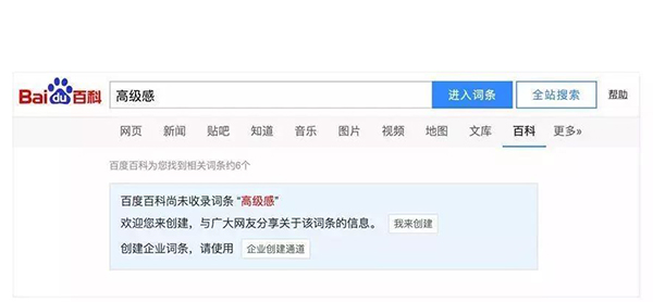
How should "high-level sense" be defined? There is no explanation for it in the Baidu entry... It can be seen that it is really abstract~
Each of us has different aesthetics, education level, and growth environment, so the definition of "high-level sense" is also different. So, how to embody this "sense of high-end" that people talk about every day, let's talk about it this time.
What is a sense of luxury
To sum up, we can see that there is no precise definition of "high-level sense", and it cannot be defined.
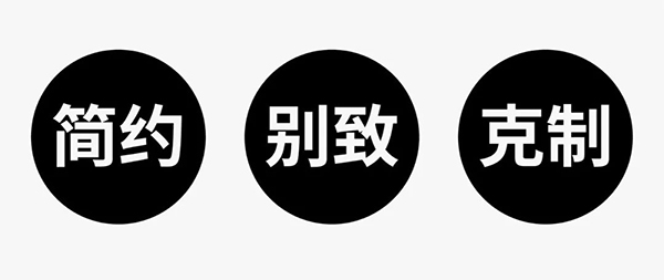
Let’s take beauties as an example. They are all beauties. Beauties without a high-end sense always have a feeling of being overly forceful and cautious about beauty, while beauties with a high-end sense are careless and willful towards beauty.
A few key words can be extracted from it: simplicity, chic, and restraint, so everyone must have a certain sense of direction.
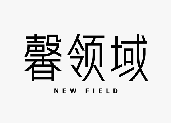
Then, how to reflect the "high-end sense" in the font logo, I have summarized the following 6 methods based on the content of "Xin field".
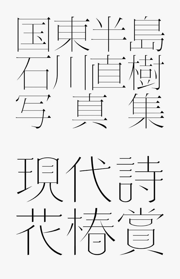
01. Concise strokes
Everyone should know that the straight line is the most concise line, clean and neat, not muddy, so naturally it can best reflect the sense of simplicity.
You can look at the case first
The glyphs with straight lines reduce the difficulty of design. As long as the structure is handled properly, the simple temperament will come to your face.
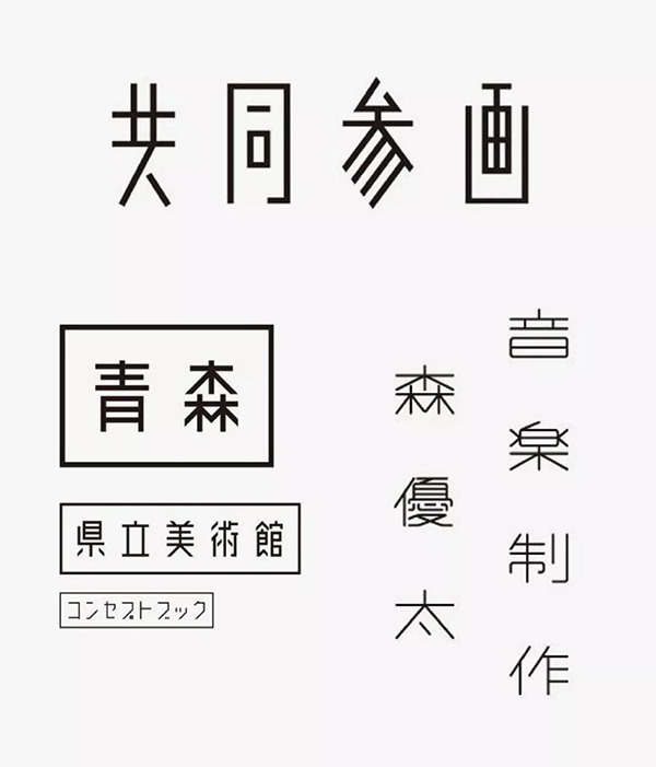
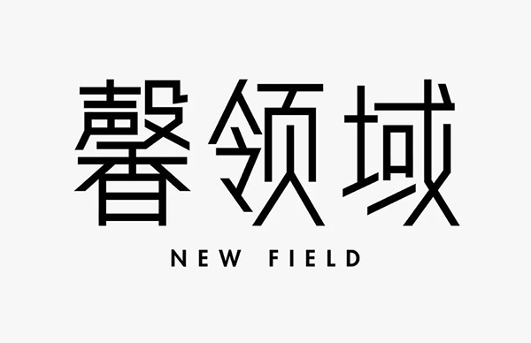
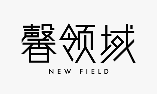
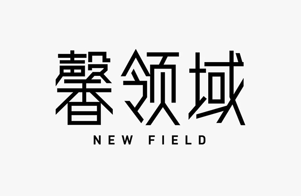
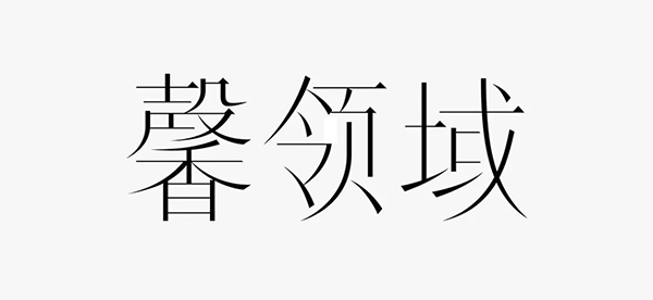
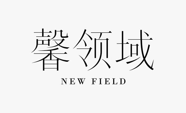
Next, we will design with the content of "Xin Domain".
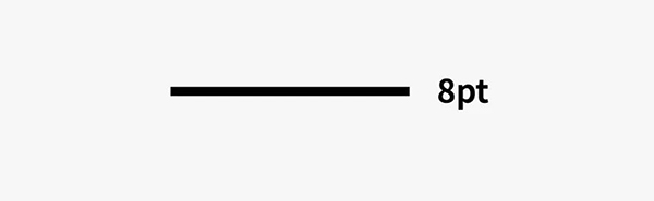
First of all, the width of the strokes should not be set too thick, so that the glyphs will feel bulky. I use 8pt stroke width.
The literal setting is higher, and the middle palace is retracted to enhance the humanistic atmosphere. When designing, you can moderately simplify the dense strokes to improve the design sense, and pay attention to the adjustment of the center of gravity of the font.
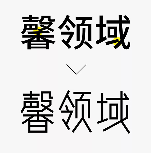
However, the effect of simplification of the word "Yuan" is not satisfactory, so the simplification here is abandoned, and the details between the strokes are increased at the same time.
After trimming, the glyphs will be more regular and stable. The bottom of the "口" glyph protrudes from the bottom, and while adding details, it further enhances the overall temperament of the glyph.
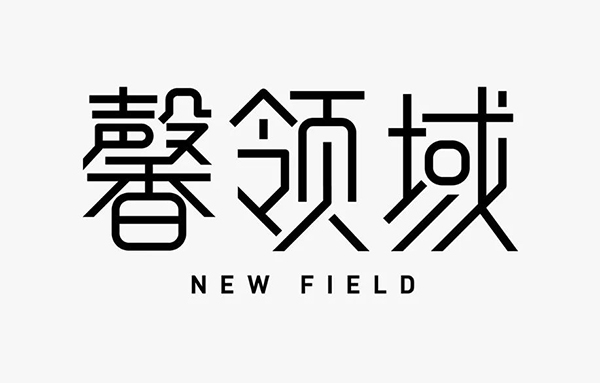
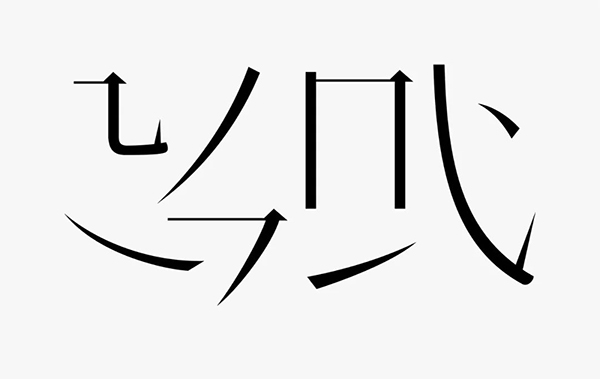
02. Moderate softening
In the case that the strokes are all straight lines, we can adjust individual strokes to curves, which makes the font both rigid and soft, and enhances the temperature of the font. You can look at the case first
Just be sure to restrain yourself when softening, and don't overindulge. I directly use the above glyphs to soften, and the curved strokes basically appear in the strokes. With a certain pattern, the glyphs will appear very uniform, so that the glyphs are not as cold as the previous one.
03. Consistent slashes
The glyphs designed by the unified slash method are unique and chic, but at the same time simple. You can look at the case first
The principle of this method is very simple, but if you want to reach a consensus, you still need to spend some brain cells. I use the most simple and easy-to-operate 45 degrees, and pay attention to the processing of the word "collar". In order to improve the center of gravity, I realized it after splitting the strokes at the bottom. Remember not to make too many deformations and simplifications, but to exercise restraint.

After softening the corners, the affinity of the glyphs is enhanced.
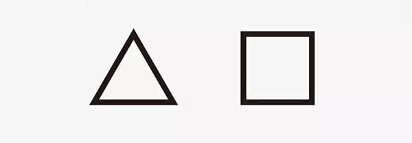
04. Graphic replacement
Incorporating graphics can enhance the novelty and memory of the glyphs, but it will involve deformation, that is, the graphics must be integrated into it without excessive deformation and loss of simplicity. This will have higher requirements on the designer's ability. You can look at the case first
You can use squares and triangles to replace the strokes in the glyph. This method has higher requirements on the structure of the glyph itself. Some characters cannot be replaced naturally, so it should be used flexibly.
Observing the glyphs, we can find that there are many strokes, which suggests that we can simplify. And it contains a structure similar to the basic graphics, so you can consider replacing it at this time.

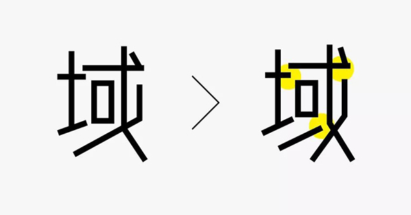
After the word "collar" is replaced, the center of gravity will be further improved, so other glyphs should also be adjusted.
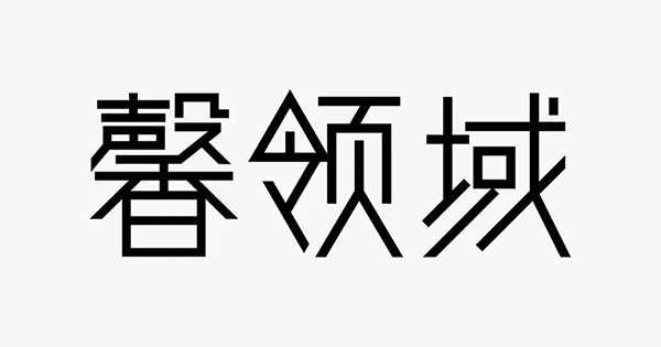
The square "口" character, after being rotated, can complement the strokes of Taita, and also play a role of simplification, killing two birds with one stone, and can achieve unique characteristics. The simplification of "you" in the word "Xin" is somewhat incongruous, so the simplification is abandoned.
05. Unique structure
The simplification of the structure mentioned above can promote the uniqueness of the structure. Here it mainly refers to the uniqueness of the overall structure. You can look at the case first

Their structure is characterized by looseness in the middle and crowding at the upper and lower ends to achieve a chic effect. On the basis of the above characters, remove and replace to return to the essence, move the structures at both ends to the outside, and narrow the characters.

The stippling of the word "Ling" is a bit abrupt, but it is much more harmonious after being obliquely cut and complementary. And remove the broken strokes of the Na painting, the font is more stable.
06. Thin Line Song
In addition to the simple straight strokes, the thinner Song style (Ming Dynasty style) will also give people an elegant and high-level sense. You can look at the case first
We only need to refine the basic strokes again, choose a font with a smaller middle palace, and refer to its structure to spell words.
The glyphs made are somewhat wide and can be narrowed uniformly.

Since the posture is already classic and graceful enough, there is no need to make it unique in structure, otherwise the opposite will happen.
Finally, fine-tune the radian and elasticity of the curve. This is the focus and difficulty of this font. The quality of the curve lies in the quality of the Song typeface.
I have sorted out the six methods above. Next time when the entrusting party brings up the "sense of high-end", I hope everyone can be targeted and no longer lose their way.
Note: The above reference works are all from the Internet without signature
at last
You forward, comment, like
I can eat enough
Thank you everyone! !
Articles are uploaded by users and are for non-commercial browsing only. Posted by: Lomu, please indicate the source: https://www.daogebangong.com/en/articles/detail/6%20strokes%20to%20make%20your%20font%20logo%20show%20a%20sense%20of%20luxury.html
 支付宝扫一扫
评论列表(196条)
测试