
Some time ago, I made a requirement related to programming, only to know that there are still code areas that need to use monospaced fonts. Maybe many friends don’t know what a monospaced font is. Let’s briefly popularize it here. A monospaced font refers to a computer font with the same character width. In other words, the width of each character in a monospaced font are the same, as shown in the image below:
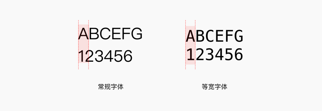
In regular computer fonts, the letter 'A' will be a little smaller than the width of 'w', and the number '1' will be smaller than '8'

When there are many lines of code, it looks more concise and fresh, and it is easier to locate and distinguish whether there are spaces. It is more friendly to the development brother, so many development programs use monospaced fonts.
Then let’s recommend some commonly used and good-looking code fonts
Menlo is a set of sans-serif monospaced fonts designed by Jim Lyles. It first appeared in August 2009 as one of the built-in fonts of the Mac OS X Snow Leopard system. Menlo is improved based on the open source font Bitstream Vera and the free copyright font DejaVu.
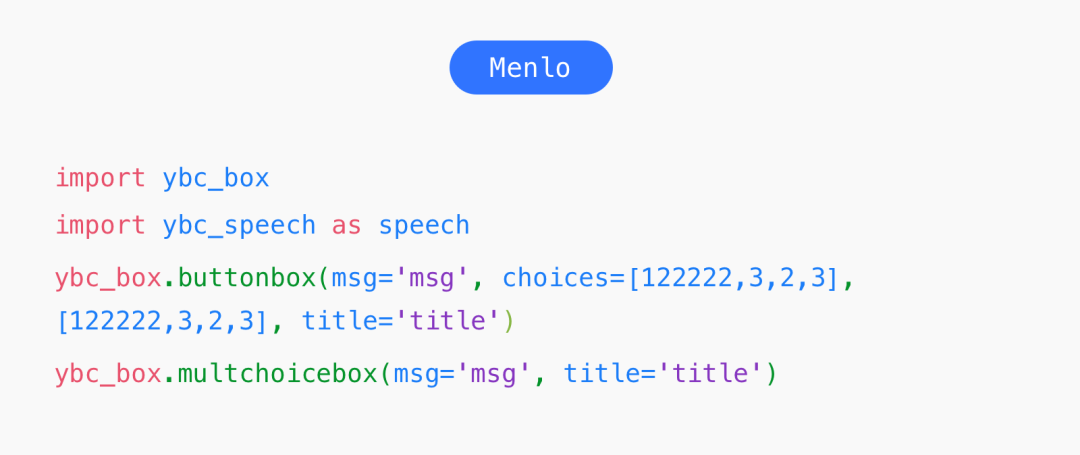
In terms of font shape, it is very similar to Pingfang. Most of them will rank it first in the font order. It is also my favorite font. It has multiple weights, regular, bold, italic, bold italics.
Consolas is a sans-serif monospace font designed by Lucas de Groot. It is mainly designed for the display font of program code. It is similar to Menlo, but the character spacing is much smaller than it, which looks more compact and can reduce the display space of the page.
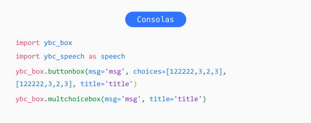
It also has a special feature, a stroke is added in the middle of the number 0, which is convenient for distinguishing it from the letter O.

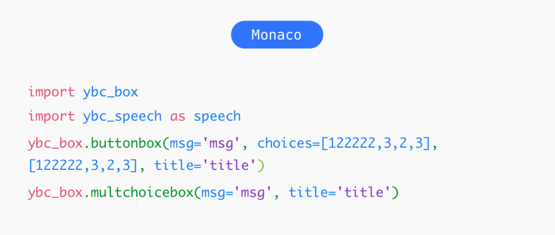
3. Monaco
Monaco is a font produced by Apple, with relatively few bugs. Some people say that it is one of the best programming fonts in legend. But I don't like this font very much. Some letters are not soft enough in font transformation, such as "m" and "p", which are not regular enough, and it is a bit difficult to read for a long time.
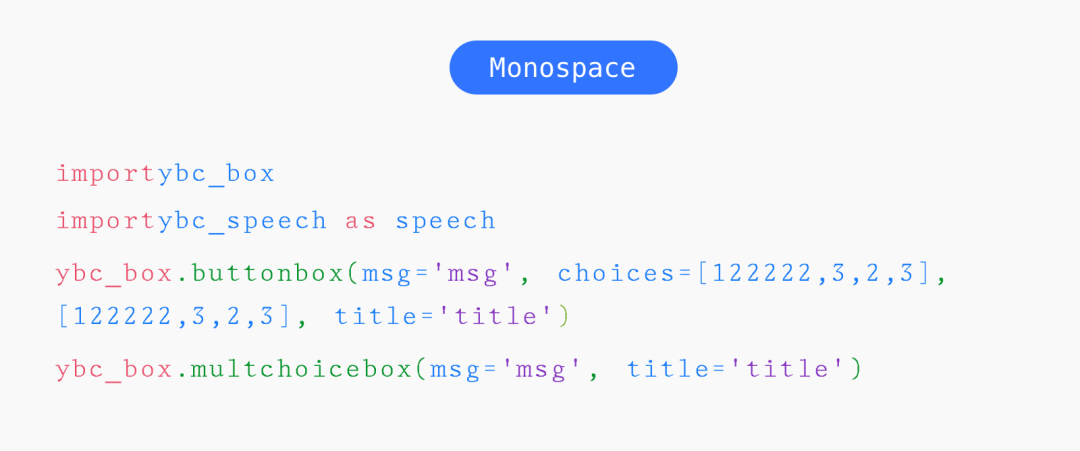
4.Monospace
Monospace is thinner than the above fonts, and the spacing between characters is larger, which looks more refreshing. However, because of the large spacing between characters, it takes up more space, and the number of codes that can be displayed in one line will be much less.
5. Courier
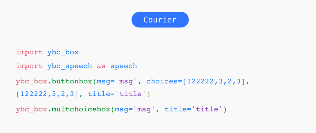
Courier is a common computer font designed by Bud Ketler of IBM Corporation. It was first used on typewriters. In the 1950s, it was often used as the default font for output devices. It is Most standard monospaced fonts.
6.Courier new
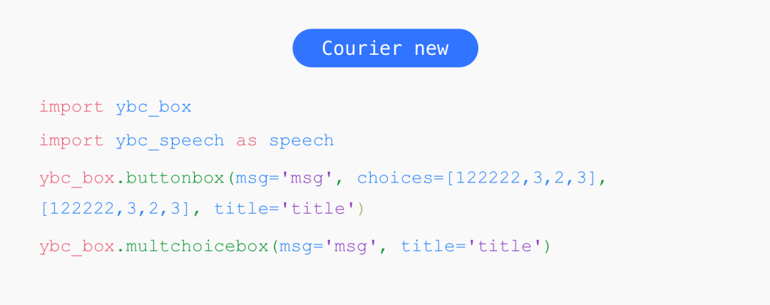
Courier new looks like a thin version of Courier, which was a built-in font of early windows. At that time, when writing code in the windows environment, Courier new was generally used, but it was gradually replaced by Consolas, and the improved Consolas font Clearer and more code displayed on the same page.
How to choose a suitable monospaced font
There are so many fonts recommended above, many people may think that they all look similar, and they don’t know how to choose the right font. In fact, they look similar, but if you look carefully, there are actually many differences between these fonts.
The easiest way is to judge by the thickness of the font, whether it is thin or stable. The thin font looks lighter, but the disadvantage is that it is not stable enough to hold the page.
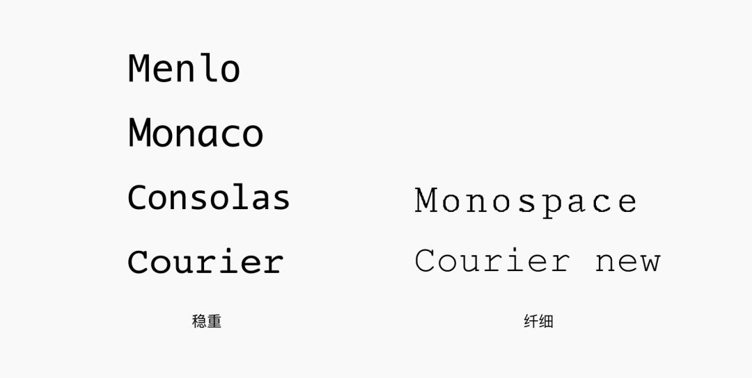
Secondly, it can also be judged according to the character width. For the same page width, a smaller character spacing can display more code content than a larger character spacing.
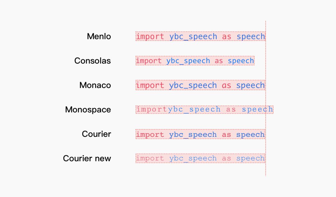
From the above comparison chart, it can be clearly seen that Consolas has the smallest character spacing, Monospace has the largest character spacing, and the others have little difference. Therefore, it is preferred to choose stable fonts and small character spacing. For the code, it is necessary to sort the fonts and give a few more fonts to ensure a good reading effect when the user does not have the corresponding fonts.
My general font order of choice is Menlo, Monaco, Consolas, Courier, Monospace, Courier New
The above is the recommendation of monospaced fonts. If you have better ideas, please leave a message to communicate, hehe...
Articles are uploaded by users and are for non-commercial browsing only. Posted by: Lomu, please indicate the source: https://www.daogebangong.com/en/articles/detail/6%20recommended%20monospaced%20fonts.html

 支付宝扫一扫
评论列表(196条)
测试