have a major impact. Here are six unifying principles of type design: 1. Readability: Typefaces should be easy to read, both in print and on screen. Choose a font that is easy to read, and make sure that the font size, leading, and kerning are all appropr
Click on the top blue word, Set me as a star ☆ bar span>Today, I will share with you some basic design knowledge about font design. Font is an important means of conveying information through visual expression. It has similar functions to advertisements and has a certain expression of theme ability to appeal. In the actual font design process, it should be considered that the appeal effect of the font design is consistent with the theme information; after satisfying the connotation needs of the font design, the principle of unity and creativity of the design should also be followed. The so-called unity, in simple terms, is To achieve the unity of font direction, strokes, style, slope, and space, so that the font presents an integrated visual effect; while the principle of creativity refers to that in the design process, the designer through the overall, partial, structure, layout and other elements of the font. Transformation to realize the creative design of fonts. When carrying out relevant design, the shape of the font must be unified and standardized, which is one of the most important design principles in font design. The main content it involves includes font direction, font slope, stroke thickness, overall style space and the unity of text. 1. Unification of font direction Direction means that a row of characters is inclined as a whole according to a specified single direction to form a sense of flowing rhythm. In the design of this type of font, it is not only necessary to grasp the overall orientation of all fonts, but also to ensure that The slope of local strokes is consistent. Only when the overall direction and the local stroke direction are unified, >, the unified orientation can make the picture full of strong dynamics and bring a novel visual experience to the viewers . 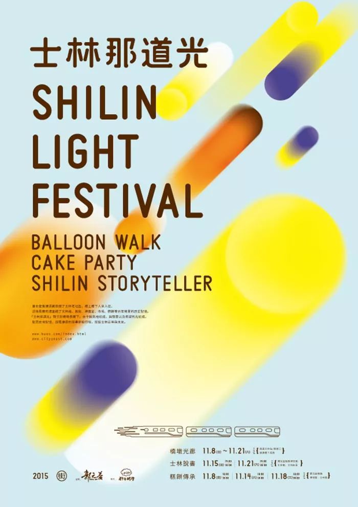 The designer uses the unity of the font direction to create a sense of flow in the screen, and different orientations bring different visual sensations. For example, when the overall direction of the text is horizontal, the overall picture will show a strong sense of space and rhythm, and give the audience a relaxed and comfortable visual experience; while when the When the text is arranged in the vertical direction, it will reflect a unified sense of falling, and make the viewer deeply feel the tension brought by the picture; in addition, there is unity of oblique direction . Oblique means that the text is uniformly extended in any direction of the layout, so that the picture presents a personalized visual effect and gives people a distinct sense of design. 2. Unification of font slopeFont slope It refers to the inclination of the strokes of the characters. When designing fonts for related content, first ensure that their strokes in a group of fonts have a uniform slant direction in space. Regardless of whether it is left or right, the shape of all characters must be processed into the same slope, and the overall sense of the picture can be strengthened through the unity of the slope. If in the design, the inclination of the font is not handled uniformly, the text will appear swaying, which will seriously affect the beauty and cleanliness of the layout, making it difficult to produce visual appeal. In some cases, the designer also unifies the slant of a phrase in the layout, making the group of slanted fonts stand out from the crowd in the layout, thus becoming more eye-catching.
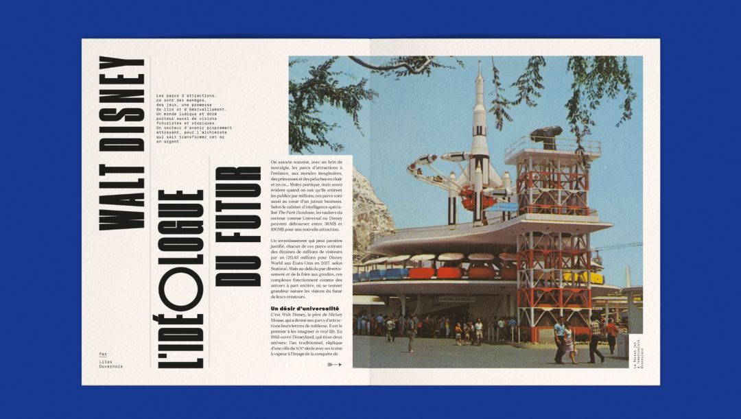
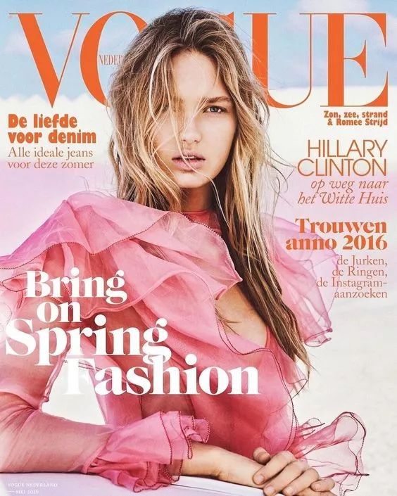
  This is the font design for the cover of a fashion magazine. As the headline of a certain node in the magazine, the headline is crowned with a unified orange font slanting to the right, making it particularly eye-catching in the layout and successfully attracting the attention of the audience. 3. Unification of stroke thickness
< section>
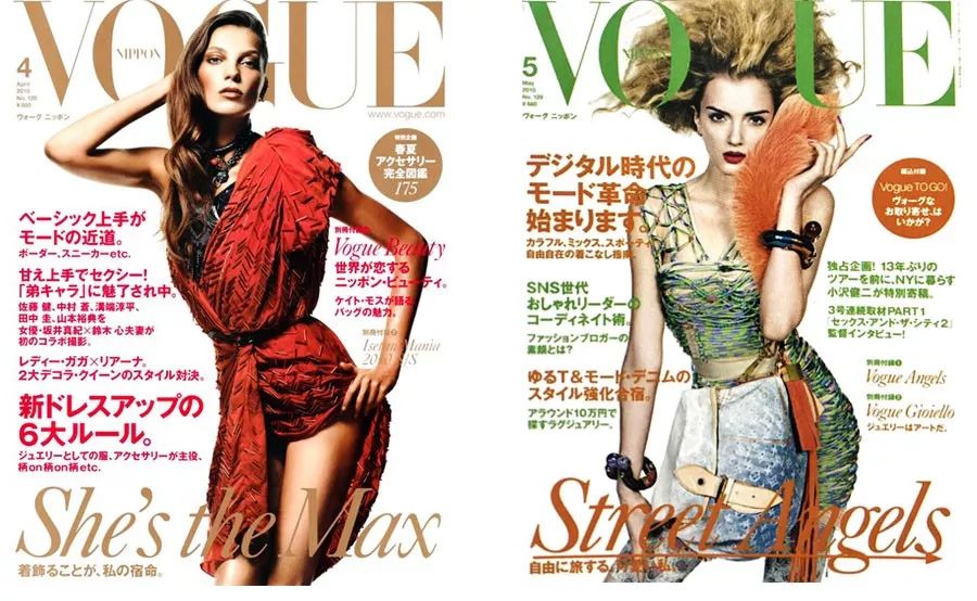
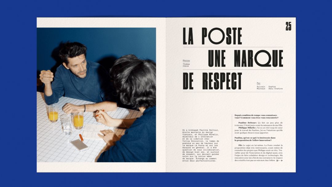
The thickness of font strokes is one of the important factors that constitute the balance of the design screen. When designing fonts, the thickness and shape of the same strokes within the same character and between different characters should be kept uniform, so that the thickness of the strokes of the font conforms to certain specifications and proportions. Maintain the uniformity of the stroke thickness of the font, which can make the font present a well-proportioned and beautiful visual effect, if there are too many strokes in a text Changes will cause the strokes to present uneven visual effects, which will not only have a negative impact on the psychological emotions of the audience, but also make the font design lose the overall sense of balance. Usually, the uniformity of stroke thickness can also help to divide the content of the layout, which is one of the most common division methods in books. Simply put, in a layout,Set the title to a uniform bold font, For the main text, choose a relatively slender small font, so that the content level of the layout is clear at a glance. In this way, it is beneficial for readers to quickly preview the layout information and filter the subject content in real time. In this type of font design, the thickness changes between them are divided according to the different content of the text, so that the layout forms a neat sense of patchwork, and thus produces a harmonious and unified visual effect.  This is the font design for the cover of a magazine. The text information on this page is composed of the magazine name, headline and main article title. These three elements are distinguished by the size of the text and the thickness of the strokes. It gives readers a sense of order and coordination. 4. Unification of the overall styleThe so-called font style refers to the shape of the text. In the current font design , certain styles can stimulate people's potential emotions. According to the external characteristics of the text and the type of use, some styles make people feel happy and happy, while others feel dark and depressed. When designing fonts, it is necessary to unify the overall style. Only by unifying the overall style of the text can the recognition and originality of the font design be realized in terms of visual expression; on the contrary, if the text is not unified Modification processing will destroy the overall aesthetic feeling of the text, thereby affecting the transmission effect of the font.
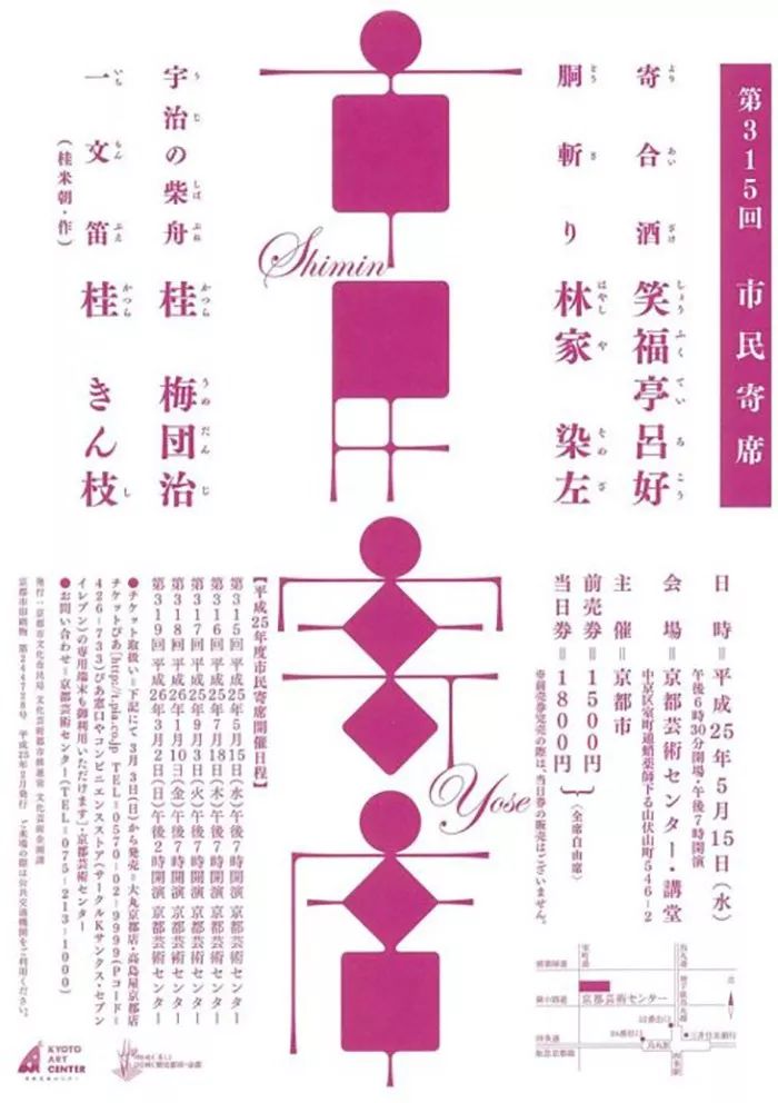
 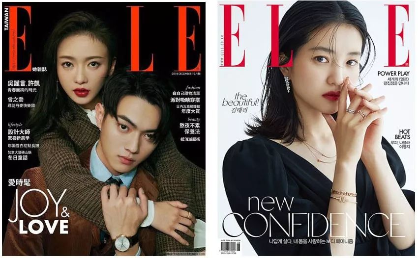 In the layout design of newspapers, books or magazines, the unified style of fonts is also very important. Compared with font design such as posters, the layout content of book elements is much more complicated, including titles, quotations, texts, annotations, etc., so the style settings also vary due to different content. In this type of text design, the font style of the title is usually the most ostentatious, because the essence of the content of the page is reflected in the title text; while the style of the main text is much more regular than that of the title, and generally maintains a moderate font size , for easy reading; other relatively less important elements appear in a smaller font than the main text. Although this type of font design does not achieve a complete unity of style as a whole, the relatively harmonious text style in local details can still make the layout show a full and coordinated visual effect.
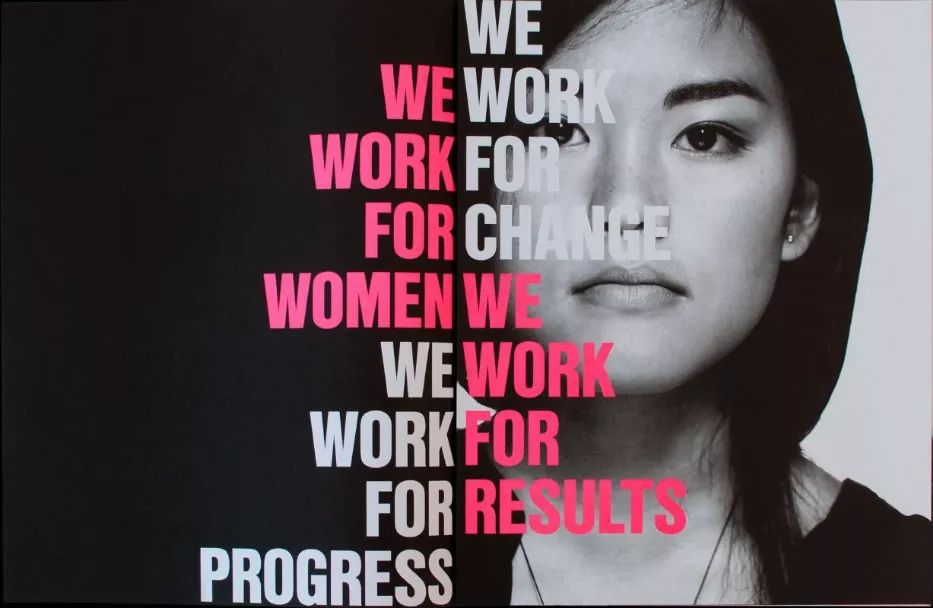
 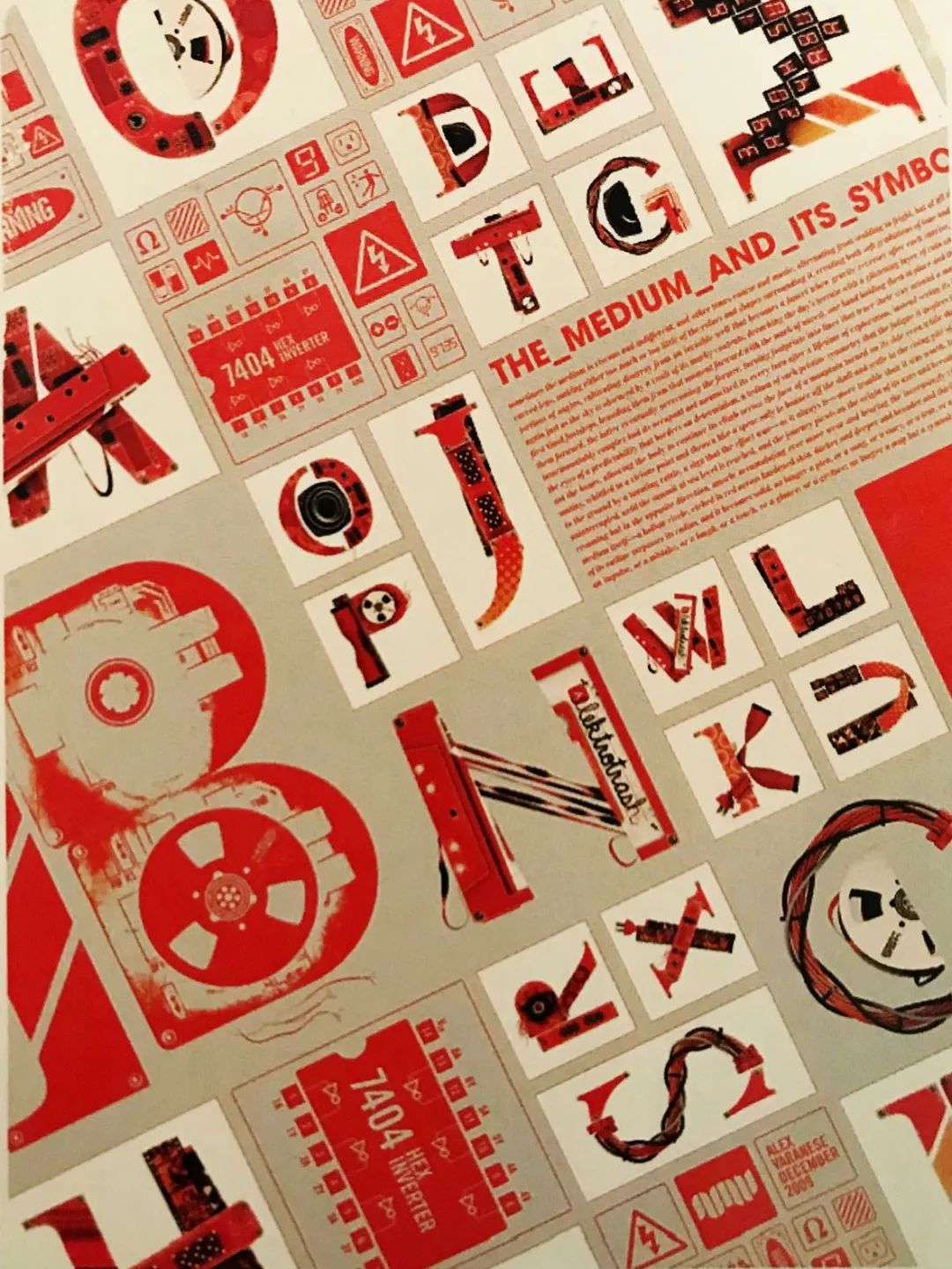 This is the font design for the cover of a certain magazine. The designer distinguishes the fonts in the layout into different styles through the subtle changes in stroke thickness and structure. With the help of typography design, the layout becomes full and substantial, so that these combined texts form a unique mix-and-match effect in the layout. When designing fonts, in order to ensure that the text as a whole To achieve a perfect and unified aesthetic, it is also necessary to grasp the spatial balance of the font. The so-called space refers to the visual size of the spacing between characters. For example, in the same font design, the characters with fewer strokes leave more space The text with many strokes is just the opposite. In order to solve the area difference in space, it is necessary to pay attention to reducing the area of fonts with few strokes, so that the text with different strokes in the space presents a compact and orderly visual effect, while maintaining the overall beautiful shape . This is a set of font design. According to the different strokes of different fonts, the designer arranges these fonts in different spaces for performance, so that they can play their strengths. The entire layout is very compact, and all fonts form a unity in the overall space. The so-called unification of text means that all the information about text in the layout must be consistent in expression content. In simple terms, text information must be unified, so as to avoid the situation where the content is chaotic and the ability to explain the text is weakened. In font design, the text information mainly plays the role of conveying the appeal of the theme. Usually, the setting of the text content is based on the idea of the theme. The designer achieves the purpose of text unity through such design principles, and In this way, the internal harmony of the layout can be improved, the shape and meaning of the text can be effectively combined, and the public can be provided with complete and accurate theme information. This is the font design of a magazine. The designer creates a unified texteffect for the viewer through the combination of text and images. The most basic function of font design is to transmit information. When we design fonts, in addition to meeting the requirements of expressing the theme, we should also abide by the unified principle of design , so as to achieve the purpose of correct dissemination of subject information. @字体设计edit release< /span>Design and creativity, why are they so cheap in the eyes of some people? This fluorescent color advanced color matching reference book is recommended for designers to get one! 2020 LOGO design trends: Color and shapeThe 20-year-old Japanese Let’s get to know the font designerThe typography geek QuimMarin released a new work in 2019
Articles are uploaded by users and are for non-commercial browsing only. Posted by: Lomu, please indicate the source: https://www.daogebangong.com/en/articles/detail/6%20Unifying%20Principles%20of%20Typeface%20Design.html


 支付宝扫一扫

评论列表(196条)
测试