As the author said in the article, simple things often need to be carefully designed to become simple. This is a very detailed and complete article about the process of a product realization. You can learn how to flexibly apply design methodology and combine thinking to design and product.

People use calendars on a regular basis. A large percentage of people use them more than once a day.
Calendar helps you organize your day and keep track of your "to-dos". Plus, it's a great time management tool.
Calendar might seem like a simple application, but when you start digging into it again, you'll find that the subject becomes quite general.
The methodology I have followed to try and improve the user experience when working with the calendar is: Double Diamond (The Double Diamond: is the name of the design process model developed by the British Design Council in 2005. It suggests that the design process should Divided into four phases: discover, define, develop, deliver). I have a week to research and a week to make the final prototype.

"Double Diamond" example image
01 Exploration stage
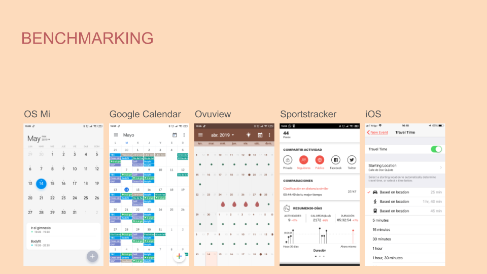
I decided to start this topic with Desk-Research. At the beginning, I used benchmarking analysis (Benchmarking) to research the market, discover potential competitors and analyze what they are doing. For example, after I enter Google play, I download various calendar applications, use them, and then record their usage performance, including functions, and the beauty of the UI interface.
I also researched the differences between mobile and web calendars to help me understand how to combine information across platforms. In addition to focusing on researching calendar-related applications, I also searched for other tools, which may have some potential functions that can be used for reference in the final product.
These motivational apps include: BeWet, Drink Water Reminder, and Water Drink Reminder; sports apps like Runastic and Sportstracker, and other project tracking apps like Ovuview.
Desk-Research (Desk-Research): A market research term, research activities on information that already exists and has been collected for a certain purpose, that is, secondary dataCollect, screen, and judge whether their problems have been partially or completely resolved.
Benchmarking (Benchmarking): It is to compare the various activities of the enterprise with those who are the best in this activity, so as to propose action methods to make up for its own shortcomings.
I did a little Netnography - collecting valuable discoveries directly from the user comment section.
Netnography (Netnography): From the combination of words, there are two parts, namely "network" (net) and "log" (-nography). Network (net) refers to the Internet (Internet), and Zhi (-nography) is the abbreviation of ethnography. It is an online research method derived from anthropology and applied to social interaction in contemporary digital communication environment.

"Network" example map
Among all the comments, I found that users are most concerned about:
- It is possible to choose which festivals they would like to have (eg: you are from Germany, but you live in Italy. So you want to know about festivals in Italy too).
- Very easy to sync and share events.
- Ability to add tasks (for a certain day).
- I selected some applications that have many interesting functions and are also liked by users: Mi Calendar (OS system), Google Calendar, Ovuview, Sportstracker and iOS system calendar.
"Users love the calendar app" example image
Through the research method of Lightning Demos, I drew some special functional sketches that can be studied in depth. For example: Google Calendar users really like the monthly overview design that clearly distinguishes between different tasks. The Mi Calendar has a unique minimalist style.
Users of iOS Calendar find it useful to get notifications based on the time of their event location. Although some functions were not included in my sketch, in the future design, I hope to include the function of clearly distinguishing past and future dates like the application Ovuview. This is one of the few places where there is a difference.
Lightning Demos: It is a quick design research method. Through quick research on related products (about half an hour), list three inspiring product or service functions, and record them in text or graphics.

"Sketch" Example Diagram
After this initial contact with the product, I sorted out a series of research questions to help us dig out valuable content, and to facilitate future access to users:
- Is it possible to trace the user's/her actions?
- Is it possible to track the user's biological date?
- Do you have permission to access the user's monthly calendar?
- Is it possible to synchronize other calendars of users?
- Is it possible to synchronize users' email accounts?
- Is it possible to synchronize holidays of users in different regions (home country, Madrid, Castilla y León...)?
- Is it possible to share user schedule events with others?
- Can users set different types of schedule event notifications?
- Can users edit calendar events in batches?
- Can the user customize the style of the calendar?
- Can users divide calendar events by classification?
- Can the user quickly change the calendar?
- Can the user search for a specific date on the calendar without scrolling infinitely?
- Does the user want a summary overview of all calendars?
- Can the user add a map to a landmark to help him find the location when he arrives?
- Is there an option for users to add challenges?
- Can the user cross off completed activities/calendar events?
- Is it possible to visually allow users to clearly distinguish past, current, and future dates?
- Can the user pre-set the calendar?
- Can users customize and add calendars?
- Can the user see a progress bar for his/her target events?
I conducted a series of user interviews and developed a grid to get other people's views and opinions on their use of the calendar. I wanted to see from an outsider's point of view what users think about the products currently on the market, and what they feel they are missing.
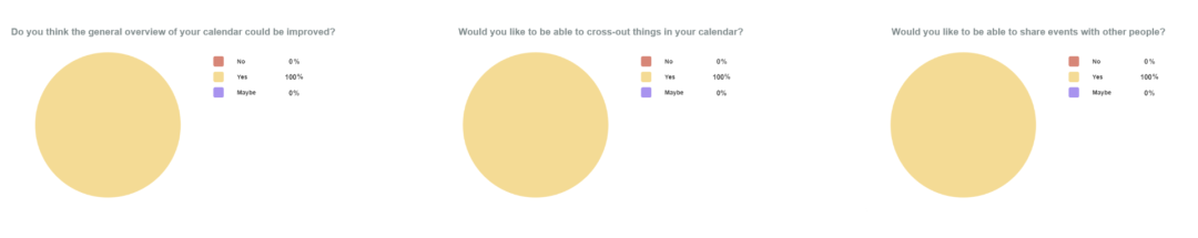
In order to allow this topic to obtain more valuable discoveries, I compiled a form and sent it to everyone. 78.6% of the respondents use the calendar almost every day, which is quite a high proportion! So I think it's important to give this kind of tool application this much weight, not to mention it's worth it in its own right.
The table shows that most users prefer to use the calendar to manage work and personal calendar events. An interesting observation I made from these tables is that 50% of users use desktop OS calendars and 92% use mobile OS calendars. Among these users, 35.7% use calendars provided by e-mail. That means, there are quite a few users who haven't found a better calendar app.

"Survey Data" example graph When asked if they felt a more complete calendar application was missing, 7% answered yes and 28% said maybe.
When asked about the functionality, 100% of users agree that they all want to cross off past events or completed tasks. At the same time, everyone hopes to have a better event overview page, and can share events with other users.
"Research data" example graph
After completing these tasks, I created user portraits (User Personas) to help me sort out all the information to better understand user needs.
Even though none of the users I interviewed used a calendar to track exercise or diet, I decided to include this feature in my user persona because my goal was to change the phenomenon that ordinary calendars do not include this feature, and to design Proposal to include this functionality.
User Personas: A synthetic persona based on the typical usage behaviors, motivations, and goals of actual users in research.

"User Persona" Example Diagram
From my current research, I have found the following:
The user wants to:
- Custom activity.
- Add tasks and events.
- Sync calendars.
- Share events.
I have collected the following helpful comments:
- Strengthen the distinction between past and future dates.
- Cross out tasks and events.
- Separate activities from goals.
- Add a progress bar.
- Metrics for target tracking.
02 Define function
In order to define the functionality of the future solution, I started comparing the differences in the event overview pages of the previously selected calendar applications. Take an in-depth look at the features that users like about these apps as a whole.

"Definition function" example diagram
I performed a Heuristic Analysis to determine which features stood out and which could be improved or simplified. The most important thing to point out is Google Calendar’s “goal selection,” which is an awesome feature that allows users to track their goals.
Google Calendar currently distinguishes between events, goals, and reminders. This is also the function I plan to implement in the future. Avoid cognitive load on the user by trying to simplify the process and reduce the number of steps. This is also what I want to maintain consistency and standards in this regard.
Heuristic Evaluation (Heuristic Analysis): A method for usability testing of computer software, aimed at finding usability problems in the process of user interface design.

"Heuristics" Example Diagram
I flag the feedback on the app to see what needs to be added to my design. For me, the really important thing is to explore the aesthetics of the UI interface and get inspired by minimalism. Because some calendars look very rough and crowded. It is very difficult to maintain a clean design when new features are added.

"Clean interface" example image
While researching this, I conducted a MoSCoW survey to help me more clearly identify important functionality in my application. According to user needs, the functions I choose to put in the application mainly include:

"MoSCoW" Example Diagram
- Import
- Share
- Sync
- Delete
- Category
- Custom notifications
At the same time, I think that if you can customize your own calendar to record and challenge higher goals. This may be very attractive to the user (such as drinking more water), or a physiological record (such as a girl's menstrual period).
03 Developing products
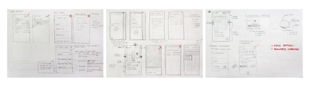
I organize the design solutions through some sketches and choose the best visual form to present. In this process, the most difficult thing is to add functions without overloading the design. I drew the first wireframes (Wireframes) based on the sketches, visually prioritizing which interfaces need to be designed and which ones do not need to be designed.
"Wireframe" example diagram
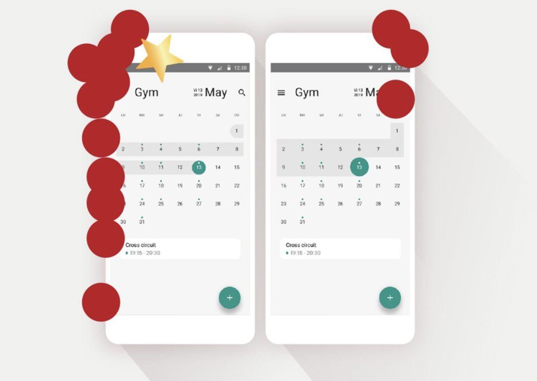
I dug a little deeper into how past, present, and future dates are clearly distinguished under the monthly calendar. To this end, I also created a Medium Fidelity Prototype and did some Tree Testing to see which solution would be more visually pleasing to the user.
Medium Fidelity Prototype (Medium Fidelity Prototype): A prototype with limited functionality but clickable areas that shows the interaction and navigation possibilities of the application.
Tree Testing (Tree Testing): A usability technique for assessing the findability of website topics. It is also known as reverse card sorting or card-based sorting.
"Calendar visual design" sample diagram
I had to think of many ways to implement the "remove" function. I did a lot of sketching around this particular functionality in order to choose the best solution from all available options.
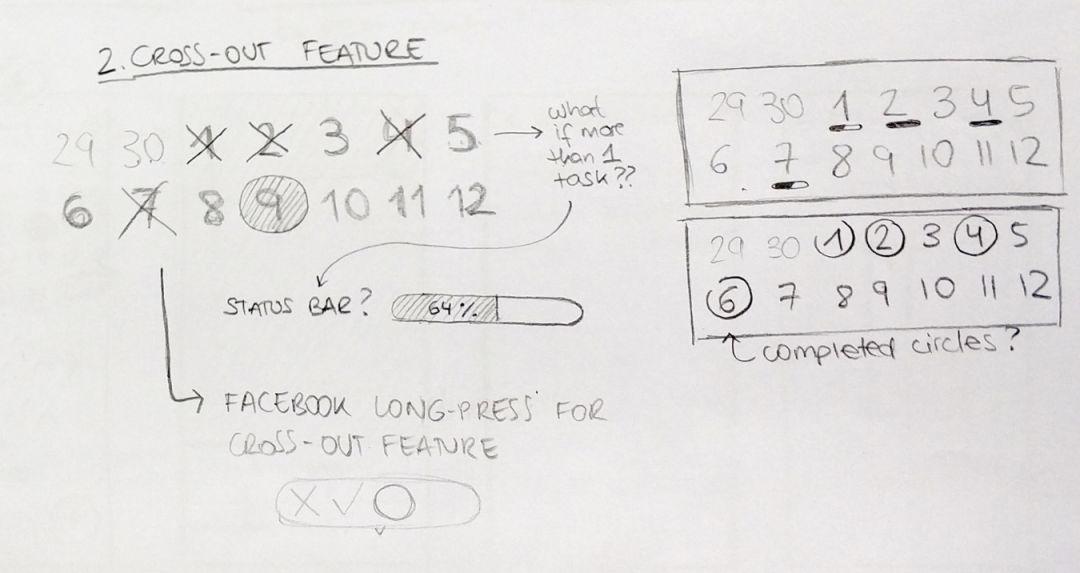
"Strike out function" example diagram
I also ended up quickly building a Branding System for the new calendar app. The swatches were created to find soft, neutral colors, and one thing to consider when choosing a color range is to stay away from the classic blue swatches, which are so typical in digital design.
Branding System: is a collection of elements that work together to create a unified, consistent, and flexible brand asset that effectively communicates brand values to target audiences.

"Brand System" Example Diagram
The logo uses a goat as a symbol of perseverance to convey the meaning of the brand. The name "Chivo" is "Cabra" in Spanish, which also means "goat". Thus, through style, combined images and fonts constitute such a young and dynamic logo.
The font for the app was Roboto’s Medium and Regular glyphs, mainly because it scales better in digital formats and because it fits well with the overall look and feel of the brand.
04 Solution Delivery
Chivo is a brand new calendar app that gives you an easy way to keep track of the things you care about.

The "Chivo App" sample image Have you ever found your schedule so packed that it's hard to keep track of what you need to do?
Chivo can create individual calendars according to your preferences. You can still see the typical overview of all events and targets. But now if you want, you can focus on one of those categories. This means that if you only want to focus on your fitness calendar, then you can choose to view the fitness calendar category. Similarly, you can also choose to view the work calendar or other calendars, as shown in the figure below:

"Chivo App" example diagram
You can find the calendars you've created on the hamburger menu at the top left. After some interaction experiments with real users, I created an accelerator to encourage users to change calendars by swiping left or right.
In most calendars, when you swipe left or right, you're actually changing the month. Whereas in Chivo you are scrolling through the calendars. By swiping vertically, users can switch months. As shown below:

"Chivo scrolling effect" sample image
When creating a new event, I added an existing option in the ios calendar to get notified based on your travel time. As shown below:
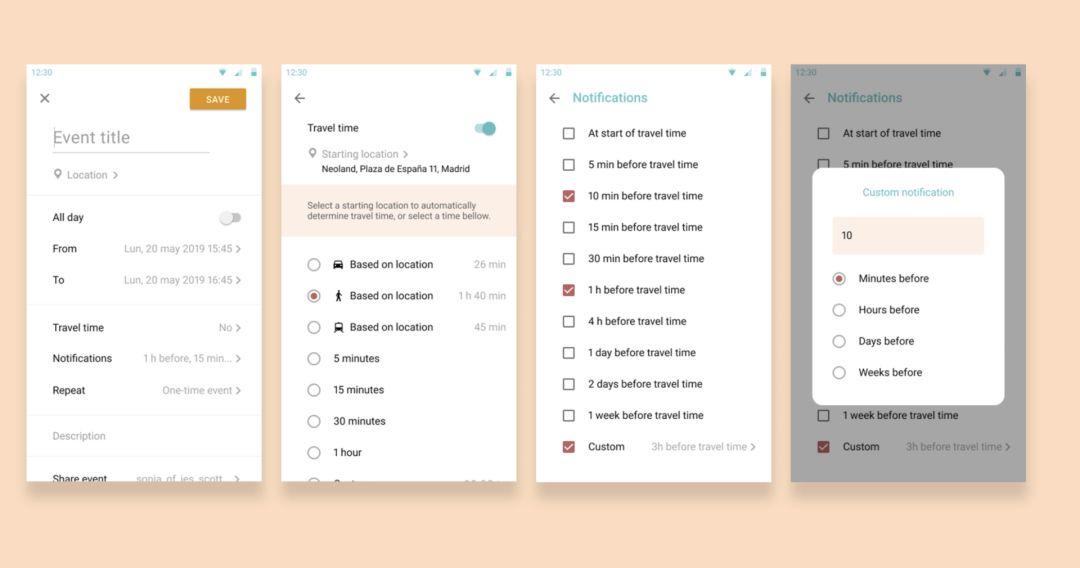
"Create a new event interface" sample diagram
I noticed heuristics and creating feedback to let the user know what to expect in the app. Example: If you create an event on your fitness calendar, but it's on the same day or at the same time as an event on your work calendar, a popup will let you know. In this popup, you can choose to create it in any way or cancel and modify the date/time. As shown below:

"Pop-up window content" example image
Chivo can also distinguish between events and objects. Events are a typical calendar entry, while Goals is a flexible entry that can be postponed. Chivo gathers information from your goals and shows you graphs of the data so you can keep track of what you're doing.

"Add Event/Target" Example Diagram
As mentioned above, I simplified the process of creating targets. I create masks to reduce the number of steps/interfaces in the process of creating objects. This brings the user back to his/her common target or editing interface and gives him/her a clear idea of what he/she is doing. As shown below:

"Create a new target interface" sample diagram
Combined with the user's need to be able to cross out events and goals, I have implemented a function in Chivo that allows users to mark things that are gradually completed. This feature helps users clearly see the status of daily task completion by adding a progress bar to the calendar. As shown below:

"Function to mark gradual completion of events" example diagram
05 Future Planning
Due to time constraints, I had to leave out two features that could be very interesting in the future: the ability to add things like challenges and the ability to track a woman's period.
I never imagined that creating a calendar application would be so challenging. But I think the reason why simple things are easy to operate is because they are carefully designed.
Author: Carlota Anton
Original address: https://uxplanet.org/rethinking-a-calendar-def7711c8b02
Compiled by: Buxichu, Hangzhou UI designer
Review guidance: Fat Fish, Hehe, Bouncing from the TCC committee; Editing and finishing: Pippi, the operation editor of the third division
This article was translated and published by @三分设 on Everyone is a product manager. Reprinting without permission is prohibited.
The title picture is from Unsplash, based on the CC0 protocol
Articles are uploaded by users and are for non-commercial browsing only. Posted by: Lomu, please indicate the source: https://www.daogebangong.com/en/articles/detail/5%20Stages%20of%20Calendar%20APP%20Conceptual%20Design.html
 支付宝扫一扫
评论列表(196条)
测试