Editor: Green Onion Original Author: Liu Baikun
Share some old Japanese magazine covers, the layout and fonts are very good, and it is still very trendy now.
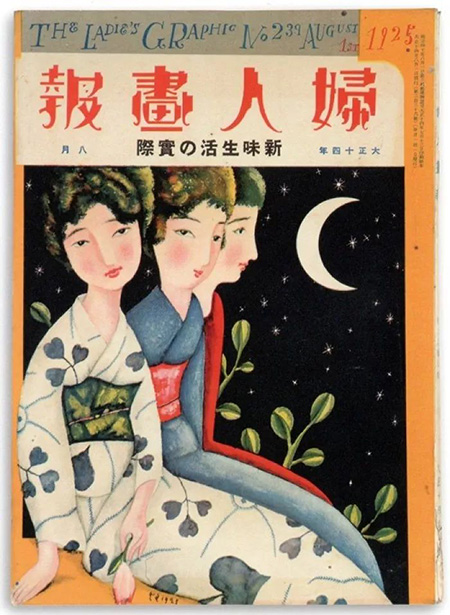
In the picture, three women are sitting next to each other, using a contrast technique. The first two women look sideways, and the one behind This arrangement makes the picture less rigid and rigid, and the contrast between the large blank area in front and the moon makes the picture breathable. The font style in the picture is similar to Huakangli Yasong.
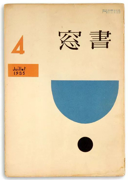
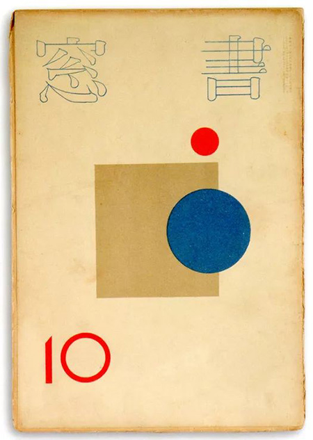
These two covers use geometric shapes as elements, and through the contrast of size, color and shape, the pictures are static and dynamic. The following font styles are similar: Mona Song Jin Black Jane.
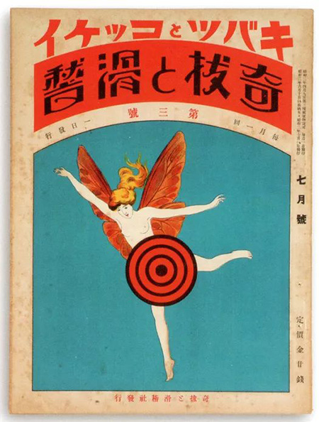
The font in the picture is passionate and unrestrained, and the fonts with similar style are: Wordmaking Workshop Mengyuan
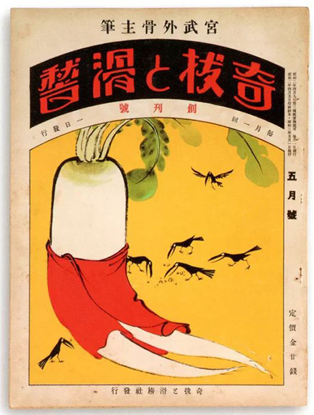
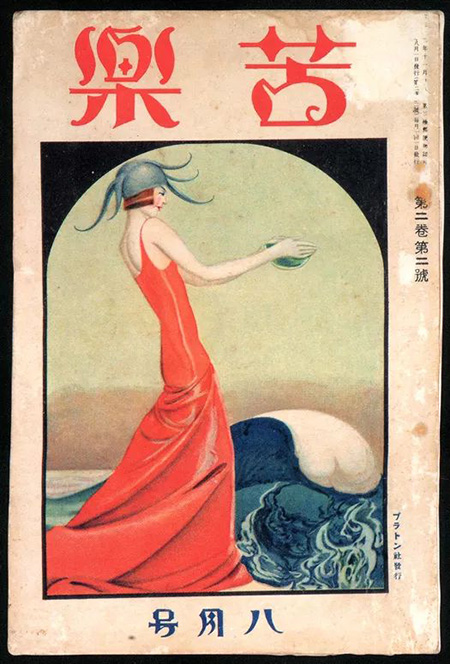
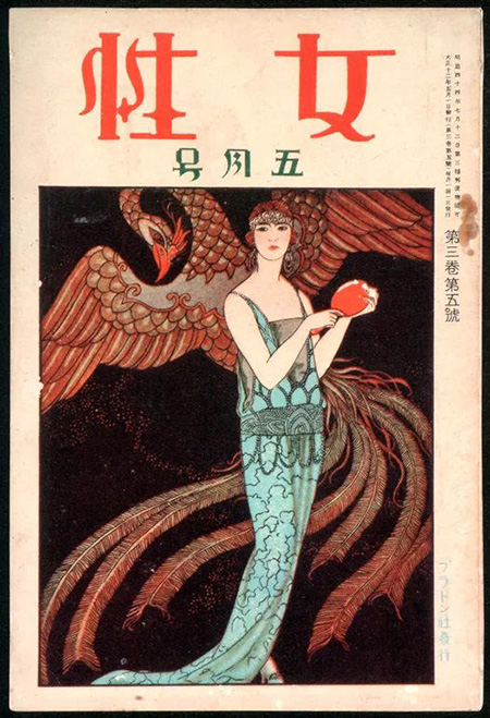
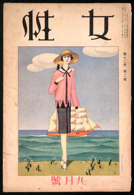
The font style in the picture is similar: Huakang Romantic Snow W9
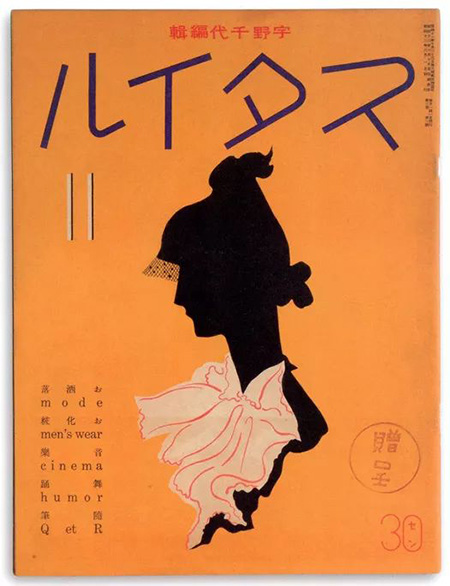
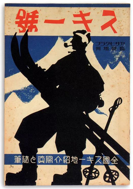
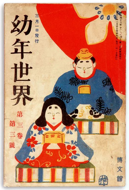
Similar font style: Blue Bird Huaguang Fan Dabiao Song
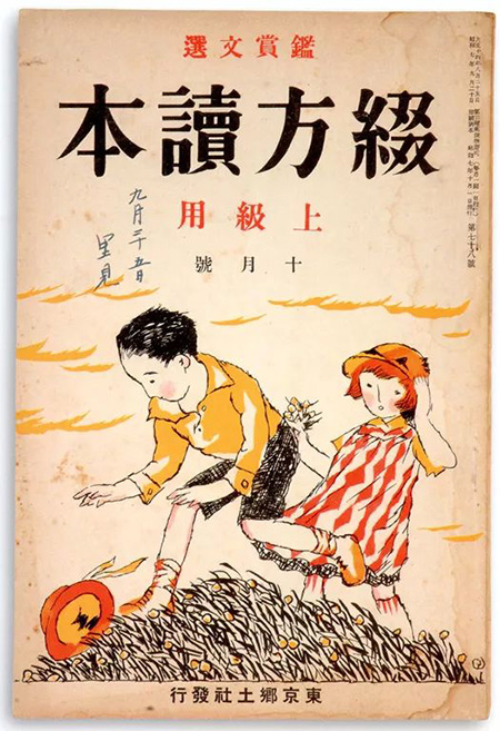
The picture above adopts a vivid and interesting hand-painted style, and the font style of the title is similar: Wang Hanzong Te Ming Traditional.
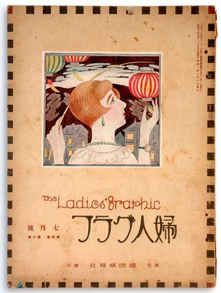
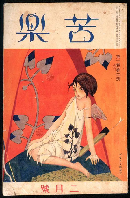
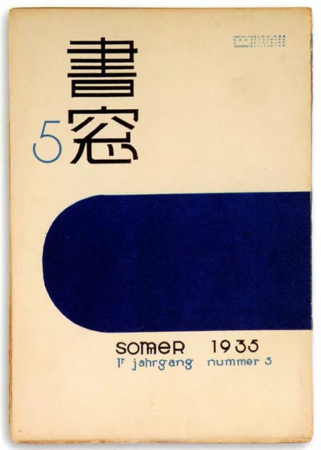
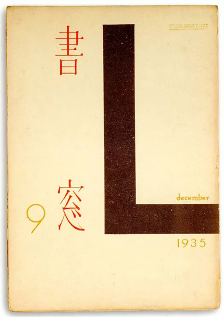
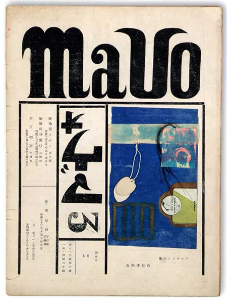

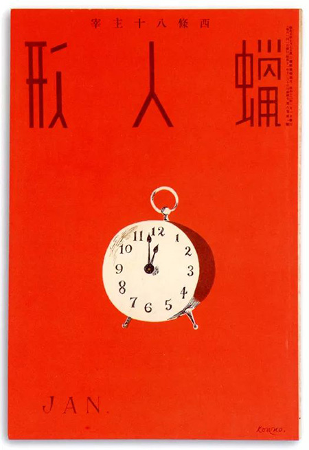
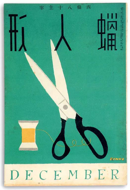
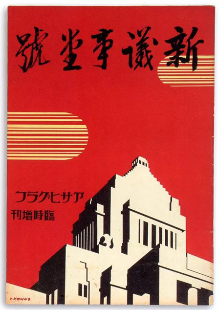
The font style in the picture is similar: Hanyi Xu Jingxingkai
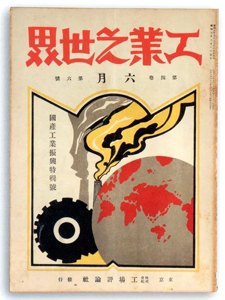
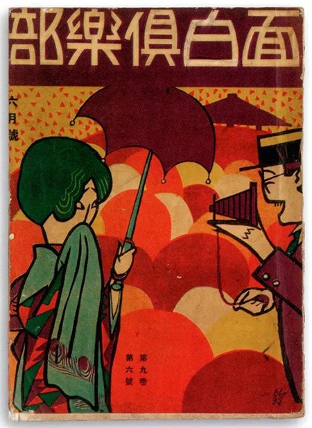
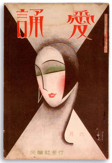
The font style in the picture is similar: Founder Extraordinary Simplified
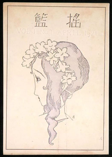
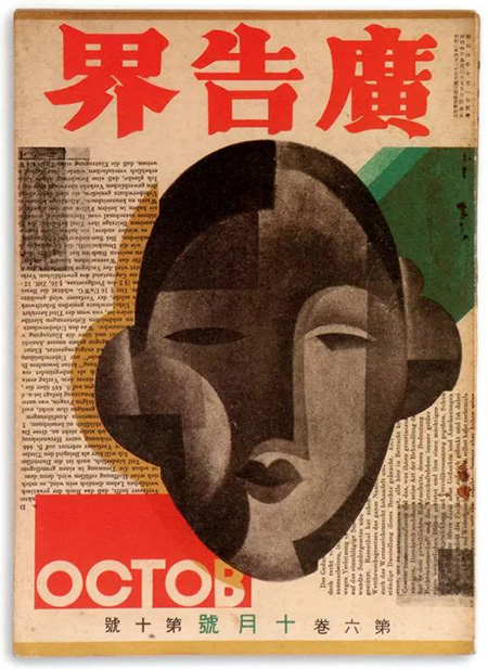
The font style in the picture is similar: Hanyi Super Bold Song
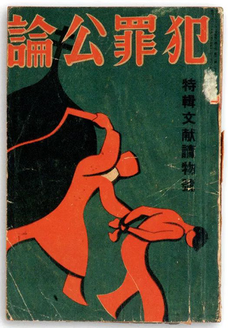
The font style in the picture is similar: Yuji Yetai regular script
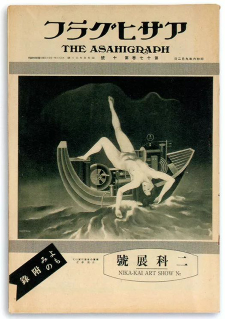
Similar font style: Huakang Romantic Snow W9
Articles are uploaded by users and are for non-commercial browsing only. Posted by: Lomu, please indicate the source: https://www.daogebangong.com/en/articles/detail/30%20old%20Japanese%20magazine%20cover%20designs%20let%20you%20experience%20the%20beauty%20of%20font%20design.html

 支付宝扫一扫
评论列表(196条)
测试